Introduction
Too Good To Go is an application aimed at reducing food waste. It brings together cafes, restaurants, delis and supermarkets, that want to prevent wastage of their food by selling unsold items at a reduced price at the end of the day. Customers are required to reserve their ‘Surprise Bag’; its contents depend on the business’s leftovers at the end of the day. This gives the business a chance to earn profits on items they could have thrown at the end of the day while preventing food wastage at the same time.
While this application has the noblest cause, the purpose of this study remains to evaluate and analyze its design per Don Norman’s book, ‘The Design of Everyday Things’.
The Process
For the purpose of this study, I decided to ‘reserve’ a ‘Surprise Bag’ for myself. Later the same week, on a beautiful Friday afternoon, I decided to get a ‘Surprise Bag’ from Bagel Buffet, just to understand how the pick-up works. Throughout the process, I was accustomed to my mental model, formed through the usage of food pickup and delivery applications such as GrubHub and Uber Eats.
However, throughout the project, it will be evident that I am pointing out problems that are not just limited to my reserving a ‘Surprise Bag’ at Bagel Buffet, but are present in other parts of the application’s design.
1. Browsing Various Options
Although the ‘Discover’ page is the first page that the application loads into, ‘Browse’ is another page which functions as a way to search and find different cafes, bakeries, supermarkets or just any business giving away ‘Surprise Bags’ in the nearby area. It has two options to view these businesses, a ‘List’ view and a ‘Map’ view.
1.1 Browse List View
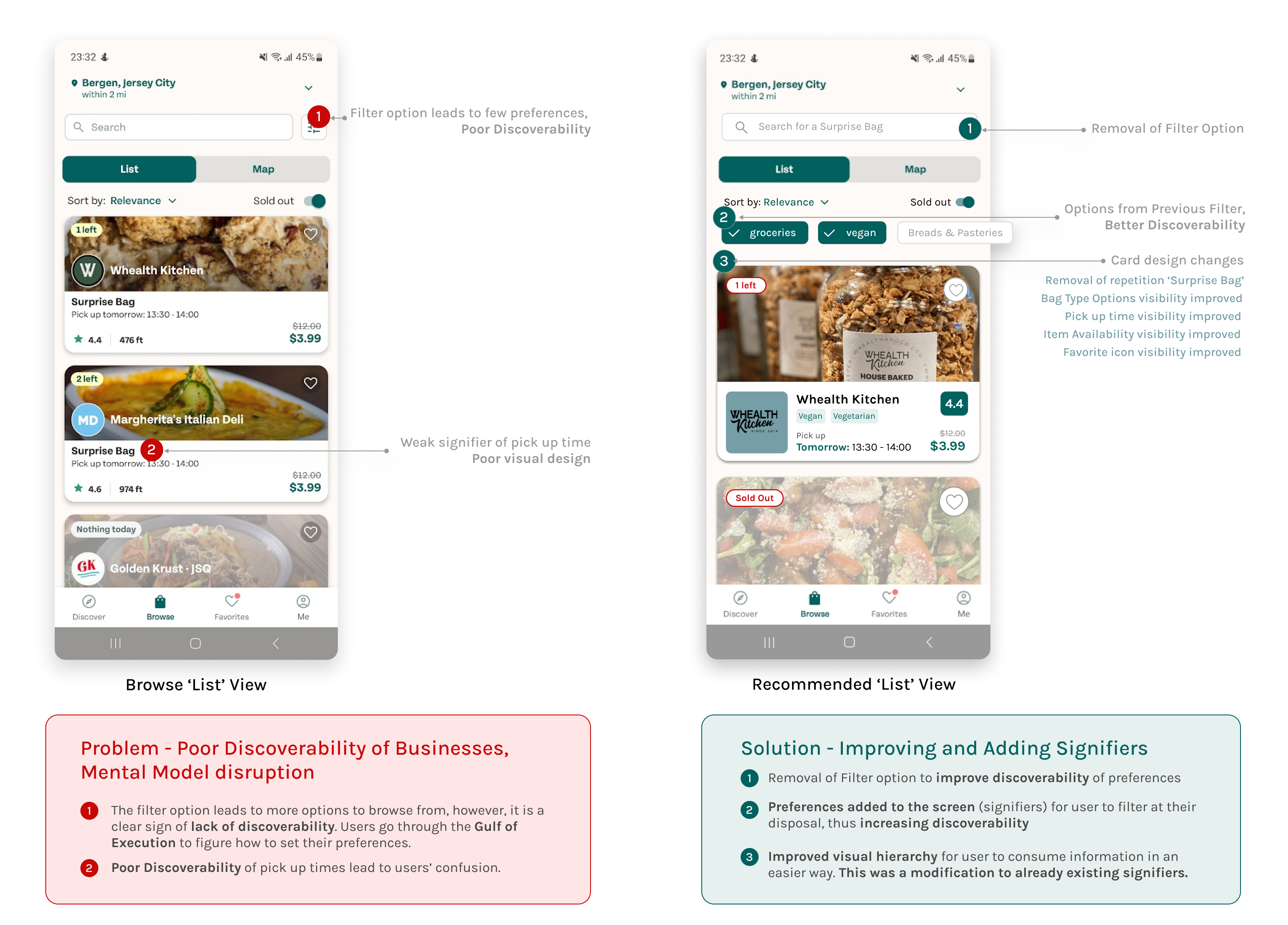
1.1A PROBLEM (List View)
Throughout my interactions with the page, due to my own mental model, I found it especially difficult to discover the options for ‘Vegan’ and ‘Vegetarian’ bags. However, I realised that the filter icon (marked as ‘1’ in the following image), was to be used to get the specific preferences set for me. This icon reduced the overall discoverability and made it difficult for users with a similar mental model like to me select their preferences. It also went against the ‘Knowledge in the World’ concept described by Don Norman. Since users know they are in for the ‘Surprise Bag’, I felt that it was unnecessary to write ‘Surprise Bag’ on every card repeatedly.
1.1B SOLUTION (List View)
Since the application provides limited options for setting preferences, I recommend removing the filter button. The preferences can be used as filters and made available on the Browse Page. This also supports the mental model of most users who are used to the experiences of products such as Uber Eats and GrubHub as well as the concept of ‘Knowledge in the World’. Their primary function is to signify the affordance to set one’s own preferences. I also recommend adding tags such as ‘Vegan’ and ‘Vegetarian’ on the cards of available ‘Surprise Bags’ to increase discoverability for specific user groups. I also recommend focusing on the visual hierarchy to prevent the user from overlooking the pick-up times (I overlooked them due to the font being the same).
1.2 Browse Map View
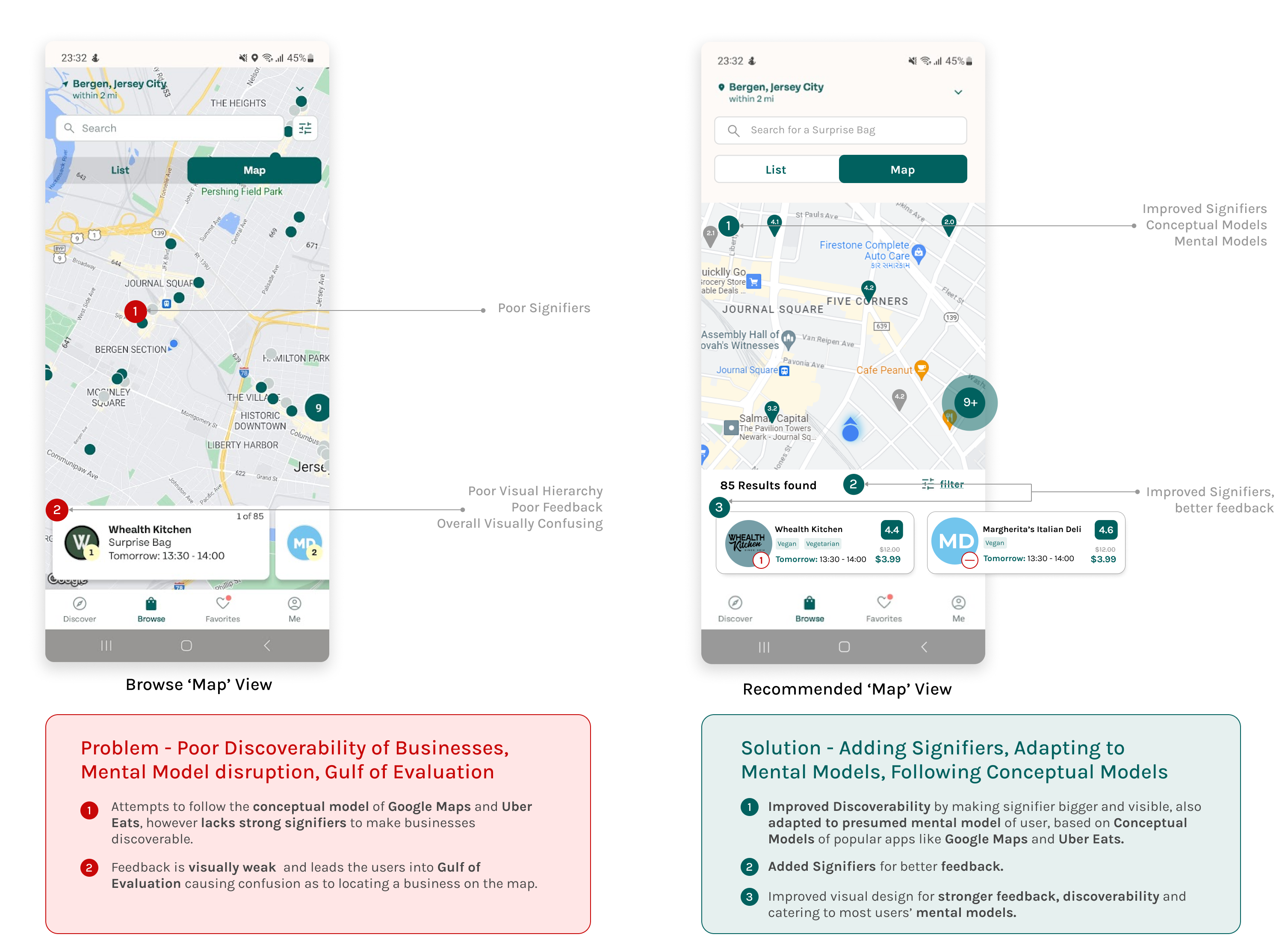
1.2A PROBLEM (Map View)
The Map view has a lack of strong signifiers. Users may have a difficult time interpreting the tiny dots. It is however clear that the application follows the conceptual model of Google Maps and Uber Eats. Even after clicking on the ‘dots’, it is the weak feedback which leads the users into a ‘Gulf of Evaluation’, wondering if the interaction even has any consequences. A visual design problem – The green signifiers match with the green of the segmented button.
1.2B SOLUTION (Map View)
I recommend enhancing the signifiers to adapt to the mental models of the users. The cards could also use a better visual hierarchy for users to make better use of the interface. I recommend that the size of the map be changed. Instead of the entire screen, covering just a certain designated part of it seems much better due to the fact that the original design looks a little visually confusing.
2. Store and Surprise Bag details
2.0 PROBLEM (STORE AND SURPRISE BAG DETAILS)
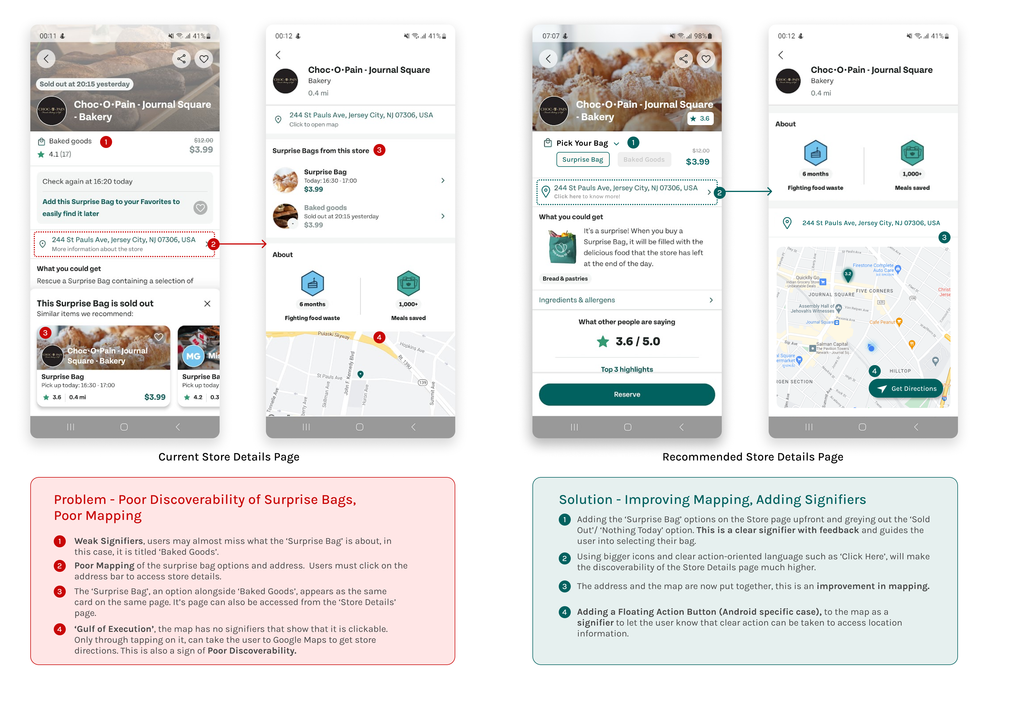
The store page lacks strong signifiers, which could allow the users to overlook their options for the bag. In this case, there are two bags being offered, one titled ‘Surprise Bag’ and the other ‘Baked Goods’. This can also be seen in the first screenshot in Fig 3 which shows two store cards popping up on the same page with the same content, leading to a lot of confusion. The user may miss the latter in the case presented above. This is the result of poor mapping. Another example of poor mapping on the same page is that the user has to click on the address bar to view the options for these bags as well as other store details. There are no clear signifiers communicating the need for it to be clicked in order for the above action to be completed. This could lead the user into ‘Gulf of Execution’.
The Store Information Page is also flagged by visually weak signifiers. In my case, I overlooked the address bar again because I considered it to be the same on the Store page. I experimented with clicking on the map and thus realised that it was the way to access the store’s location via Google Maps.
2.0 PROBLEM (STORE AND SURPRISE BAG DETAILS)
One of the first recommendations I thought of was adding the Surprise Bag options to the store’s bag reserving page itself. This could let the users select what they want to get. The ‘sold out’ buttons can be greyed out and disabled. These signifiers can also adhere to the users’ mental models as well as follow the concept of ‘Knowledge in the World’, by taking inspiration or adapting from common shopping experiences.
Using clear action words such as ‘Click Here to Know More’ or ‘Click Here to Access Location’, can signify to the user that they can expect a way to access location from the application itself. Mapping can also be consistent by grouping the address text and the map together.
This is an Android-specific case, but adding a Floating Action Button to the bottom right can make it easier for the user to know that the application affords providing directions to the store through Google Maps.
3. Adding Reviews and Checking Your Impact
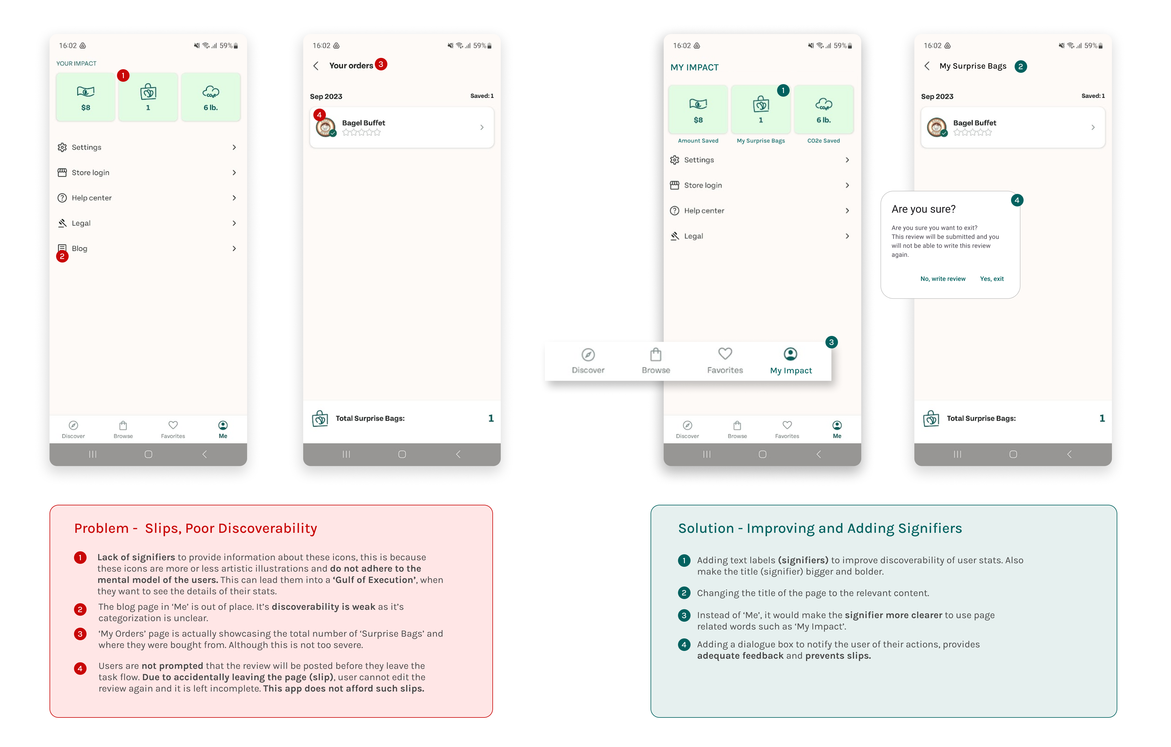
3.0 PROBLEM (THE ME PAGE AND REVIEWS)
The page has some interesting insights into the user’s impact on the environment and their wallet through using this application. A major setback of this really good feature is that it does not have any clear text labels to signify its purpose. The illustrations are too artistic and the user’s mental model may not be able to figure their purpose out immediately, often mistaking them are infographics and thus going through the ‘Gulf of Execution’ to finally understand their importance.
The Blog shortcut on the ‘Me’ page is rather poor in its discoverability and irrelevant to the context of the page.
The ‘My Orders’ page is accessed through the ‘Bag’ icon on the ‘Me’ page. However, since the application uses the term, ‘Surprise Bags’, the page title is not a clear signifier.
Another major affordance issue is that this application cannot afford users to come back and add to their review, in case they accidentally left the review writing task flow. It lacks signifiers to alert the user of this anti-affordance. It does not afford slips.
3.0 SOLUTION (THE ME PAGE AND REVIEWS)
The overall recommendation for this page is adding text labels as signifiers. I also recommend that they improve text sizes to signify the importance of the pages.
The ‘Me’ page can be relabelled as ‘My Impact’ page to make discoverability easier. I also recommend moving the ‘Blog’ feature to the ‘Discover’ page to make it more discoverable.
Lastly, since the application does not afford the user to leave the Review task flow, I suggest that they add a ‘dialogue’ box (Android-specific) to confirm their decision. This could reduce the number of slips.
4. Pick Up Flow
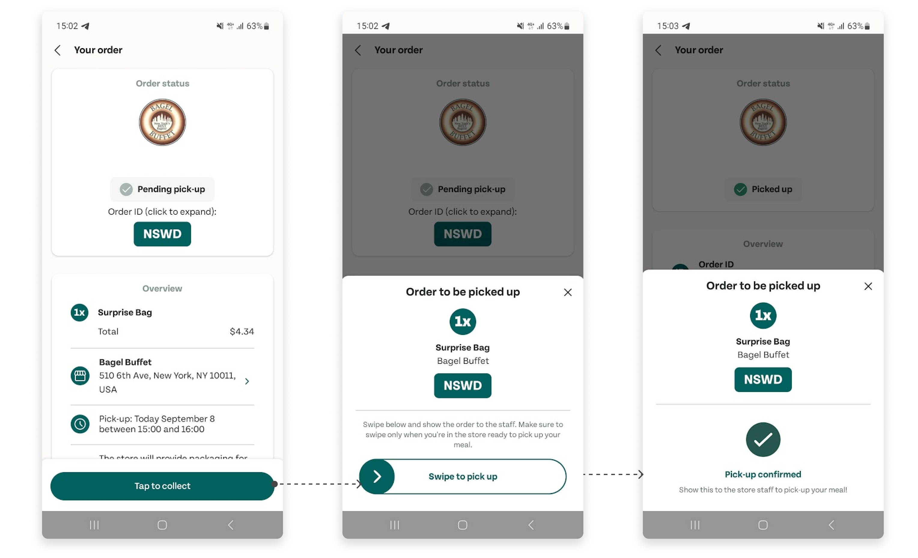
The Pick Up flow was fairly simple and well-designed. The signifiers are clear and the feedback is very good too.
One recommendation for this could be Too Good To Go’s policy that orders placed within two hours of pick-up time cannot be cancelled. This signifier can be used and placed on the page prominently to avoid customer complaints.
Compared to the lack of signifiers in the overall application, the pick-up flow performs well and does not need much to change. There is no Gulf of Evaluation and Execution.
Conclusion
Too Good to Go supports a great cause, however, it has very weak signifiers and poor mappings resulting in the Gulf of Execution and the Gulf of Evaluation. It clearly tries to follow the conceptual models of popular applications however due to the problems stated above, it is unable to match with users’ mental models. Navigating through the application is rather confusing and this can be prevented if Too Good to Go decides to take Usability Testing into account and implement the changes derived from those results.