RidePATH is a mobile application by The Port Authority of New York and New Jersey for commuters to stay updated on real-time train schedules, important updates about PATH services and planning upcoming trips. This blog critiques the RidePATH iOS mobile app, particularly in the dark/system mode, using the design concepts and principles presented by Don Norman in his book ‘The Design of Everyday Things.’
First time experience
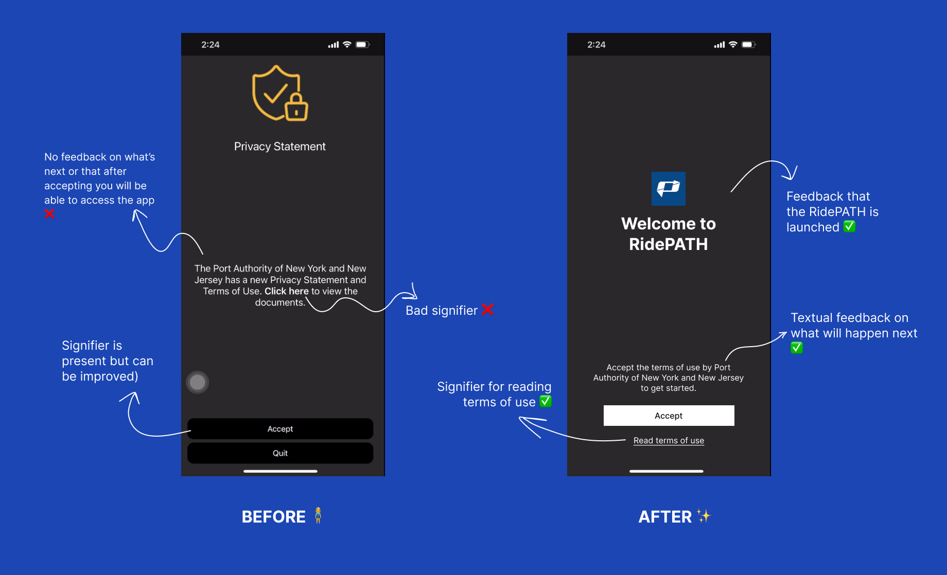
When the app is launched first-time users are prompted to accept the Port Authority’s terms of use. There is no visual feedback or splash screen to convey to the user that they are now accessing RidePATH app. The interface also does not convey any feedback to users about why they need to accept the terms or what will happen next. Also, most users would not be interested to read the terms of conditions document but if a user wishes to, they can do so by clicking on ‘Click here’ in the body of text. However this is a bad signifier and can easily be missed. It may also not match the user’s knowledge of the world because commonly on most websites and apps, terms of use/conditions is often linked as a tertiary or anchor button.
One of the ways to improve the usability of this screen and provide better feedback to the user would be to change the body of text to “Accept the terms of use by Port Authority of New York and New Jersey terms of use to get started”. The button colour (in the dark system mode) can also be improved for better visual accessibility and discoverability.
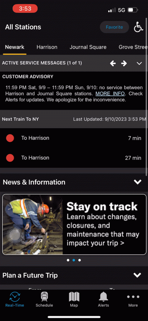
Home Screen ‘Real-Time’
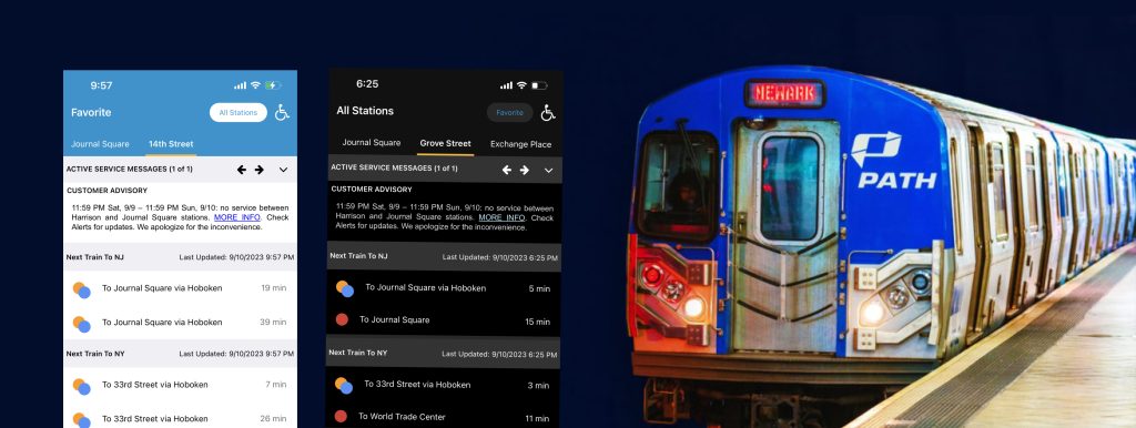
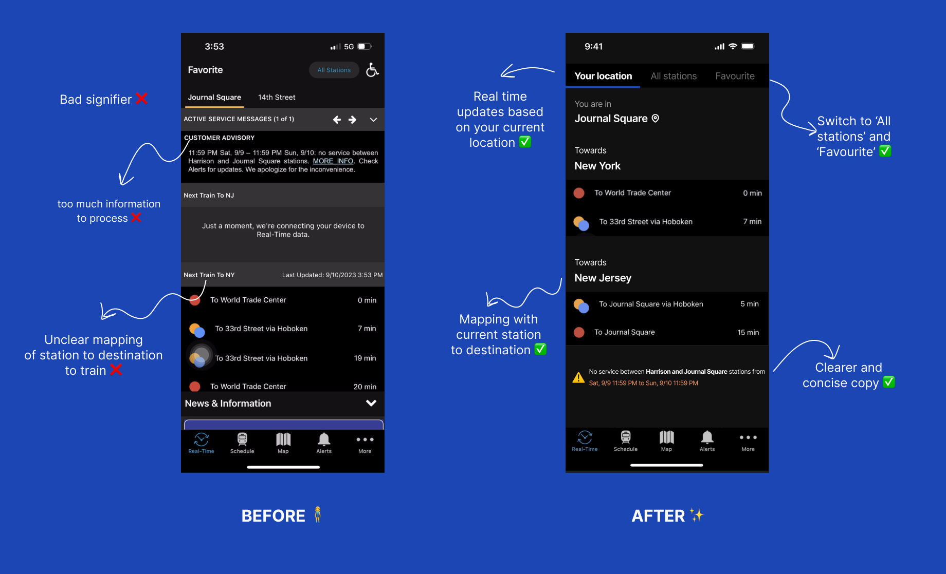
The home screen is named “Real-time” and attempts to match the user’s conceptual model by showing real-time updates of train departures but fails to do so intuitively. The menu navigation is named ‘Real Time’ whereas the title on the top is called ‘Favourite’ which can confuse the user. The app also severely lacks mapping between the stations, destinations and train departures. The screen is riddled with too much information with no clear affordances or signifiers which increases a user’s cognitive load while navigating the app. The design also fails to follow Gestalt’s principle for visual grouping which results in a confusing interface.
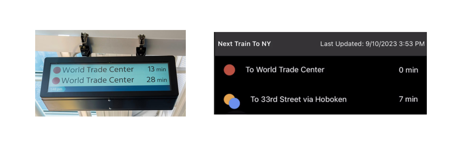
On the top right of the screen the chip ‘All stations’ affords to navigate to the ‘All stations’ tab, however the chip fails as a signifier and hence is not discoverable. The screen can be vastly improved by starting with taking into account a user’s knowledge of the world relating to a PATH station, commuting towards NJ/NY and train departures and mapping it on the app appropriately. The screen however does a good job of maintaining a user’s knowledge in the head and creating a familiar UI pattern by showing the train status exactly like a real life train status board, making it easy for the user to browse through.
To improve this screen the app can show real time updates of the PATH station that the user is currently closest to. Users can also navigate to ‘All stations’ or ‘Favourite’ by switching tabs instead of using chips which are typically used for the action of selection. It is also extremely important to have clear mapping of trains going to NJ and NY, and their respective train departure times with the station/tab that is active. The redesign also improves the discoverability of the destination (towards NY or NJ) of the trains and hence helps the users find train schedules more easily.
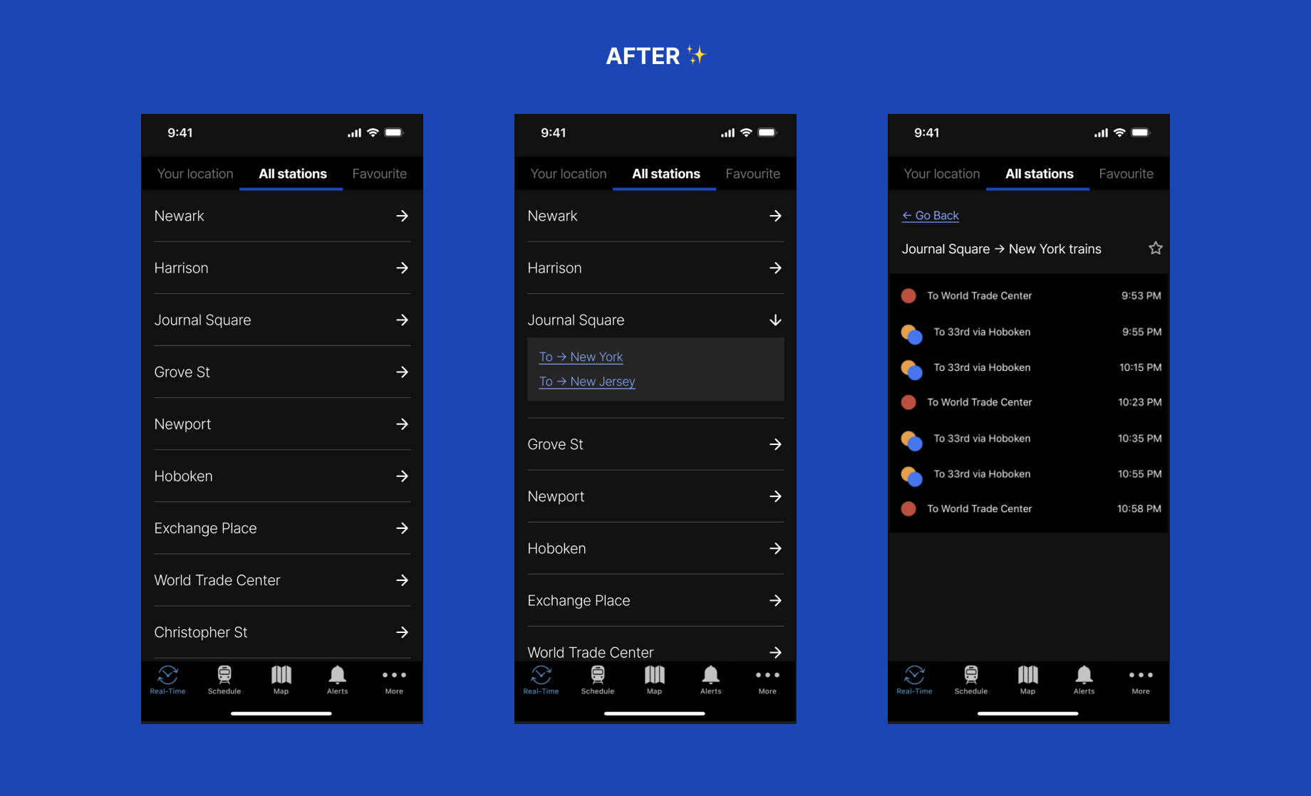
All Stations
When a user clicks on the chip ‘All stations’ they expect to see information about all the PATH stations. However, the app does not match this expectation and on first glance only 4 stations are visible on the interface. This means the user misses out on information about nine PATH stations: Exchange Place, WTC, Newport, Hoboken, Christopher St, 9th St, 14th St, 23rd St, and 33rd St which are not discoverable at all. Spending a few more minutes swiping and tapping everywhere on this screen, you will find that in order to view all stations, you have to scroll horizontally. There is no signifier to nudge the user to scroll this way, neither is it intuitive to scroll horizontally to access multiple options.
To improve this experience, we can change the horizontal scrolling to vertical scrolling to improve the discoverability of all PATH stations. This would also enable us to create a better mapping of stations, destination (towards NY or NJ), and train departure times. The arrows mapped to each station help users get constant feedback throughout the user journey and help to bridge the gulf of evaluation and gulf of execution.
Conclusion
In conclusion the RidePATH app has a learning curve and needs to be improved by updating the mapping of features, usage of signifiers, and making the app more intuitive and usable for an average commuter. Thousands of commuters use the PATH everyday and by understanding their conceptual model and knowledge of the world, the app can be improved tremendously and prove to be extremely helpful.