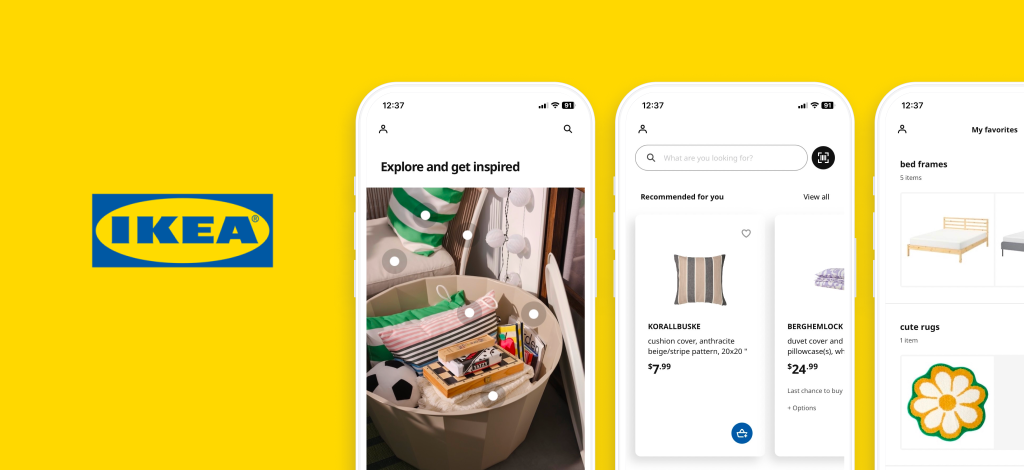
Exploring IKEA: A budget-friendly haven for furniture and home goods, fueling ideas for a cozier home
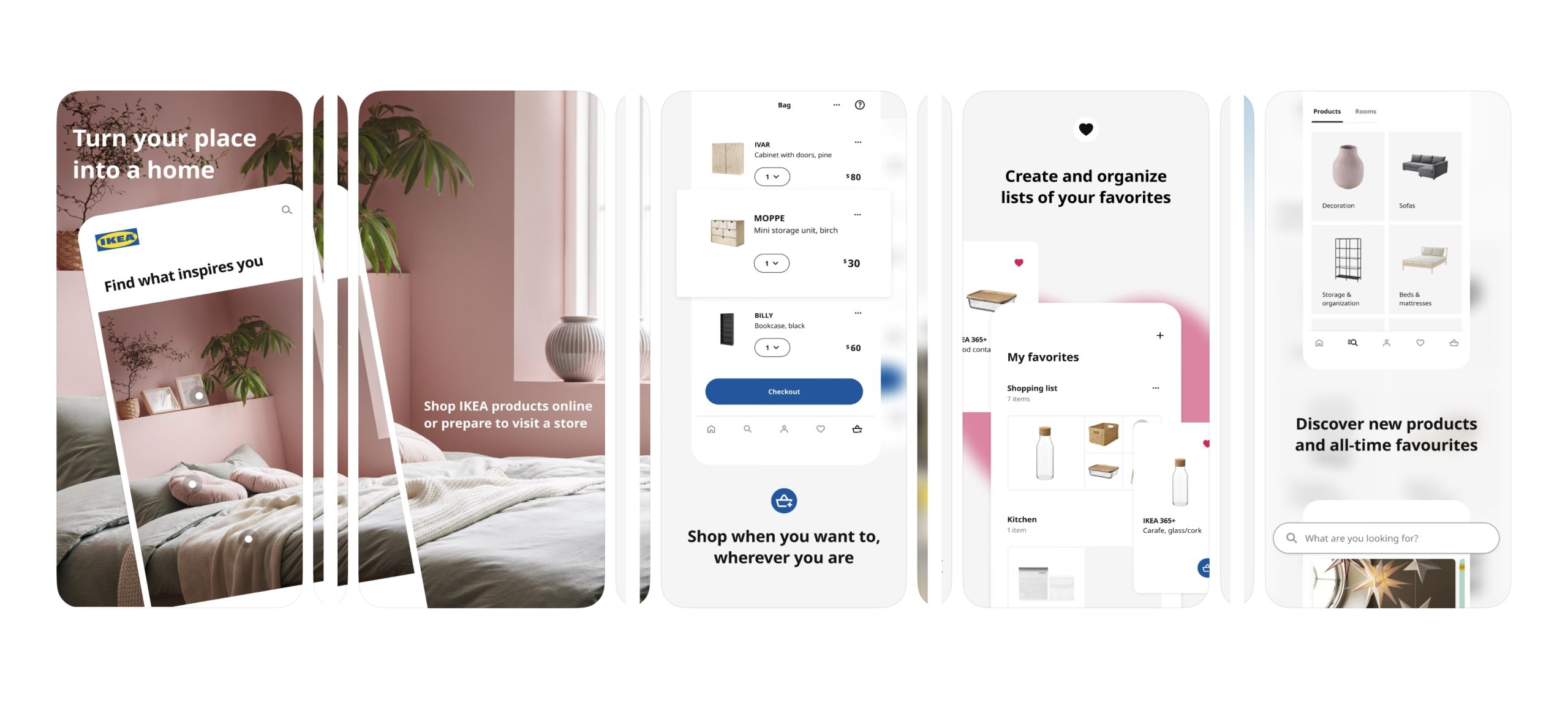
IKEA is a Dutch-based multinational conglomerate known for designing and selling ready-to-assemble furniture, home decor, and various other goods and services. The IKEA app, available on both iOS and Android, provides an affordable furniture and home goods shopping experience while offering inspiration for creating a better home life. This critique focuses on an iPhone 11 user exploring the IKEA app’s features. For each recommendation, I have created visual mock-ups using Figma to show exactly how they would be implemented.
The initial entry page: Search
When users open the app, they are greeted by the search page with a search bar, clearly indicated by the search icon and the placeholder text “What are you looking for?” This signifies the affordance of searching for various furniture and home goods, aligning with the user’s goal of discovery.
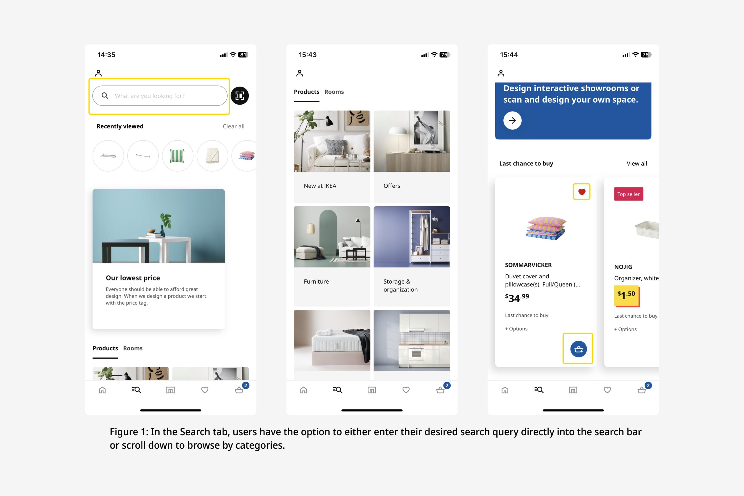
As users scroll down, they encounter a visually well-structured card list of product categories, which provides great discoverability for them to find specific items. Further down, there’s a card carousel list of products that are last chance to buy, where the prominent “add to bag” and “favorite” buttons serve as clear signifiers, affording users the option to add items to their favorites or shopping bag. The card carousel design also facilitates easy exploration of listings without the need for a separate “view more” or an arrow button.
Log in
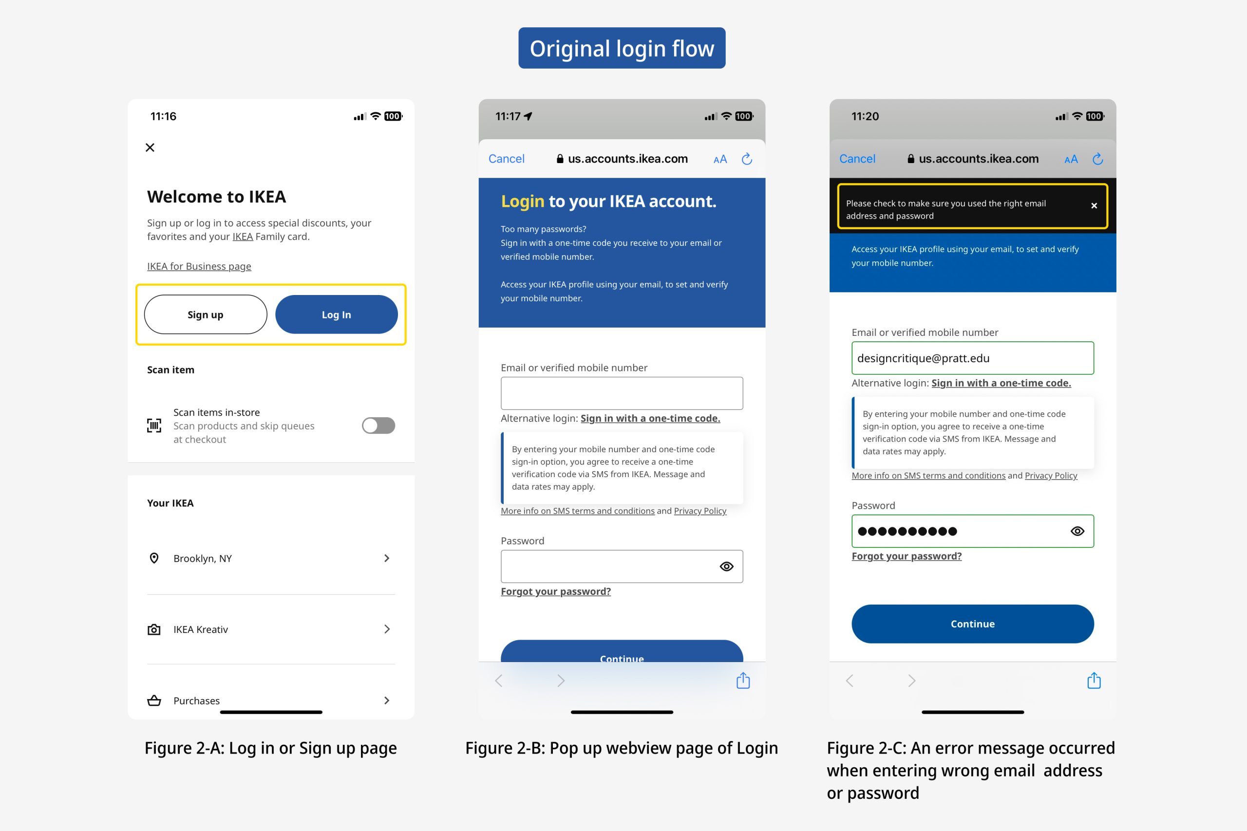
When users initiate the login by tapping the “Log In” button, they are directed to an in-app webview displaying the login page. The prominently displayed “login” and “sign up” buttons are good signifiers that the webview affords to log in and sign up.
During login, users may encounter capture slips or description-similarity slips, resulting in incorrect email or password inputs and unsuccessful login attempts. In response, an error message appears, stating, “Please check to make sure you used the right email address and password.” (Figure 2-C) While providing immediate feedback for unsuccessful login attempts is commendable, the current UX writing lacks clarity. An effective error message should assist users in recognizing, diagnosing, and recovering errors promptly. Unfortunately, the current design does not clearly inform users whether they have entered the incorrect email or password, nor does it offer guidance on immediate error correction. Consequently, the existing error message falls short in bridging the gulfs of evaluation and execution.
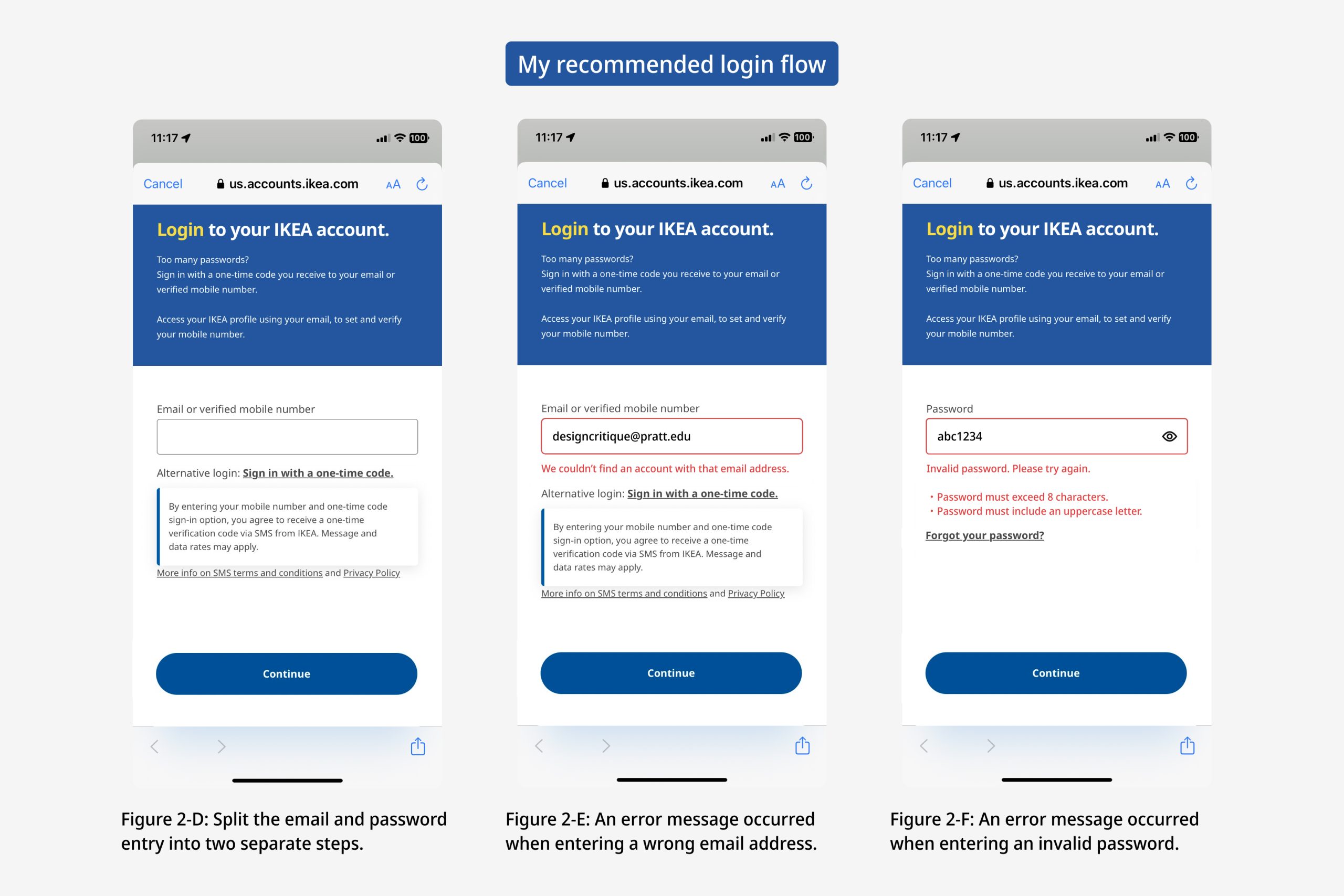
I recommend enhancing the error message by delivering concise and precise descriptions of the issue, including clear identification of incorrect email or password input. In cases of password errors, it should explicitly outline why the password is considered invalid and provide specific requirements, such as “must exceed 8 characters” or “must include an uppercase letter.” (Figure 2-F) This approach will improve the clarity and usability of the login error feedback.
Product Browsing
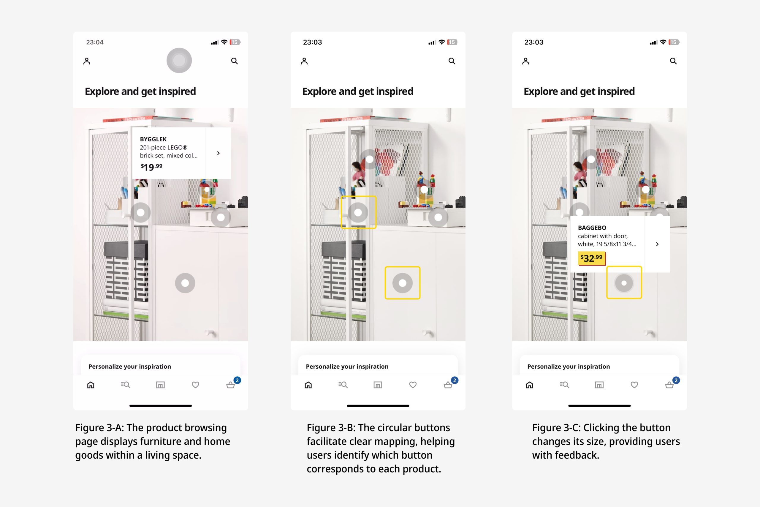
The product browsing page effectively demonstrates the potential uses of items within a living space, aiding users in envisioning how to personalize their homes. (Figure 3-A) This feature is particularly valuable as it facilitates a clear mapping of information. White circular buttons positioned atop or adjacent to the items serve as intuitive cues for users. (FIgure 3-B) Upon clicking these buttons, users are presented with detailed descriptions of the respective items, enhancing their understanding of the product. Furthermore, the dynamic sizing of the circular buttons upon selection provides valuable feedback. (Figure 3-C)
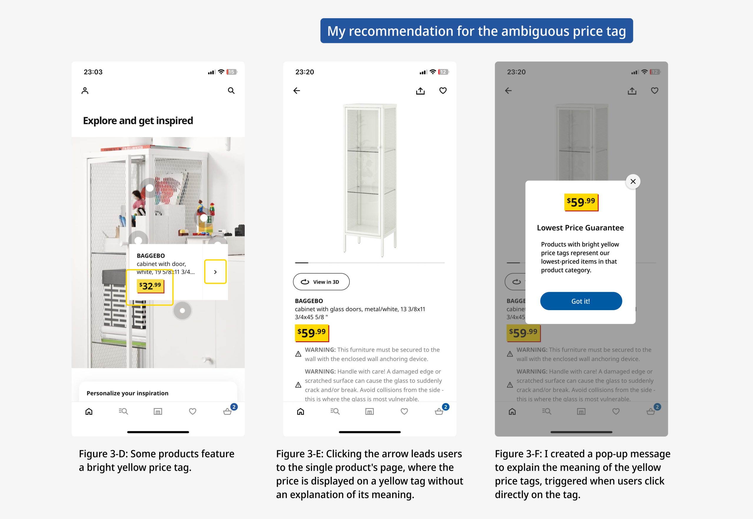
However, one aspect that could be improved within the product list is the use of “yellow price tags”. While most products use a black-font price tag without a background color, some display a bright yellow background with different typography. (Figure 3-D) The yellow price tag lacks clarity and context, potentially causing confusion for users regarding pricing. This ambiguity creates a gulf of evaluation. To address this issue, I recommend implementing a pop-up message as a signifier that offers additional context about the yellow price tag when users click on it within a single product’s page. (Figure 3-F) This would ensure users gain a more comprehensive understanding of its meaning.
My Favorites
The “My Favorites” page is commendably designed, offering users a convenient way to explore curated categories of items, eliminating the need for extensive searches or manual catalog browsing. However, when users have a substantial number of categories, finding a specific list, such as “table lamp,” can be challenging due to the absence of an instant search option. (Figure 4-A) Users are currently limited to scrolling through categories, which proves to be inefficient and hampers discoverability when searching for specific wishlists they’ve created.
To enhance user experience and streamline the process of locating desired products, I recommend adding a search bar to the top of the My Favorite page. (Figure 4-B) This addition would empower users to effortlessly search for their desired items, improving the overall usability of the feature.
Tab bar
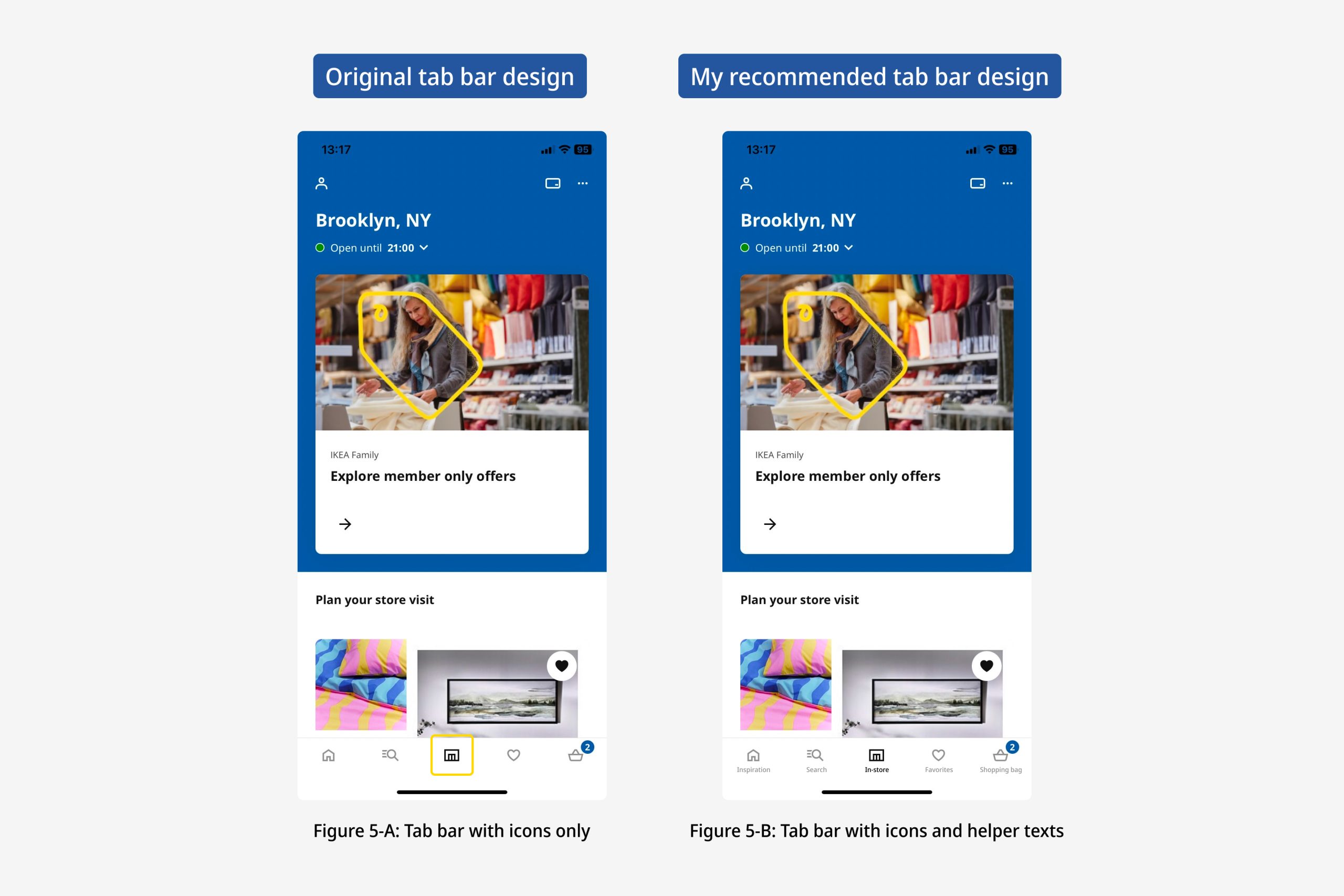
In the tab bar, you’ll notice icons like a home, search, and a shopping bag. These icons are good conceptual models, which help users predict what they can achieve through the buttons. Some icons, like home, search, heart, and shopping bag, are easy for new users to understand due to their universal meanings. However, the central icon in the tab bar might leave first-time users feeling unsure. (Figure 5-A) It’s unclear because it lacks a clear meaning that everyone knows, which can clash with how users think the app should work. This gulf of evaluation can make users hesitant to tap on unfamiliar icons, limiting their ability to explore the app with confidence.
To make things clearer, I recommend adding helper texts beneath all the icons, acting as signifiers. This will improve the understandability of the interface. For example, IKEA could use labels like “Inspiration,” “Search,” “In-Store,” “Favorites,” and “Shopping Bag” to help users navigate with ease. (Figure 5-B)
Conclusion
Overall, IKEA offers a generally smooth online shopping experience. However, there are areas that could benefit from improvement, such as adding helper texts to the tab bar and enhancing the error messages in the login process.
In conclusion, IKEA’s app successfully provides a user-friendly platform for discovering and purchasing furniture and home goods. By addressing the mentioned areas of improvement, IKEA can further elevate its design and continue to offer a delightful experience to its users.