LinkedIn Learning is an online educational platform offering a wide range of courses across various industries. Tailored for professionals, it provides access to industry expert-led, on-demand content to enhance skills and knowledge. Users can learn at their own pace and advance their careers, making it a valuable resource for lifelong learning and career development.
1. Lack of ‘See all’ Option on Categorized Courses
Current Issues:
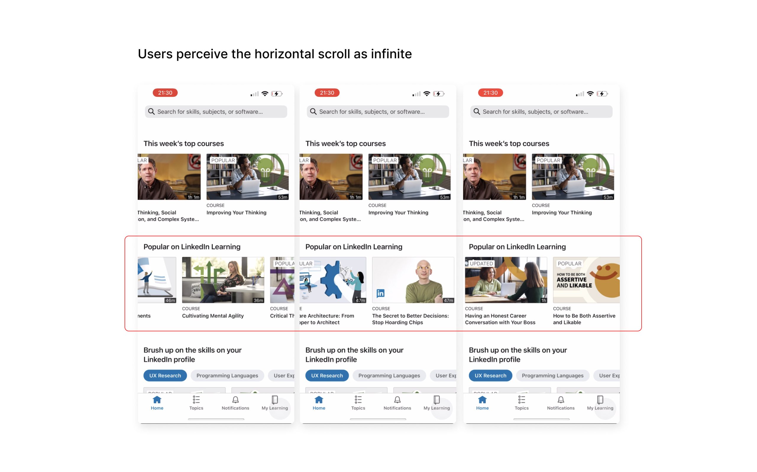
Infinite scroll: Users are required to keep scrolling endlessly to find a course of interest.
Lack of navigation: There’s no direct way to navigate to a separate page to view all courses within a specific category.
Problem Breakdown:
Feedback and Perception: The design lacks feedback and creates a large gulf of evaluation, making it difficult for users to understand the state of the product. Users cannot confidently perceive whether the content is truly infinite, if it has refreshed, or if their intended actions have been successful. This lack of clarity leads to usability issues and user confusion.
Potential Improvement:
The improvement should focus on bridging the gulf of evaluation through providing clearer feedback to inform users that their intentions have been met. I believe there are three solutions.
Loading Indicator: When users reach the end of one scroll, adding a loading indicator (such as a spinner or progress bar) is a good solution. This informs users that new content is being generated, reducing uncertainty about the system’s response.
Micro-interaction effects: Another option is to add micro-interaction effects such as a subtle dissolve in or an instant move-in effect to signal the availability of additional content.
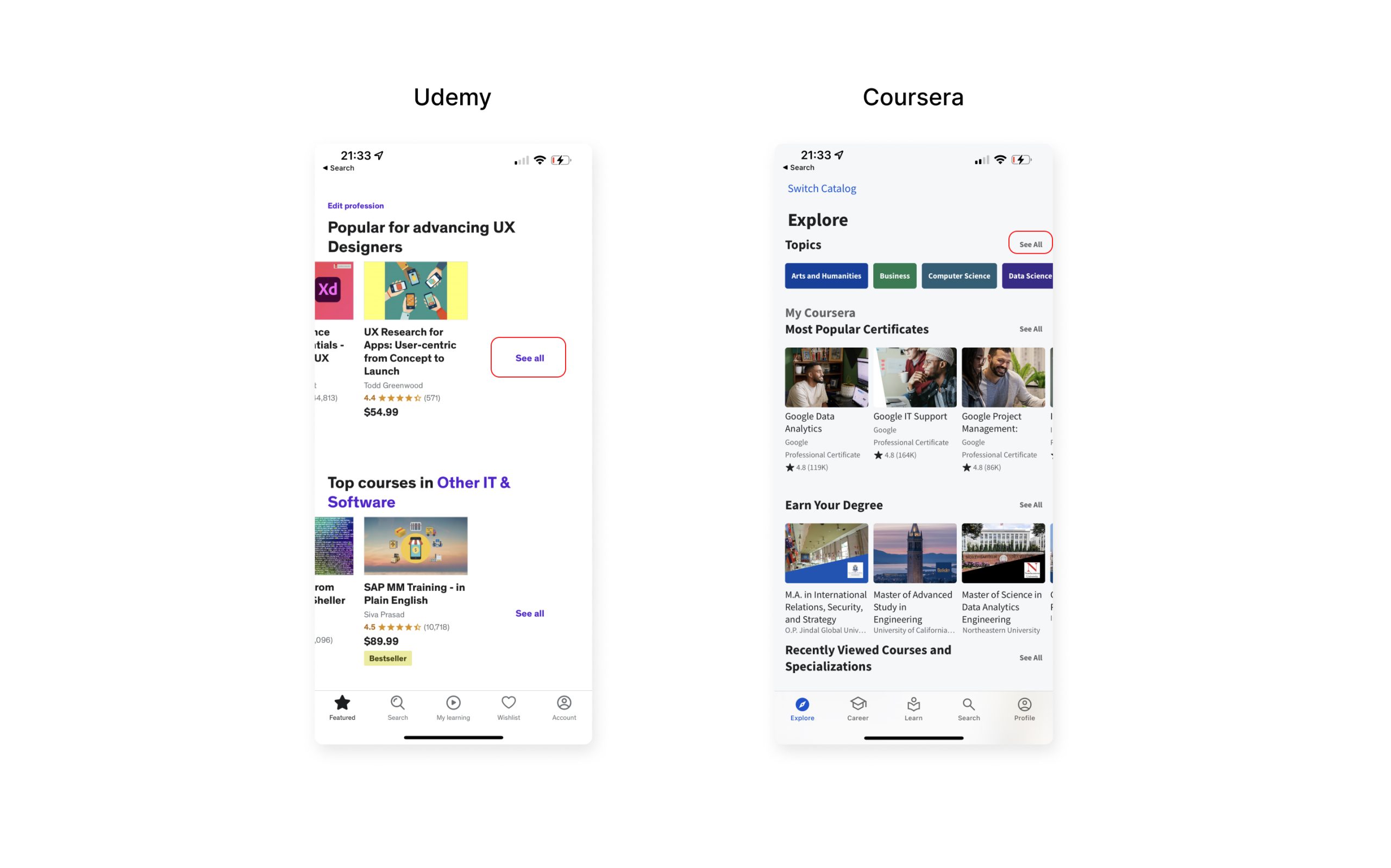
See all Call-to-Action: Consider adding a “see all” button as signifier within the course section or at the end of the horizontal scroll is an effective way to indicate that more content is available. This approach aligns with the practices of platforms like Udemy and Coursera.
2. Download Course Button and Icon Have The Same Result
Current Issues:
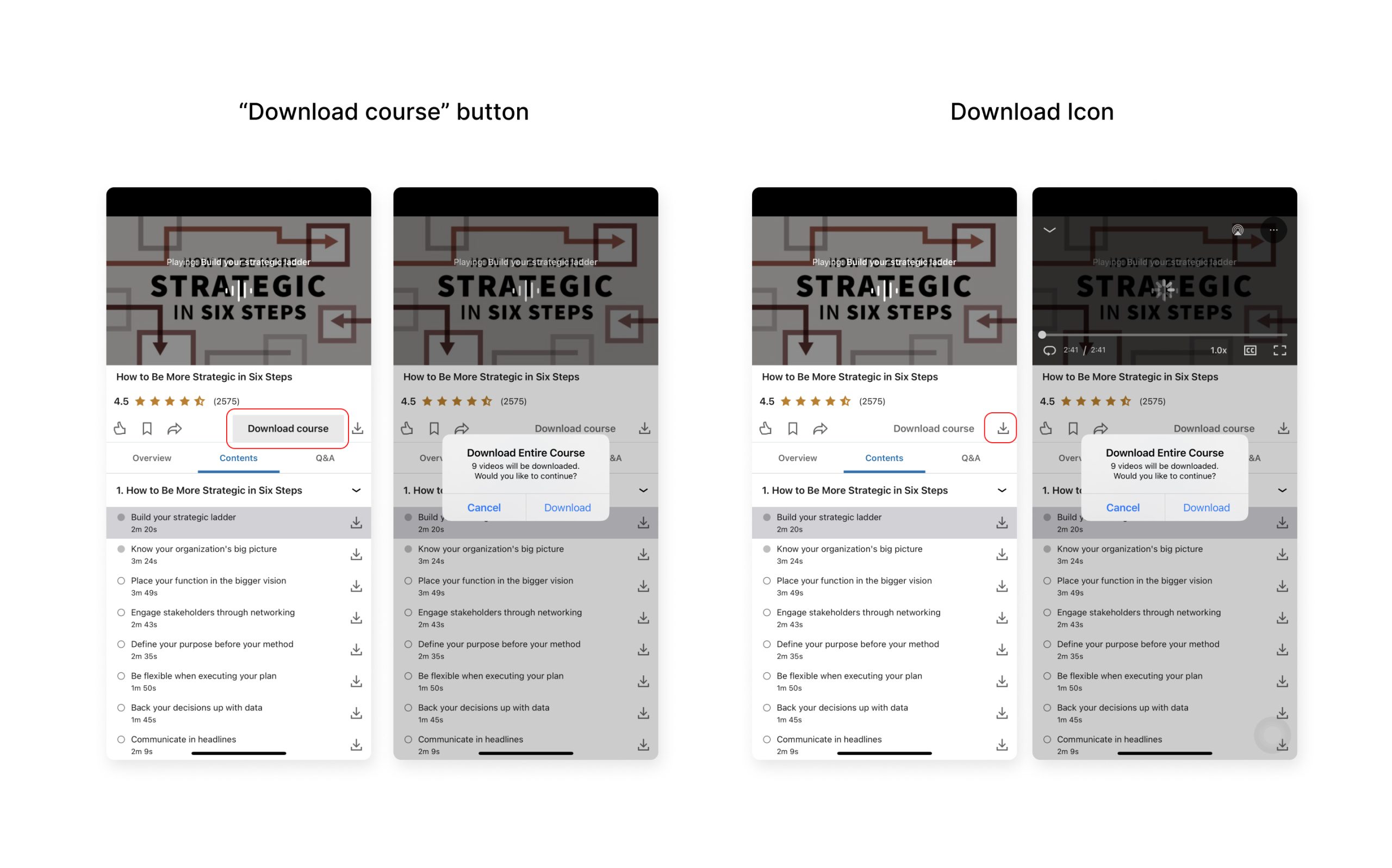
When users first land on this page, both the download course button and icon are highly discoverable.
However, contrary to expectations, users might soon realize that these two options lead to the exactly same result, a modal window confirming with users downloading courses videos.
Problem Breakdown:
Because of knowledge in the head, when users click on the download icon, they assume either the videos will start auto-downloading or a pop-up window will come up to confirm their actions, which is the latter in this case.
The fact that these two buttons, placed side-by-side, lead to the same result inevitably disrupts proper mapping.
Potential Improvement:
To address the mapping mix-up, I suggest removing the download icon and retaining the “download course button” for better visibility and discoverability.
3. Home Page Lacking in Consistency and Affordances
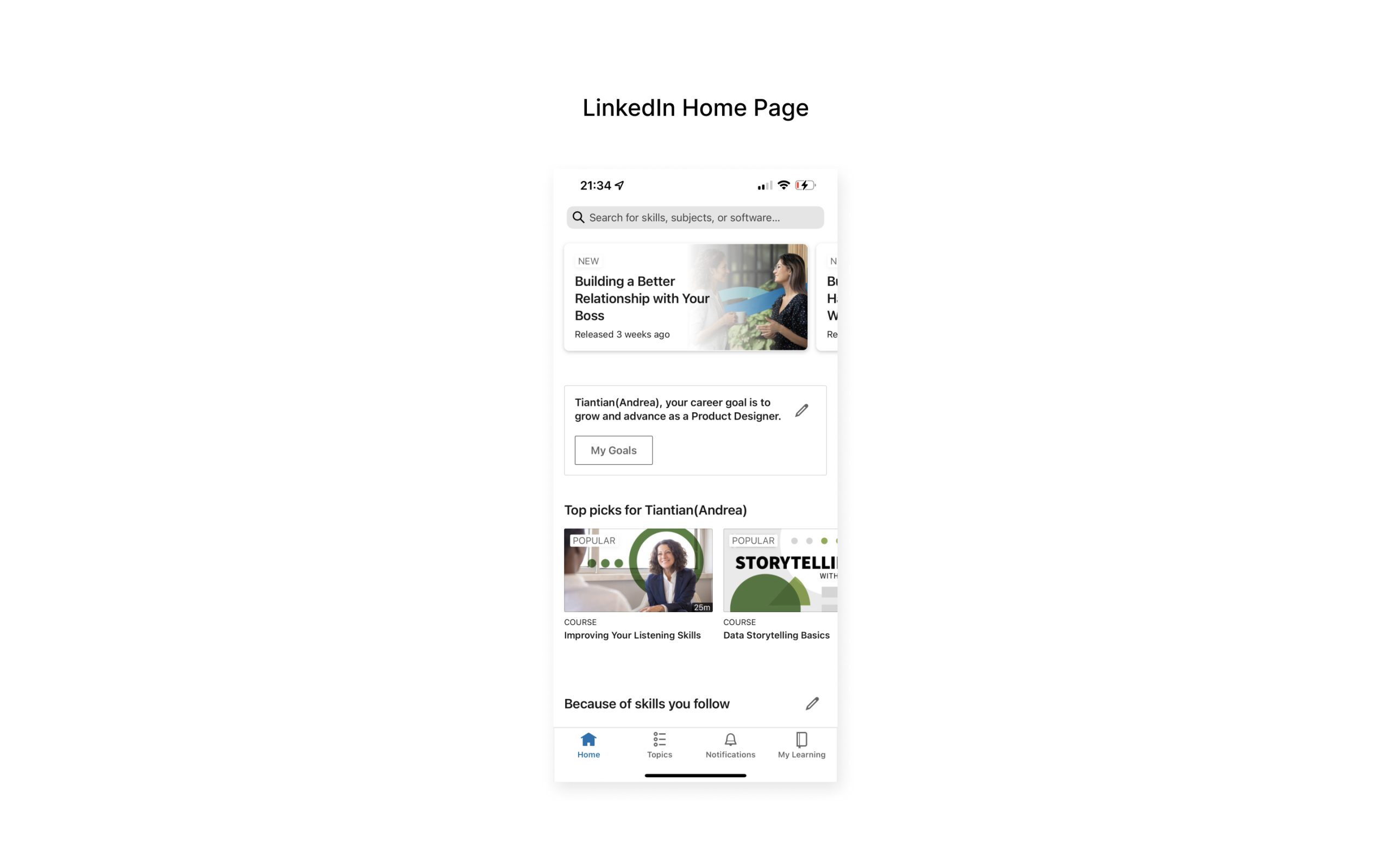
Current Issues:
Upon landing on the home page, users perceive three separate sections. However, due to the absence of titles, inconsistent design, and misaligned card layouts , first-time users are unlikely to grasp the distinct functions and course contents being afforded by these three individual sections.
Problem Breakdown:
To comprehend the semantic & functional differences of each section, users would need to take additional time and effort in exploring the home page, indicating that this interface design has less than ideal learnability.
It also involves a large gulf of execution issue as it’s quite challenging for users to fully understand the interaction possibilities of this interface with ease. This includes distinguishing between each section and figuring out exactly how and where to initiate their exploration.
Potential Improvement:
For enhanced content clarity, one approach is to add titles to the first two sections to facilitate better understanding.
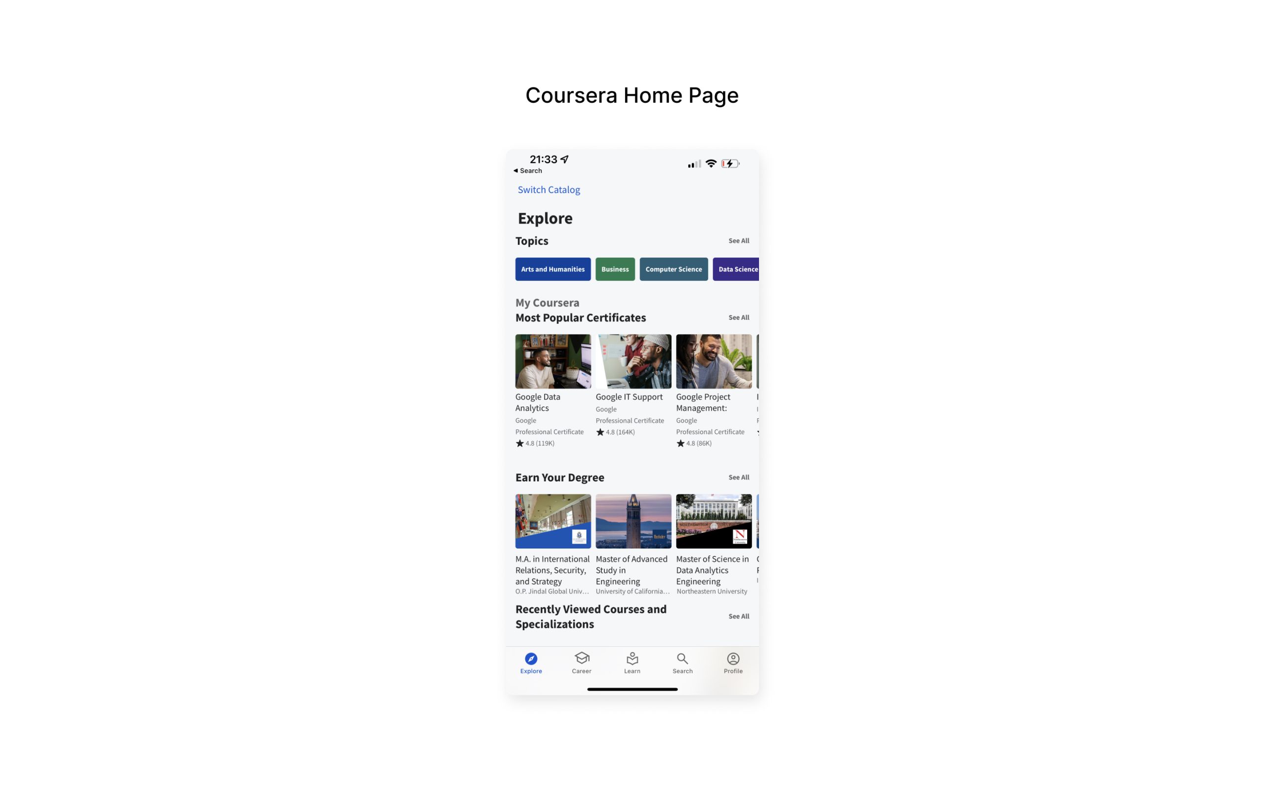
To improve visual consistency and reduce users’ cognitive load when comprehending the design details of course cards (including shapes, sizes, borders, and shadows), I believe it’s worth standardizing these elements. Reference Coursera for design consistency.
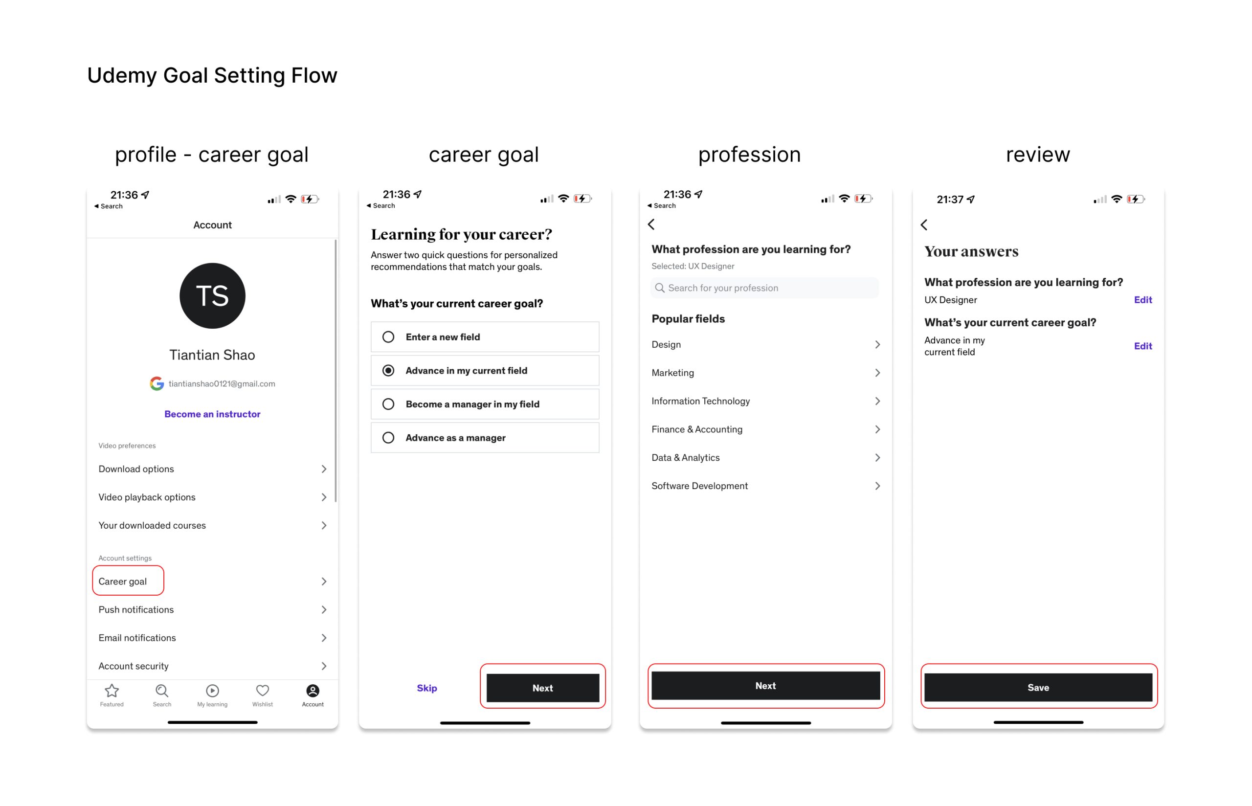
4. Unable to Dismiss Goal Setting Section
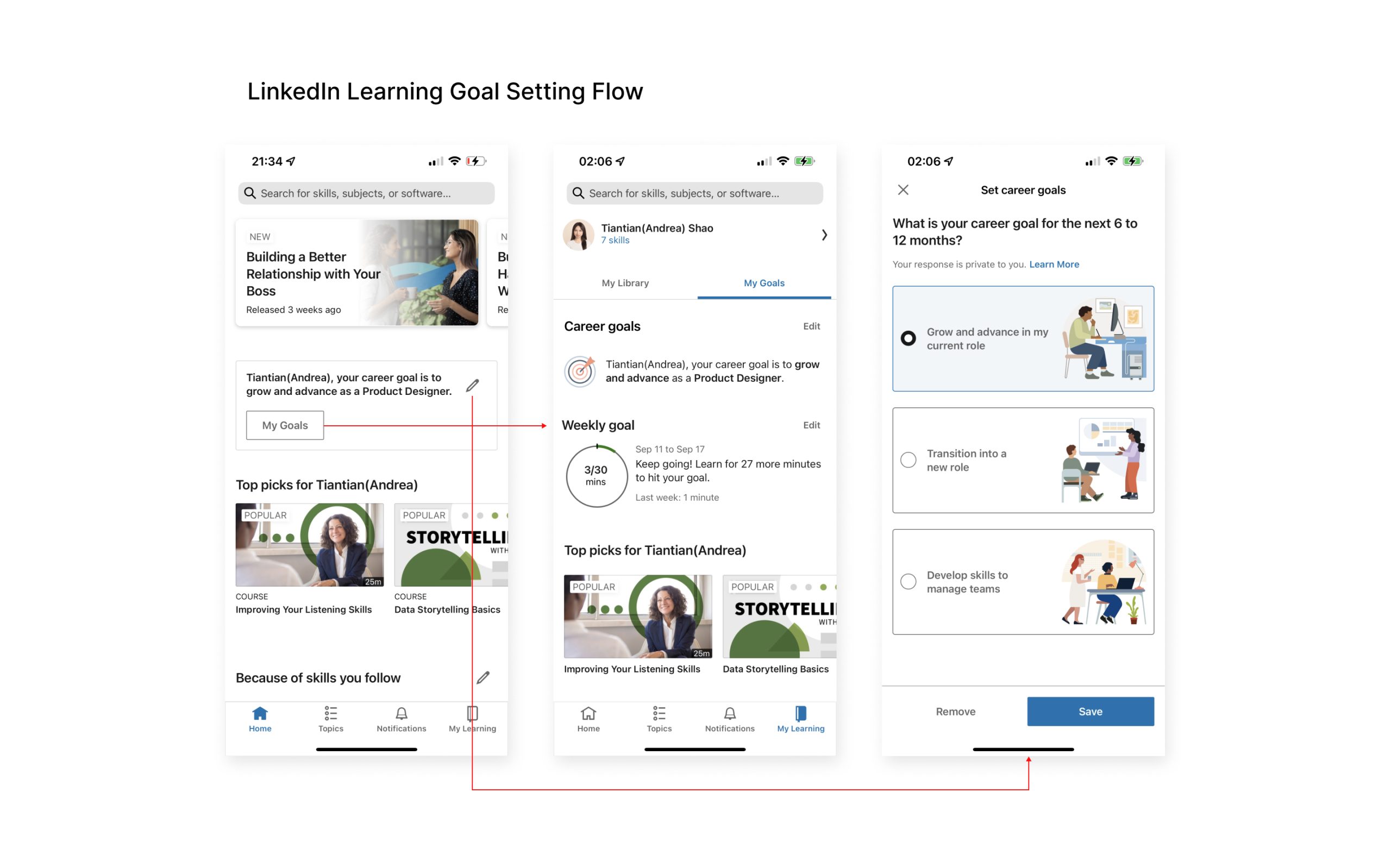
Current Issues:
Currently on the home page, users may expect, based on knowledge in the head and system images, that they can minimize or dismiss the goal setting section on the home page after setting their goals. However, in reality, this section cannot be dismissed. Instead, it remains non-dismissible and includes a Call-to-Action (CTA) that directs users to review their goals in their profile, along with an edit icon allowing users to modify their goals.
Problem Breakdown:
The design of the goal-setting section is counterintuitive and exhibits several usability issues. My primary concern is that once users set a goal, their mental model suggests they are more likely to review their goals to track their learning progress, rather than changing their goals. Consequently, the edit goal button could be made less prominent and visible.
Overall, the current design reveals a mismatch between the designer’s own conceptual model and the user’s mental model.
Potential Improvement:
Firstly, to restructure the information architecture and better align with the user’s mental model and behavior, I would recommend relocating the edit function to the profile page within the goal section.
Secondly, to accurately signify and prompt users to review their goals, the label on the Call-to-Action should be revised to “View My Goals” instead of “My Goals.”