
Introduction:
Paloma Health is a comprehensive virtual platform for people with hypothyroidism with both web and mobile applications. It provides users with an all-inclusive digital community that offers end-to-end treatment options, including recording symptoms, accessing educational resources, obtaining at-home test kits, and scheduling consultations with thyroid specialists and nutritionists.
This article intends to discuss the user experience of the Paloma Health mobile app (iOS version) by critically reviewing three primary functions: symptom recording, connecting with doctors, and sleep meditation. The analysis will be structured as follows:
Part 1: Understanding Target Users and Their Needs
- Understand Paloma Health’s target users.
- Identify users’ core needs.
Part 2: Evaluation and Recommendations for three main functions
- Feature 1: Symptom Recording
- Feature 2: Connecting with Doctors
- Feature 3: Sleep Meditation
Part 3: Conclusion and Future Perspectives
Note: The analysis is based on Don Norman’s design and usability principles as detailed in his seminal book, “The Design of Everyday Things”.
Part 1: Understanding Target Users and Their Needs
A Glimpse into the Users:
Hypothyroidism is a chronic condition necessitating long-term treatment and daily attention. Those afflicted often grapple with a range of symptoms such as fatigue, weight gain, dry and pale skin, insomnia, depression, memory problems…… Paloma Health primarily caters to two distinct demographics:
1.Undiagnosed users:
This encompasses those who might have faced inconclusive results from preliminary tests or those who suspect they have hypothyroidism but haven’t undergone comprehensive medical testing yet.
2. Diagnosed Patients:
These are users already diagnosed with hypothyroidism, seeking a community and more profound knowledge. Paloma Health aids them in symptom tracking, offers advice, and provides support to enhance their journey to improved health.
For the scope of this article, we will be delving deeper into the needs and experiences of the second category: those diagnosed with hypothyroidism.
Understanding the Needs of Diagnosed Users:
Users diagnosed with hypothyroidism typically have the following three primary needs:
1. Symptom Tracking and Recording:
Given that hypothyroidism is a chronic ailment, many users undergo a recovery period that can span decades. The most pressing need for these users is the consistent tracking and recording of their symptoms. The disease manifests in various forms based on its origins and its effects on users, making long-term data tracking crucial. By diligently recording this data, users can gain a deeper understanding of their bodies and the disease’s progression.
2. Connecting with Medical Professionals:
Diet plays a pivotal role in the life of a person with hypothyroidism. The onset of the disease can often be attributed to a myriad of factors, one of which is the deficiency of certain nutrients. Prolonged medication can also lead to weight fluctuations, dry skin, dry eyes, and other symptoms. Consequently, gaining knowledge about diet and nutrition is vital. Consulting with doctors and nutritionists offers users a way to receive tailored advice and ensure they are on the right path to managing their health.
3. Mood Regulation and Support:
One of the most significant ramifications of hypothyroidism is its profound impact on an individual’s emotional well-being. Many patients grapple with feelings of sadness, depression, and a pervasive sense of helplessness. Hence, methods to regulate and uplift their mood become indispensable. Engaging in meditation, seeking community support, and incorporating regular exercise can serve as effective remedies to counter these emotional challenges.
Part 2: Evaluation and Recommendations for Three Predominant Functions
Function 1: Symptom Recording
Symptom tracking is important for those diagnosed with hypothyroidism. The diverse origins and unique manifestations of the disease among users make it imperative to maintain detailed, long-term records. However, Paloma’s approach to symptom recording appears to have some usability challenges.
Identified Issues:
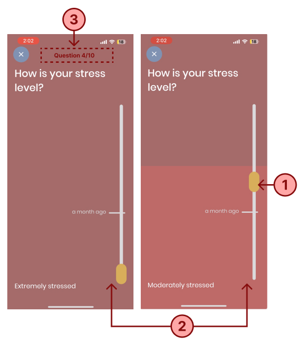
1. Mismatched conceptual models:
Users approach the symptom recording section with the expectation of swiftly logging in their symptoms from a given set of options. However, the “hold and swipe” mechanism diverges from this expectation. It conceals all available options, requiring users to drag and stop at precise positions, thereby elongating the process. The gamification attempt, though intended to inject some light-heartedness, detracts from the primary goal of efficient symptom recording.
2. Inconsistent Mapping:
In most user interfaces, swiping up is instinctively associated with escalation or moving forward. However, in the questionnaire’s context, when users are asked about their stress levels, the directionality of the swipe counterintuitively decreases the intensity. For instance, swiping up changes the label from “extremely stressed” to “moderately stressed”. This inconsistency not only disrupts the user’s conceptual model but also demands additional cognitive effort as they’re forced to double-check their answers.
3. Lack of signifier:
The platform currently lacks a clear indicator that shows users their progress or the total number of questions. Without this visual cue, users may become frustrated or disengaged, especially if they perceive the process as lengthy with no discernible endpoint. Additionally, the swipe bar’s functionality can be challenging, potentially further deterring user engagement.
My solution:
1. Design the questionnaire under user’s conceptual model:
Use a comment questionnaire layout and provide all the selection answers at once. Layout all the answers clearly with the sort text signifier and a gradient bar underneath to indicate the level of symptoms, so users can understand the answer quickly, and quickly tab to select the correct answer that matches their symptoms.
2. Maintain Swipe Consistency:
Standardize the swiping mechanism throughout the questionnaire. Swiping up should consistently represent an increase, whether that’s in symptom severity, stress levels, or any other metric. Conversely, swiping down should represent a decrease. This consistency will eliminate confusion and reduce the chances of users inputting incorrect information.
3. Introduce Clear Progress Indicators and constraints:
Set clear expectations at the outset by informing users about the total number of questions and the estimated completion time. As users navigate the questionnaire, display a progress bar or counter. If users attempt to exit prematurely, present a confirmation pop-up detailing the number of remaining questions and estimated time left. Frame the choices with empathy, using button labels like “Exit for Now” and “Continue Journey” to gently nudge users to complete the questionnaire.
Function 2: Connecting With Doctors
This page aims to display profiles of doctors, including their experience, patient reviews, and the option to schedule a video session. However, the current design lacks a coherent information architecture, making it challenging for users to gain a comprehensive understanding of the doctor’s credentials. As a result, users may not be sufficiently compelled to schedule a session or continue exploring the page
Identified Issues:
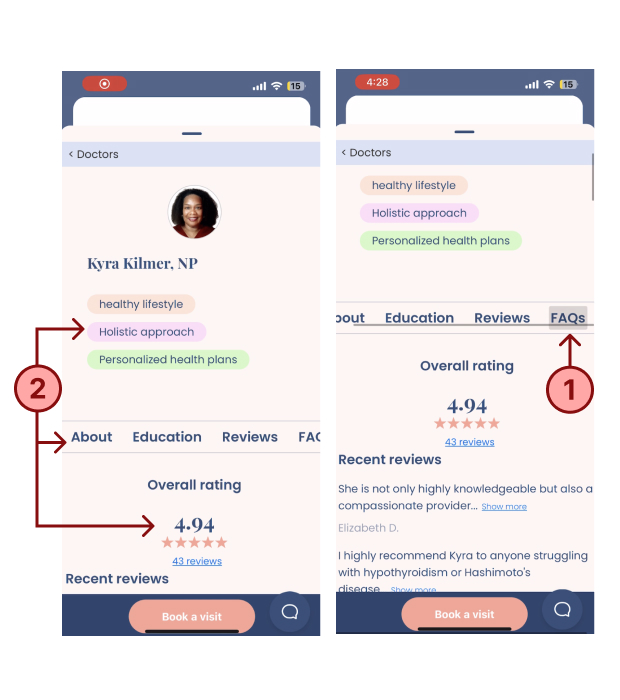
1.Inconsistent Tab Mapping
The tab menu layout is in the horizontal direction, however, when tab on each section, it scrolls vertically down to the corresponding section, which is a different moving direction. On the one hand, this non-corresponding information mapping mode will make user confuse, on the other hand, it is difficult to scroll through the long information
2. Discoverability Concerns:
The layout places the doctor’s specialization at the forefront, relegating their overall rating and introduction to the background. Consequently, users must scroll further to access information vital to their decision-making. Additionally, the tab menu resembles unclickable text, making its function unclear.
My solutions:
1. Harmonize Tab Interaction:
Segment lengthy content to align with individual tabs. Tapping a tab should smoothly transition users to the relevant section. Enhance the tabs’ design with clear signifiers to indicate selectability and the current active section.
2. Optimize Content Hierarchy:
Prioritize information crucial to users, such as the doctor’s overall rating, expertise, and basic info, ensuring it’s prominently displayed at the top. Detailed content, like offered services and patient feedback, can be positioned under the tab menu. To enhance user experience, position the “book session” and “save” buttons prominently at the beginning, with additional options at the bottom to streamline the booking process and enhance discoverability.
Function 3: Sleep Meditation
The Sleep Meditation feature aims to enhance sleep quality, especially given that 90% of people with hypothyroidism experience sleep initiation challenges. Given the target demographic, creating sleep-focused meditation courses is of paramount importance.
Identified Issues:
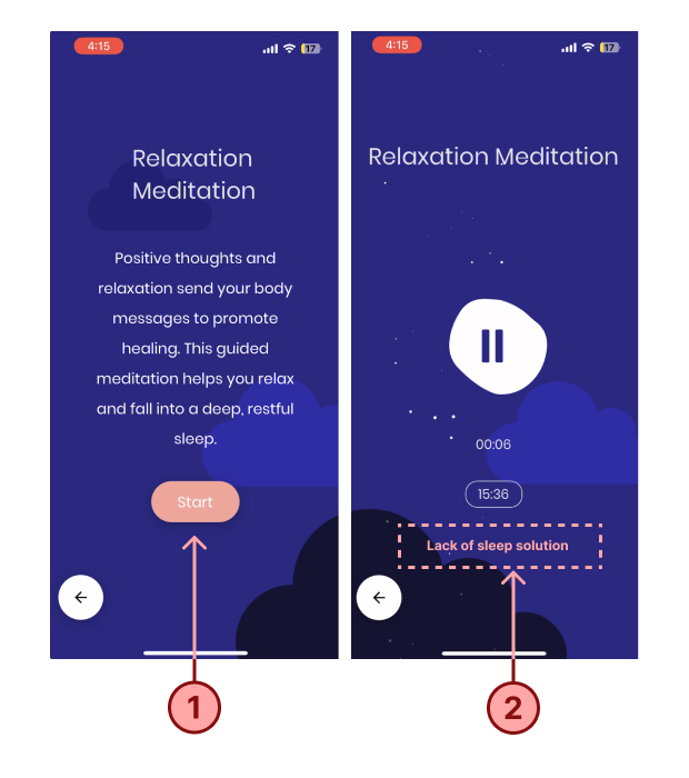
1.Misalignment with User Expectations:
When users access the meditation section, they anticipate immediate access to the meditation directory. Instead, they encounter an additional introductory page. Even after initiating the “start” action, they must tap another “start” button to begin the meditation playback, adding unnecessary steps to the process.
2. Incompatibility with Sleep Routine:
The inability of the meditation feature to run in the background contrasts sharply with the natural bedtime routine of most users. Many wish to play the meditation, turn off their phone screens, and drift to sleep. The app’s current design requires them to interact with their device post-meditation, disrupting the sleep process.
My solutions:
1.Streamline User Access:
Merge the introductory and playback sections. This ensures that users can directly access and play the meditation recording, reducing unnecessary interactions.
2. Background Play Feature:
Enable the meditation playback to run in the background. When the screen is locked, a condensed player with controls such as “play/pause”, “skip”, and “rewind” should be accessible to the user.
3. Enhanced Play Modes:
Recognizing that a single 15-minute session may not suffice for all, introduce play modes like “loop” and “play all” for a continuous, relaxing auditory experience.
4. Incorporate Sleep Timer:
As users primarily utilize this feature at bedtime, introducing a sleep timer ensures that the recording halts once they’ve fallen asleep, preventing any disturbances to their sleep cycle.
Part 3: Conclusion
Paloma Health exhibits a commendable understanding of its users’ pain points and needs, charting solutions in the right direction. Nevertheless, there remain critical details that warrant fine tuning, especially considering the real-world contexts in which users engage with the product.
Drawing from Don Norman’s design principles, my recommendations center on aligning the app with users’ conceptual models, introducing clear signifiers, ensuring intuitive mapping, and providing timely feedback. These insights aim to refine the user experience, anchored in my grasp of their overarching business objectives.