
StoryGraph is a new social cataloguing app for users to log and share the books they are reading. Serving as one of the only competitors to Amazon’s Goodreads, StoryGraph is a promising solution to the growing resistance among users towards interacting with Amazon. Users can accomplish many of the same tasks on StoryGraph as they can on Goodreads, like creating shelves for specific categories of books, share what they are currently reading with friends, and leave reviews of books they have already read. The app is currently available for both iOS and Android.
While its charm lies in its hand-coded origin story – built by software engineer, Nadia Odunayo in 2019 as a side project and subsequently run by a small team of three – StoryGraph is in dire need of a design overhaul. Features offer confusing feedback, unclear signifiers, and generally muddled information across many of its pages.
Homepage
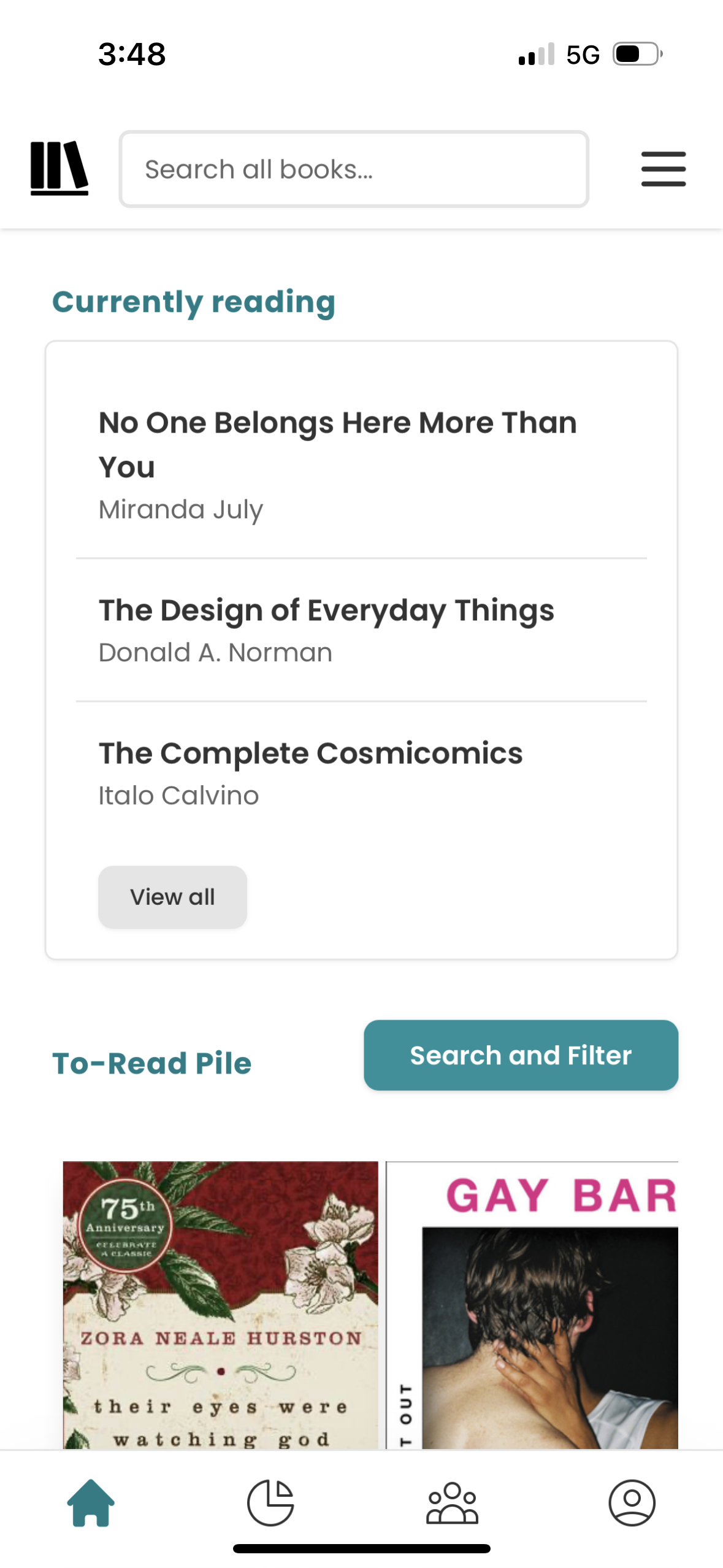
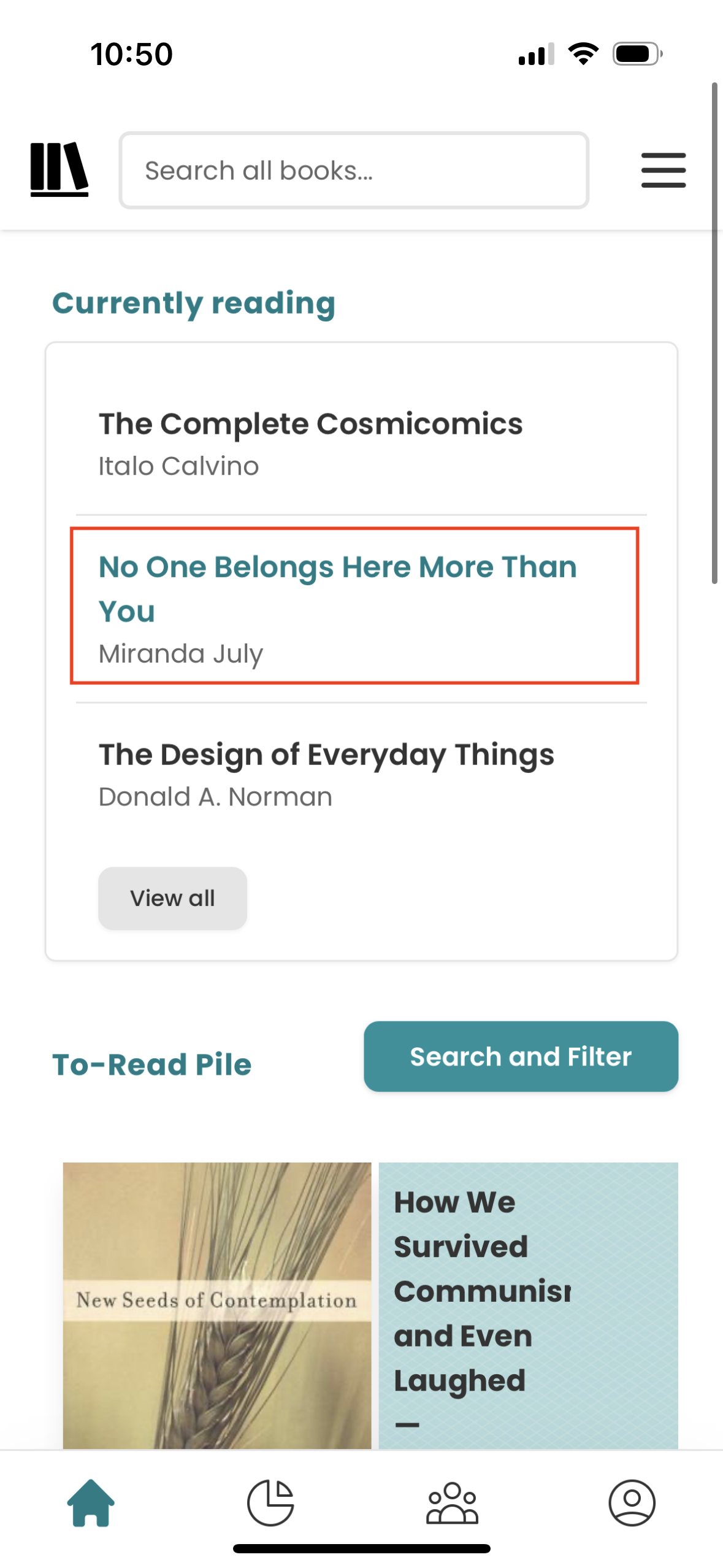
When you first open the app, the homepage is a bit confusing. The first section a user sees is a ‘Currently Reading’ card, which lists a selection of the books that a user has marked as part of that category. This section stands out as lacking in sufficient signifiers and feedback, relying solely on conventions of desktop web design. Specifically, each link changes color once tapped, but because a cursor is absent, the hover state is relatively useless. There is virtually nothing distinguishing this list as clickable other than a user’s potential previous knowledge. The bare bones design might have initially served to aid in the programming process where the engineer would have an easier time isolating components, but now it lacks a strong enough brand identity to guide users. Users might already have a strong conceptual model if they were formerly users of the Goodreads app, which StoryGraph follows pretty closely, but those without that prior experience might feel lost in a cycle of learned helplessness.
As a solution to the ‘Currently Reading’ dilemma, it would be wise to add an image of each list item next to their respective titles, as users’ knowledge in the world might immediately draw them to click through those titles.
Book Descriptions
Another significant pain point in the app comes up while viewing the pages assigned to specific titles. Again relying on the users conceptual model of similar applications, the book pages employ misleading signifiers, unclear feedback, and a generally overwhelming amount of information.
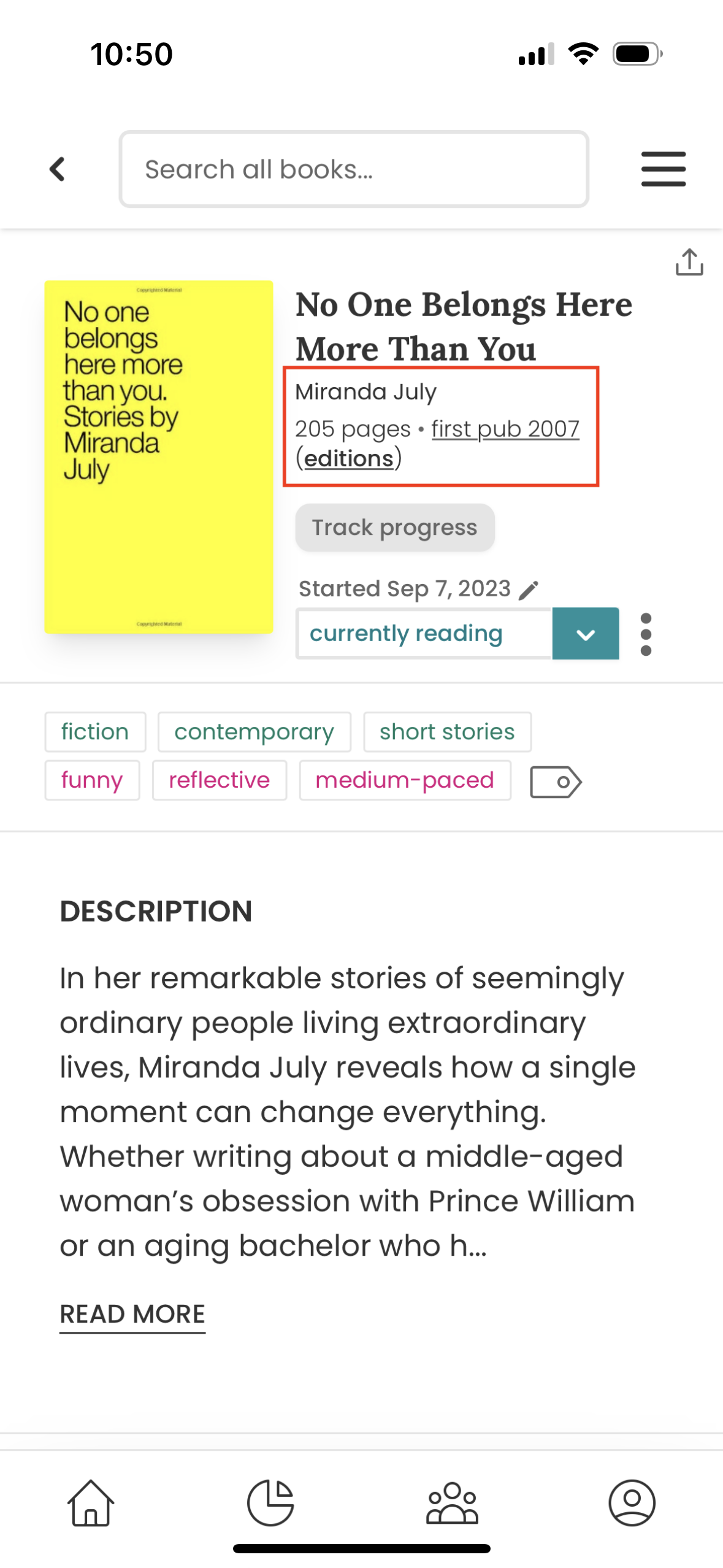
Underneath the bolded title next to the cover image are several pieces of information: author, page count, the underlined year of publication, and the word “editions” slightly bolded, underlined and wrapped in parenthesis. This info is easily discoverable, and those latter two items are decently decorated to signify them as links that are clickable. (Figure 3)
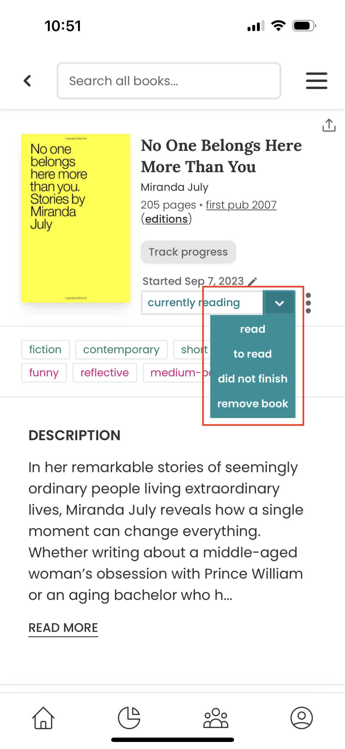
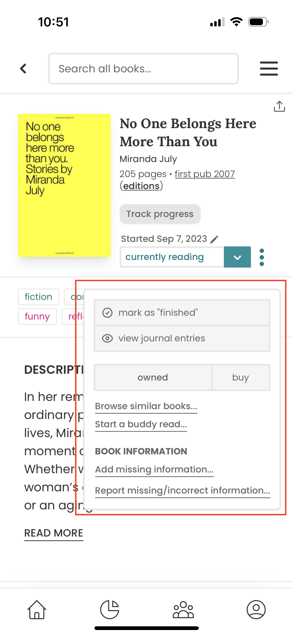
Problems arise when navigating the following features. The ‘Track progress’ button, while discoverable, does not signify that it is clickable. Users’ knowledge in the brain might conflict with the actual function of the app, leading to a hesitant experience. There are dropdown menus, tool edit icons, and kebab menus surrounding each following feature, and this range of signifiers lacks sufficient constraints to guide the user. Associated tags are bordered like buttons, and have different colors, which might signal a clickable item, but they are static. The target areas of the drop down menu are small and inaccessible (figure 4), the functions of the kebab menu are redundant and confusing as they offer features that are already contained in both the dropdown menu and the general description offered above (Figure 5). A lack of constraints send users back down a cycle of learned helplessness.
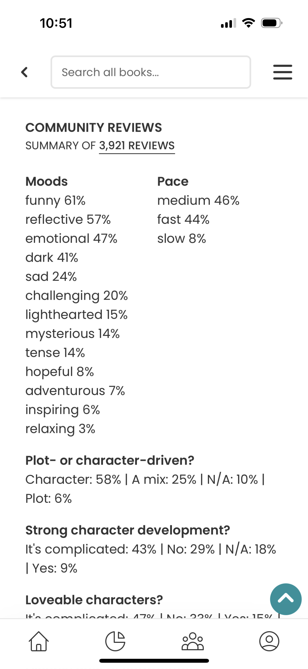
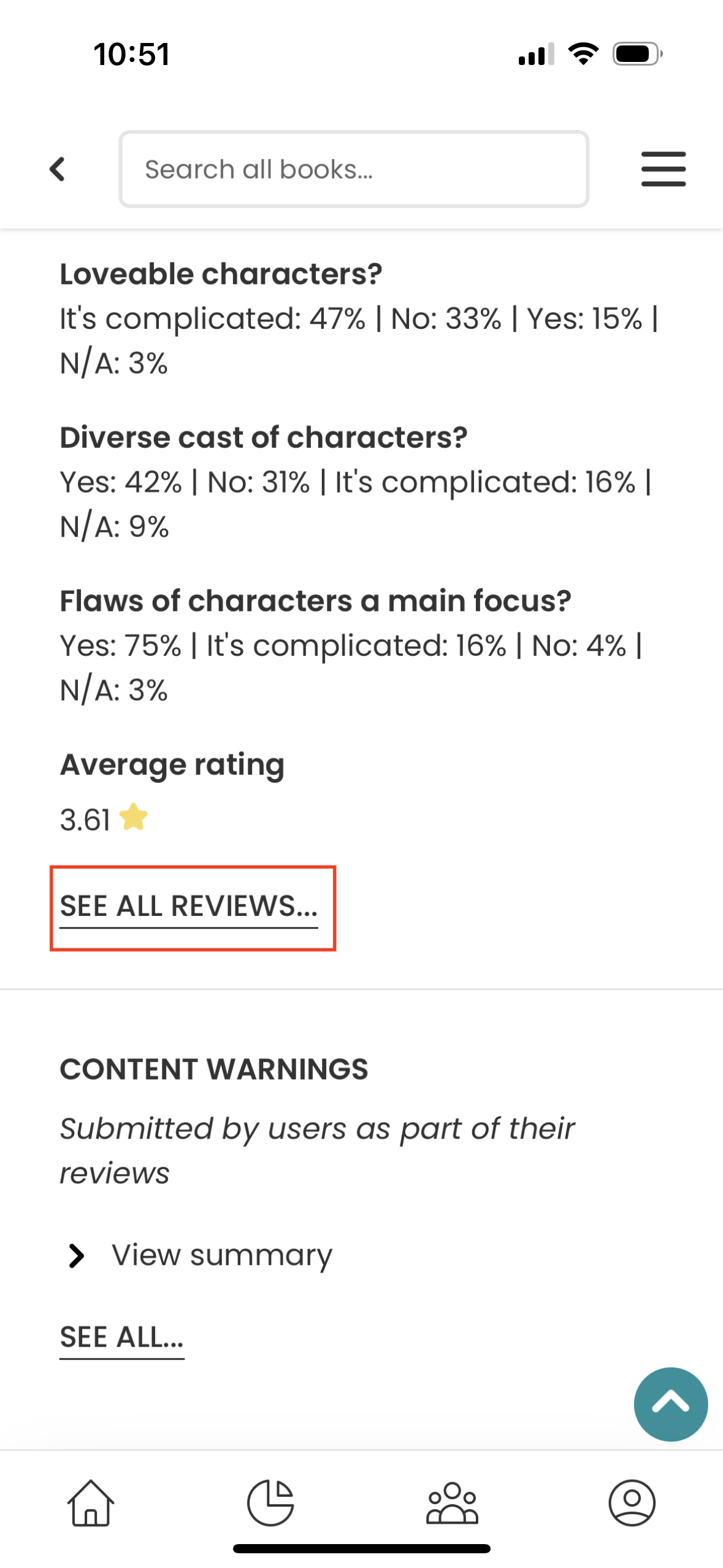
Scrolling towards the bottom of the page brings users to the ‘Community Reviews’ section; this section feasibly is what makes it the biggest competitor for Goodreads, as many users engage with Goodreads the way they might use other forms of social media. Where StoryGraph falls short is that rather than use the strong conceptual model of their users, they try to innovate. Instead of leading with other users’ actual reviews, StoryGraph displays what appears to be a word cloud of percentages. (figure 6) A list of words with numbers next to each one to indicate the number of users who described the title within the constraints provided by the app. What’s more, is none of these percentages or words are clickable! Only by scrolling to the bottom of all of this information are users offered a way to see actual written reviews with the link ‘See All Reviews.’ (Figure 7)
If StoryGraph wants to offer this more qualitative, analytical feature, it might benefit users if the collected data were presented in a more visual manner. The kind of list of information and numerical values currently displayed expand the gulf of execution to a relatively unreasonable size. Simply moving the ‘See All Reviews’ link to the top of the reviews section would shrink that gulf significantly.
Conclusion
From a visceral design standpoint, StoryGraph needs to do some work to make users feel more comfortable navigating its various – admittedly powerful! –features. Some fine tuning of its signifiers and a strengthened brand identity would go a long way in the effort to compete with Amazon’s Goodreads. This critique only scratched the surface of this application, and other notable features that should be mentioned are the ‘Reading Stats’ page which presents user data insights as a series of pie charts of information ranging from affinities towards ‘Moods’ of books read to the general trends of length of completed books. There is also the ‘Community Page’ which allows users to interact with a feed of activity among friends and strangers alike.
I encourage anyone looking for an alternative to Amazon to make an account and explore!