Domino’s is one of the largest pizza restaurant chains with locations in the United States, India, the United Kingdom, and other locations. They offer pickup and delivery through their own service or through a third party like Uber Eats and Doordash.
In this article, I will critique Domino’s iOS mobile app using concepts discussed by Don Norman and provide solutions to issues I believe could be improved or fixed.
1) The Problem with the Menu

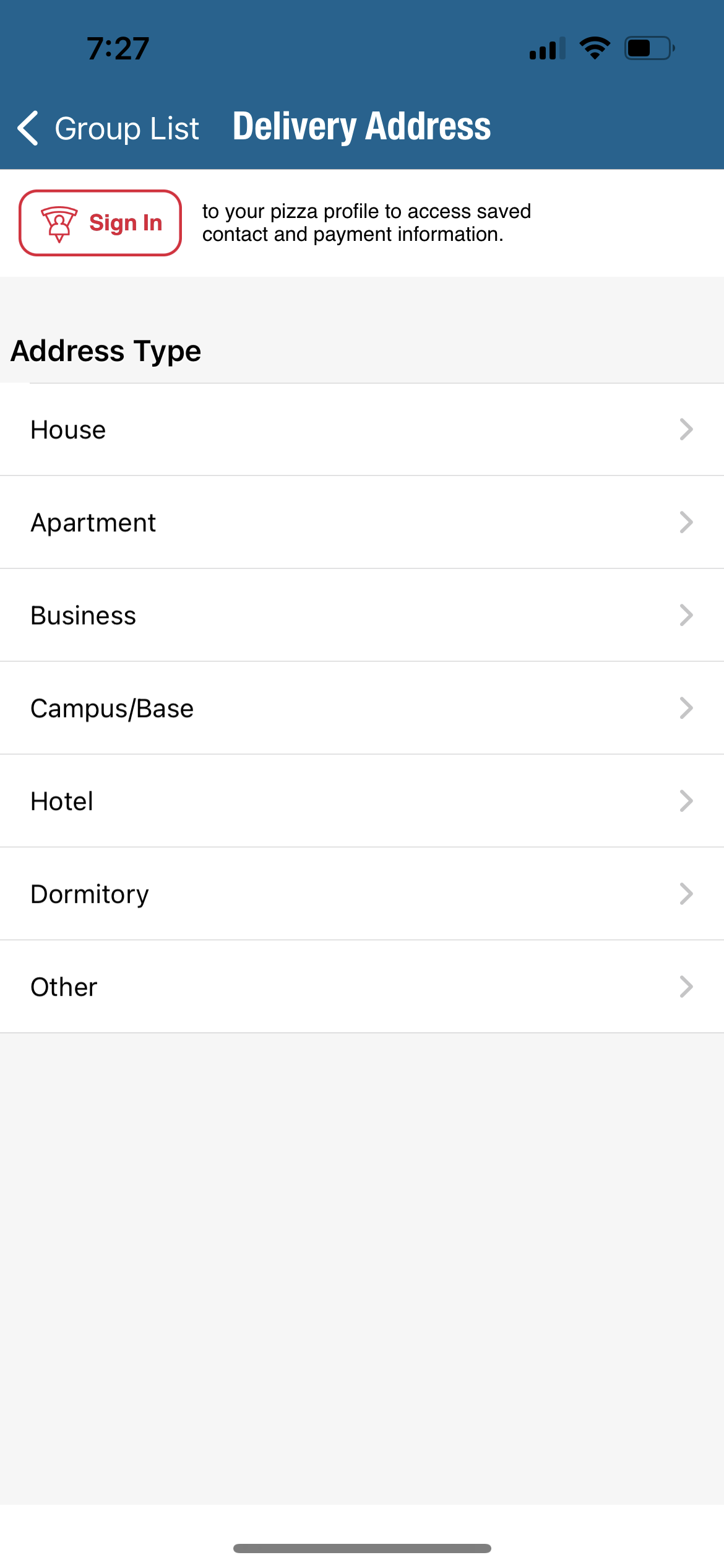


Problem: One of the first things a user would like to accomplish when they open a food app is picking out what they want to eat, especially a hungry user. Unfortunately with the Domino’s app, the user is only allowed to see the menu after they have added all their information to the system. When they click “delivery” they first have to input their address; when they click carryout, they have to pick out the location first. After going through all of that, it doesn’t even take the user to the menu – it takes them straight to checkout. The process of finding the menu and discovering where to actually order the food is a long and hard process. In terms of Don Norman’s concepts, this app would have a bad design in regard to discoverability.
While the designers of the Domino app believed this was a good design, I believe there is room for improvement. Not only does it make navigating the app confusing for the users, but it also deters customers from ordering food. Knowing that they have to go through that whole process before even looking at what Domino’s has to offer could be a huge loss for the company.
Solution: One simple solution to this problem would be to give the customer access to the menu before inputting all their information. Adding a menu signifier on the home page or on the side pop-up bar resolves the issue of low discoverability and makes it easier for users to order their food.
2) Understanding Pizza Crust
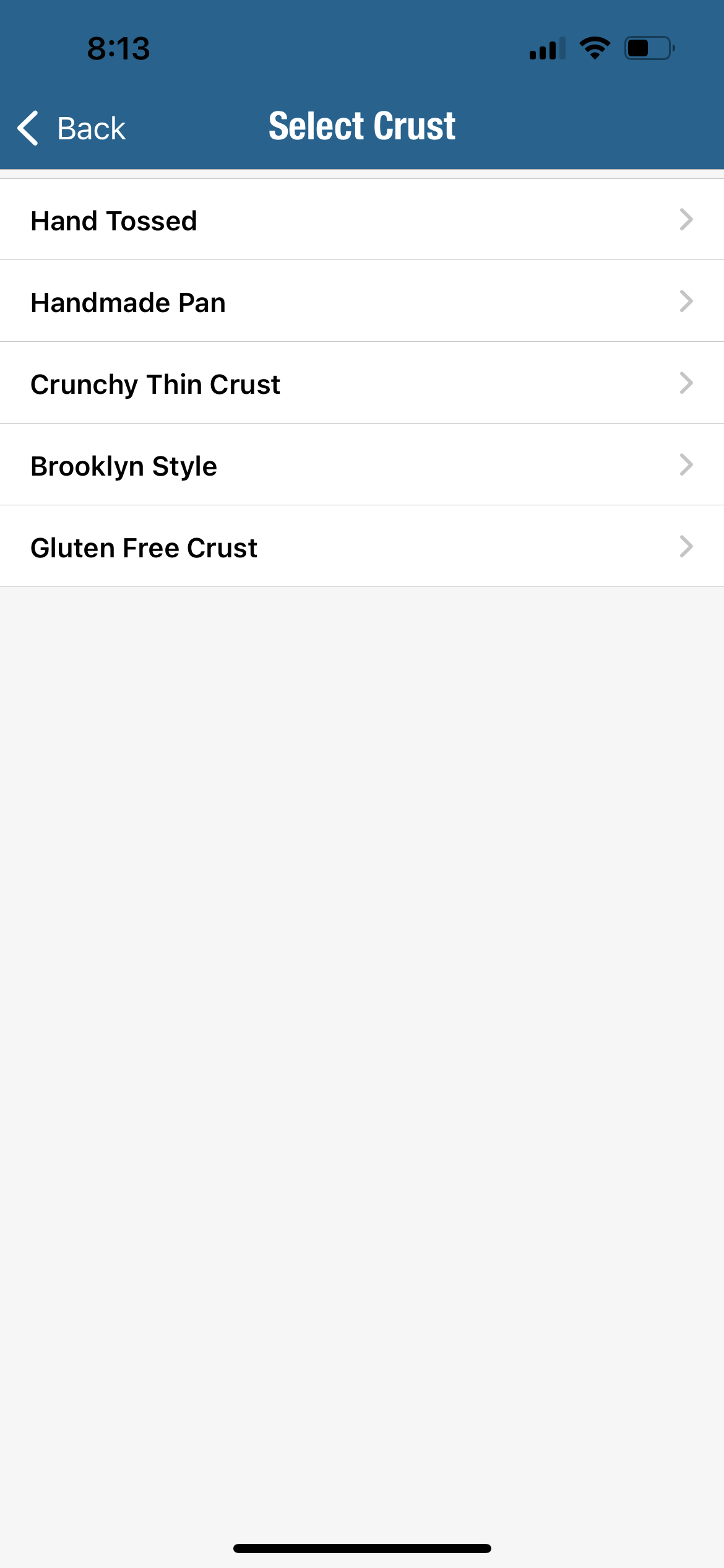
Problem: Another issue a user may encounter when ordering their pizza from the domino’s app is the lack of understanding about their order. Domino’s has 5 different crust types that users can choose from when making their pizza. However, the information about each type of crust is not there for the user to properly understand what they are ordering; theres no description about the different crust styles they offer. How is the user supposed to know what Hand Tossed crust is vs. Handmade Pan? Is it more expensive? Is it made with different ingredients?
Solution: One solution to this problem is adding a small description about each pizza crust so the user can be informed about what they are ordering. This gives the user more confidence to go through with their order rather than having to stop and think/ second-guess what they are picking. I would add a “signifier” that engages to the user to click it in order to see descriptions about what pizza crust they are ordering.
3) Whats in my checkout order?

Problem: When the user is done picking out the items they want to add to their cart, they can go to the checkout page to see what’s in their cart and pay. However, the user may have a hard time finding the items in their cart. This is because the items in cart aren’t even listen when checking out. This could be problematic for many users, because for those users that can’t remember what they ordered, they need to keep pressing cancel to make sure they have the correct items in their cart.
Solution: A solution to this issue is to simply list the items added to the cart in the checkout section. This makes it easier for the user to complete the process of ordering their food because they won’t have to keep second-guessing if the order is correct.
4) How many items in cart?
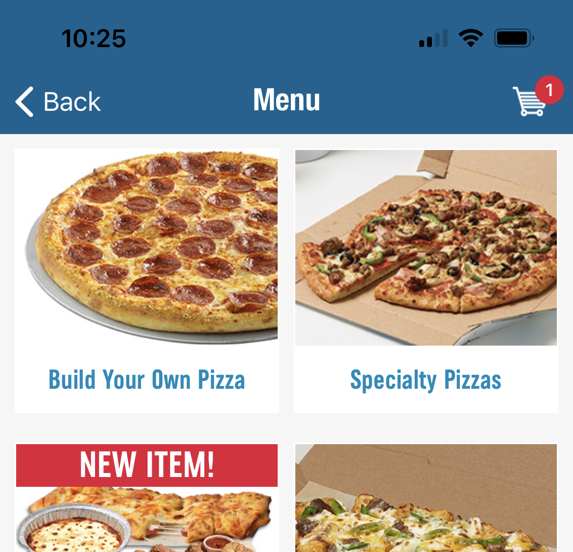
When users add an item to their cart from the menu, a little red dot on the top right corner of the screen shows how many items are currently in the cart. This little red dot with a number signifies to the user how many items are currently in their cart, and also signifies that if they click the cart symbol with the number, it will take them directly to their cart. Also, adding an item to the cart shows real-time feedback which allows user to better understand the consequence of their actions when using the app.