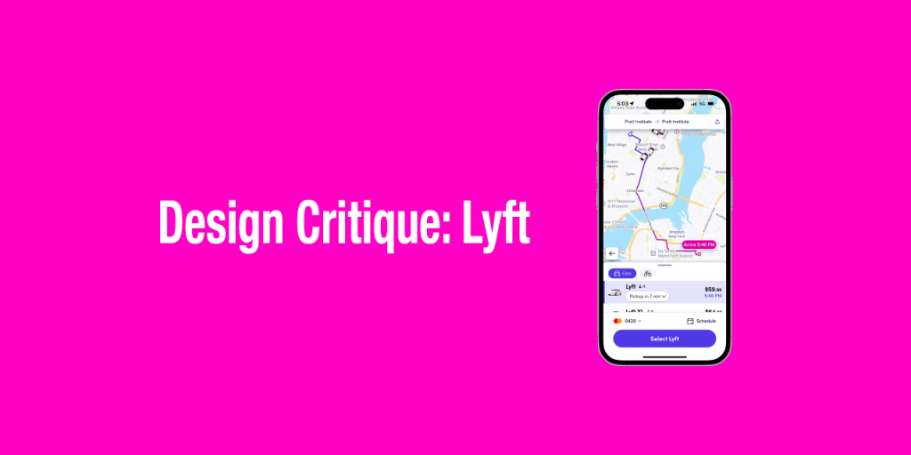
Lyft is a ride-sharing app that connects users with individual drivers. The app has gained popularity and reached the milestone of one billion rides in 2018 (CNN Business, 2019). This article evaluates the usability of the Lyft iOS mobile app using the concepts in “The Design Of Everyday Things” by Don Norman.
Call Ride
Entry Point
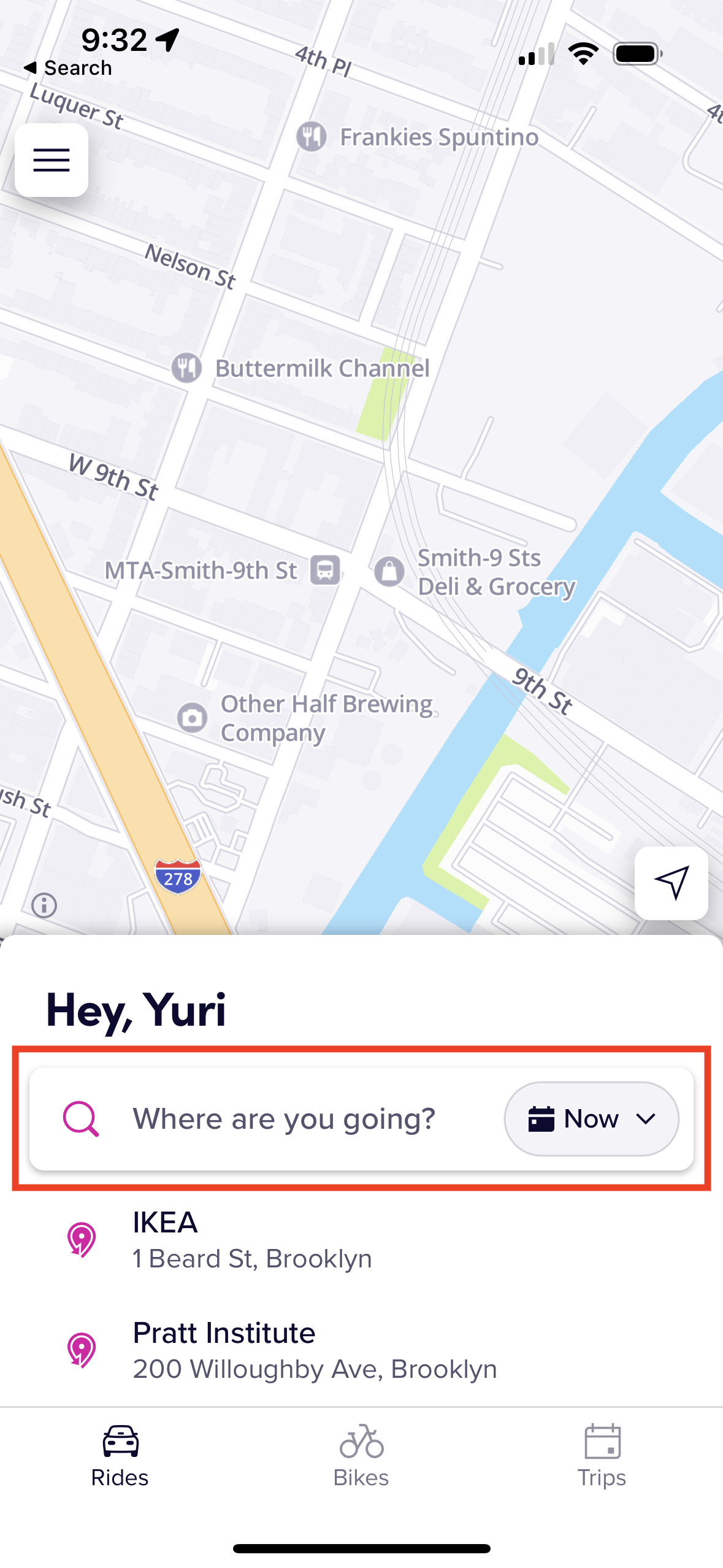
The first step of calling a ride is to set a pickup location and destination. The app provides a clear, discoverable signifier of the starting point with the label asking “Where are you going?” (Figure 1). This enables users to easily start a task.
Drop Pins on Map
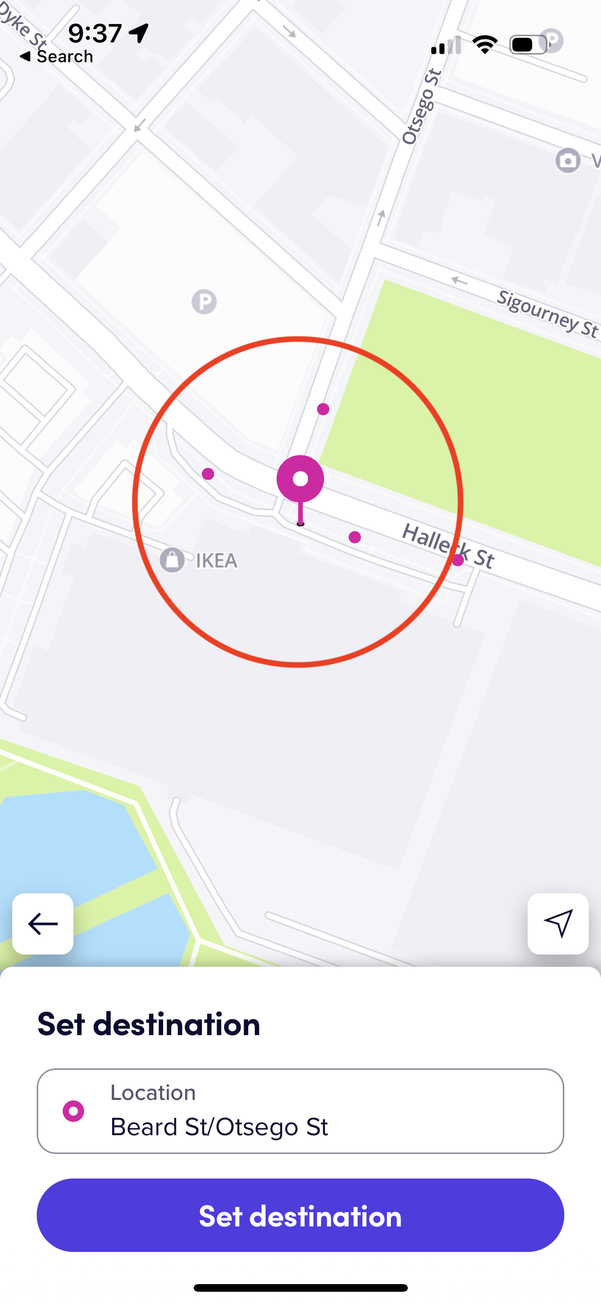
Users can set a pickup location and destination by dropping pins on the map (Figure 2). Users can easily understand how to use it because it applies natural mapping, that is, the relation between the control, in this case, pins on the screen, and the object to be controlled, the pickup/destination.
Search & Select Locations
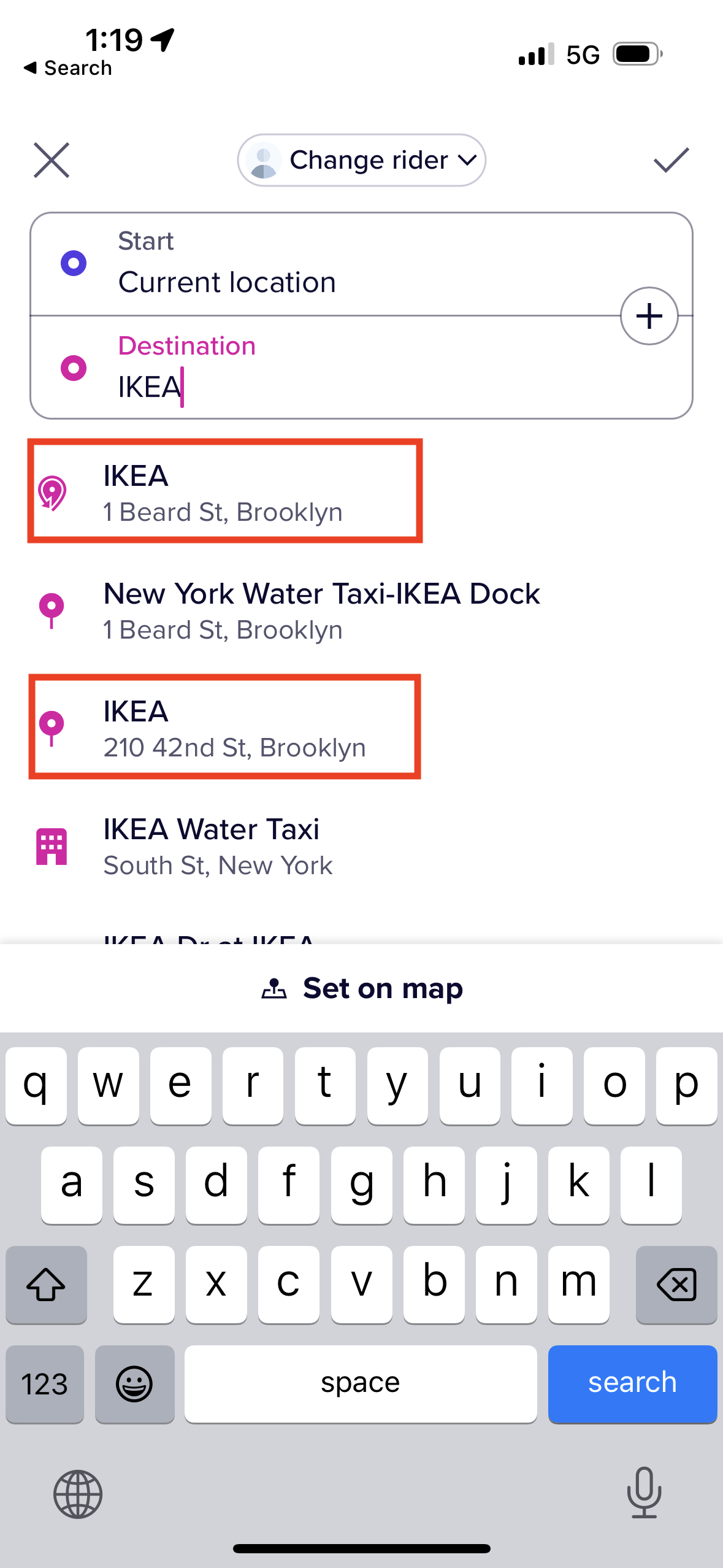
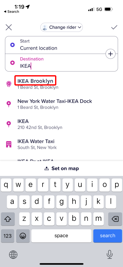
The other way to set locations is to input a location name/address into a search box and select from the options (Figure 3). However, users may face difficulty in setting their destination because the search results sometimes include multiple locations with the same label.
For example, when a user inputs “IKEA”, there are two IKEAs in the result. Users need to distinguish them by their addresses but it requires users’ knowledge in the head. In addition, since the address font size is small and the font color is light, options are visually difficult to discern. That can result in description-similarity slips. For these reasons, this feature still has room for improvement.
Solution
One possible solution for this issue is to provide the knowledge in the world by adding a description of the location, especially for commercial and public facilities. In Figure 4, the destination option label “IKEA” is replaced with “IKEA Brooklyn”. It would allow users to choose the IKEA store they intend to visit among multiple IKEA stores without memorizing the precise address.
Ride Car
Check Ride Status
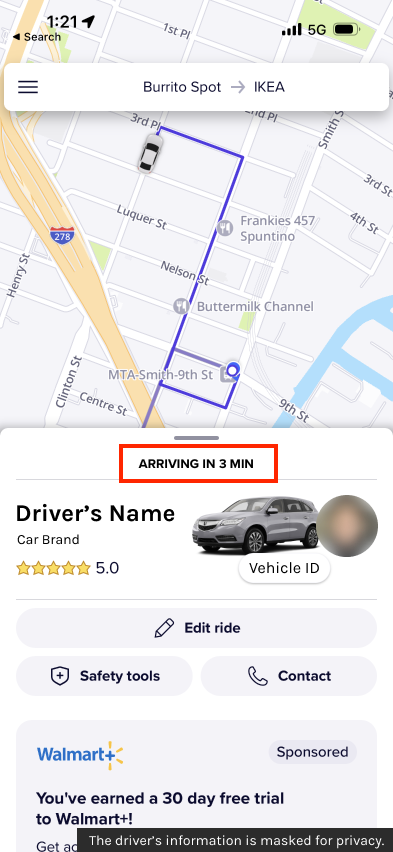
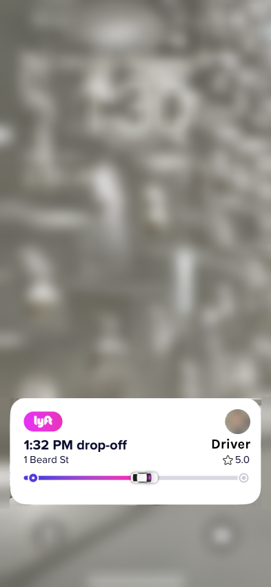
After they call a car, users may feel worried whether the car is really coming, or whether they can catch the car smoothly. Lyft successfully reduces users’ anxiety using explicit feedback. Users can check the driver’s predicted arrival time and the location of the car instantaneously (Figure 5). Also, once users ride a car, the app also notifies the progress of the trip on the lock screen of the smartphone (Figure 6).
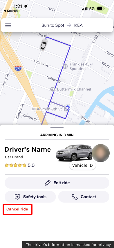
Cancel Ride (If Needed)
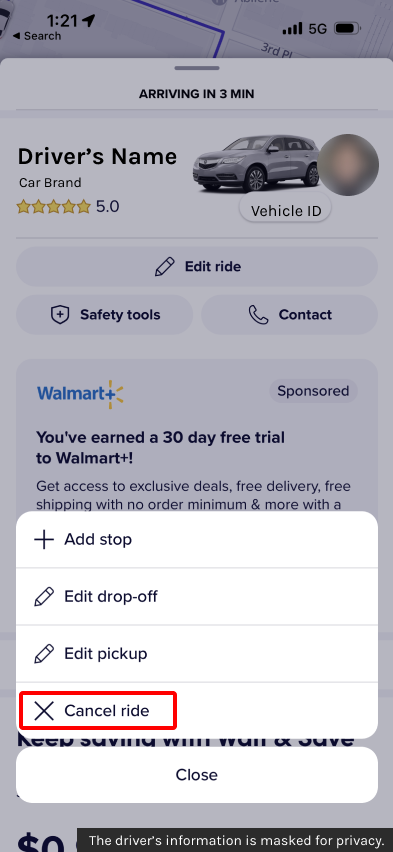
Furthermore, users can cancel a ride from the “Edit ride” option. According to Norman, an undo feature is encouraged because it can minimize the influence of error. Lyft’s cancellation feature works as an undo feature, therefore, it is beneficial to users. However, there is an issue of discoverability. The users need to navigate to “Edit ride” first to select the “Cancel ride” option (Figure 7). Some people, especially those who are panicked after calling a ride by accident might not be able to associate editing with cancellation easily.
Solution
Locating the cancel button at the same level as the edit ride button may improve the discoverability of the feature (Figure 8).
After Ride
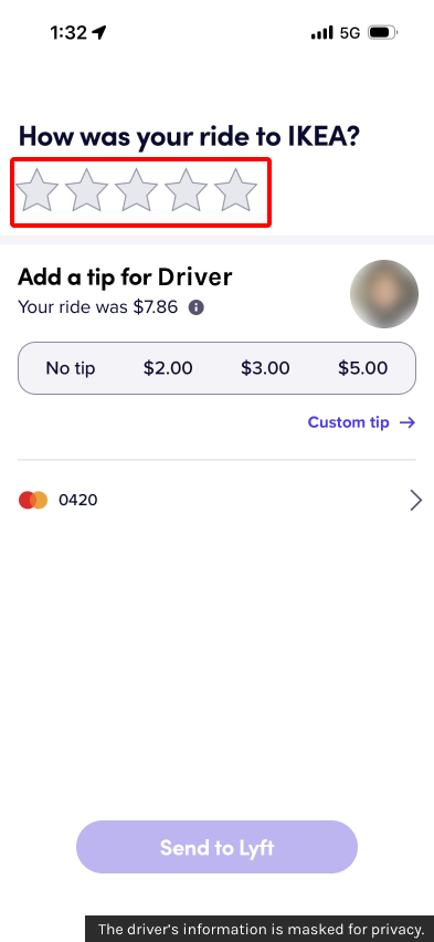
Rate Driver
The last task after the ride is rating and tipping the driver (Figure 9). The rating feature applies cultural constraints. It is designed based on the culture where the reputation is represented by the number of stars and the stars are stacked from right to left. While this type of star-rating component is commonly used in the United States, users from right-to-left locales may get confused about where to tap.
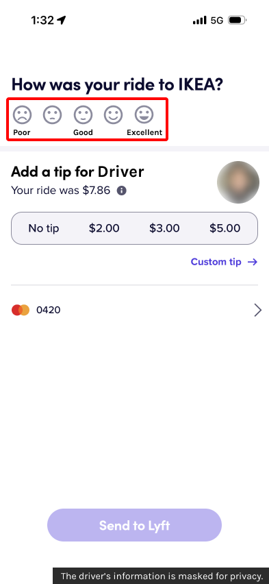
Solution
Replacing stars with facial expression emojis, and adding description labels can improve usability for users from right-to-left locales (Figure 10). While this solution still adopts a left-to-light counting system, facial expression helps users understand which icon represents their experience during a ride.
Reference
- Greiner, A., McFarland, M., Sherman, I., & Tse, J. (2019, March 28). A HISTORY OF LYFT, FROM FUZZY PINK MUSTACHES TO GLOBAL RIDE SHARE GIANT. CNN Business. https://www.cnn.com/interactive/2019/03/business/lyft-history/index.html1
- Norman, D. (2013). The Design of Everyday Things: Revised and Expanded Edition. Basic Books.