Brief
As an OTT streaming platform launching by Disney – the leading global animation film production company, Disney+ primarily feature classic Disney films, series, and animations content, while continually offering new original content for their users. Just like many other streaming platforms do, users can freely search, collect, and watch unlimited content released or included by The Walt Disney Company here.
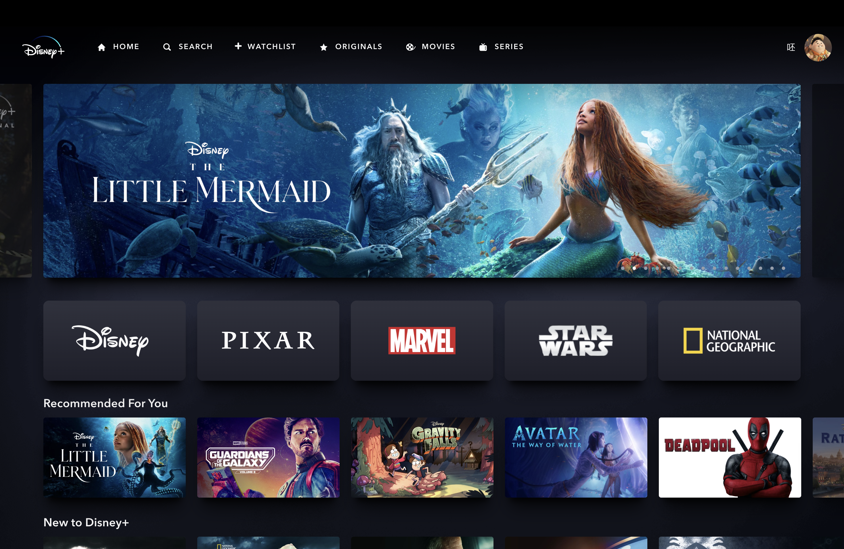
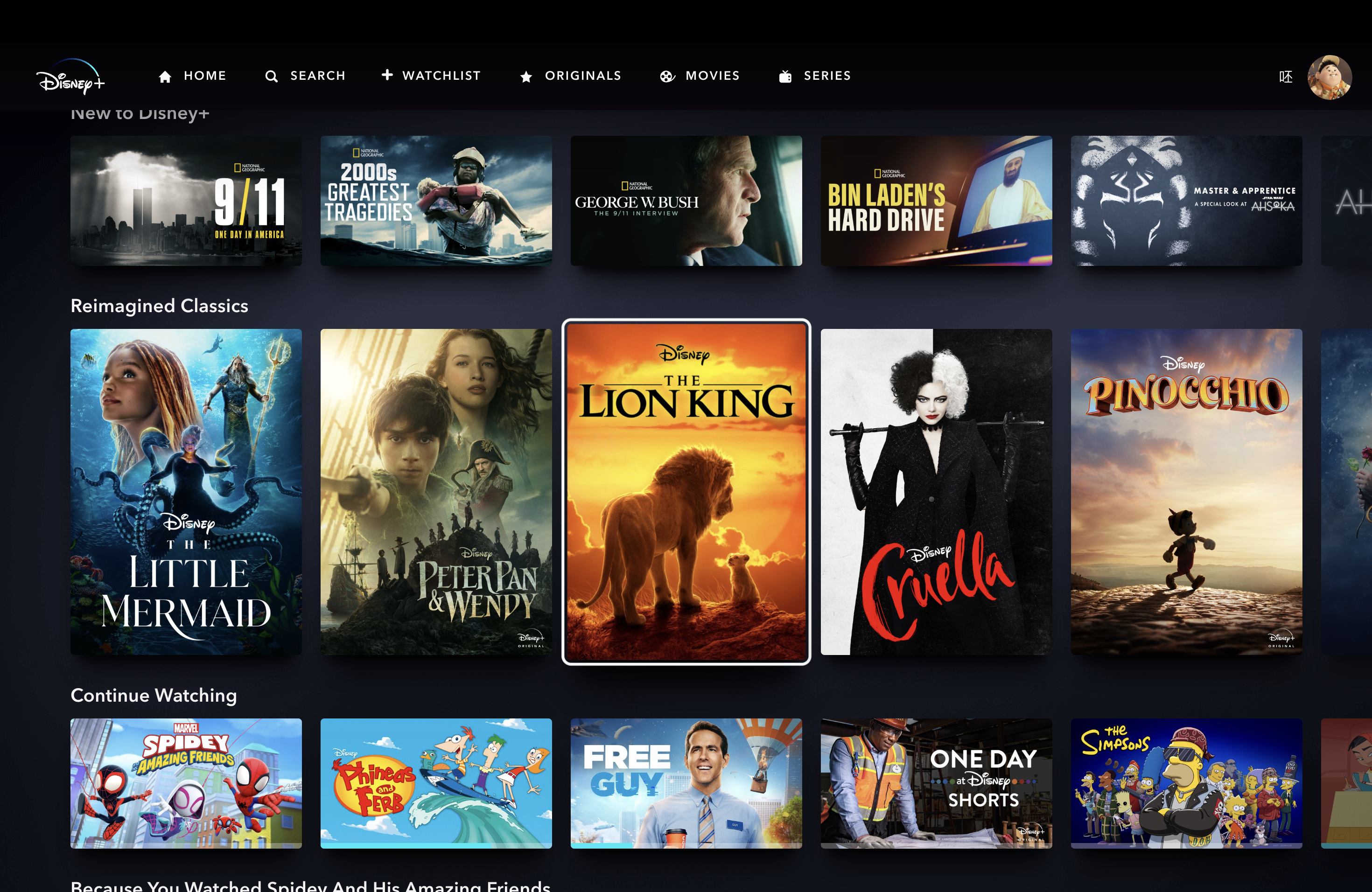
1: Continue Watching
Problem
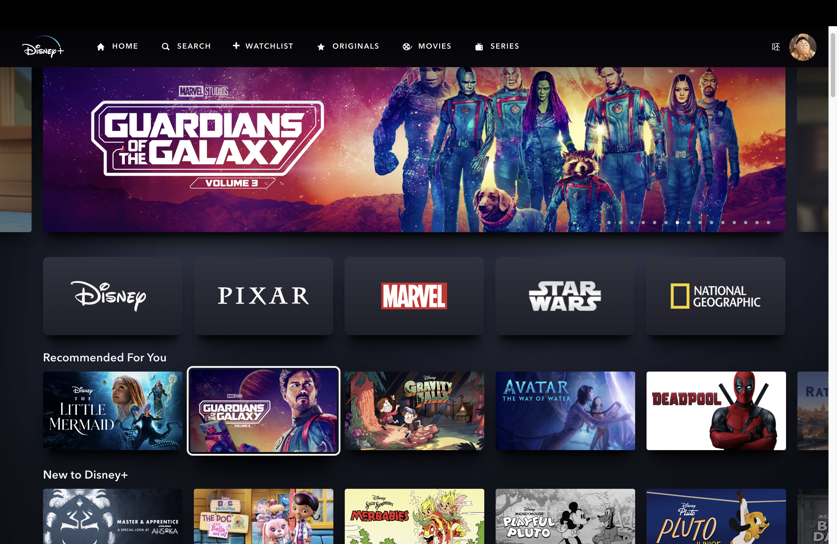
One of the paramount user scenarios for an OTT platform is that users will frequently revisit the website to resume viewing content they haven’t completed. Nevertheless, the discoverability of Disney+’s “Continue Watching” section could benefit from enhancements. Upon first land on the site, users do not have an immediate, intuitive way to pick up where they left off with a video. Instead, they are obliged to scroll down two rows to access the “continue watching” section. This arrangement places an additional cognitive load on users at the reflective level, as they must actively navigate through the sections above to locate the “continue watching” feature.
Solution
From an information hierarchy perspective, I prioritize the “Continue Watching” section over “Recommended for You,” “New to Disney+,” and “Reimagined Classics” – the 3 rows that currently being placed above “Continue Watching.” Thus, elevating the “Continue Watching” section to “Recommended for You” section’s current position, could effectively redirect users’ attention from a reflective level back to a behavioral level, since they can see it at first glance and always dive into the unfinished series without hesitation.
2. Viewing Experience at Each Episode’s End
Problem #1
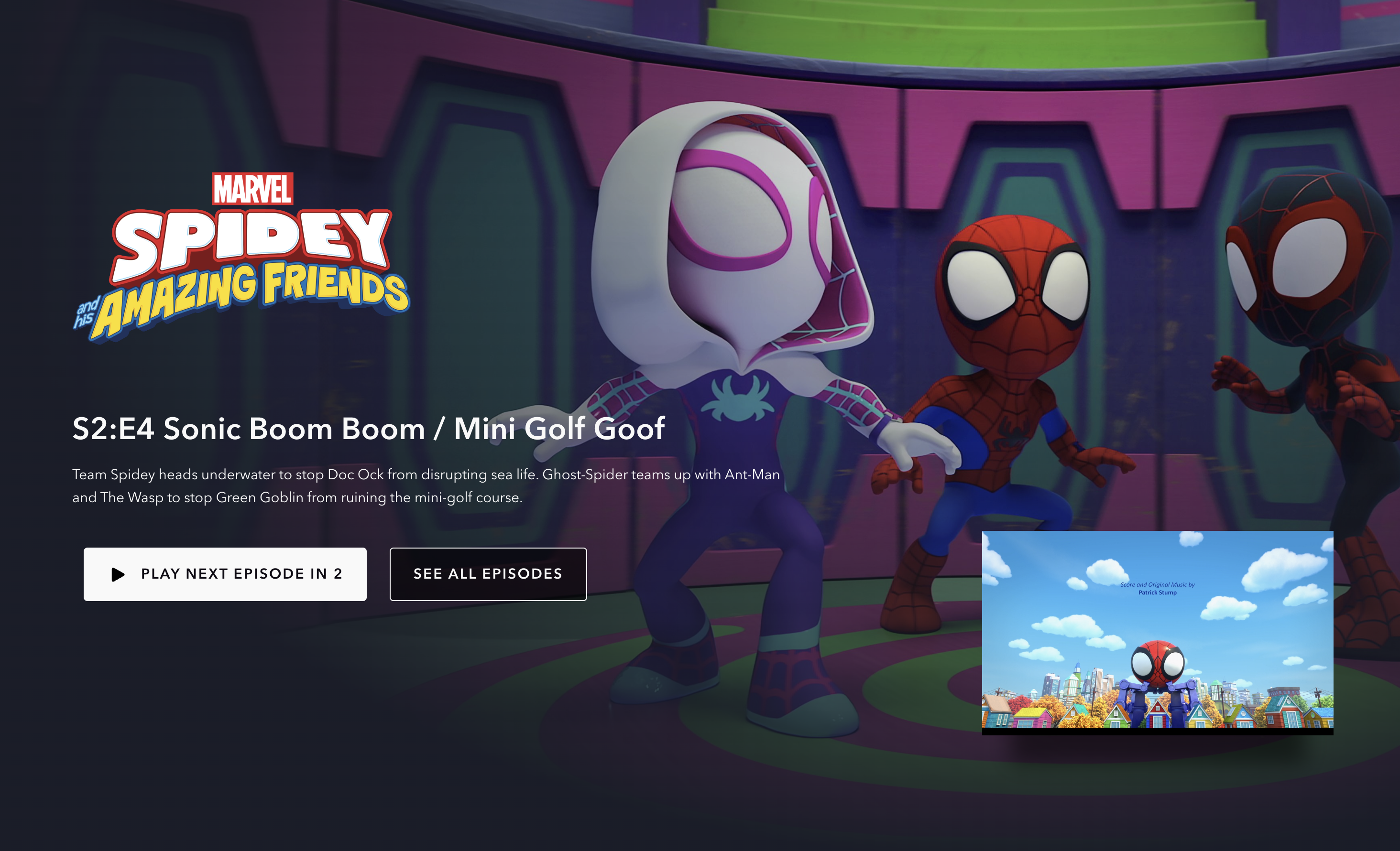
As an episode nears its end, the screen shrinks to the bottom right, displaying a ‘Play Next Episode’ countdown button on the left. This button served as a discoverable signifier that inform users to move to the next episode. However, the interface setup interrupts users who wish to watch post-credits scenes or credits. To continue, they must know to click the shrunken window before the countdown ends. Without having any signifier, this layout may potentially cause a gulf of execution and user frustration due to time pressure and sudden interruption.
Problem #2
Once users have clicked on the minimized screen, whether they’re watching the end credits or have completed the playback, the current rendition of the ‘Next Episode’ button fails to establish a clear conceptual model when positioned alongside the central ‘play’ button. This arrangement lacks consistency when compared to the ‘Skip Intro’ button, which resides on the right at the start of the film, or the previously mentioned “Play Next Episode” button on the left. These three buttons, all serving skip-related functions, being scattered across three different locations, contribute to a less-than-ideal system image. Users might mistakenly assume there’s no button for jumping to the next episode and feel compelled to navigate back to the show’s information page to select the next episode.
Furthermore, when watching the end credits or after playback, the ‘Next Episode’ button, positioned alongside the ‘play’ button in the center, fails to help create a conceptual model. This placement lacks consistency compared to the ‘Skip Intro’ button on the right, or the “Play Next Episode” button on the left that i mentioned above. For all these skip-related buttons, being placed in 3 different places create a bad system image. Users might erroneously assume there’s no option to proceed to the next episode at this point, requiring them to return to the show’s info page to choose next one.
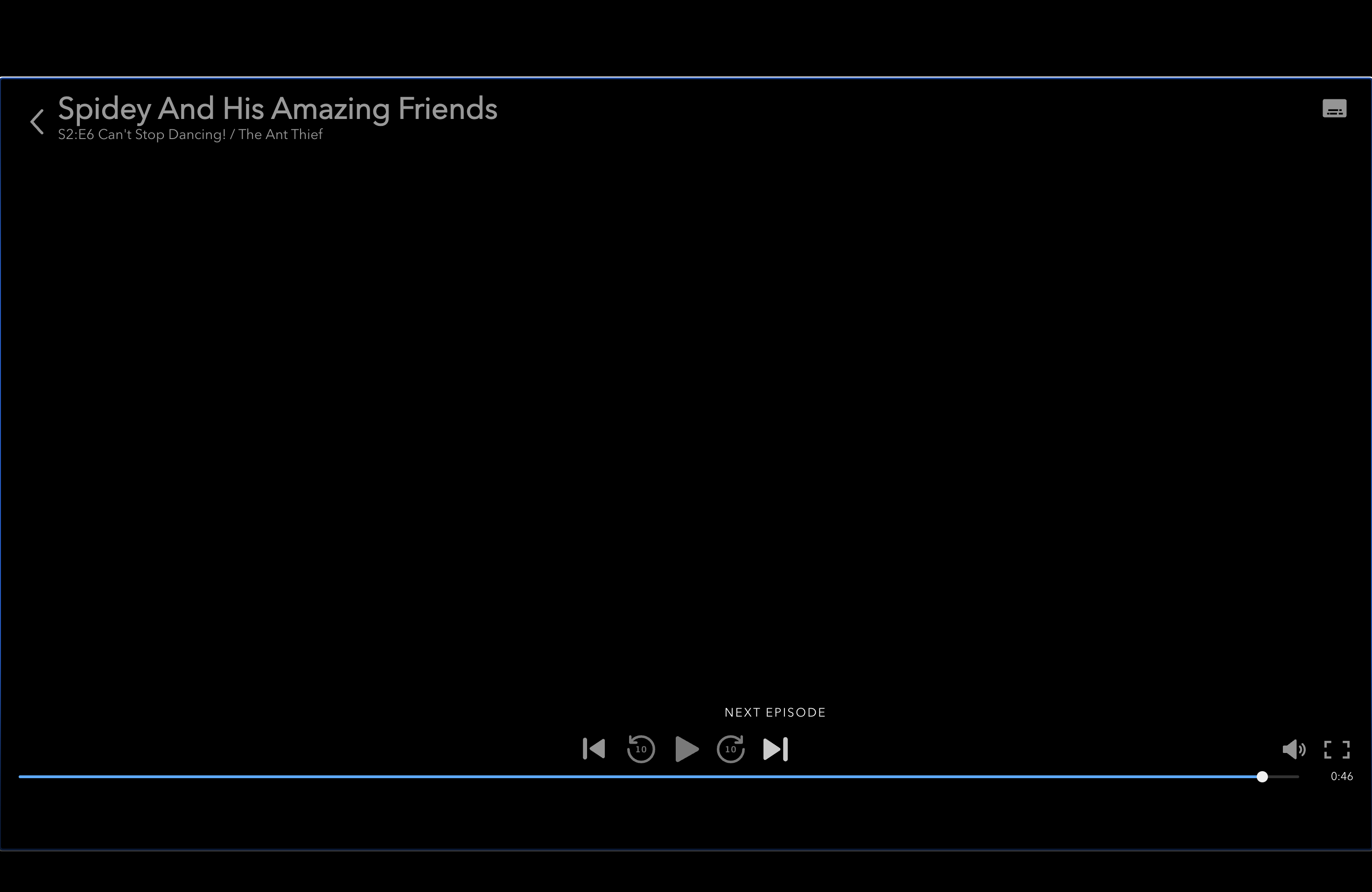

Solution
To fix the above 2 problems, the gulf can be bridged by removing the countdown button interface, adding a “Play Next Episode” button to the right side, and rearranging the button layout in the ending screen. Users will have the clear option to choose whether to watch post-credits scenes or click the ‘Play Next Episode’ button. Their viewing experience remains uninterrupted, and users can freely proceed to the next episode when desired. Also, if all functions related to skipping being placed in bottom right, when users are uncertain about the location of the “Play Next Episode” button, there is a high likelihood that they will instinctively look towards the bottom right corner of the screen. This aligns the user’s conceptual model with the product’s conceptual model, enhancing consistency.
3. Checking Content Information & Collecting to Watchlist from Home
Problem
When users discover exciting content or eye-catching movie posters on the Home page, they instinctively hover over it, expecting more details or adding the content for later watch. This action, guided by the typical knowledge in the head of website users, often leads them to expect more information. However, they will be disappointed to realize that the Home page offers no additional details. Moreover, adding the content to their watchlist directly from the Home page is not possible; to complete these 2 actions, they must navigate the content’s information page, which requires more clicks.
This design introduces a gulf of evaluation. Given users’ fast-paced computer usage habits, they anticipate a streamlined process for quickly understanding the content and adding it to their watchlist. However, the design falls short of these expectations, giving users a useless feedback (in the current version the box just simply being emphasized), and demands additional clicks that potentially diminishing the user experience.
Solution
To improve the design, providing an interactive hover-dialog that contains an “Add to Watchlist” button and also reveal more information of the content may help create positive results in the 3 evaluation stages (perceive, interpret, compare) of action.