Uber is a transportation conglomerate primarily offering ride-hailing services through its mobile application, available on both iOS and Android platforms, as well as web browsers. In this critique, I will assess the ordering process design in the Uber iOS app, applying principles from Don Norman’s “The Design of Everyday Things.”
Home Page
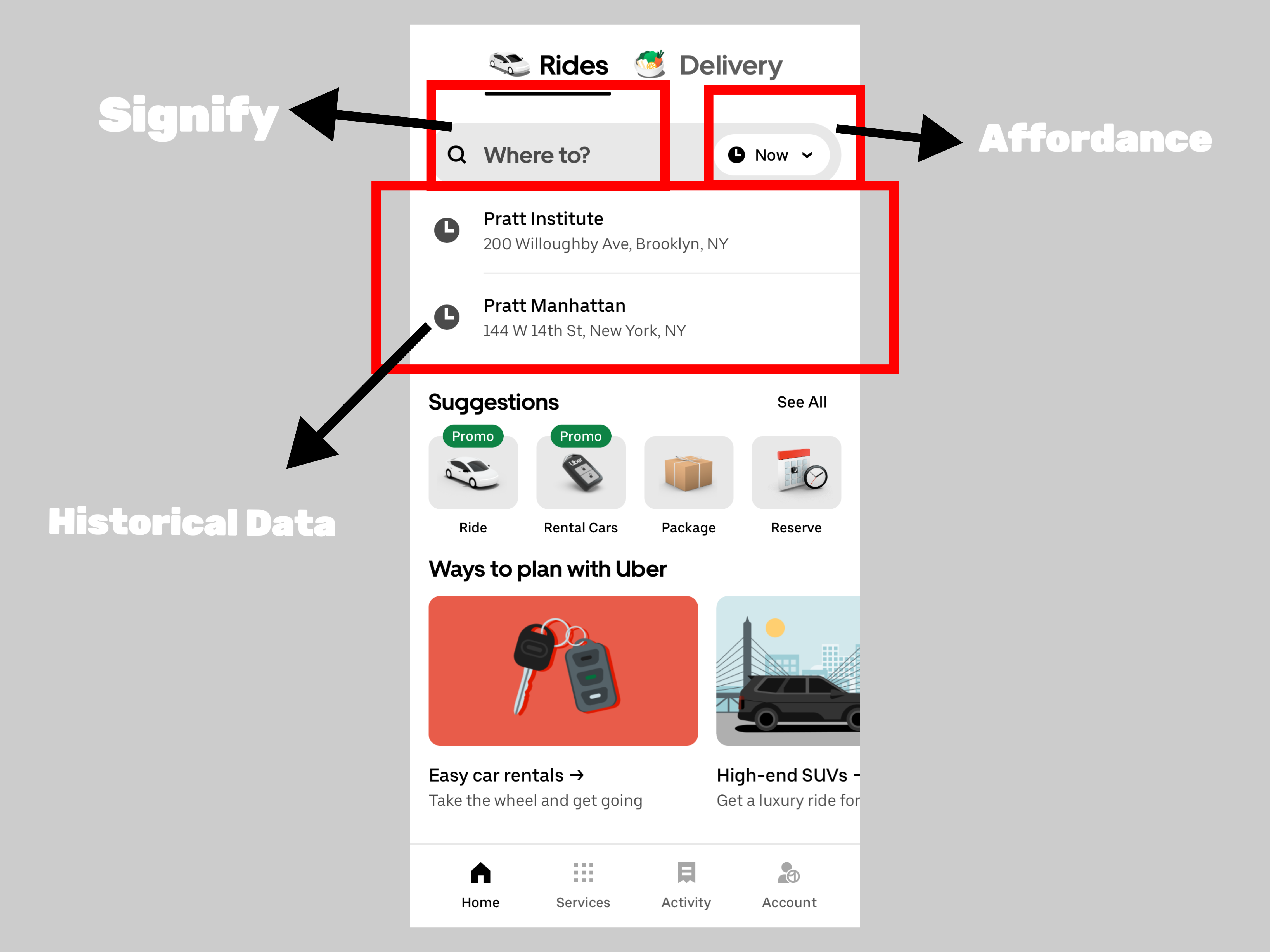
Uber’s Home Page design showcases simplicity and clarity. The “Where to” search box serves as a clear signifier, guiding users to input their destination. Adjacently, a clock-shaped button, working as a good affordance, allows users to adjust the trip time. Notably, Uber’s inclusion of historical trip data aligns with Human-Centered Design principles. This feature aids users in recalling previous destinations1, which is particularly beneficial in a service where users frequently travel to familiar locations. Furthermore, the provision of history memory contributes to error prevention and recovery1. Users can easily revisit their previous trip details, reducing the likelihood of input errors.
Ordering Page
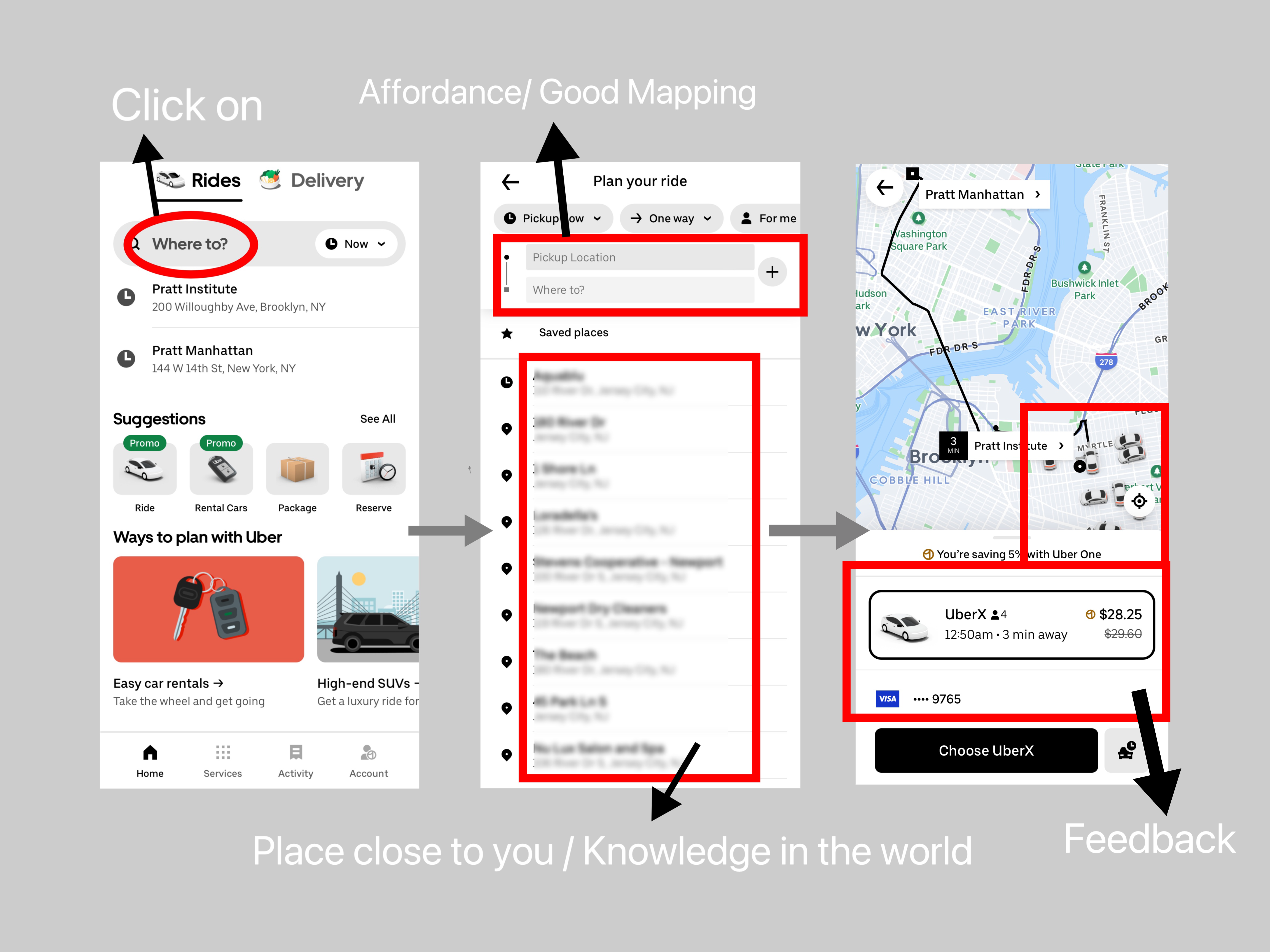
Clicking on “Where to” takes you to the ordering page. The default departure point is set to the current location, working as an affordance that simplifies the experience while reducing input errors. Moreover, it aligns with Don Norman’s principle of knowledge in the world as it leverages real-world context to assist the user. Users can edit both the departure and destination points, and they can also add intermediate stops, all of which have clear affordances.
Moreover, the layout of the departure and destination points is a good example of mapping. Combined with knowledge in the world, people typically enter the starting point, intermediate stops, and endpoint from top to bottom. After entering the starting and ending points, the software automatically switches to map mode, displaying nearby vehicles, estimated travel time, various types of available vehicles, and prices. These serve as feedback to provide users with immediate information.
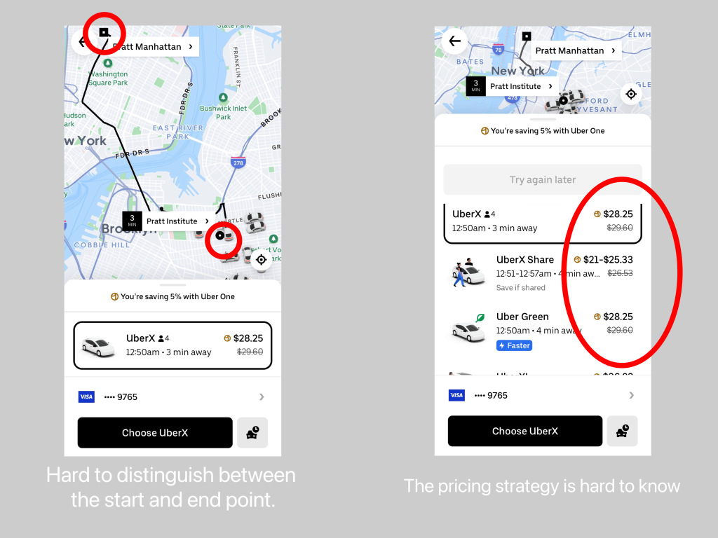
Nevertheless, there is potential for enhancement in the differentiation of the starting and ending points on the map to provide good signifiers. In addition, the conceptual model of the surge pricing concept is hard for users to know. Providing more transparency in this regard can enhance the user’s understanding.
Placing the Order
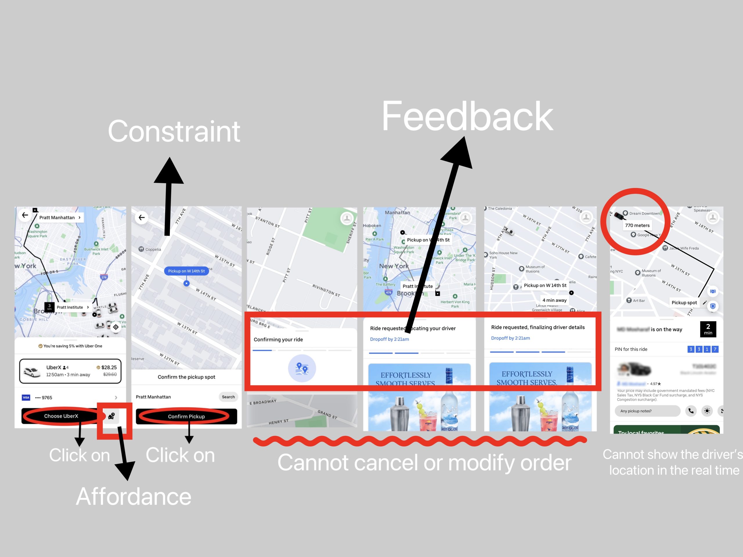
After selecting the type of vehicle, you can place your order by clicking on “Choose [vehicle type].” It’s worth noting that there’s still a button to select the pickup time, represented by a clock icon above the vehicle options. This is a good affordance and it enhances fault tolerance by providing users with the opportunity to correct their choices in case of slips. After placing the order, users need to confirm the pickup location (and possibly the drop-off location). This design, acting as a constraint, minimizes the occurrence of errors.
Then, it enters the vehicle matching stage, consisting of four phases. These stages are presented on the screen as feedbacks, letting users know which stage their order is in. Once the driver confirms, the app will vibrate (or emit a sound) to notify the user that the ride has been confirmed. This serves as a voice signifier, providing feedback to the user that the trip is confirmed.
However, I see opportunities for improvement. Firstly, users lack the ability to modify or cancel their orders before the driver’s confirmation. Adding this functionality, possibly at the bottom of the screen, could enhance the user experience. Secondly, the cost of changing pickup or drop-off locations after the driver’s confirmation is prohibitive as it necessitates order cancellation. Providing more user-friendly options for order modification would be beneficial. Additionally, there is potential for enhancing feedback on the ride’s progress, such as real-time driver location updates.
Other Issues
Uber does not consistently consider real-time traffic conditions, often resulting in significant delays compared to the estimated arrival times. I believe that Uber should pay more attention to real-time road conditions to give better feedback.
In Summary
All in all, Uber’s design is effective and successful overall. However, I believe there is room for improvement. As mentioned earlier, if the icons for the starting and ending points could be made more distinct, if pricing strategies could be made more transparent to users, if modifications to orders after placement could be simplified, if real-time driver location could be more accurate, and if estimated trip durations could better align with actual conditions, I believe Uber can become even more user-friendly.
Reference
- Nielsen, J. (2000). Designing Web Usability: The Practice of Simplicity. New Riders.
- Norman, D. A. (2013). The Design of Everyday Things. Basic Books.