Jollibee is a fast food brand with American-style items and casual Filipino food. Jollibee’s iOS app aims to simplify the food ordering experience for users. However, the interface design still leaves room for improvement. This critique uses Don Norman’s principles and terminology to identify and recommend improvements for these issues.
Problem 1: Unclear Functionality of “View Full Menu” Switch
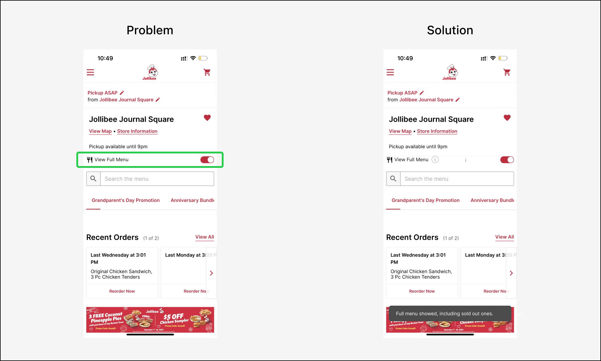
The “View Full Menu” switch on the menu page creates confusion. When users toggle the on/off switch, nothing visibly changes in the menu below. I asked two Jollibee customers and two staff members, and they were all confused. While this is not a scientific sample, it clearly shows a design issue, as there’s no clear signifier or immediate feedback to inform the user what has changed.
Solution:
- Add an information icon (“ⓘ”) next to the “View Full Menu” text. This would serve as a “signifier” to indicate that more information is available. Users could click on it to understand what the switch does.
- Upon toggling the switch, display a snackbar that explains what changes have been made. This would provide real-time feedback, also allowing users to understand the consequences of their actions.
With these two changes, users are no longer left guessing, but will have a better conceptual model of how the “View Full Menu” feature functions.
Problem 2: Confusing Menu Tabs
Users face two issues with the horizontal tabs at the top of the menu page.
- Incomplete Display of Tab Names and Misaligned Indicators
The tab names are cut off, and the red line under each tab doesn’t line up right. Both of these design elements serve as “signifiers,” but they fail to adequately convey the intended information. - Too Many Tabs with Long Text
There are too many tab options with long names. Users have to swipe a lot, making it hard to control. This messes up the user’s conceptual models.

Solution:
- Add a Dropdown in Tabs
Include a dropdown menu within the tabs to help users easily switch between food categories, making navigation more efficient. - Align Highlighted Tabs
Make sure the highlighted tab matches the category the user is looking at. This improves “Mapping” and gives the user better control.
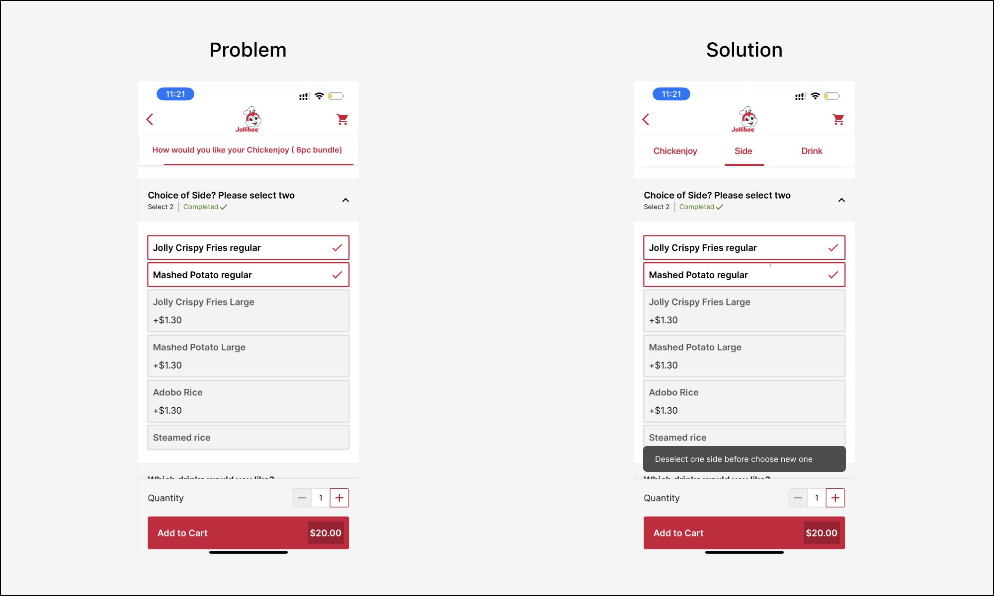
Problem 3: Confusing Grey Options
On the meal editing page, once users select two sides, clicking on other grey side options provides no feedback. If users miss the “Select 2” text, they will get confused. This adds unnecessary cognitive load and diminishes the users’ sense of control over the ordering process.
Solution:
Show a pop-up snackbar when users try to click a grey option after already picked two. This notification will inform them to first deselect one of the chosen sides to make a new selection. This makes the system easier to understand and speeds up ordering.