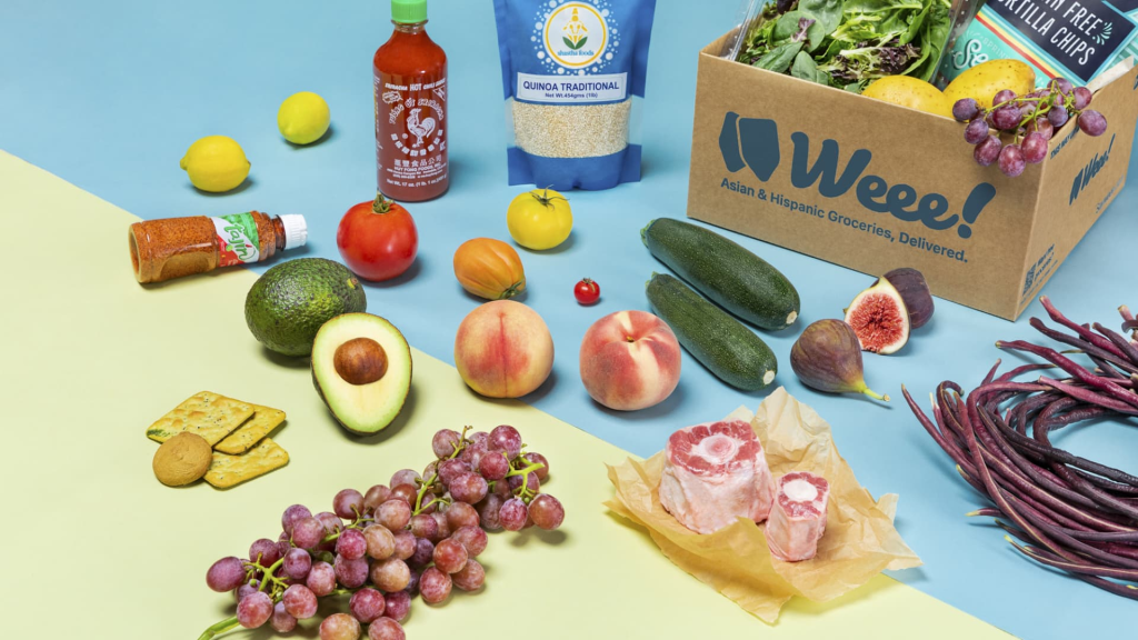
Weee! is an e-commerce platform specializing in the delivery of Asian and Hispanic groceries. Established in 2015, Weee! provides a wide selection of over 10,000 locally sourced and rare products from various parts of the world. Customers have the convenience of ordering these items using either a computer or a mobile phone, ensuring access to the freshest foods.
This article conducts a design critique using Weee!’s web version as a basis, highlighting a total of five good designs and elaborating on two bad designs within the three main processes: login, shopping, and checkout.
Login
The login process of this app closely aligns with the principles of affordance and signifiers. To the right of the email input field, there’s an arrow button with a default gray color, serving as a clear signifier. When a user interacts with the input box, the button changes to blue, indicating the action to register or log in. Overall, the login process is designed for discoverability and ease of use.
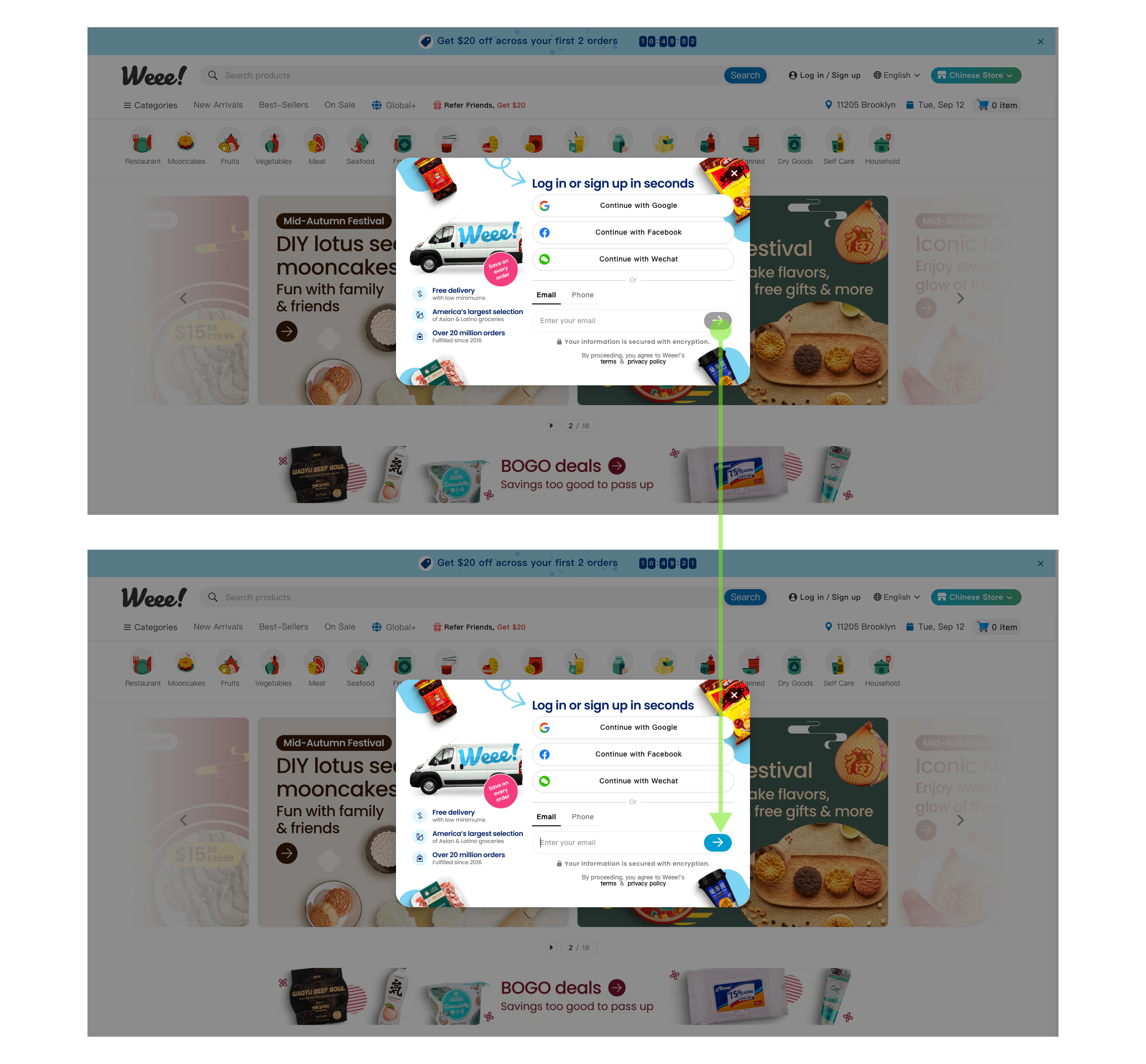
However, a disruptive pop-up window appears upon entering the website, promoting various offers. While this design may be intended to stimulate impulsive decisions driven by the lizard brain, it can actually interfere with the user experience.

It is advisable to maintain discoverability and consistency by displaying promotional content at the top of the webpage using a slider, avoiding intrusive pop-up windows, and preserving a seamless user experience.
Shopping
Add to Cart
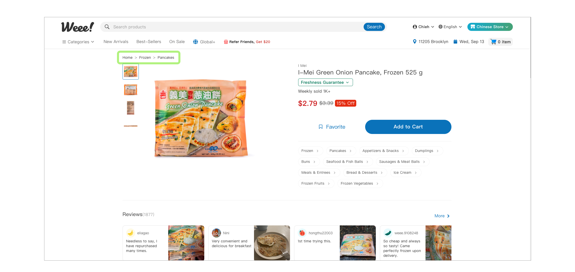
After registering for an account, users can commence their shopping journey. On the product description pages, a breadcrumb design in the top left corner exemplifies the principles of discoverability and mapping. This design ensuring users can easily discern their current location within the website.
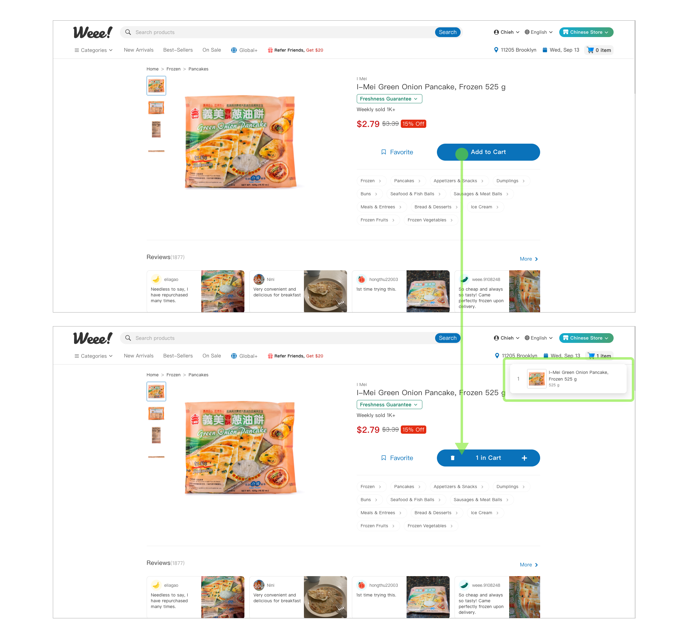
In addition, clicking the “Add to Cart” button triggers an immediate pop-up window in the top right corner, displaying the quantity added to the cart. This design leverages feedback concepts, providing a clear signifier that informs the user of the successful addition of the product to the cart.
Favorites
Users have the option to click “Favorites” to include products in their wishlist. However, this feature’s design is less effective. The “Favorites” function lacks a distinct outer frame, impacting its discoverability and default use concepts. While the icon does turn red upon clicking, it fails to display a pop-up message akin to the “Add to Cart” button, notifying users of a successful save. Consequently, users may struggle to utilize the “Favorites” feature.
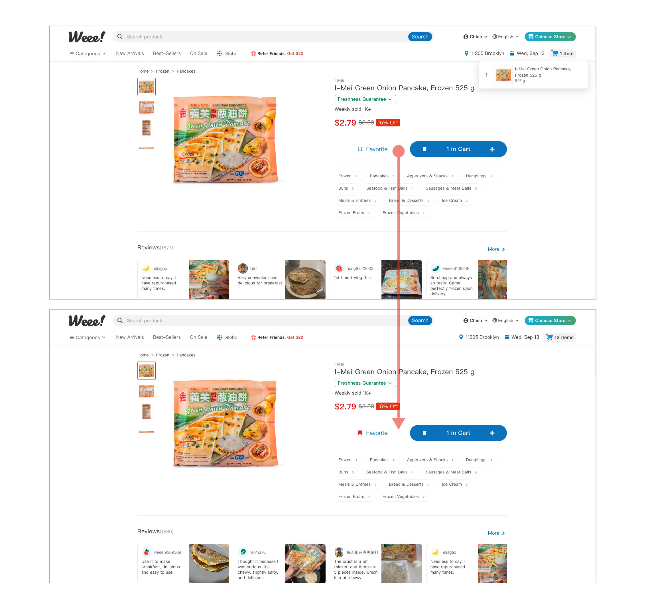
To enhance user experience, it is recommended to incorporate a button outline. This design may reinforce the concept of association, making it evident that “Favorites” is a clickable element. Additionally, consider adding a pop-up notification to confirm successful saves.
Checkout
On the checkout page, users can check out the delivery date, payment options, and purchased items. There are downward arrow buttons on the right-hand side of each item. This design leverages the concept of affordance, as these buttons serve as clear signifiers, suggesting to users that they can expand these fields to access more detailed information.
Furthermore, in the interface design for selecting purchased items, only up to seven products are displayed at a time. The rest are concealed behind a “+” icon, serving as a signifier to prompt users to expand and explore more comprehensive product details. This approach enhances discoverability, making it intuitive for users to find additional information.

Overall, Weee! is a user-friendly platform that enables users to easily register their accounts and locate the products they need. To further enhance the user experience, the Weee! product team could consider optimizing elements such as promotional pop-up windows and standardizing button components. These improvements have the potential to attract more Weee! users and increase the loyalty of existing ones.