Canvas is a popular platform when it comes to students and teachers. It enables users to post/submit assignments, participate in discussions, view course grades and materials, etc. This article will critique the Canvas website using Don Norman’s design and usability principles mentioned in his book: The Design of Everyday Things.
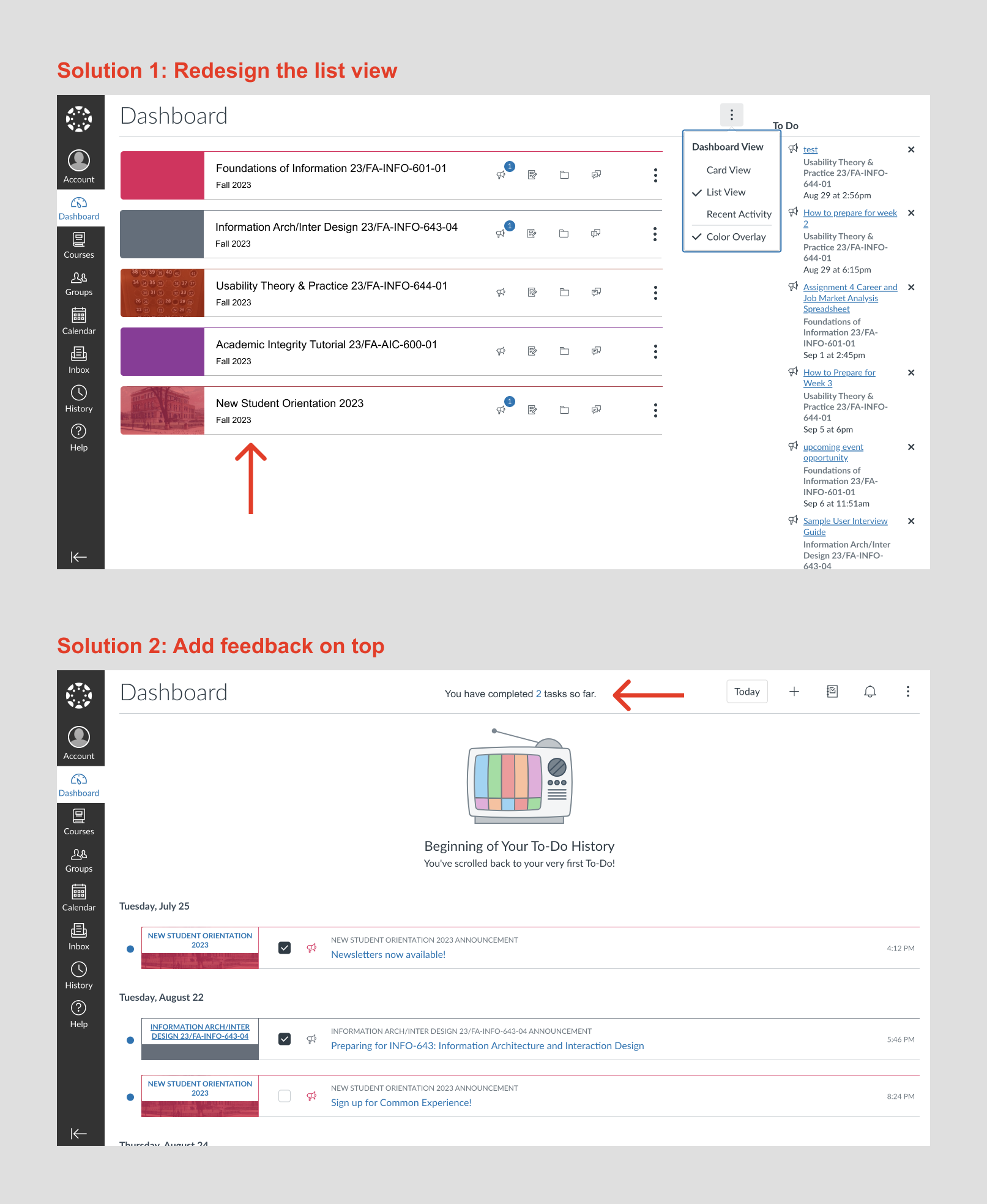
1. Dashboard’s list view doesn’t match user’s mental model
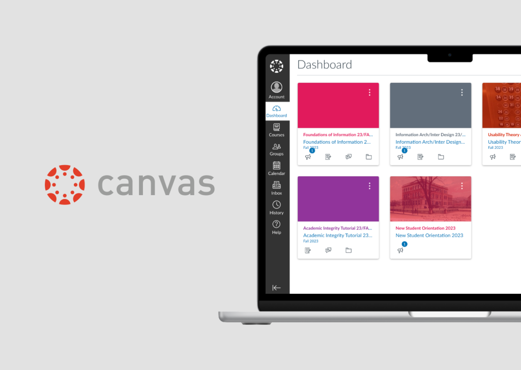
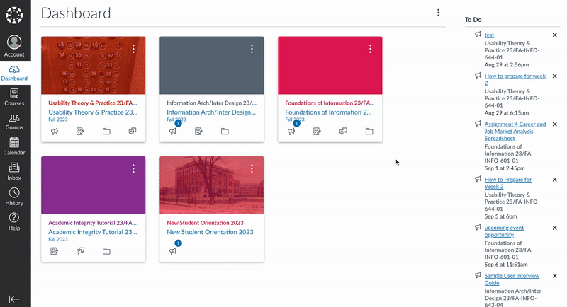
The dashboard page is one of the most frequently visited pages in Canvas, as it shows what classes users are taking. When users select the “list view” option of the dashboard, a to-do list page shows up. The to-do list might create a mismatch between the designer’s conceptual model and the user’s mental model, as the word “list view” does not explicitly imply “to-do list”. In addition, the “card view” page is a display of cards, yet the “list view” page is not a display of lists, but rather checkboxes. This unmatched expectation can demand a higher cognitive load for users to understand what’s going on. When clicking on the checkbox of the list, it gives feedback of a box being checked. However, there’s no feedback after that, which means users don’t know what “checking a box” means. This lack of feedback can prevent users from moving on with the task of completing more checkboxes, as they don’t know what result it leads to.
Canvas Dashboard Flow
The Solution:
To solve the mismatch between the mental models for “list view” and “to-do list”, I’d suggest either sticking with the word “list view” but redesigning the checkboxes into lists of the classes and having the same elements as the cards. Or else, change the word “list view” to “to-do list” in the drop-down menu, and stick with the checkbox design. In addition, I’d suggest adding feedback after completing the action of checking the boxes. One example could be adding the message “You have completed (number) tasks so far” at the top of the page, and the number of tasks increases immediately after more boxes are checked.
Redesign Created on Figma
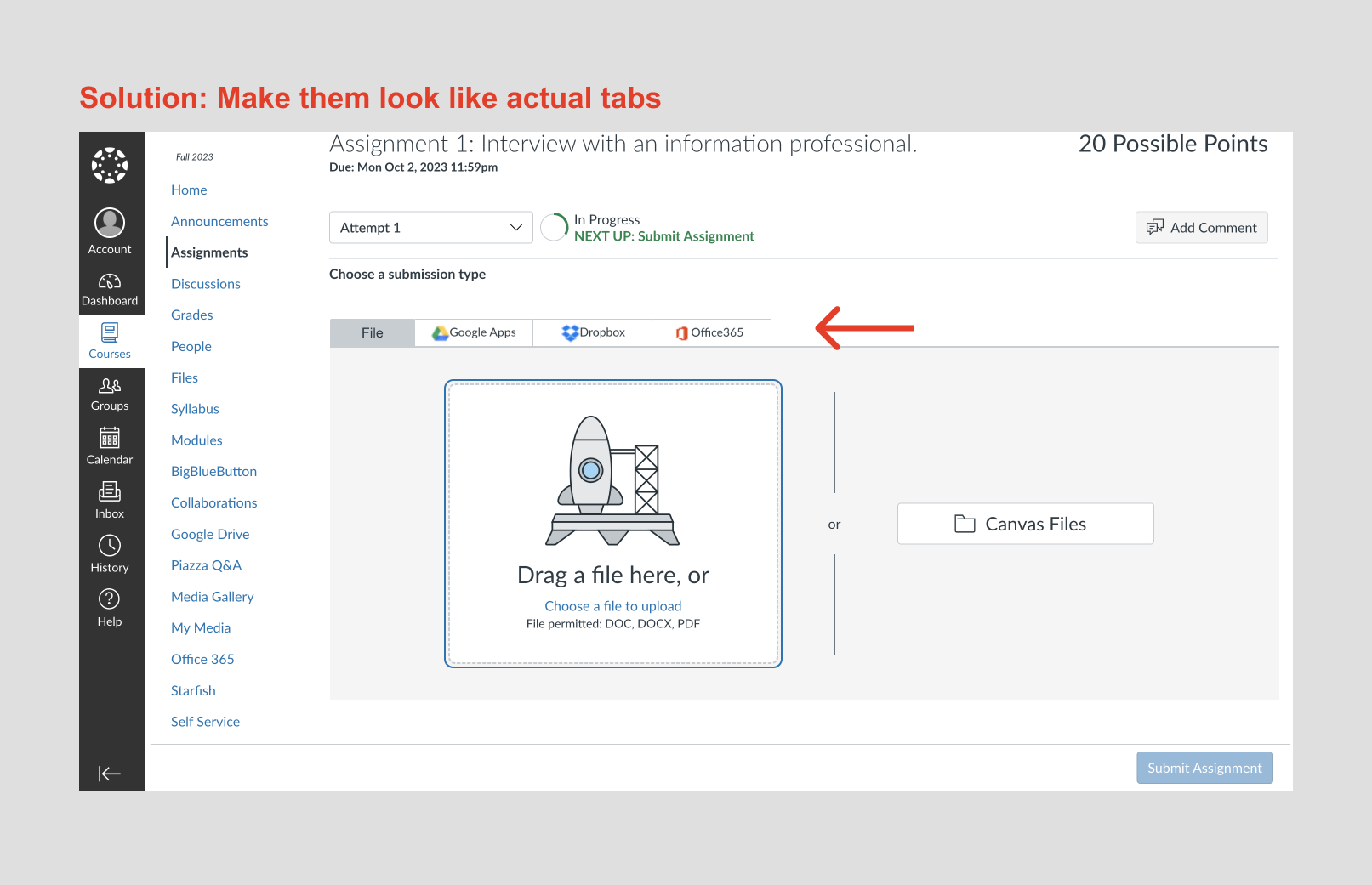
2. Upload feature can easily lead to a description-similarity slip
When users click on an “assignment”, the bottom of the page has a section that affords uploading assignments. However, the existence of an “upload button” and a “drag a file here” box can confuse the users on which one to use to complete the uploading. With 2 signifiers offering the same meaning, it can easily cause users to make a description-similarity slip, where they might end up clicking the upload “button” that doesn’t afford the action of uploading at all. The upload “button” is indeed a tab, mapping the upload section below. The “more” tab maps 3 other options to upload assignments – Google Apps, Dropbox, and Office 365. However, both their highlighted colors and square shapes can cause users to misunderstand them as buttons instead of tabs, thus another mismatch between the design’s conceptual model and the user’s mental model. Both are also an example of poor mapping, as users might not associate them with their right functions.
Unload Task Flow
The solution:
To prevent a description-similarity slip and create better mappings, I’d suggest redesigning the “upload” and “more” tabs to match what users think a tab looks like – I’d refer to another tab design in the Canvas discussion page which meets the industry standard better. I’d also change the word “upload” and “more” to the names of the submission types – “Files”, “Google Apps”, etc. to provide more clarity on what users are uploading.
Redesign Created on Figma
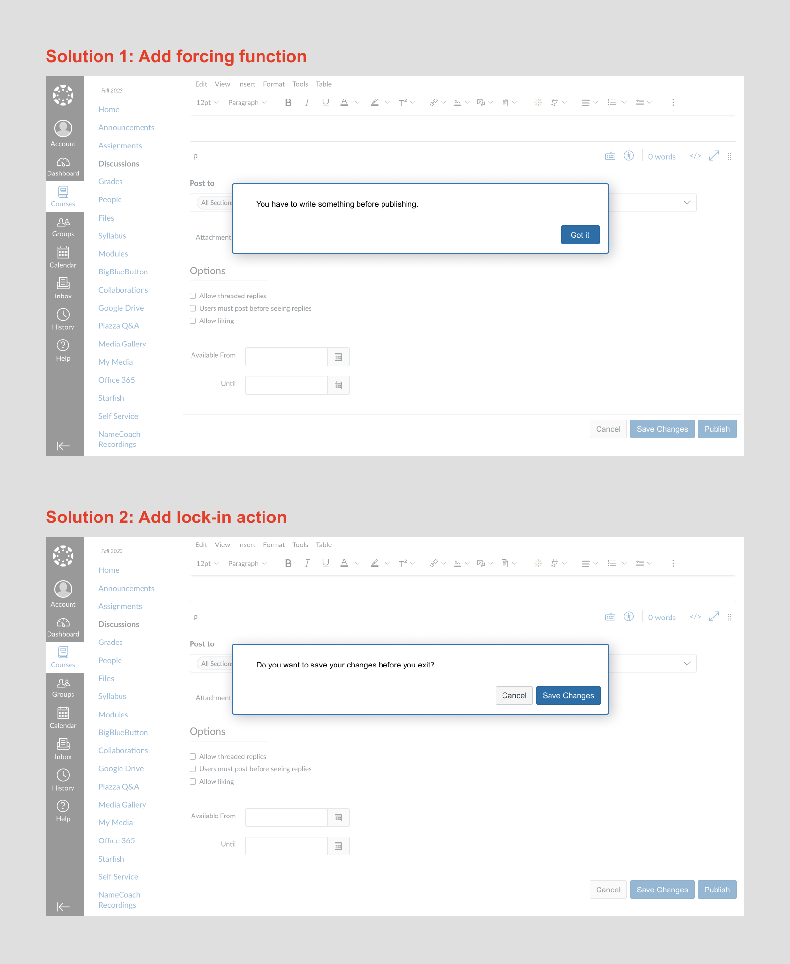
3. Posting discussion lacks constraints to prevent mistakes
The discussion page lacks logical constraints to prevent the mistake of posting without a title and content. In addition, the “save” button affords the action of publishing the content. Yet, it might not match the user’s mental model, as “save” conventionally stands for “saving changes” in other platforms. This inconsistency in the use of the word “save” can force users to learn something new specifically to this platform, increasing the user’s cognitive load. This is also an example of knowledge in the world doesn’t match knowledge in the head. Besides the “details” tab, there is a “mystery path” tab that is relatively discoverable but doesn’t afford clicking and provides no feedback. This lack of feedback and use of unfamiliar words can cause the users to feel a loss of control, feeling frustrated that they might be missing out on something important. Under both circumstances, users are forced to approach the problem from a reflective level of consciousness rather than a behavioral one, as what they learned no longer matches what they expect.
Post Discussion Task Flow
The Solution
To prevent users from creating an empty discussion post, I’d add a forcing function in the form of a pop-up that displays “You have to write something before publishing” after the users click the “save button” and before publishing the post. In addition, I’d add a “publish” button to afford and signify the action of publishing the content, distinguishing it from the “save” button, which will be redesigned with the affordance of saving changes. This matches with the user’s mental model of how these words are conventionally being used. In addition, when clicking the “cancel” button, a lock-in action will be added in the form of a pop-up that displays “ Do you want to save changes before you exit?” to prevent memory-lapse slip/imprecise knowledge.
Redesign Created on Figma
4. Dashboard’s cards afford a lot of functions, but few are signified properly
On the dashboard page, each card shows good discoverability, displaying the name of the class, 4 conventional icons, a picture or color block, and 3 dots. The 3 dots afford the action of either changing the color of the block or moving the cards. However, without users actively clicking on the dots, they have no idea what it signifies. In addition, each card affords the action of being dragged around to alternate placement. This affordance is not being signified either, with no icons or words communicating this action to the users.
Dashboard Cards’ Affordance
The Solution
I’ve played around with several options, such as adding an “edit” icon (conventionally displayed as a pencil icon), turning the mouse into “drag” mode when hovering over the color blocks, etc. However, adding an “edit” icon on each box or on the whole page fails to convey the characteristics of a dashboard – static and unalterable, but more of a user profile that is conventionally known to signify and afford changes. Turning the mouse into “drag” mode fails to signify the card’s affordance of being clicked. As a result, I believe it is best to keep the design as it is. In addition, since dragging and editing are not necessary actions needed to use Canvas, but rather complementary ones, I believe it is acceptable to be hidden in the 3 dots.