
Instagram is a photo and video sharing social networking platform. It allows users to upload media that can be edited with filters, be organized by hashtags, and be associated with a location. This article applies the concepts discussed by Don Norman in The Design of Everyday Things, using Norman’s terminology to critique the design of Instagram’s digital interface.
- The visibility of new posts and stories in the user’s feed
In Don Norman’s terminology, visibility refers to making relevant elements and functions easily visible and discoverable, reducing the need for users to guess or remember where to find them. In Instagram, one interface design problem related to “Visibility” is the visibility of new posts and stories in the user’s feed.
The problem:
- New Posts and Stories: Instagram’s algorithmic feed often displays posts out of chronological order. This can lead to a visibility problem where new posts or stories from followed accounts may not be immediately visible to users, especially if they scroll quickly through the feed.
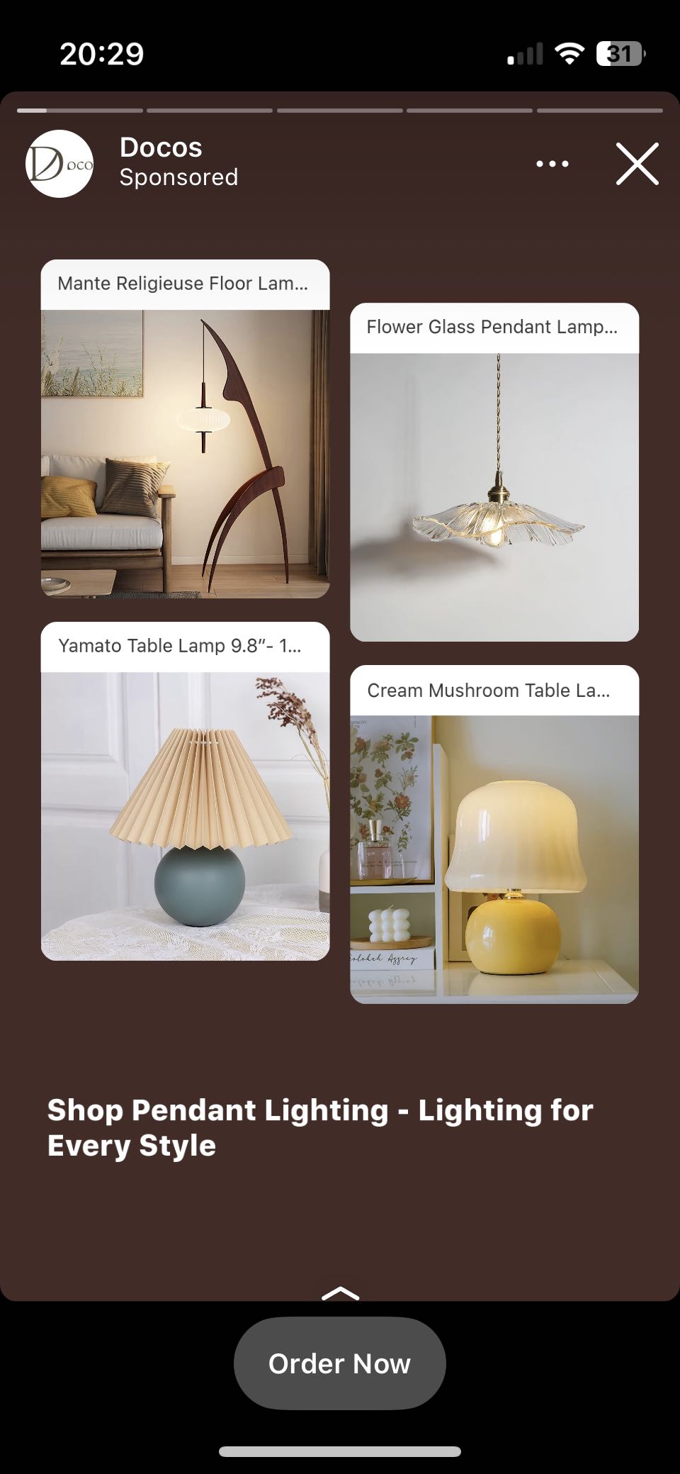
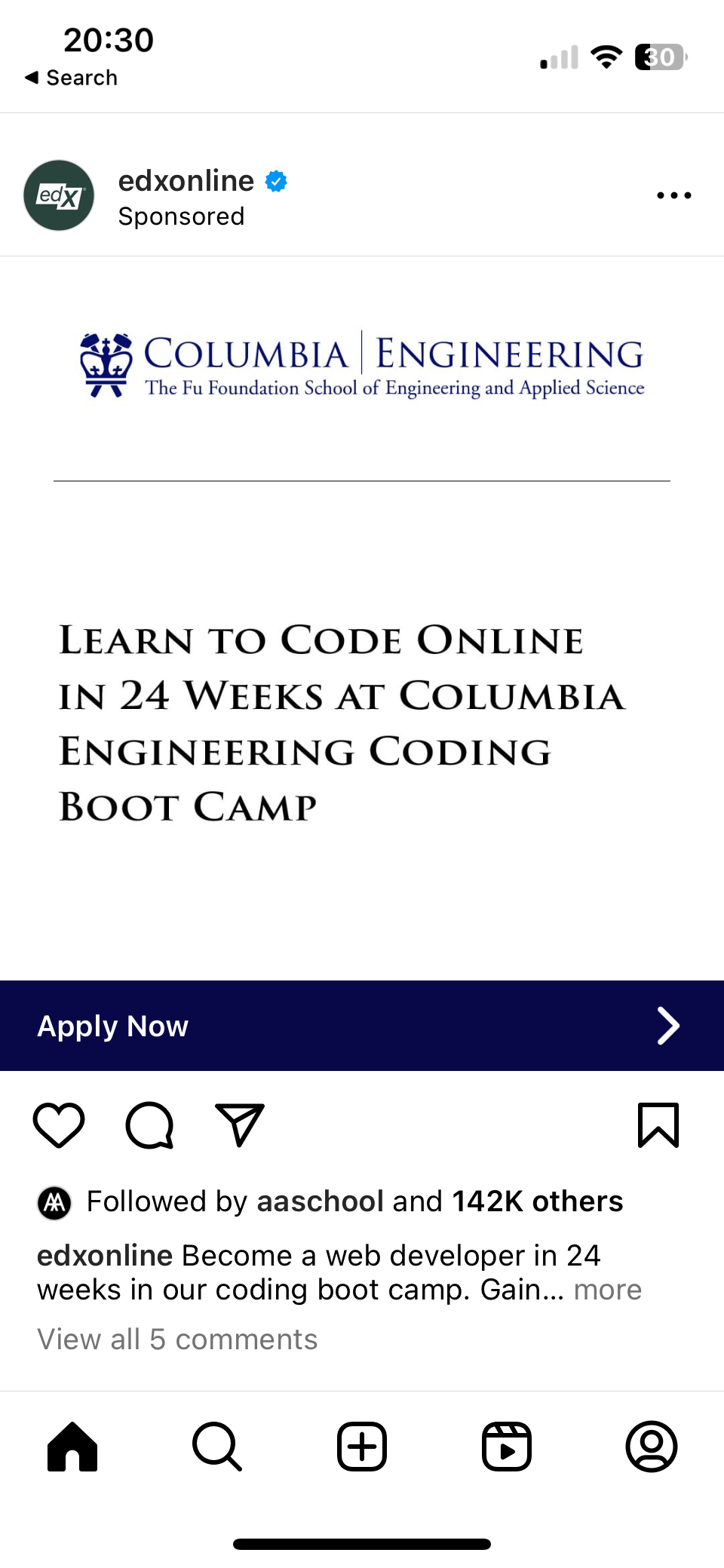
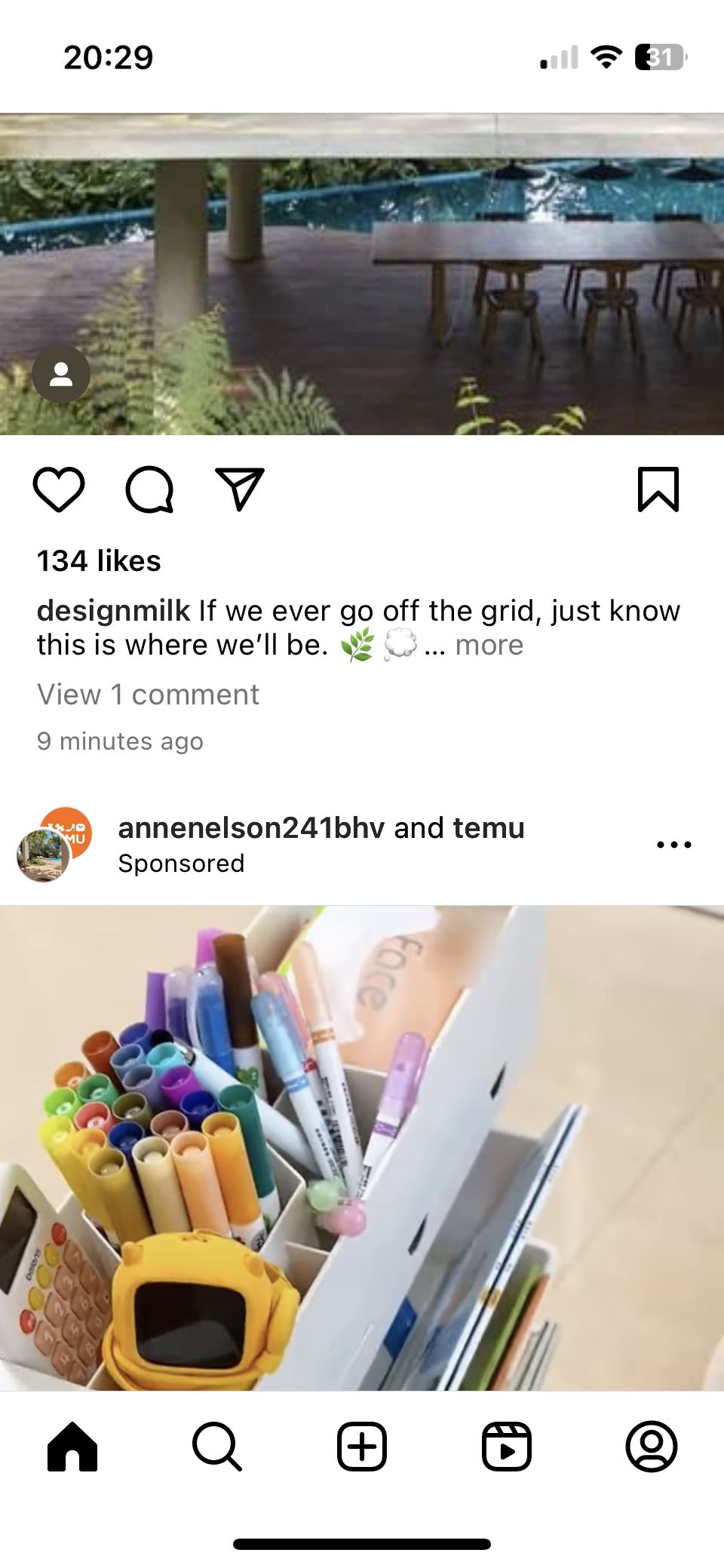
- Overwhelming Content: The Instagram feed can become cluttered with sponsored posts, ads, and suggested content. This can make it challenging for users to find and engage with the content they care about most.
The solution:
- Chronological Sorting Option: Instagram could provide a option of chronological sorting for the feed, allowing users to see the most recent posts first. This would enhance the visibility of new content.
- Clearer Content Labeling: Instagram could label sponsored content and ads more clearly, distinguishing them from regular posts. This would reduce clutter and make relevant content more visible.
- Ambiguity in Business Accounts
The problem:
- The interface design problem on Instagram related to “affordance” is the lack of clear affordances for distinguishing between personal user accounts and business accounts in the user interface. In Instagram, business accounts (such as those of brands or companies) often have similar profile icons to personal accounts. This similarity can create confusion for users trying to distinguish between personal and business accounts.
The solution:
- Distinct Profile Badges: Instagram could introduce a visual badge or icon overlay on business profiles to clearly distinguish them from personal accounts. This would serve as a strong affordance for users.
- Labeling or Tagging: Instagram might consider allowing users to label or tag accounts as “Personal” or “Business.” This label could be displayed prominently on the account profile, making it easier to identify.
- Filtering or Sorting: Offer users the option to filter or sort their followers or following lists by account type (personal or business) to simplify navigation and interaction.
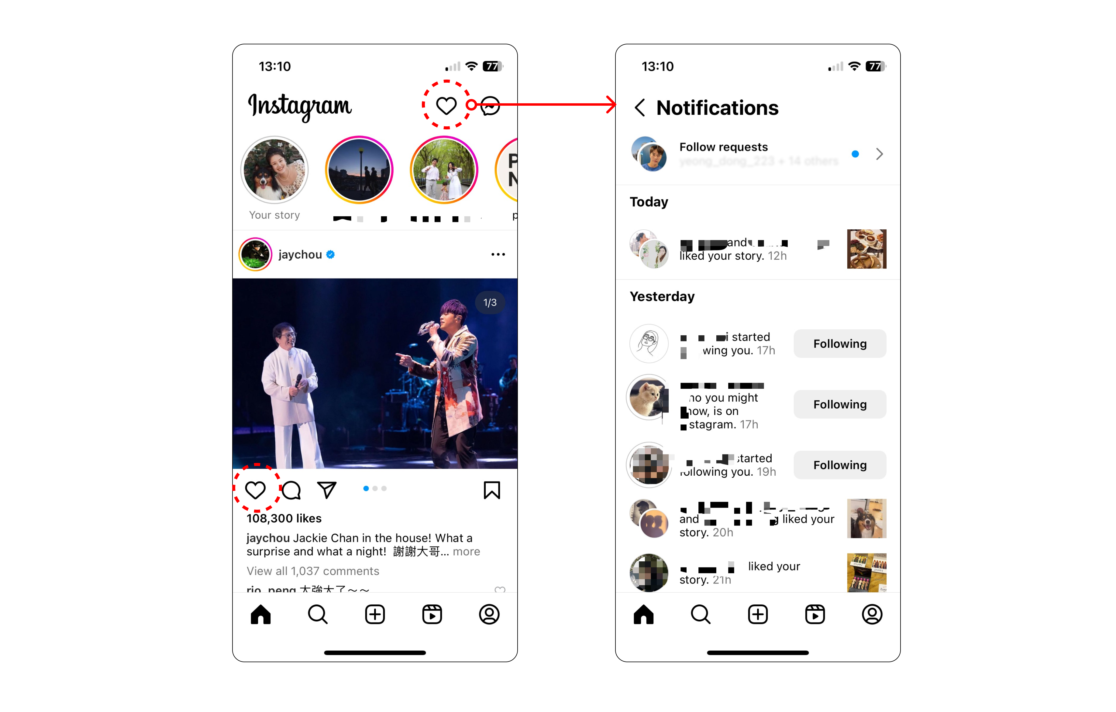
- Confusing “Notification” icon
A heart icon on the right top of the homepage indicates “Notifications” on Instagram. This heart icon has been used as a “signifier” – an indicator to assist people interact with app updates.
The problem:
- The heart icon does not have affordance of Notification function: The characteristics of the “heart” icon did not suggest how it should be used. Users who would like to find notifications may not click this button because the heart shape in the interface is frequently associated with the “like” or “collect” feature.
- Mapping Problem: If tapping a heart icon leads to the “like”, Instagram should maintain this mapping across all areas where heart icon is displayed. In Instagram homepage, it uses heart icon to indicate two separate functionalities. The heart icon in the upper right corner represents “Notifications,” while the heart icon beneath the post image represents “Like.”
The solution:
- The Notification icon should be changed from a “heart” image to a “bell” image. A bell can be used as a signifier to signal that something needs to be reminded.
- “Unfollow” accidental can be prevented
The problem:
- There is no limitations or barriers that prevent users from taking unintended actions, unfollow, for example.
The solution:
- Strengthen “constraints” to prevent potentially irreversible actions. For example, if a user attempts to unfollow someone, consider adding a confirmation dialog to reduce the likelihood of accidental unfollows.