TickPick app is a mobile application that offers a convenient and user-friendly interface for users to easily browse and purchase tickets for various events (including sports, concerts, and theatre) as well as sell event tickets directly from their smartphones. The app is available for iOS and Android devices.
TickPick’s business model is similar to that of other ticket marketplaces, such as StubHub and SeatGeek. However, TickPick differentiates itself by offering a no-fee guarantee. This means that users can see the final price of a ticket before they buy it, including all fees. This is a major selling point for the company. It allows users to save money on tickets and makes it easier to compare prices from different sellers. The company also offers a BuyerTrust Guarantee, which protects users from fraud.
Upon downloading the app, guest users can freely explore the app by searching for their desired events and view the available tickets, however majority of features are only accessible to registered users who create an account with TickPick such as Favouriting, Price tracking, Purchasing & Selling tickets and credit.
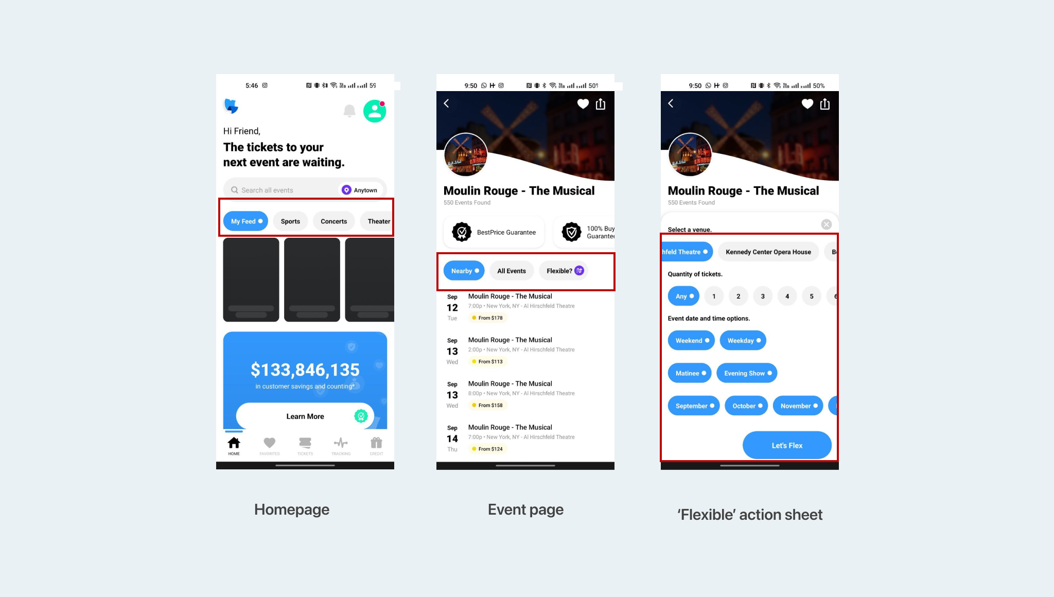
1. Navigation
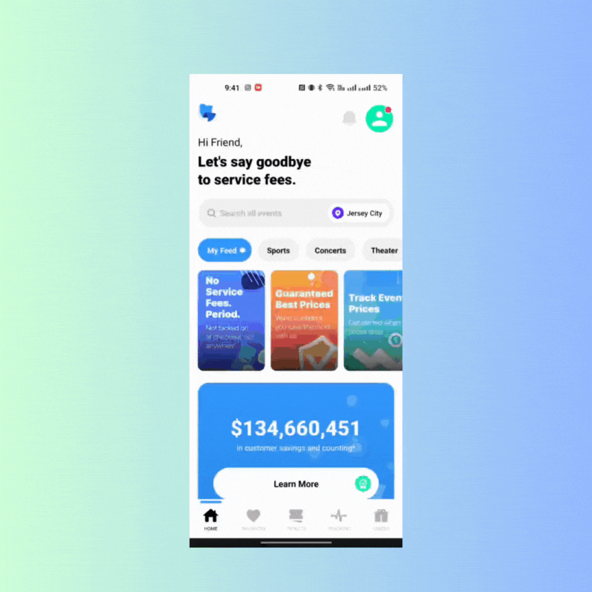
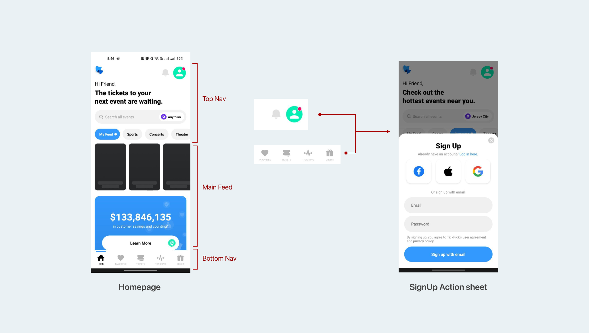
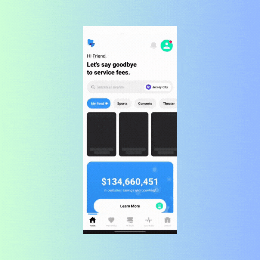
There are three sections on the homepage: the top bar- search, notification & profile features, the main feed- displaying trending events, and the bottom bar- navigation options. There are visual inconsistencies in terms of color, type, iconography and visual hierarchy in the homepage. The conceptual model of the app’s navigation is not clear, leading to confusion for users. The app doesn’t have a consistent mapping between its features and their effects. For example:
- Some icon button provided in the bottom nav and the top nav does not meet the user’s goal when tapped on. (e.g. Tapping on notification icon should open the notification page, instead the app prompts the user to log in to access notifications. The same happens to other features listed in the bottom nav and the rest of the app ).
- The red badge on the profile icon suggests to users that there is something new or noteworthy related to their profile, creating an expectation of a notification or activity. However, when they click on it and are prompted to log in, this contradicts their initial expectation and causes confusion, thus breaking the rule of visibility and mapping.
Recommendation
To improve the navigation of the TickPick app, it is recommended to establish a clear and consistent conceptual model for the app’s features and their corresponding effects. One way to do that would be to clearly distinguish between features that require user’s to log in and features that are accessible to guest users. Rather than an having a sign up action sheet constantly pop up each time users tap on a feature, they may want to be informed about the feature’s functionality, with a signup/login CTA on the main feature page itself. That way user’s would know what to expect when interacting with restricted features of the app.
2. Event page
When I began searching for events, I landed on the main event page that has a list of all the dates at different venues the event is taking place in.
- The list is never ending and the absence of signifiers meant that the app is not effectively communicating to users where they are in the infinite scroll or how many events are available in total.
- Due to an infinite list of events being displayed on the page, there are no constraints provided to users that may aide them to make a more informed and accurate decision. The lack of constraint may lead to description similarity slips where users may have difficulty distinguishing between similar-looking event blocks.
Recommendations
- To improve this, TickPick could consider implementing visual indicators like a scroll bar or pagination, to inform users about their position within the list of events. Additionally, displaying the total number of events available on the page can help users gauge the scope of the available options. By incorporating these signifiers, the app can make the user experience more transparent, aligning with Norman’s principles.
- TickPick could also introduce constraints that help users refine their choices and make more informed decisions. For example, the app could offer filtering options such as date range, location, or time, allowing users to narrow down their choices. These constraints would assist users in finding relevant events and reduce the risk of confusion caused by visual similarity among event details.
3. Inconsistent use of chips.
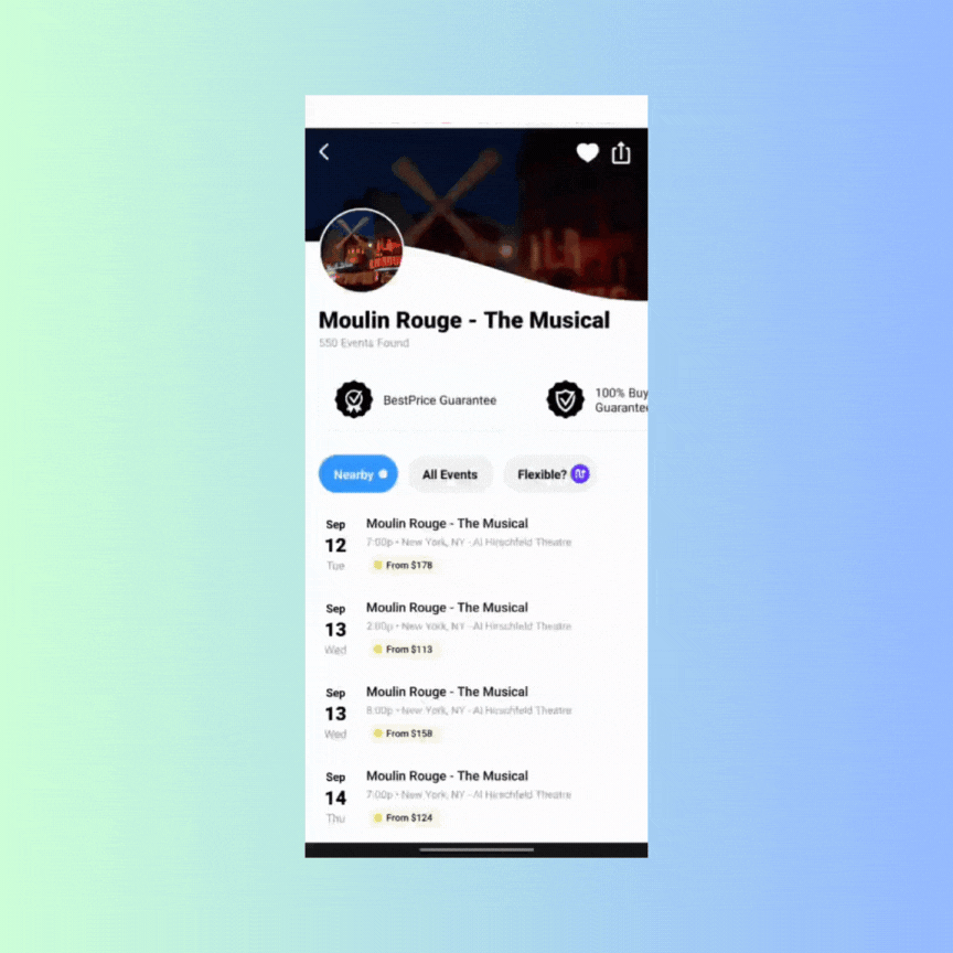
There is a gulf of evaluation because users cannot easily discern whether the chips are meant for single/multi selection or toggling between pages. Users may expect chips to allow multiple selections, causing a “knowledge in the head” problem because the system’s behavior is not aligned with their mental model. Let’s assume that through behavioural processing, they learn that the chips in the interface act as toggle buttons. Where they may likely face an experience inconsistency is when tapping on ‘Flexible’. Users may not anticipate that selecting ‘Flexible’ will trigger an action sheet with filters, creating a gulf of evaluation and execution. There is a lack of feedback regarding the purpose of ‘Flexible’ and they may not discover it’s capability until they interact with it, impacting discoverability. Users may expect chips to behave consistently throughout the app, but the variation in functionality can lead to knowledge of the world issues.
Recommendations
- The app could use distinct UI elements for single selection and toggling, such as toggle switches for toggling within the page and radio buttons for single selection within ‘flexible’.
- It is also advised to provide a clear and descriptive label for the ‘Flexible’ option, indicating its functionality (e.g., “Advanced Filters”). Additionally a more appropriate visual treatment could be given to the feature to ensure there is an understandable mapping between the control and it’s result.
Conclusion
In conclusion, the TickPick app, while offering a promising ticket-buying experience, exhibits several design areas that could benefit from enhancement to improve the overall user experience. The issues discussed in this critique can be understood in light of key principles and concepts advocated by Don Norman, offering valuable insights into areas where refinement would be advantageous. Ultimately, these improvements will not only benefit the users but also contribute positively to the success and reputation of the TickPick platform in the competitive ticket marketplace industry.