
The app Weee is the Largest Asian and Hispanic Grocery Store in North America, offering the best and most up-to-date Asian foods. Weee’s website is easy to navigate and shop from, but it’s more convenient and frequently used via iOS and Android apps. Users can add groceries to their cart and place orders, explore restaurants around them, order for delivery, and discover new products via the community.
This article will critique the Weee mobile app based on the usability factors mentioned by The Design of Everyday Things.
Overall navigation

Design brightspots
Groceries purchase is the main profit method. The cart button is displayed on the top right of each tab, ensuring high discoverability and good consistency, which makes purchases easier and more accessible. The search bar and search icons on the top of each tab meet users’ conceptual model, which is more than common in e-commerce apps. The bottom navigation bar acts as a natural mapping, connecting with the tab controls and clarifying the usage of each tab. There are five tabs: Home, Explore, Restaurant, Community, and Account. The order of the five tabs follows the usage frequency and users’ knowledge in head (what they get used to in other e-commerce apps). The icon status changes play as feedback to users, telling users which part of the app they’re currently interacting with. The tab labels work well without ambiguity: Users can predicate contents before clicking each tab.
Usability issues
Issue 1: The icons in the bottom nav bar are inconsistent: when active, the “Explore” icon is the bold icon, while others are filled icons.
Recommendation 1: Make the icon statuses aligned: regular icon for unselected ones and filled icon for selected ones.
Issue 2: The magnifier icon is used in both the search bar and explore tab, which would cause a Description-Similarity slip since users might take those as the same action and get confused.
Recommendation 2: Change the explore icon and make it very different from other icons.
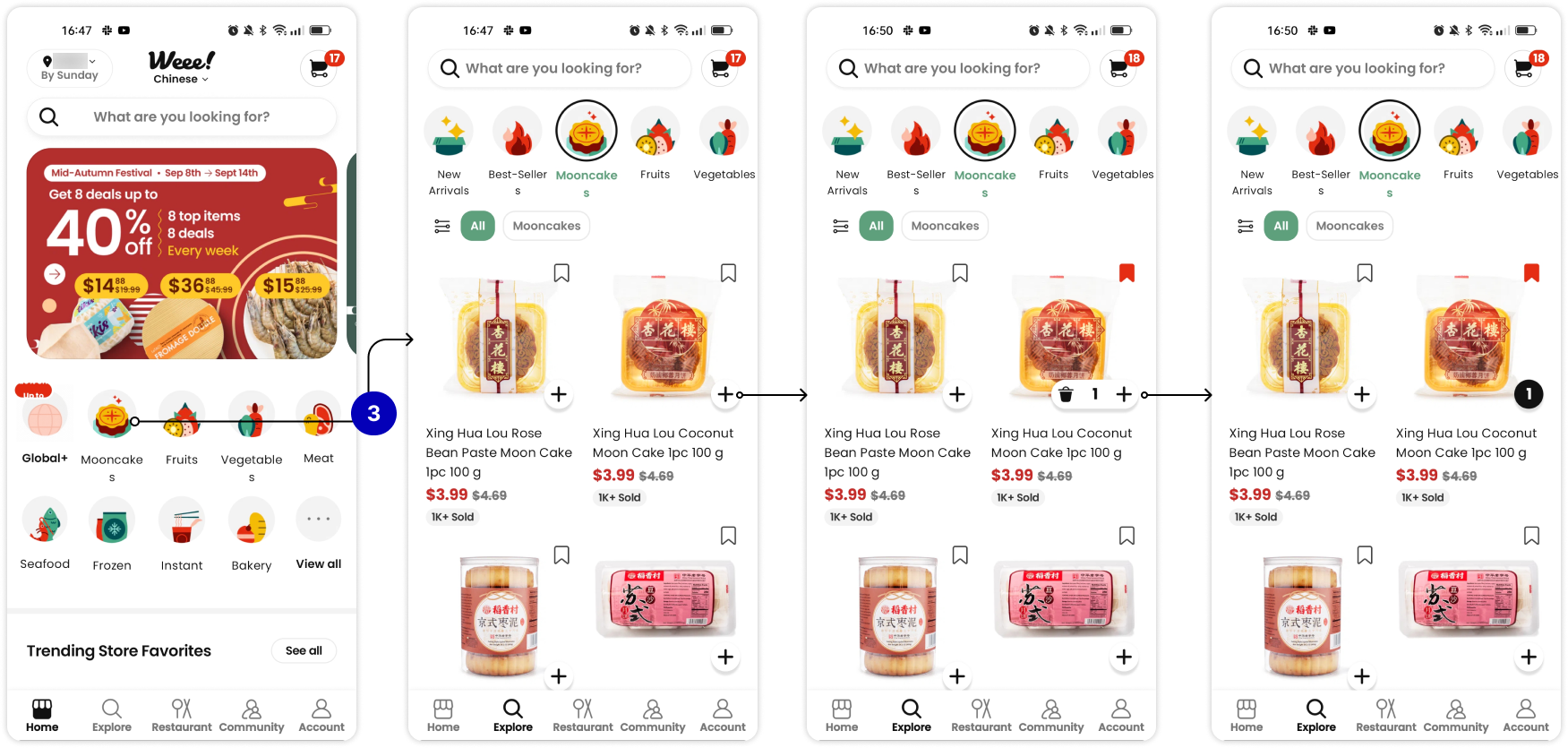
Flow 1: Add item to cart
Design brightspots
Adding items to the cart flow is seamless and clear, performing a good conceptual model and learnability for new users. The plus button of each item owns affordance for users to click and add items. After clicking, the plus icon turns into an icon set, acting as effective feedback that this item has been added to the cart successfully, and a clear signifier to edit item numbers or delete items.
Usability issues
Issue 3: When selecting one category on the [Home] page, the interface will jump to the [Explore] page without intuitive visual cues, leading to difficulty in perceiving the state of the app and interpreting the perception.
Recommendation 3: Add a horizontal scroll animation to indicate the tab switching.
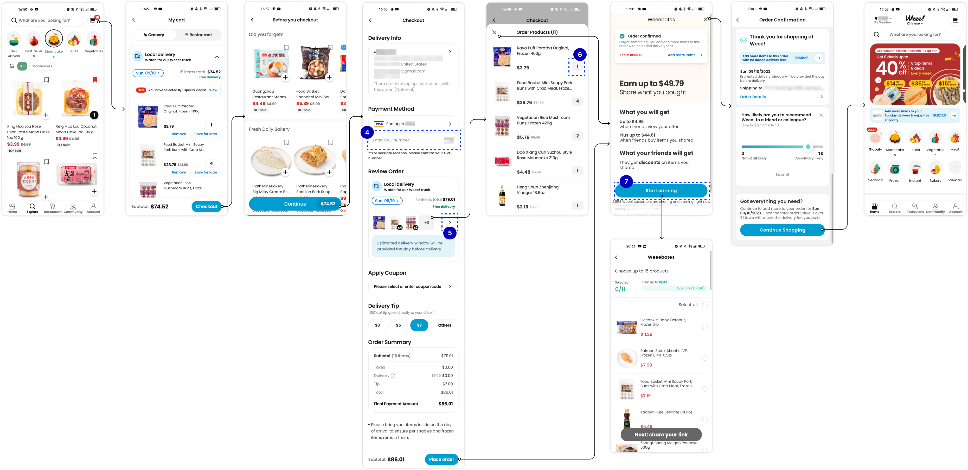
Flow 2: Place the order
Design brightspots
The checkout flow works well overall. The CTA buttons and titles on each page provide straightforward indications for the following steps (effective conceptual models and intuitive signifiers). The CTA buttons are easy to find. After placing the order, users receive confirmation information as effective feedback, which is highly visible.
Usability issues
Issue 4: In the Payment Method section: the cvc number is required to proceed with the flow, while it lacks effective signifiers. If a user misses it and clicks “Place order”, a reminder will pop up and push users to check the information again, which increases extra user effort.
Recommendation 4: Enhance the visual weight of this text field, and add indicator text with prominent colors as signifiers.
Issue 5: In the Review Order section: the right arrow looks clickable while it’s not, which is against users’ prediction. Users have to click item cards to view orders. These violate natural mapping.
Recommendation 5: Make the arrow clickable as well.
Issue 6: In the Order Products detail page: The number of item looks clickable but it’s not as well, which violate users’ conceptual model and natural mapping seriously: Users might expect to edit item information in the cart before placing the order.
Recommendation 6: Add the feature to edit the cart in the order product detail page, and make the design aligned with “add items to cart”.
Issue 7: After the user clicks “Place order”, users would expect to see the confirmation information immediately. However, the most prominent information and CTA on the next page is to recommend the app to other friends, which doesn’t match users’ expectations (conceptual model) and will affect user satisfaction. (It probably is designed for business growth.) To exit this page, the user has to click the cross icon on the top right to enter the confirmation page, which has low discoverability.
Recommendation 7: Provide confirmation feedback instantly after the user clicks “Place order”. Move the step “Earning” after confirmation.
Flow 3: Edit address

Design brightspots
The address management flow works quite standard. Constraints are used when users input the address or delivery date: to avoid entering an invalid date or state and causing errors, users are only allowed to select the available dates or valid states instead of entering free text by themselves.
Usability issues
Issue 8: The address management access in the [Home] page is not intuitive enough: low discoverability. Some users might not be able to find it at first glance and will jump to the [Account] page instead.
Recommendation 8: Improve the visual weight of address information to enhance findability.
Summary
In summary, Weee is mostly designed following Norman’s principles. However, it still has room for improvement in usability. Especially in the check-out flow, it’s important to balance the business goal (eg: user amount growth) and user need (easy and seamless experience).