Via Jersey City : Like a ride share, but better!

Via Jersey City is a ride-sharing application designed to provide residents and visitors in Jersey City with convenient, affordable, and on-demand transportation solutions. Serving as Jersey City’s on-demand public transportation service, Via offers seamless connectivity to the PATH and various other destinations. With just a few taps, you can book a shared ride and be picked up by their distinctive and comfortable purple vehicles. Whether you’re commuting or running errands, it aims to offer a hassle-free transportation option that won’t strain your budget.
Today, I’ll explore some potential adjustments to the app aimed at improving the overall user experience. Let’s begin!
1. User onboarding process
PROBLEM
Difficulty in discovering registration CTA
Users begin by launching the app and providing their essential information such as Name, Email, Password, and Phone number during registration. However, a common issue arises where users experience confusion due to the absence of a CTA to continue with the registration process in the expected location. Furthermore, there is a risk of users overlooking the statement that reads, “By pressing ‘Next,’ you agree to Via’s Terms of Use and Privacy Policy.” I also believe that the term “Next” doesn’t serve as a clear signifier. Typically, “Next” implies that there are more steps to follow, potentially confusing the users.

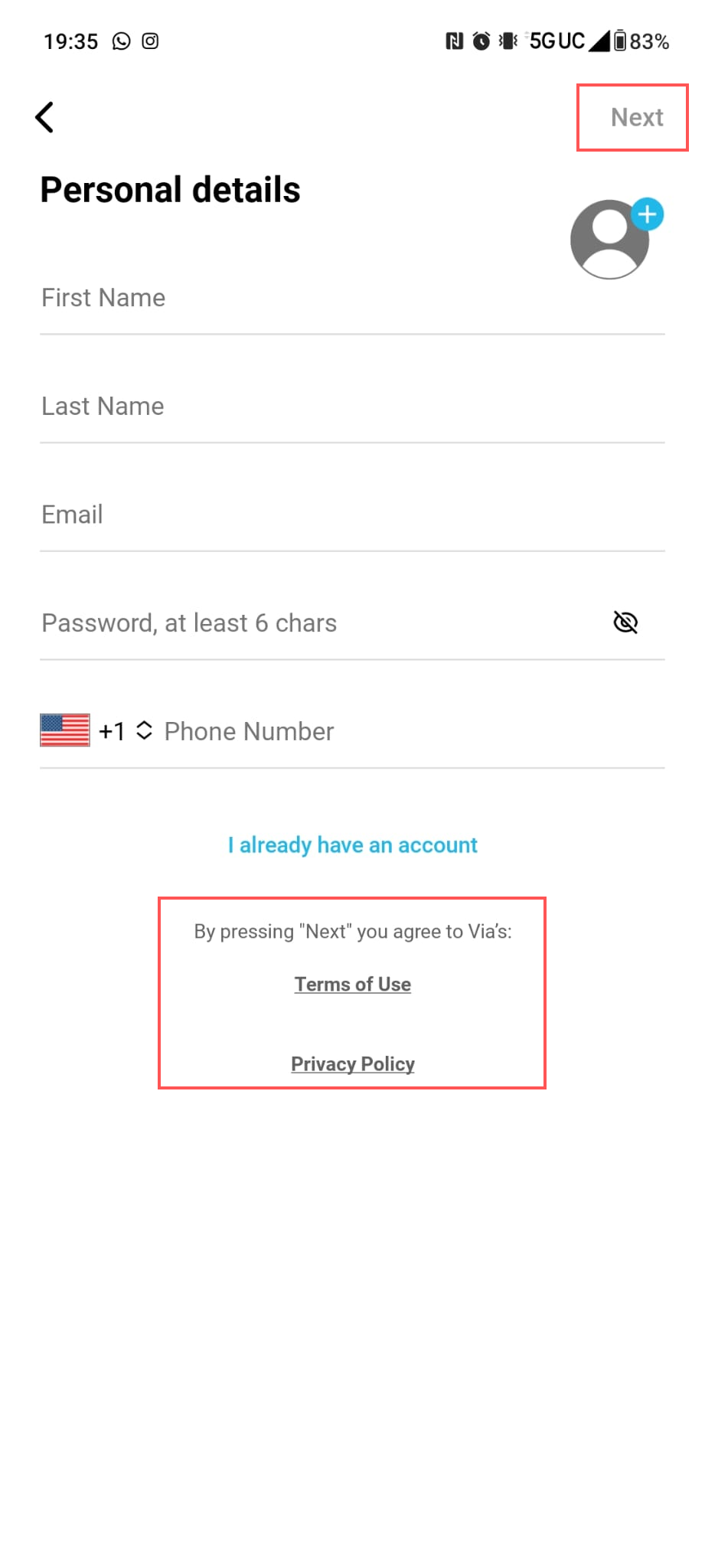
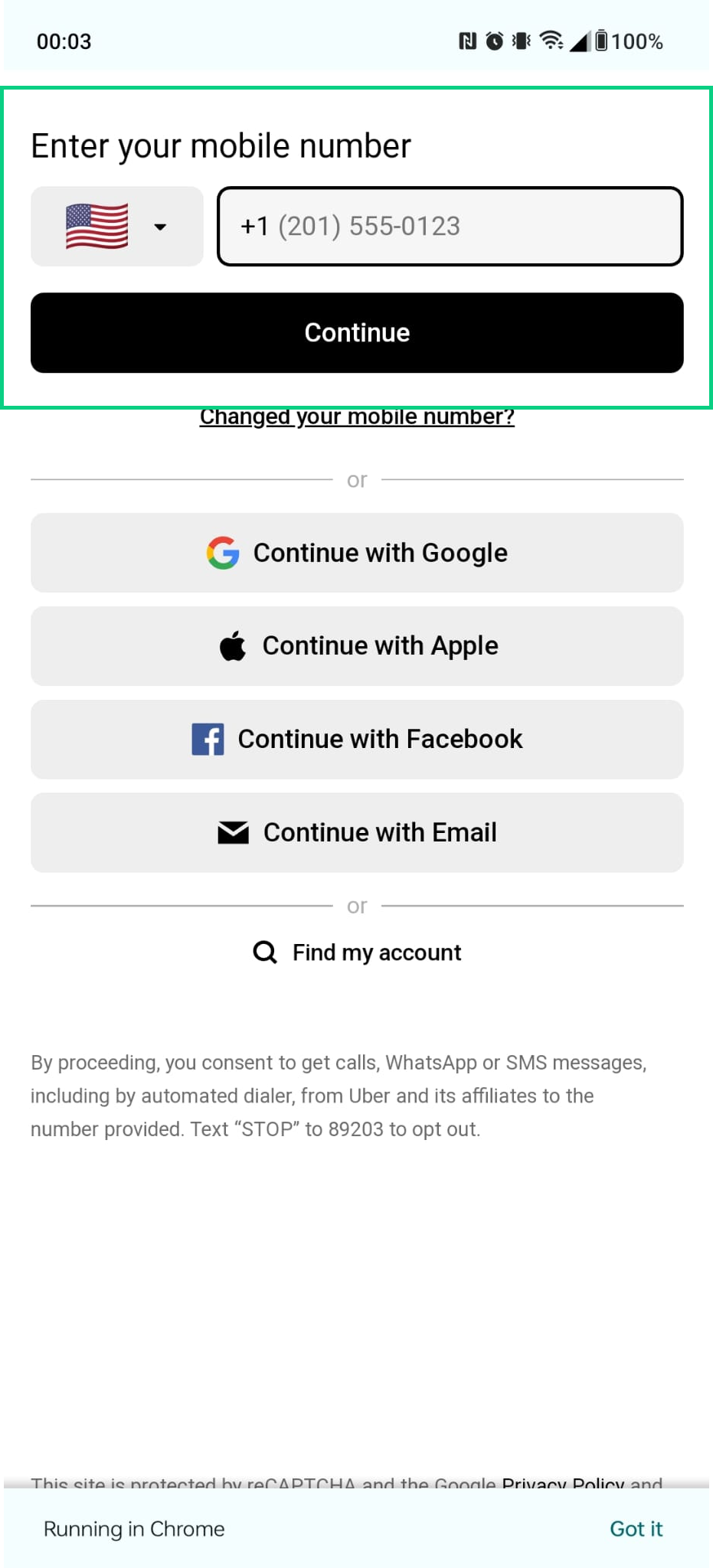
Solution
Changing the position of CTA
To address this issue in Via’s onboarding process, I propose improving the discoverability of the “Next” button. Placing this button directly below the last field (see CTA positioning in fig 3) that users need to fill out would greatly enhance its visibility. This change aligns with Norman’s Discoverability principle and ensures that users can easily find and proceed with the registration process as expected. By doing so, we’ll provide a more user-friendly experience and better adhere to Norman’s Knowledge in the world concept. To provide clearer guidance, I recommend changing the label of our Call to Action (CTA) button from “Next” to something like “Sign in” or “Login.” This change in terminology will better convey the action users are about to take, reducing any potential ambiguity in the process.

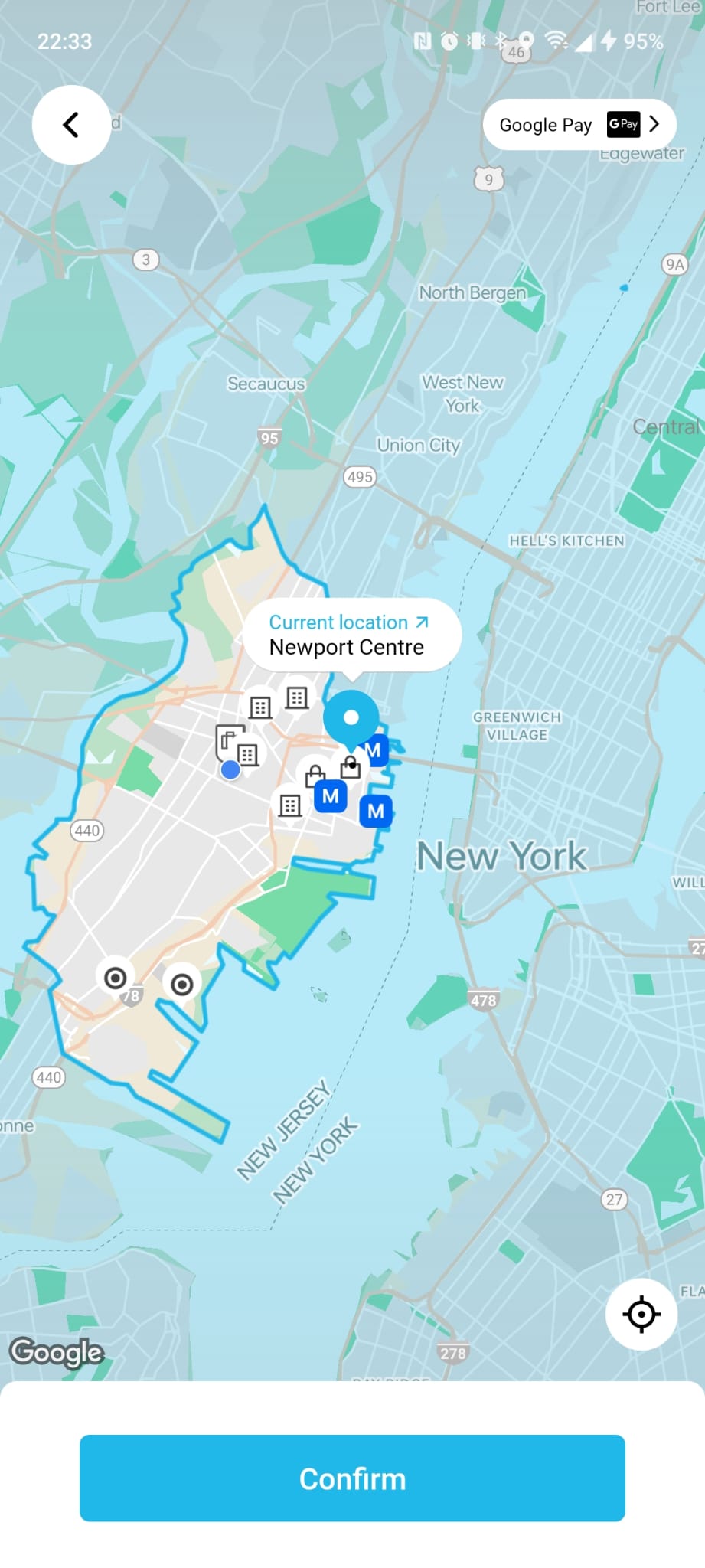
2. Choose a source or destination
PROBLEM
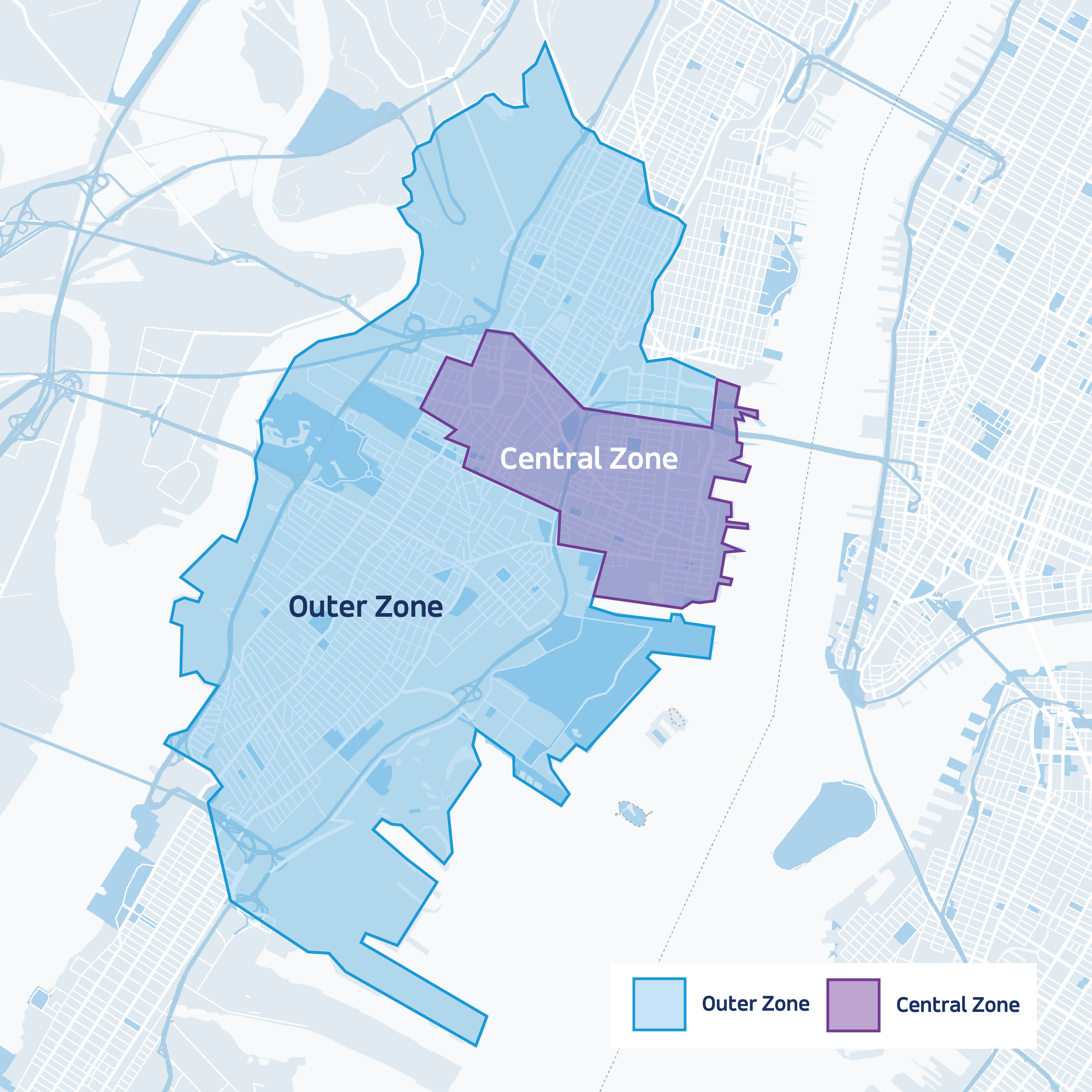
No differentiation for Source and Destination Zone Modes
In Via’s system, it is difficult to easily identify out-of-zone areas on the map. Even though these out-of-zone areas are correctly displayed in grey, they are still enclosed by a blue border that overlaps with active regions. Additionally, certain locations may be within the service zone for the source (See Fig 3. See current location Newport) but outside it for the destination(See Fig 3. Destination Newport). Although the system appears to operate with two distinct modes for source and destination, users might struggle to discover and differentiate these functionalities. This design element leads to confusion as it remains unclear whether a specific area is situated inside or outside of the service zone and fails the concept of gulf of execution as well as discoverability.

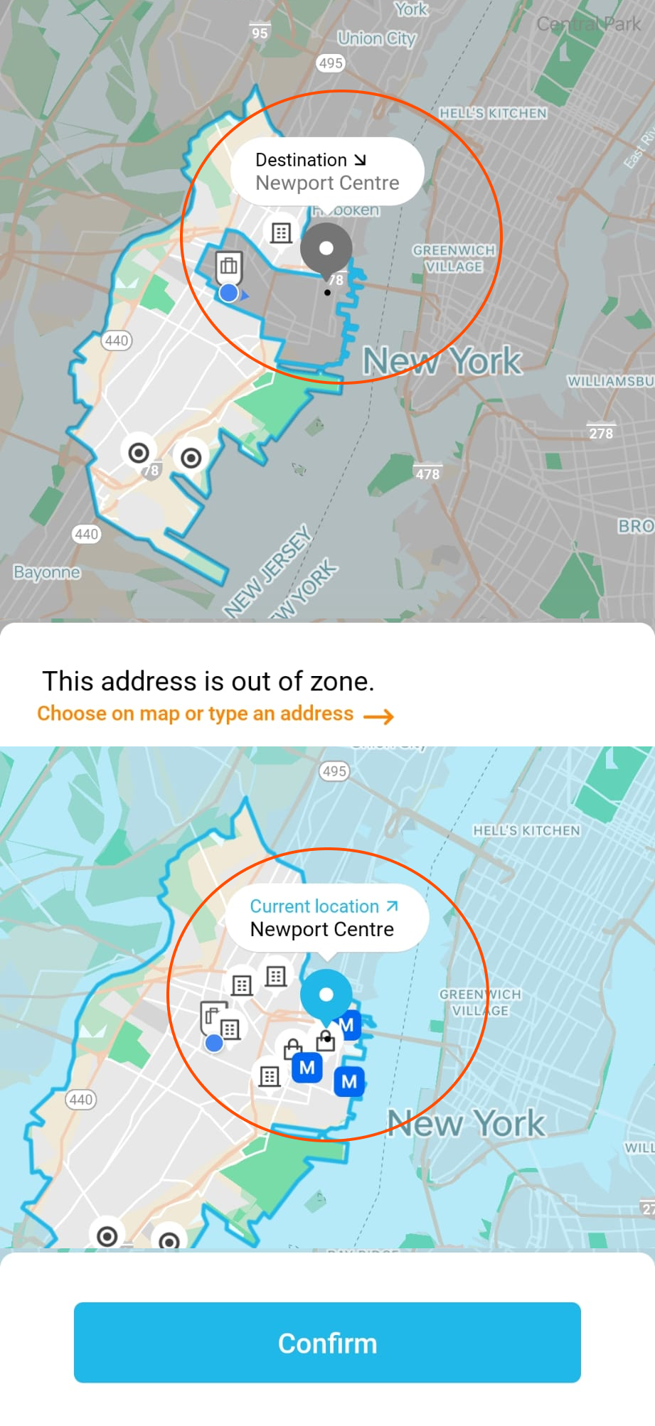
Solution
Use a consistent color scheme and alter the dropdown layout
The system should actively assist users in discovering whether their chosen source or destination falls within the service zone. By providing this information directly in the location drop-down menu, users can quickly discover the availability without having to navigate through multiple screens or processes #Discoverability. Additionally, adopting a consistent color scheme on the map as an overlay, akin to the distinctive colors for source (blue) and destination (orange), will help users easily understand the state of the system, mitigating confusion #GulfofExecution

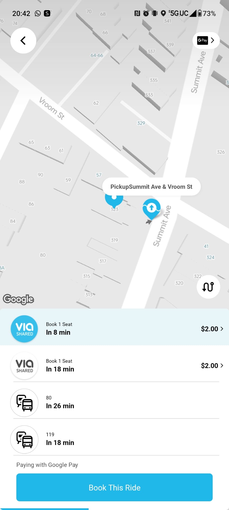
3. Choose no. of riders
PROBLEM
Traveling alone? No.
While using Via, a ride-sharing app that initially appears to operate like Uber share, where users can book only one seat, I encountered an unexpected feature: the ability to select multiple seats under the label of “Traveling alone?”. However, this option is not easily discoverable, requiring careful scrutiny to locate it. Furthermore, this means users must remember the position of this feature to use it efficiently. A notable issue arises when users select their pickup location; they are redirected to a new screen, and the “Traveling alone?” option disappears. This situation relates to Norman’s Knowledge in the head concept, as users need to remember to choose the number of passengers before proceeding to choose the pickup location. The absence of clear hierarchy in these actions adds complexity to the user experience.

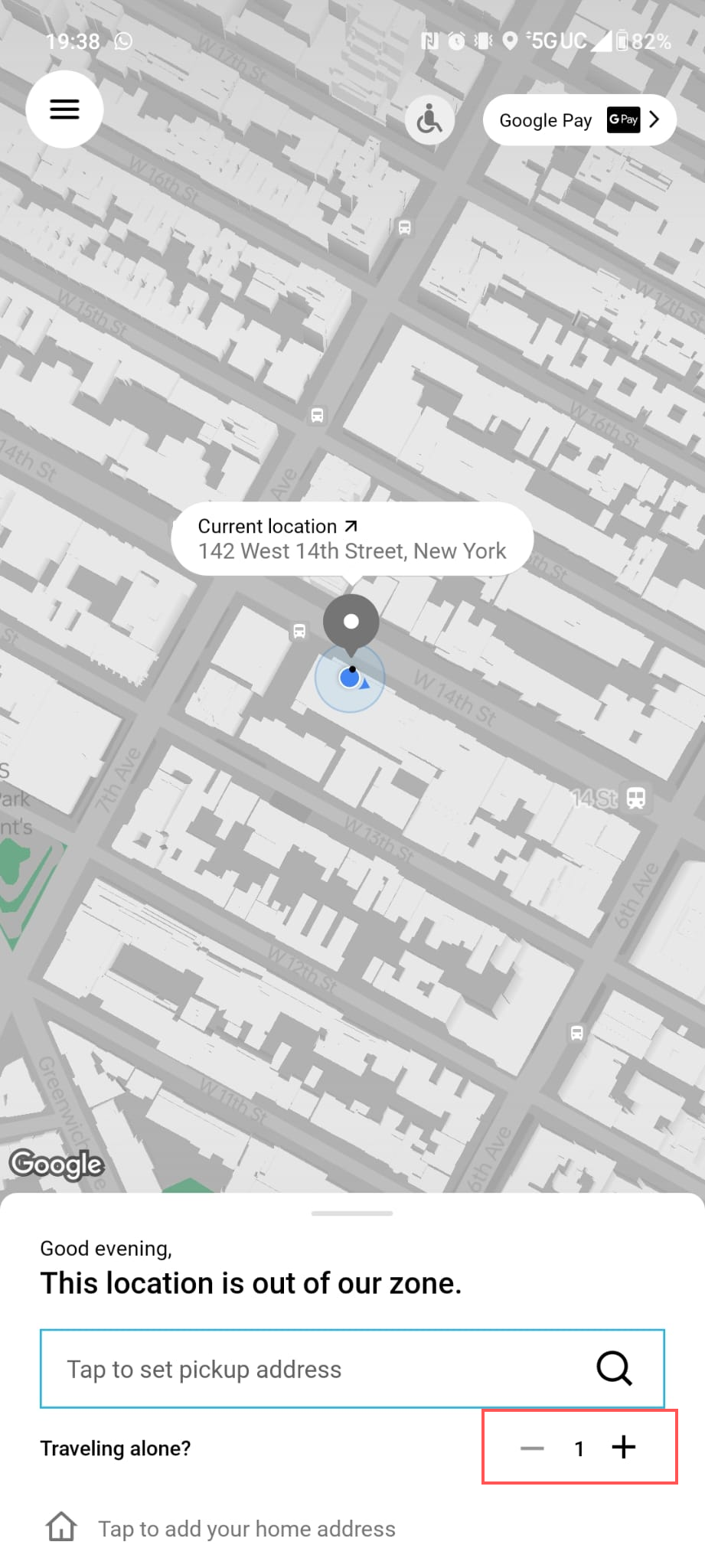
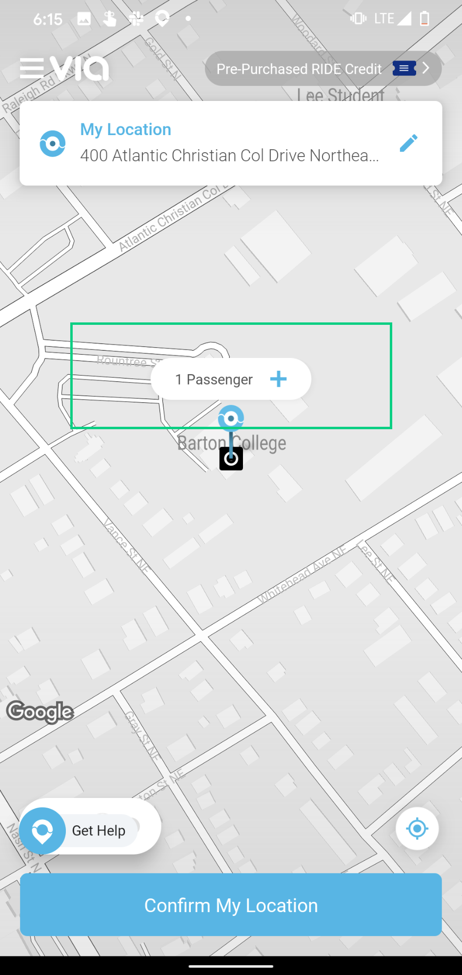
Solution
Old is gold
To address the issue, I suggest retaining the original feature from Via’s app (as shown in the figure) that allows users to add more passengers directly on the map pin when they choose their pickup location. This approach ensures that users have the option to select the number of passengers seamlessly after choosing the pickup location, avoiding any disruptions in their flow. Placing this feature directly in front of users as part of the natural workflow eliminates the need for them to discover it or remember it separately, thereby enhancing the user experience. The user would just have to go with the flow! Optionally, I would also suggest relabeling it from “Traveling alone?” to a simple “Add more Passengers” or “Book multiple seats” to keep the context straightforward and clear.

4. Payment option
PROBLEM
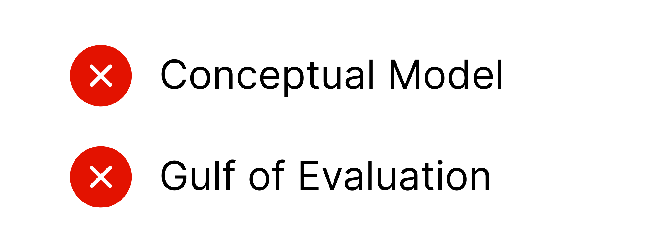
No option to Choose Ride Credits as Payment Method
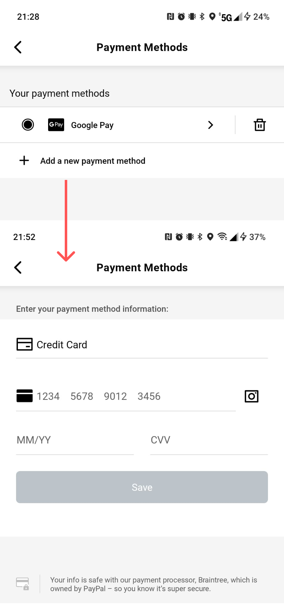
While Via’s marketing strategy of allowing users to share promo codes and refer friends for $10 Via credits (equivalent to 5 free rides) is appealing, there’s a frustrating aspect to this system. Users are not given the option to choose ride credits as their preferred payment method. Instead, they are compelled to add a debit/credit card and automatically select it as the payment method when booking a ride. This creates confusion because, although the payment ultimately comes from the credits, there is no clear indication of this process. In some instances, both the user’s card and credits are charged. This contradicts Norman’s conceptual model principle since there’s no clear instruction on how to pay using ride credits.
Additionally, users don’t receive immediate in-app feedback about payment success; instead, they get an email confirmation, which is not instant. This results in an increase in gulf of evaluation because the users cannot interpret if their action was successful.
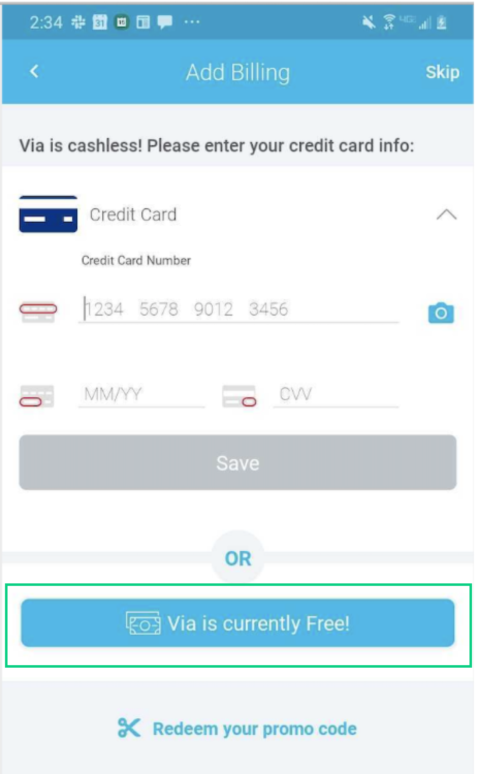
Solution
Let users choose their payment method
Revise the system to offer users the choice of ride credits as a payment method when booking rides. Ensure that this option is visibly presented during the payment process, allowing users to easily select it if they wish to use their credits. Additionally, provide clear and transparent information regarding the payment process, explaining that credits will be used as the primary payment source. Surprisingly, Via’s older version did have this option.(See Fig 8) By changing the label from “Via is currently Free!” to “Pay using free ride credits” this layout should meet our needs!
When a payment is made, users should receive a clear and real-time notification within the app, confirming the transaction’s success. This immediate feedback assures users that their payment has been processed without delay and reduces the gulf of evaluation. Simultaneously, the subsequent email confirmation can serve as a secondary record for users’ reference.
Conclusion: Via is already making commuting easier for residents. These simple fixes will improve the user experience and make navigating the app even more straightforward.
Disclaimer: The observations provided here are derived exclusively from my initial personal experience using this app. It is important to acknowledge that individual user experiences may vary significantly.
Thanks for reading!