
Shein is an online fashion retailer known for offering a wide range of affordable clothing, accessories, and beauty products for women, men, and children. The Shein app is the mobile application version of the Shein website, allowing users to browse, shop, and make purchases directly from their smartphones and tablets. Let’s talk about it in depth using Don Norman’s principles of Design and the stages of action.
GULF OF EXECUTION
1. GOAL – User wants to shop for clothes
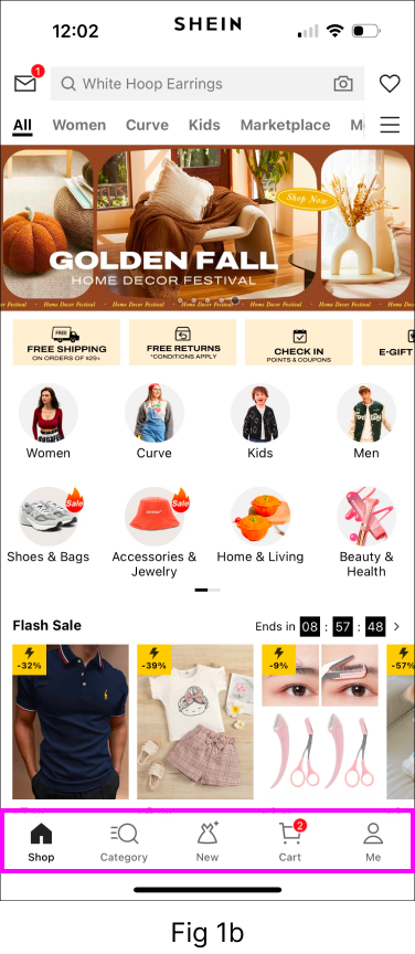
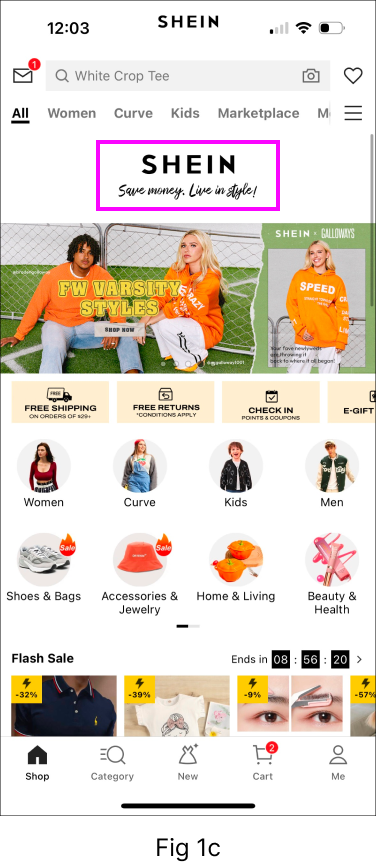
The Shein app’s home screen (Fig 1a) typically displays featured products, promotions, and categories, making it discoverable for users to access the key functionalities and start shopping. The icons used in the navigation bar (Fig 1b) for Home, Category, New and Cart act as signifiers thus leading to good understanding of each tab. The app does a great job of mapping user’s activities, including looking through and purchasing items, to the right response. The app provides feedback by showing a Shein logo animation on the top (Fig 1c), after the user refreshes to view the reloaded data, making sure that the user understands that the action has been taken and is now completed.

2. INTENSION – User wants to search for white dresses
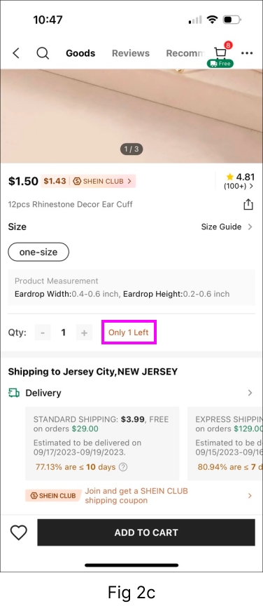
When the user searches for “white dress” in the search bar, they see a list of white dresses popularly searched for (Fig 2a). This section increases discoverability and helps the user in narrowing down the number of items for a particular category thus making it more convenient for the user to go ahead in the process. When the user clicks on “Search” in the top right corner, the app provides feedback by redirecting the user onto the next screen where the filter “color-white” is already applied (Fig 2b). This is Shein’s way to deal with mapping content after filtering. There is also a back arrow that signifies that the user can go back to the previous page. Shein enforces constraints to prevent users from adding products that are out of stock or have limited supply to the cart (Fig 2c). Although Shein accomplishes that, it will be a better practice to provide the user with a specific feedback, like an animation, in the event that they attempt to add more items than are now in stock.


3. EXECUTE – User adds item to the cart & places the order
Now when the user adds the dress to the cart, the app provides appropriate animation feedback showcasing that the item has been added to the cart.
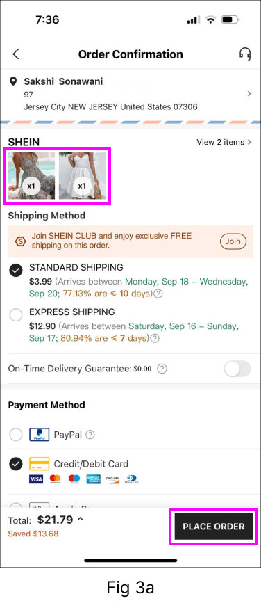
On the checkout page, the user can place the order by clicking on “Place Order” button which acts as a signifier. After the order is placed, the user receives an email which acts as a feedback to placing an order (Fig 3a).
But what if the user wants to delete a particular item or add more of it? There is no provision on the checkout page to do so. Here is a solution for the same (Fig 3b). Incase the user wants to add or remove a product, they can simply click ‘+’ or ‘-’ on either side of the mentioned quantity. The user can also click on the ‘delete icon’ on the top right corner of the image to remove that product completely from the cart. These added affordances will make it convenient for the user to take the required steps and not make them feel helpless as such features are a part of the user’s learnt behavior.


GULF OF EVALUATION
The Gulf of Evaluation, a concept from Don Norman’s principles of design, refers to the cognitive effort a user must make to understand system status, feedback, and how to interpret the information presented. In context of Shein app, we have seen multiple examples where this theory works very well. The app has good discoverability of features, mapping is done well, affordances are clear, signifiers are logical, constraints are specified and feedback is instant. Overall, the app has a good Conceptual Model as per Don Norman’s principles and stages of actions. But not to forget, any application always has the scope to better itself for incremental growth and success.