

Overview
To eradicate global poverty, Concern Worldwide, an international organization based in Ireland, recently relaunched its website to attract donors. Due to the current lack of historical user behavior data, our research aims to understand user behavior, focusing on increasing Concern Worldwide’s donor base in the United States. Our 12-week study highlights donors’ preference for causes that align with their interests and transparency in giving. We identify obstacles in the donation process, provide recommendations to improve the website’s usability, and advance Concern Worldwide’s mission through user-centric strategies.
Meet Our Team

My Role
Recruit eligible participants
Plan and conduct Eye-tracking testing on 2 participants.
Observe and summarize eye-tracking test results for 2 participants
Compile a list of issues identified in usability testing
Consolidate recommendations for addressing usability issues
Create the visual summary based on findings and recommendations
Contribute to crafting a presentation and incorporate video clips from the eye-tracking tests
Participate in presenting identified issues and proposed recommendations to the client
Meet Our Client
Dan Rocklin — Marketing Manager at Concern Worldwide
Tools
Tobii Pro Eye-tracking Software, Figma, Hotjar, Google Analytics
Timeline
12 Weeks
Our Process
Design a study for Concern Worldwide with the known requirement of incorporating eye-tracking
Define Research Objectives & Research Questions:
Based on the communication with the client, we aim to test user behavior on the Concern Worldwide website, identify areas for improvement, and evaluate the impact of the new site on donor conversion rates. Specifically, it is crucial to investigate engagement metrics in key desktop priority areas, such as ultra-high-traffic pages, news pages, project profiles, and top Google Analytics landing pages. The average donor to the site is currently a 50-year-old highly educated and relatively wealthy individual. We plan to study the behavior of Concern Worldwide users because we want to find out what attracts users before taking action so that we can increase Concern Worldwide’s donor base in the United States.
We have summarized the above information into four research questions:
- What parts of the website encourage or discourage donations?
- What content are the users drawn to?
- What is the last point of contact before users sign up for emails/donate?
- Are there any hindrances in conversion journeys?
Specify Participant Selection Criteria:
We were seeking participants who met specific criteria for our study. Those eligible should possess proficiency in English, fall within the age range of 30 to 60 years with a flexibility of +/- 5 years, and express great interest in charitable giving. Participants must be able to physically come to the Pratt Manhattan Campus to complete the test in person. This targeted profile ensures that our study includes individuals who align with the demographic characteristics relevant to our research objectives.
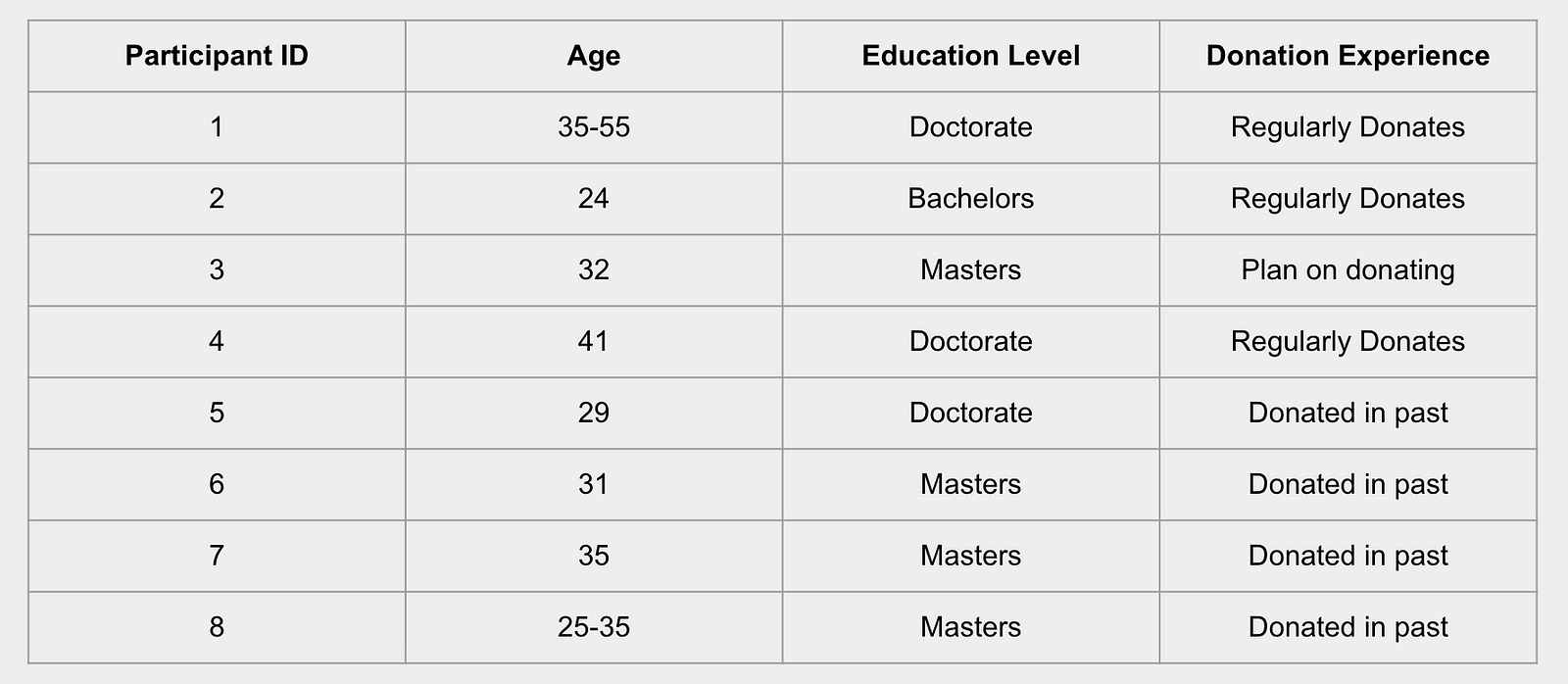
Demographics of Actual Participants:
Designing Research Tasks:
Task 1: Explore the website
The goal was to find out which content is attractive/confusing
Task 2: Sign up for email updates
The goal was to evaluate the visibility and accessibility of the email sign-up section.
Task 3–5: Making a donation
The goal was to evaluate the donation flow through multiple channels (individual, employee matching, retirement, etc) and to find out if there were any hindrances to completing the donation.
Conduct Tests & Collect Data:
We selected eight eligible participants from the recruitment form and invited them to Pratt Manhattan Campus for the Eye-tracking test. Each test will have a team member moderate it, and another team member will participate using Zoom as a remote observer. Tobii Pro Eye-tracking Software was used as the leading test equipment.
After the participants follow the prompts on the computer screen to complete the task, we will replay the video recording of their eye tracking and let them watch it while explaining their thoughts.
We used Tobii Pro to export the data generated after the test, such as Heat Map, Gazeplot Map, etc. Each team member also compiled a summary of the participants’ information for the sessions they conducted for later review.
Analyze data and compile Findings
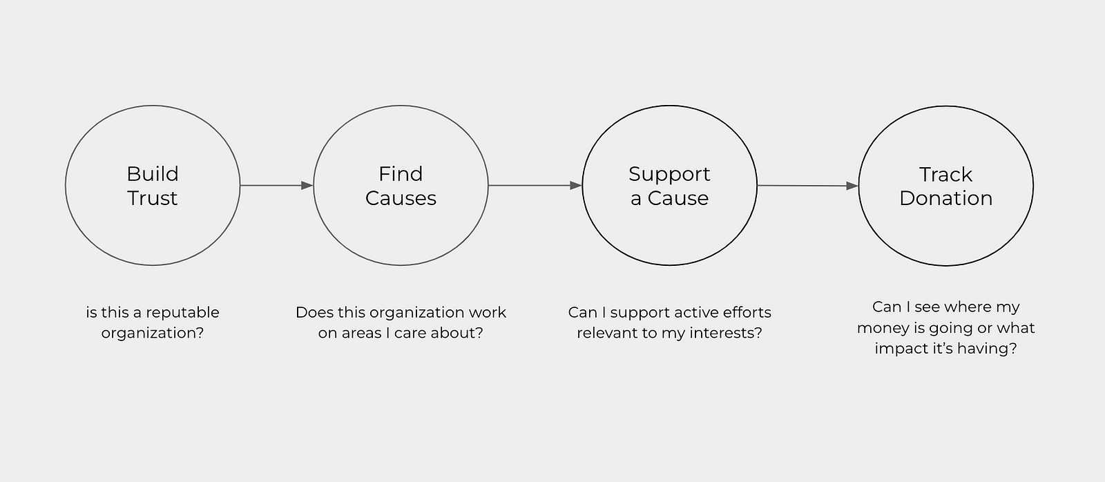
Through our eye-tracking study, we crafted this donation journey based on observations and participant feedback.
Overall Findings:
Overall, the participants in our study demonstrated a high level of trust in the organization that followed the world, with all eight participants expressing confidence in the organization based on their experience with the website. Most people find this site quick to navigate and rate it as easy to use. In addition, seven out of eight participants reported feeling very confident when interacting with the website, and all participants successfully navigated the process of matching contributions with employers. Some participants showed confusion in various donation categories, including pension-based and monthly contributions. An exciting finding appeared in the retrospective read-aloud. Seven out of eight attendees said they were hesitant to make an actual donation, highlighting that improvements could still be made to increase users’ motivation to donate.
Findings & Recommendations
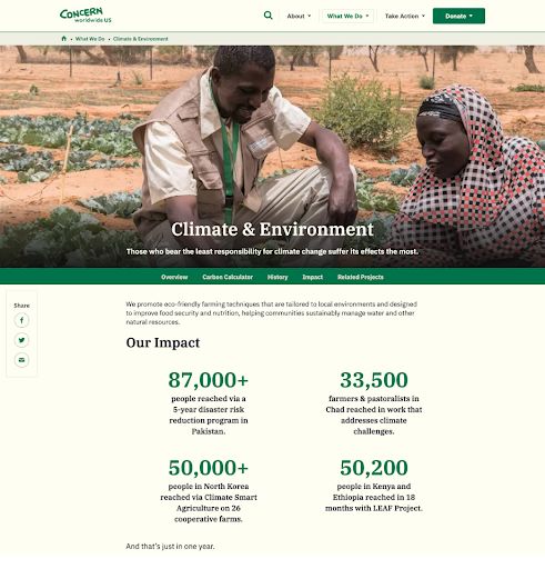
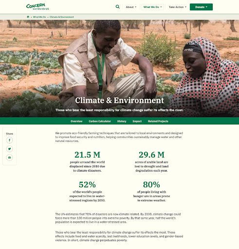
Finding 1: Blurred Information
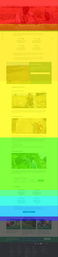
Once users establish trust in the organization’s authenticity, they seek alignment with their interests by exploring Concern Worldwide’s work. Testing shows that participants tend to explore the ‘Browse Our Work’ page. While the organization’s broad scope captures diverse interests, the overwhelming volume and relevance of projects present a challenge. There are 3 out of 8 participants briefly browsed statistics on the “Climate & Environment” page but lost interest due to perceived generic content. The captions beneath these attention-grabbing statistics fail to explain the meaning behind these numbers. Heatmap data from Hotjar indicates that critical statistics are currently displayed where less than 50% of users scroll, suggesting an opportunity for strategic content positioning to enhance user engagement.

Recommendation 1: Curate Information to Help Users Find Causes
We recommend repositioning the ‘recent impact’ statistics to the top of the page and utilizing color differentiation for percentage (%) and numerical stats. This visual enhancement will effectively highlight Concern Worldwide’s recent contributions, work, and accomplishments, providing a more engaging and impactful user experience.
Finding 2: Easily Overlooked In-page Navigation
During the testing process, we observed that all participants found the current in-page navigation confusing, and feel hesitating to use it. The provided video clip is a genuine excerpt from the actual testing session. This footage illustrates participants’ eye movements lingering on the in-page navigation, but they never truly engage with it throughout the entire session. As this participant goes through her thought process, she states, “I think this is a tab that can lead me to a new page. I wish it was more apparent in letting me know what it’s doing.”
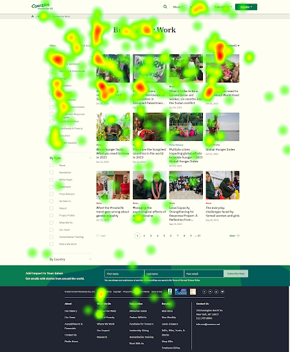
Utilizing screenshots from Tobii and Hotjar, we aimed to gain additional insights into user feedback, with Hotjar offering data beyond our participants. The Hotjar movemap visually depicts users’ mouse movements on the screen, while the ‘Click Map’ illustrates the specific areas on the page where users are clicking. The analysis of these images reveals that the user under observation explored the in-page navigation but ultimately decided against using it, suggesting a potential usability issue with this feature.


Recommendation 2: Sticky Vertical In-Page Navigation
Building on our previous findings, we strongly recommend transitioning the in-page navigation from a horizontal to a vertical layout. Vertical navigation tends to be more user-friendly, offering intuitive visibility without requiring users to visually scan for it. This layout provides scalability and aligns with the stronger usability associated with left-side navigation in widely used web applications like Gmail and Slack. Simultaneously, we suggest integrating the Share box with the navigation to enhance visibility and encourage increased usage. Introducing a sticky navigation feature will further elevate user interaction. Additionally, implementing vertical in-page navigation universally across all pages will significantly enhance information visibility, offering a comprehensive overview of covered topics on each page and dynamically updating the highlighted section based on scroll-to-anchor recognition.


Finding 3: Newsletter Visibility
There are seven out of eight participants overlooked the newsletters, both when embedded in an article and in the footer, with one participant stating, “I am not ready to sign up for newsletters yet.” Even when actively seeking ways to connect, the footer sign-up button was often overlooked due to poor visibility. Only one participant noticed the footer due to its large size on the home page. The current sign-up prompt, “Add impact to your inbox” failed to capture attention effectively. Additionally, three out of eight participants navigated to the “Attend an event” page, and three of them navigated to programs and impact-focused pages as alternative means to stay connected with Concern Worldwide, while the newsletter was overlooked in the video footage.
Recommendation 3: Make the footer Newsletter stand out
We recommend establishing a clear expectation that motivates participants to sign up for newsletters, such as offering invitations to upcoming events, donation allocation updates, program updates, etc. And also, we suggest enhancing visibility by adding contrast to the form fields, as demonstrated below. This will not only draw attention to the newsletter sign-up but also improve the overall user experience, increasing the likelihood of user engagement.


Finding 4: Users are unable to donate to projects of their interest
Six out of eight participants expressed a strong desire to make donations to specific causes, signaling a clear preference for targeted contributions rather than general donations. It was observed that users, in general, lacked awareness of Concern Worldwide’s model of general donations, actively seeking avenues for specific forms of contribution. A participant articulated this sentiment, stating, ‘I focused on Emergencies & Refugees, but I won’t feel like the money will direct to it.’ The video evidence further underscores participants’ efforts to find a means to donate to projects of personal interest. This finding highlights a need for improved communication and visibility regarding Concern Worldwide’s donation model to align with user preferences for targeted giving.
Recommendation 4: Consolidated Donations
We recommend the implementation of sections to orient users, clarify their options, and manage expectations for their actions. To enhance transparency, we propose the inclusion of a paragraph explaining Concern Worldwide’s policy for general donations. To streamline the donation process, we suggest prioritizing and grouping donations handled by the main donation widget. Additionally, we recommend the creation of a dedicated “More Ways to Give” section to accommodate options that fall outside the scope of the donation widget, providing users with a comprehensive overview of various giving opportunities.


Conclusion
In understanding user behavior, it becomes evident that transparency is a critical factor for donors seeking alignment with personal causes and clarity in donation allocation decisions. However, the challenge lies in the visibility and information hierarchy on Concern Worldwide’s website. Despite hosting a plenty of information, it is not consistently easily discoverable for prospective donors. To address this, we recommend a strategic approach of curating information on the website in a concise and targeted manner. This enhancement aims to foster both trust and interest in the donation process, ensuring donors can readily access and comprehend the information relevant to their decision-making. We aspire for users to get the needed information with minimal clicks, empowering them to make donations seamlessly.
What We Can Do Better
Our initial stages of formulating the research plan and recruiting participants proceeded smoothly. However, unexpectedly, we did not find many individuals who met the age requirements and had prior donation experience. If time allows, we would like to seek more participants who better align with the specified criteria. During the use of Tobii Pro, we encountered some technical issues that we hope can be addressed in future improvements. Collaborating with a real client has been a valuable experience, and I believe that maintaining closer communication with the client could yield more feedback for future enhancements.