CONTEXT
MHM’s website had become stale: a crucial yet underutilized point of contact for Young Visitors
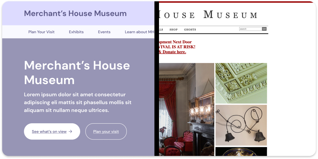
The Merchant’s House Museum is New York City’s only 19th century home preserved intact, with original family furnishings and personal belongings of the Tredwell’s family. Despite the visitation numbers reaching pre-pandemic levels, the museum still struggled to appeal to young visitors. This project aims to restructure the museum website and make it more engaging to increase the footfall of young adults.
My role was to identify the needs of young adults and to create medium-low fidelity wireframes for desktop and mobile responsive website.
I like historical things. So I DO want to check out the merchant house eventually once it gets cooler.
– Interview participant 2
RESEARCH
What do young museum visitors care about?
For starters, we analyzed MHM’s website and compared it with other museum websites to identify the existing issues and potential opportunities for redesign. But, before we moved on, it was crucial to understand what makes an enjoyable museum visiting experience for young visitors.
We interviewed 6 young museum-goers (aged 18 – 35 years) to understand their visit planning, factors influencing their museum choices, and the ticket booking process. We found out that, young visitors prefer:
1. Easy access to ticket prices, museum hours, and location
“The ones (websites) I found it difficult to use are those where I it’s difficult to find new information like operating hours or to book tickets really fast or easy.”
– Interview participant 4
Aside from the current exhibits, essential information like location, ticket prices and opening hours influence their decision on which museum to visit. So, they expect museum websites to provide easy access to such information.

2. Match their schedules with tour timings especially when going with a company.
“I go to museums has exhibit that I like and it also fits my schedule.”
– Interview participant 2
“Maybe I’ll look it (tickets) up at the beginning of the week, and ask a friend to go with me on the weekend or maybe on a special event day, on one of the days that week.”
– Interview participant 1
Young visitors often spend time planning their visits by considering specific factors such as the company they’ll be with and any special events or exhibits. This highlights the significance of scheduling flexibility and the consideration of both personal and social calendars when preparing for a museum outing.
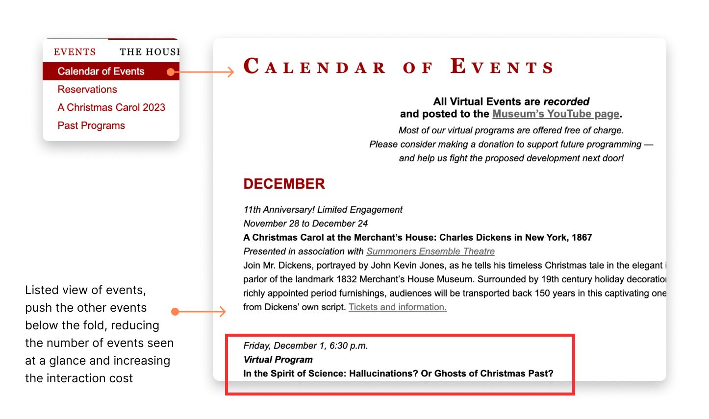
Currently, MHM presents complete list future events in a text-heavy format. Readability is hampered because of small text size and edge-to-edge sentence length. The ticketing information are present in form of hyperlinks which gets missed because of the grey link color.
3. Websites with unique layout, and crisp information and engaging visuals.
“What I loved is that they got really creative. It didn’t look like just the typical formats that we see. You could tell everybody’s probably using the same stuff where it’s like columns, and everything fits in a box. But when I looked at this particular website, I felt like I was experiencing a curation of something.”
– Interview participant 1
Young visitors tend to scan the museum website to understand the vibe of the museum and what they can expect to be seeing at the museum. Because of their shorter attention spans, they like to get quick highlights rather than reading long blocks of textual information.

Although MHM offers rich content, its presented in an outdated fashion. It has very traditional layout or is text-heavy creating a cognitive overload, hence discouraging users to engage with the material.
Goals for redesign
1. Create a well structured and easy-to-follow content
2. Provide a seamless ticket purchasing experience
SOLUTION
Presenting a comprehensive ticketing experience


APPROACH
Restructuring content: Tearing apart the navigation and weaving it back together
We wanted to understand how users group information present on MHM’s website and how they associate with different ideas. Using these insights we formulated an information architecture. Here are some of the key decisions we made:
1. Repackaged the tour labels to remove ambiguity
The term “self-guided tour” might be confusing to users because the actual experience doesn’t have a tour component and visitors get full access of the museum. We wanted to use a more commonly-used word to let users to know what to expect.


2. Separating ‘Exhibitions’ as its own category label
Labeling of “virtual” and “online” with events/tours/exhibitions caused some confusion for users during our card sorting phase. Most saw “Events” and “Exhibitions” as the most appropriate group categorization label. We organized by “Current” and “Past” labels for chronology. “Permanent” and “Special” exhibits signifies temporality.“Digital Exhibits” condenses and discerns from permanent exhibit offerings
3. Adding an educational aspect to the museum history
Card sorting showed most users consistently placed “The House” content under “History” or similar title
Grouping includes historical background of the house, residents and neighborhood. To add engagement, we phrased this label group as “Learn about Merchant’s House”. Most users were able to accurately find historical information in tree test, affirming our decision

KEY DECISIONS
How did we get there?
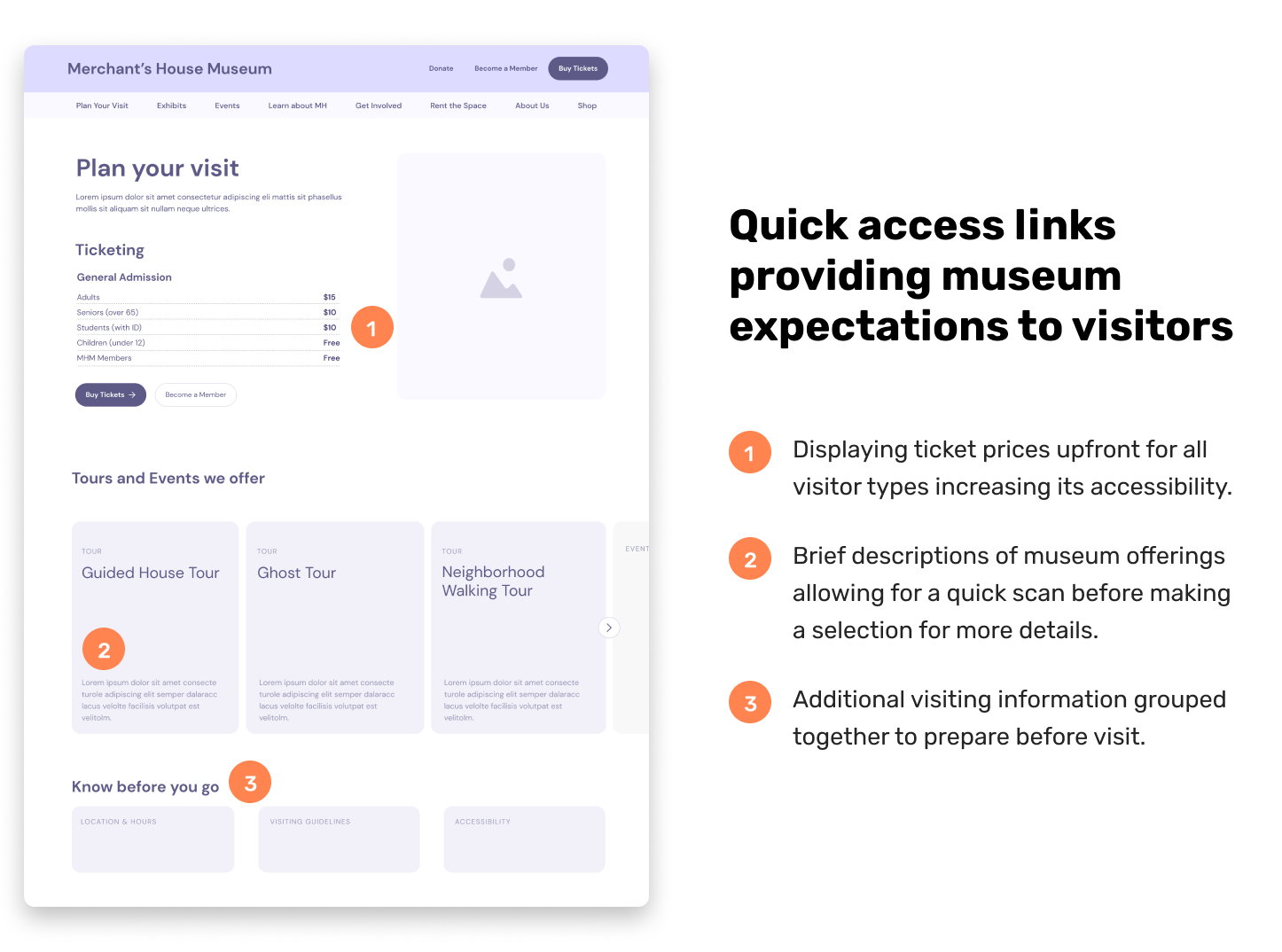
1. Highlighting the ‘plan your visit’ section

The journey of ticketing right from deciding whether a tour / event interests the to understanding what to expect from it to finally booking tickets for it was fragmented into different parts of the ‘Visit’ tab. This led to a discontinuous flow, increasing the chances of drop offs.
With admission details like ticket prices for each user group, types of tours offered, and information to know before making the visit we wanted to inform visitors on expectations for the museum and to expedite the decision making process by helping them navigate the offering.
2. Different entry points to ticketing journey based on user’s planning behaviors

During our usability tests, we found that time-sensitive users clicked on the ‘Tour and Event Schedule’ before making a ticket purchase. Where as the ones who wanted to explore the museum offerings before making a decision to visit clicked on ‘Plan Your Visit’.
To cater to both these user behaviors, we created two flows having separate entry point which eventually merge into a singular ticket purchase flow.
3. Consolidating all tours’ timings in a calendar

MHM has set schedules for various tour types on specific days of the week, but this information is spread across multiple pages, organized by tour type. Card sorting suggested that 67% participants grouped different tours together, indicating a preference for finding all tour information in one place.
For enhanced accessibility, we decided to centralize all tour schedules under “Tour Schedule.”
Our plan is to create a unified calendar displaying all tour days and timings, allowing users to toggle the visibility of different tour types for better decision-making.
References
- Research Insights – Presentation link
- Structuring content – Presentation link
- Usability test results – Presentation link
Looking back
I thoroughly enjoyed collaborating on this project with Meina and Andrea, sharing insights and providing actionable feedback to each others ideas. The design solutions were really well-received by the client. The major challenge for me in this project was creating effective presentations. I learned that it is very important to understand the needs of the audience you’re presenting to, their domain expertise and time-constraints in order to resonate with them with a good presentation. Finally, I also found Optimal Workshop’s Card sorting and tree testing tools very helpful for analyzing our test results.