Overview:
For this project, our team of four graduate students (Medhaswi Paturu, Marc Molta, Josie Xu, and myself) was tasked with evaluating Concern Worldwide’s website and conducting user research to find out how to optimize their website for new donors.
Concern Worldwide is a non-profit organization focused on aid for extremely impoverished countries. Their overall goal is to end extreme poverty, and work to rebuild and transform lives in some of the most poverty-stricken communities in this world. One of their main goals for their website is to be able to attract donors and convert their interest into impact. This case study presents our research process as well as overall findings and recommendations for Concern Worldwide regarding these goals.
Research Goals
Our main goal for this project was to study the behaviors of Concern Worldwide users in order to find out what catch’s users’ attention before taking an action. We believed that focusing on those pieces of information such would allow to increase Concern Worldwide’s donor base in the United States. The content and layout of the site should be optimized to convince prospective donors that this charity is worth their time and money.
Based on this goal, we formulated our research plan around the following four questions:
- What parts of the website encourage or discourage donations?
- What content are the users drawn to?
- What is the last point of contact before users sign up for emails/donate?
- Are there any hindrances in conversion journeys?
Research Methods:
For our research, we made use of two methods: analyzing behavior analytics data (using Google Analytics and Hotjar), and eye tracking studies. Analyzing Google Analytics and Hotjar data allowed us to gain insights on current user journeys, while also finding out what factors affected overall conversion rates. Eye tracking studies were useful in helping us to understand what content was most attractive to users. Combining these two methods was extremely helpful for us to be able to make key observations on the factors that affect user behavior on the Concern Worldwide site.
General Findings:
Before going into our specific findings and recommendations, these are some initial observations we got from our research.
Analytics:
From our analytics data, we found that there was minimal engagement with all existing donation paths Our heatmap data revealed similar findings.

Google Analytics data showing minimal engagement with donation paths

User clicks on Give Today Donation page
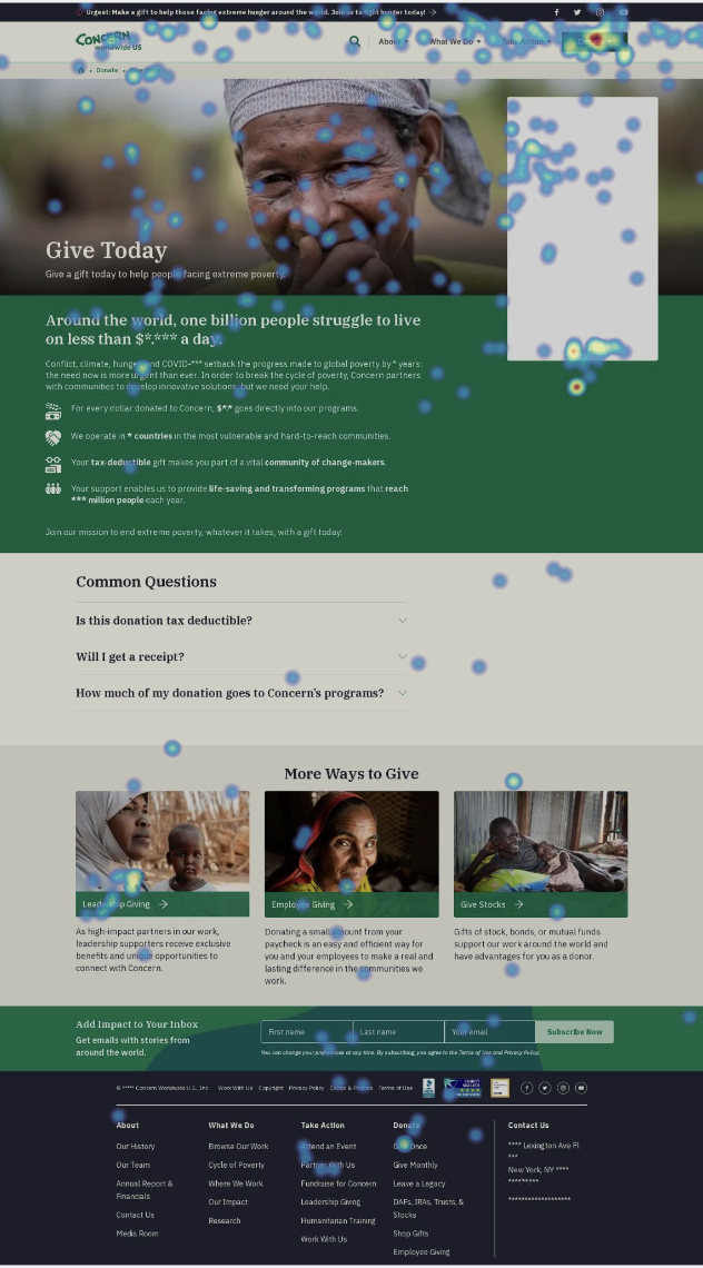
Mouse Movements on Give Today
Donate page
Eye-Tracking:
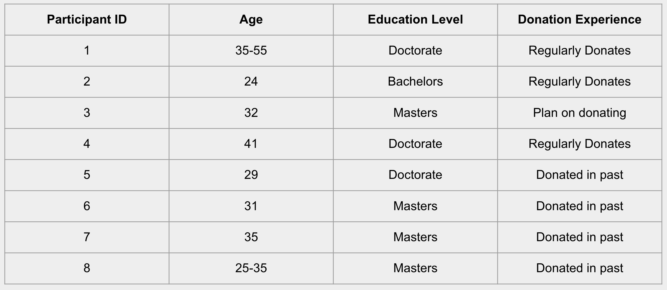
For our eye-tracking studies, we focused mainly on accumulating donation-specific data, to find how we can bridge the gap between interest and conversion rates. We conducted 8 sessions, followed by read-alouds from the participants. Below are our participant demographics:
We presented the participants with 5 tasks to complete during the session. The scope for these tasks were as follows:
- Task 1: Explore the website
- The goal was to find out which content is attractive/confusing
- Task 2: Sign up for email updates
- The goal was to evaluate the visibility and accessibility of the email sign-up section
- Task 3-5: Making a donation
- The goal was to evaluate the donation flow through multiple channels (individual, employee matching, retirement, etc), and to find out if there were any hindrances to completing the donation
From our eye-tracking studies, we formed this donation journey, based on observations as well as feedback from participants.

Key Factors considered when deciding to donate:
- All participants want to confirm organizations legitimacy
- 5/8 evaluated based on alignment with personal interests
- 7/8 participants wanted to support a cause of their choosing
- All participants were interested in knowing where their money would be allocated
How can we organize content to increase the impact on readers?
Findings:
- 3/8 participants were originally drawn to information such as the statistics on the Climate & Environment page, but said that they eventually lost interest, since they were not able to understand the significance of the statistics
- “When I read the information under the stats, it was all generic”
- Our heatmap data also showed us that important and impactful statistics about CW’s work is currently placed in an area where less than 50% of users scroll to
Recommendations:
- Move the “recent impact” statistics to the top of the page
- Highlight CW’s recent contributions, work and accomplishments

Current Layout

Mockup of Recommended changes
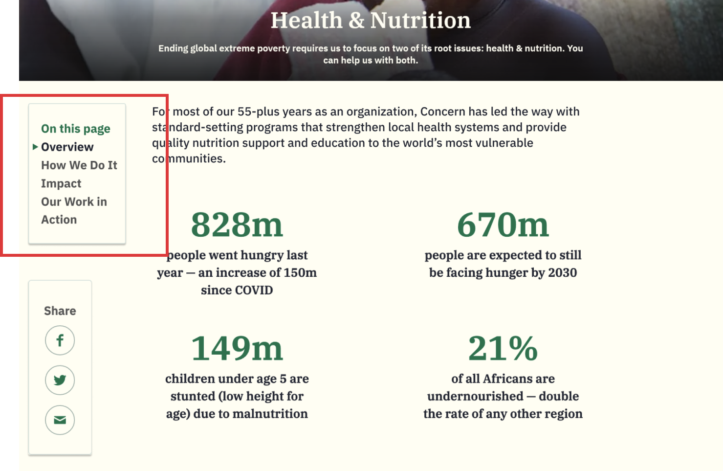
How can we increase ease of use of the site’s in-page navigation?
Findings:
- Most participants overlooked the horizontal in-page navigation bar
- Participants also hesitated to interact with in-page navigation, because they were not sure if it was an actionable item
- Participants often missed the IRA section that was embedded in another tab
Recommendations:
- Changing the in-page navigation into a vertical layout
- Combining the share box with the vertical in-page navigation, in order to de-clutter the page and concentrate attention to one area
- Implementing the same vertical in-page nav bar on every page, to directly improve information visibility and organization on the site

Current Layout of Horizontal Nav Bar
Mockup of New Vertical Nav Bar
Increasing Newsletter Sign-ups
Findings:
- Participants overlooked the newsletter signup boxes, both when embedded in an article and in the footer
- Some also mentioned that the sign-up box appeared prematurely, before they felt ready to sign up for newsletters.
Recommendations:
- Clearly informing the reader of what details they can expect to receive from signing up for newsletters (i.e., invitations to upcoming events, donation updates, program updates, etc.)
- Adding contrast to the form fields, in order to increase visibility.

Current Newsletter Signup Forms

Mockup of New Signup Forms, with descriptions included
Optimizing access to and usability of donation pages
Findings:
- Participants were confused by the repetitive and overlapping information + actions found on multiple donation pages
- Participants found that they were unable to donate to specific projects or causes, which prompted them to express their concerns about the lack of transparency in the donation process
Recommendations:
- Creating clearly labeled sections to better orient users to the information they are looking for, clarifying their donation options, as well as managing their expectations for possible actions
- Adding transparency by writing a blurb that explains Concern Worldwide’s umbrella donation policy.
- Creating a “More Ways to Give” section for options that may fall outside the scope of what is possible on the donation widget.

Current Donation Pages with Repetitive Information
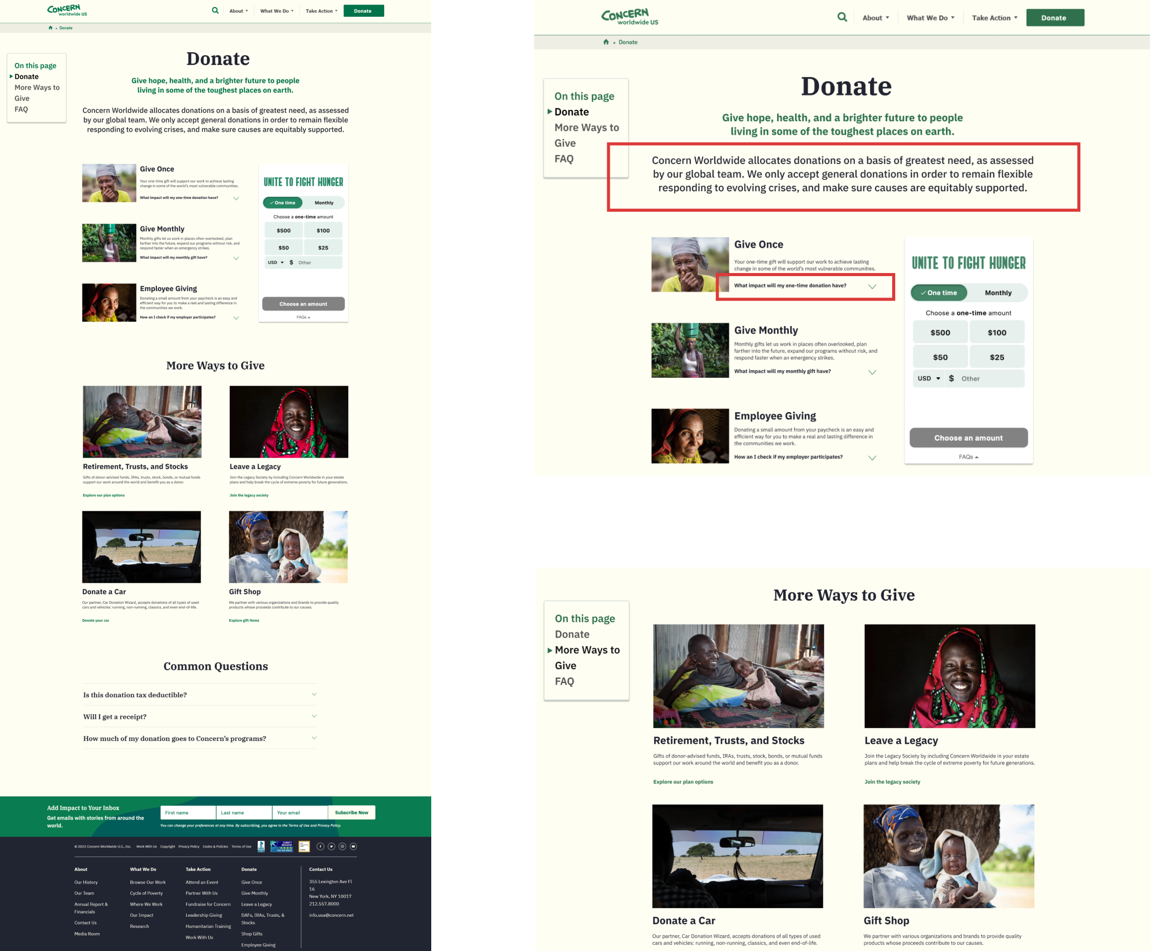
Mockup of new Donate Pages with consolidated + organized layout
Key Takeaways:
We presented our process and findings with our clients in a productive meeting, where we were able to discuss our thought process, our methods, and also hear their thoughts and opinions on what we had prepared for them. Our key takeaways are as follows:
Transparency
Donors tend to look for alignment with their personal causes and transparency in donation allocation while making a decision to donate.
Visibility + Information Hierarchy
Although Concern Worldwide’s website has lots of information, it is not always easily discoverable, when prospective donors are browsing the site.
Thus, we recommend focusing on curating the information on the website in a concise and targeted manner in order to increase trust as well as interest in donating.
Overall, working with a team to provide deliverables for a real-life client, with the potential to crate lasting changes was a hugely rewarding experience. Presenting and hearing direct feedback from throughout the process was an exciting experience as well. Although we felt as though there was more that we could test or look into, had we more time, we believe that what we were able to deliver to the client is a great starting point for lasting improvements on their site.