

Introduction:
The Nike Training Club (NTC) app is a fitness application that is designed to help users achieve their fitness goals with the help of guided workouts led by professional trainers and athletes. NTC also offers training plans that include a set of workouts within a specific time frame to target different goals such as strength, mobility, endurance, etc.
Who is the User?
In this critique, I will evaluate the user experience and design of the NTC app through the lens of Don Norman’s principles and concepts from “The Design of Everyday Things”. I will approach this as a first time user looking to start a beginner-friendly training program with no equipment needed.
Selecting a Training Program:
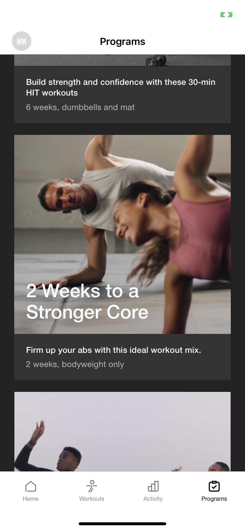
There is a discoverable tab at the bottom right corner that indicates where I can find training programs with the help of signifiers; an icon as well as a label and it’s clearly distinguished from where I can find individual workouts. When I click on this icon I am directed to a page that shows me all the programs I can begin and at first glance their labels communicate the goal of the program as well as the duration and the equipment required. Once I click on my selected program I receive more information, again with the help of strong signifiers, such as the frequency of workouts and the level of expertise needed. Overall, the design makes the process of training easy to understand but since I had a clear goal of selecting a workout that is beginner-friendly, I wish there was some indication of the level of difficulty on the first page so I could avoid clicking into and out of a program that is not meant for me.

Let the Training Begin:
Affordances provide visual cues to make a user understand what a feature within an app can do. A button that looks clickable is using this principle. The buttons to start/end workouts or check progress, etc. are made to look clickable throughout the NTC app by using contrast and/or borders and shapes. They are also made discoverable by using the same.


Once I start a program I am immediately greeted with a screen that tells me to “prepare for the hard work”; this is an example of feedback.

After beginning the first workout within my program I realized that I can only do one program at a time. This makes sense in certain scenarios so that I don’t overwork myself by doing two high intensity programs together but what if I wanted to do a yoga or breath-work program alongside my strength training? I experienced some lack of freedom. This is an example of a constraint. Constraints can be useful to keep a user from getting overwhelmed but in this case I found it to be limiting. A possible solution could be an option to group together different categories of training programs (like strength and mindfulness) of similar durations and levels, in order to achieve optimal benefits.
Another example of a constraint was that you cannot speed up or slow down the pace of a class. While this makes sense if you are doing a HIIT training where time constraints are crucial, it doesn’t make sense if you are doing yoga and would like more time to perfect a certain pose.
You are able to track your progress quite easily with the help of multiple signifiers that provide constant feedback. There is even a “View Program Progress” button that takes you to page with detailed feedback regarding your progress. It shows you how many workouts/minutes you have completed and which stage of the program you are on using progress bars. This is an example of mapping which is basically the relationship between controls and their outcomes.
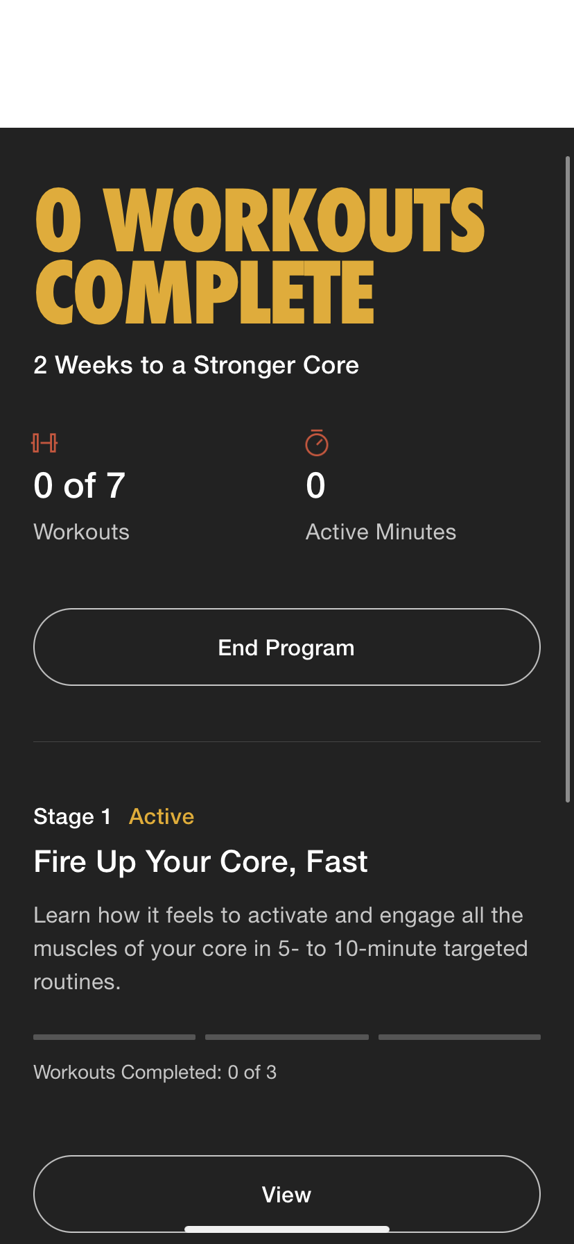
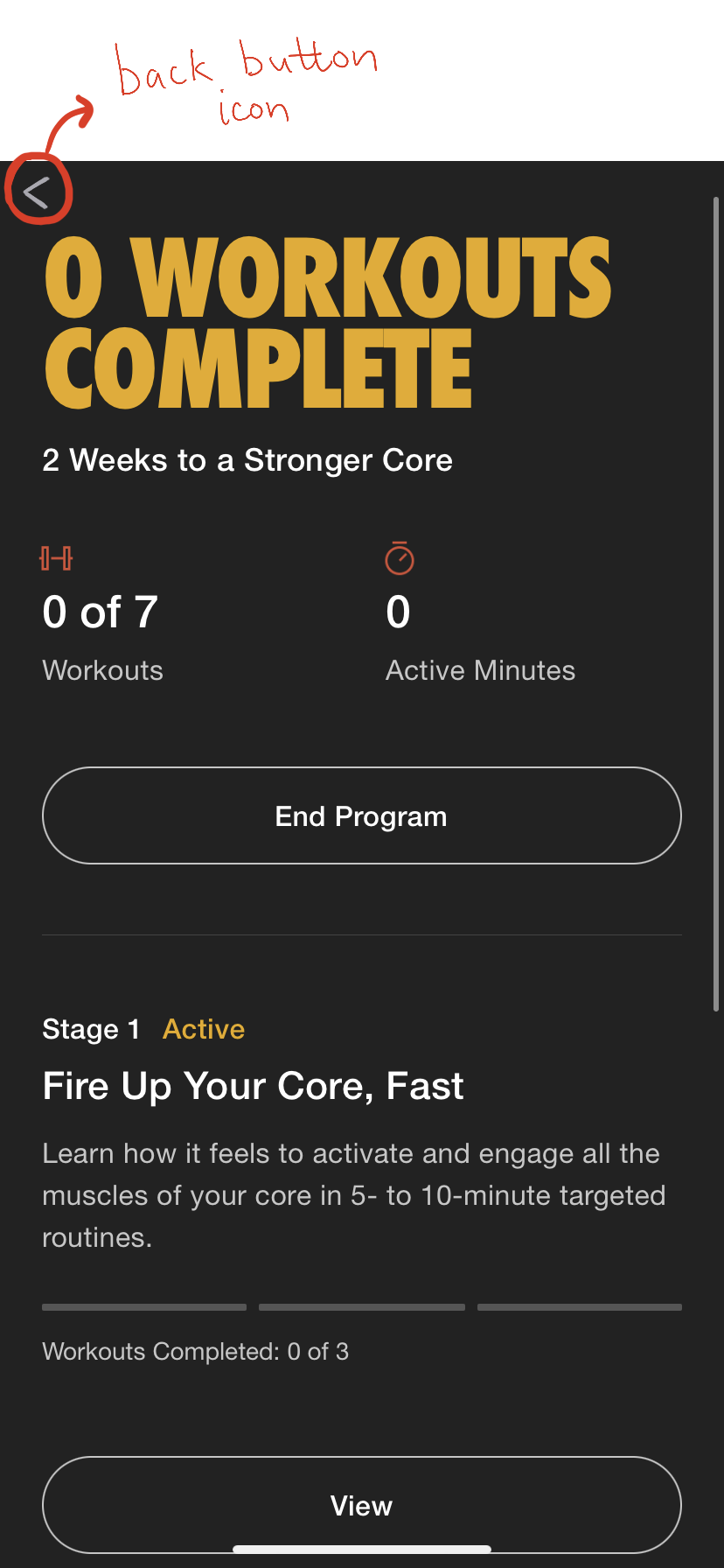
One problem that I noticed when I reached this page was that there is no clear back button. It took me a second to realize that I need to swipe to the right in order to get back to the previous page, which was my training schedule. I found this to be inconsistent as there are other similar pages on the app that do have a back button in the top left corner. This is a simple fix as you can see in my low fidelity mockup.
Life after the Program:
Once I complete a program I am able to keep track of the workouts completed as well as the minutes I worked out for through the activity tab.
The NTC app also gamified my training experience through the “achievements” page by rewarding me with virtual “trophies” for reaching different milestones. I am sure we have all received trophies, medals, or stickers in childhood when we performed a task successfully; this feature utilizes our mental model of what we associate with achievements in the physical world and translates that, with the help of signifiers, into the digital world. I think this strategy can be effective and motivating in certain scenarios but I found it to be a little unnecessary and overbearing in this case. To me, it seemed like a classic case of featuritis, which means the constant expansion of features within an app even when it is not really needed. With addition of each feature, the complexity of the app increases, therefore it is important to be mindful of excessive features that can cause cognitive overload.
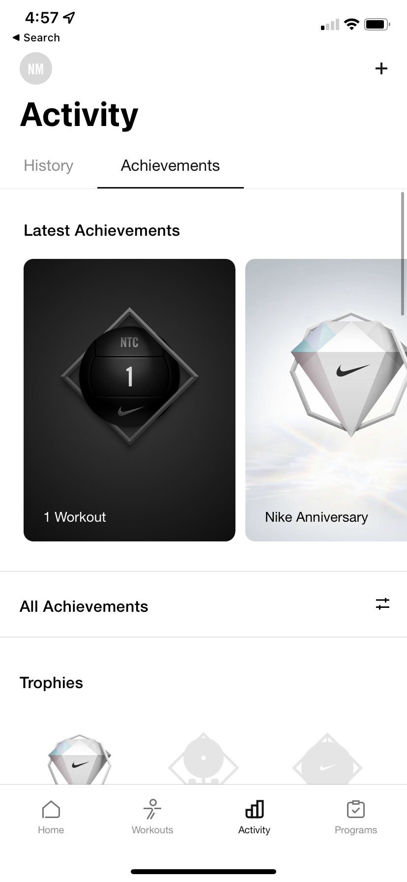
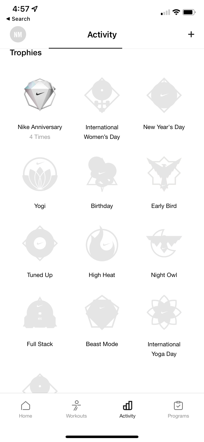
There are plenty of other motivators within the NTC app such as tracking your progress and the option to turn on notifications for reminders that I don’t think “trophies” are really required.
Conclusion:
As a final observation, the NTC app really does feel like a pocket gym membership with many things to explore. It does not only filter workouts by training programs but also by trainers/athletes, levels, equipment, goals, etc. It also has articles and tips to explore about living an active lifestyle. Although, all these different options to filter through the same content can become a little overwhelming and inconsistent, which leads me back to the concept of featuritis and places the NTC app on the border of engaging and overwhelming. That being said, the overall design of the app is intuitive and enjoyable to use.