
What is Instacart?
Instacart is an online grocery shopping and home delivery service that helps users shop from the most popular stores from the tip of their fingers. Apart from groceries, they also sell electronics that stores like Walmart sell and feature recipes for users to try out. This report explores the process of using the application through an average user’s eyes, and points out the key features and what could’ve been different.
Home page
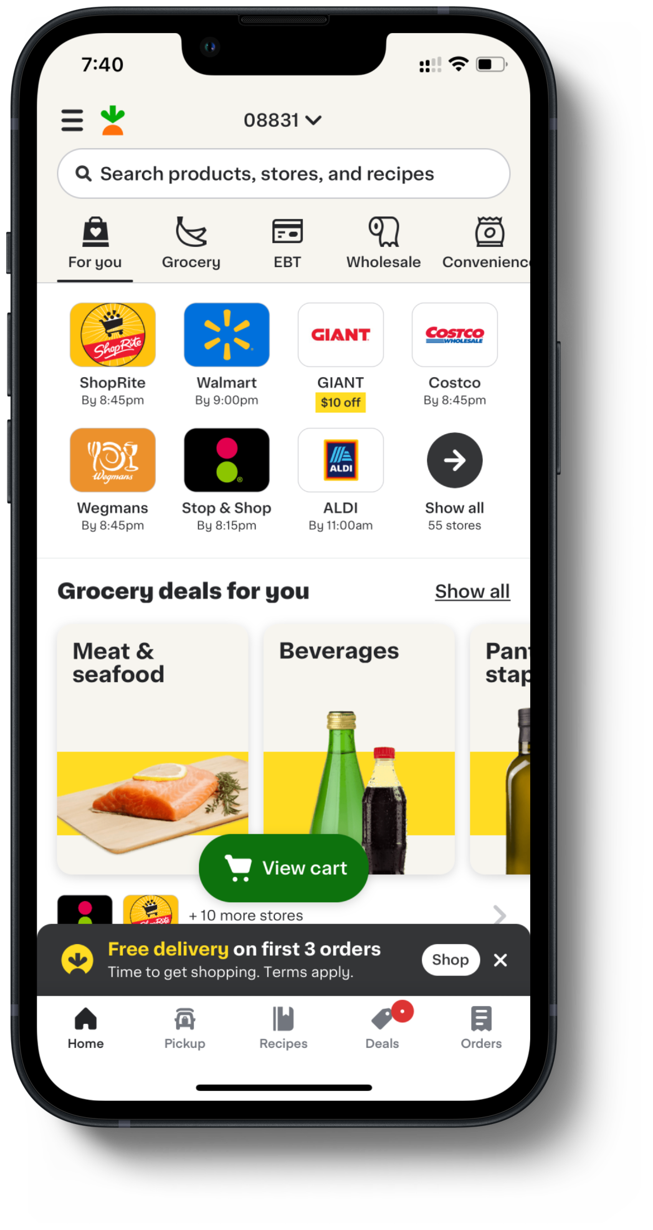
The home page of the app has its elements laid out quite well. It features several signifiers for users including iconography. Not only is this accessible for users with reading disabilities, but it also helps any user get a clear picture of what each tab does.
The layout of the homepage is heavily featuring popular stores in the user’s proximity, followed by categories of groceries. As we scroll down, it also has options like “Natural and organic near you”, and “buy in bulk and save”. This caters to a wider range of users than just an average grocery shopper.
The search bar on the top also shows suggested prompts like “best foods to bring camping”, helping the user understand that the limits of the application are much more far-reaching than just buying groceries.
The bottom menu also has the most basic features that a user can need with easy access, such as “deals”, “pick up”, and “orders”. But what stands out the most is the “recipes” menu. This unique feature further suggests that the app has far more purpose than just grocery delivery.
Shopping process
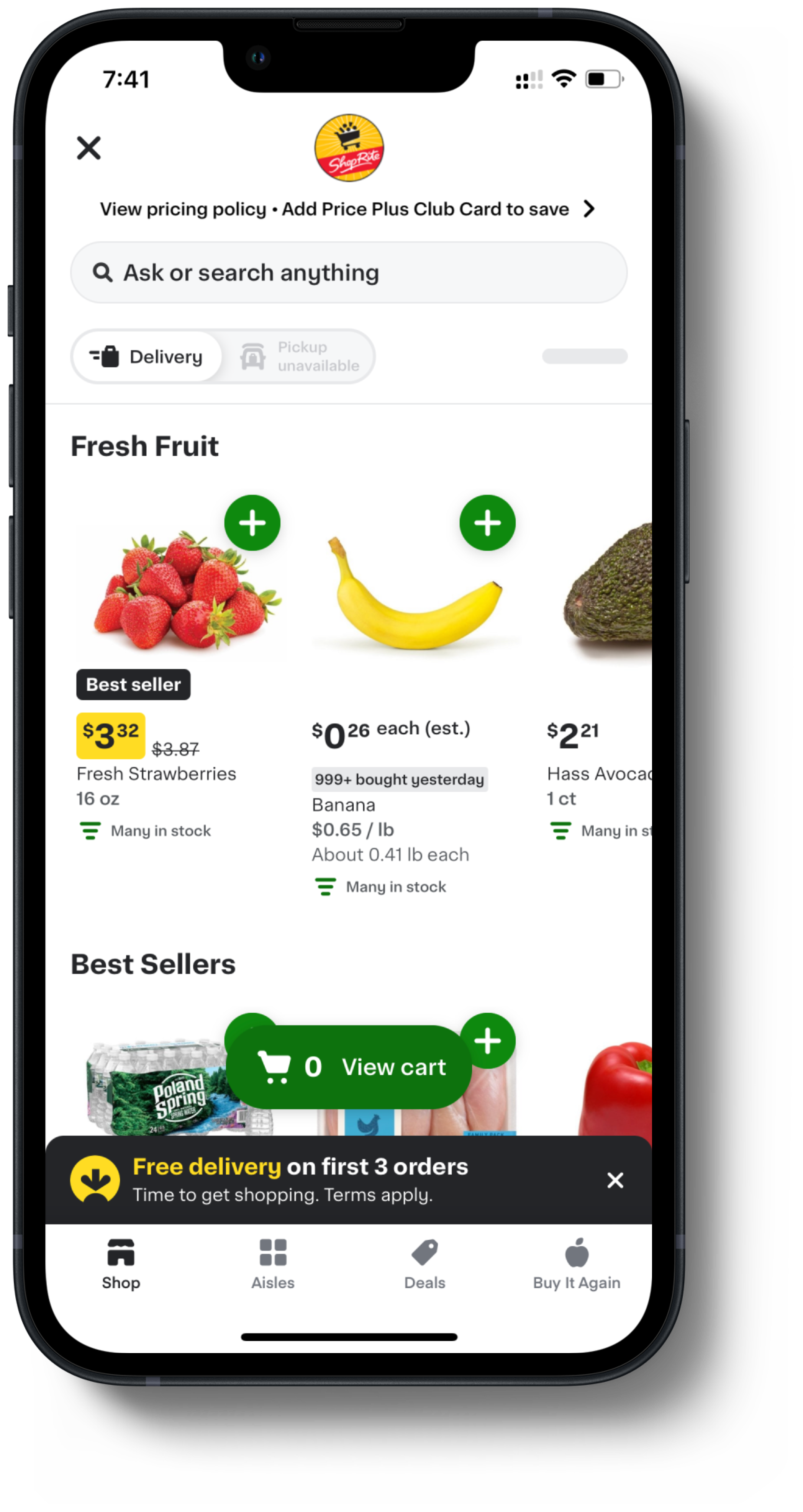

The process of ordering is quite straightforward and can be done in one of two ways. The first method is to shop by store. We can simply go into the store we wish to shop from. Their best-sellers are listed right on the top. We can also browse through the catalog of goods, or we can simply use the search bar on top to look for specific products that the store might sell. The green “+” is a great signifier to tell the user that clicking it will add the product to our cart. The cart is also easily accessible at the bottom of the page, displaying the number of items in it at all times.
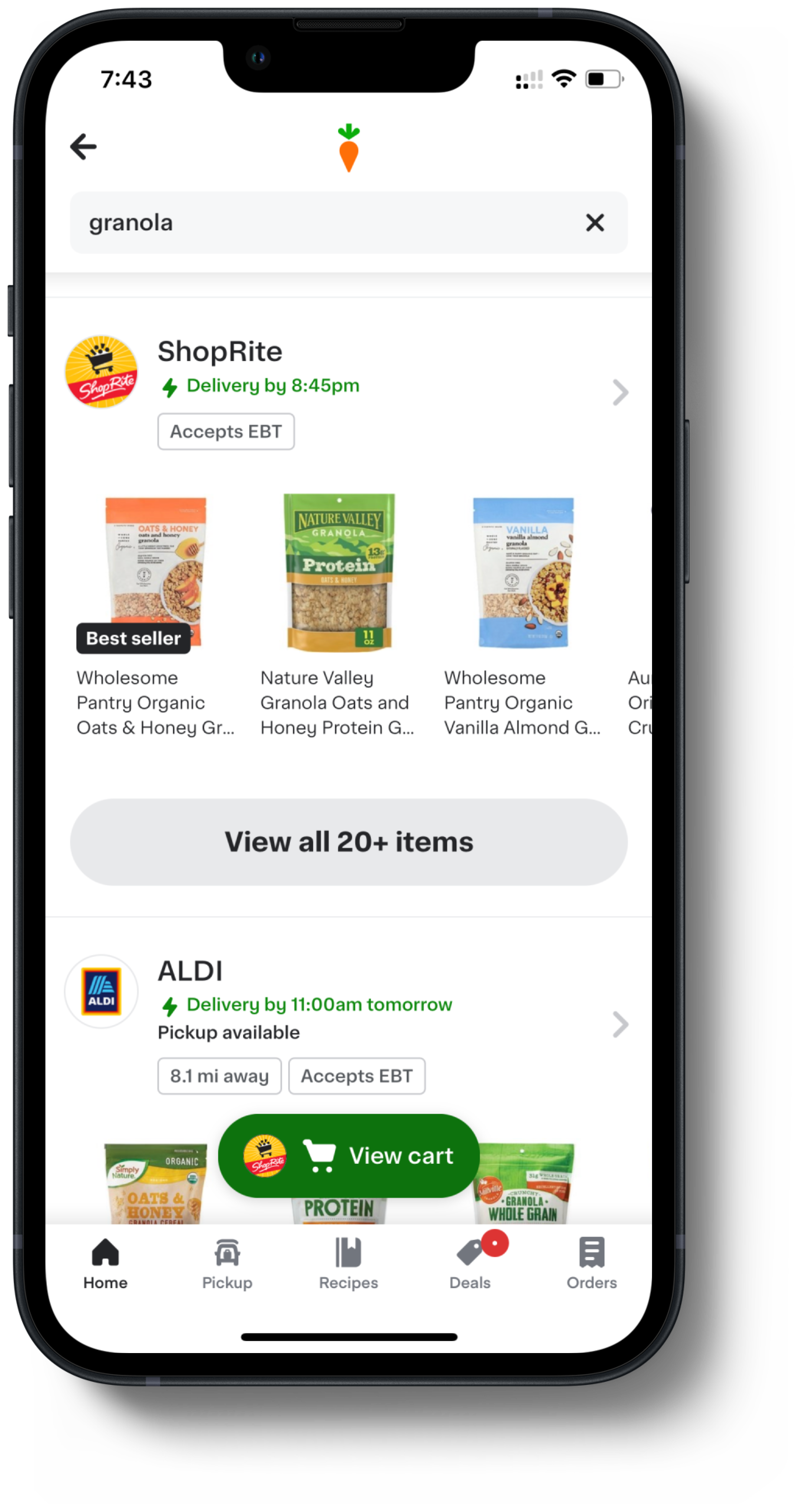
The second process would be to search by product. Say a user only wants a specific product. From the homepage, they simply type the product on the search bar. The results show that particular products are sorted by stores. The user can then choose they store they want the product from, and add their preferred brand/flavor to the cart.
Checkout process
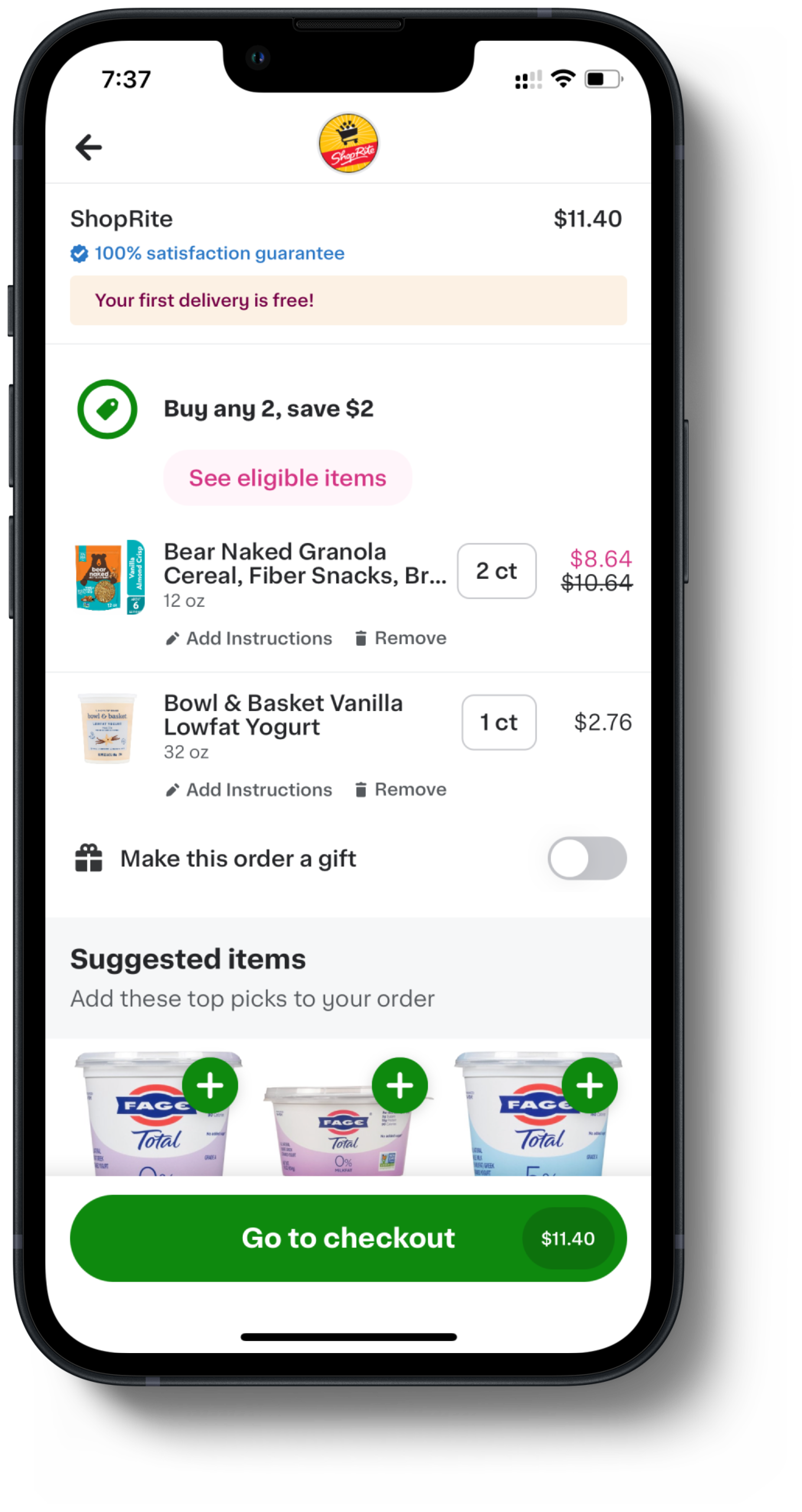
Once the cart is to the user’s needs, they can access it through the green button that is on the bottom of the screen at all times. When in the cart, the user is also shown suggested items to be added to the cart. There is a big green button saying “go to checkout” at the bottom, which also displays the total price that the user would have to pay. This is a great feature to have, as more often than not, the user may not realize the total bill until later into the process, and they would have to go back and edit the cart.
In the checkout menu, the users can pick the address, the delivery slot, and the payment method. It also shows a greyed-out menu of all the items they are purchasing, followed by a place to enter their membership ID if purchasing from a single store. The checkout menu also highlights how much they are saving on the order, followed by a green “continue” button.

After purchase, an immersive page is displayed with a map of the delivery personnel’s location, along with the status of the order. This keeps the user engaged with the app and prepares them for when to expect the delivery.
Conclusion
Instacart has a unique purpose that is more far-reaching than grocery shopping remotely, and the application seems to be designed in the best way possible to put forth that purpose. It appears to follow the design principles to make the interface easy to learn and use, making the app worthwhile for anyone in need for it.