About Google Earth
Google Earth is to be an immersive experience for users to gauge and understand different local and abroad locations. Developed in 2015, its primary function is for web imagery interaction applications for commercial and personal use.
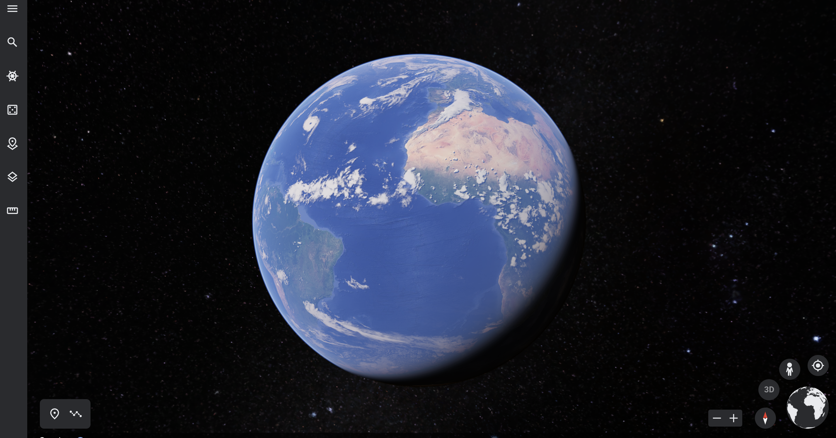
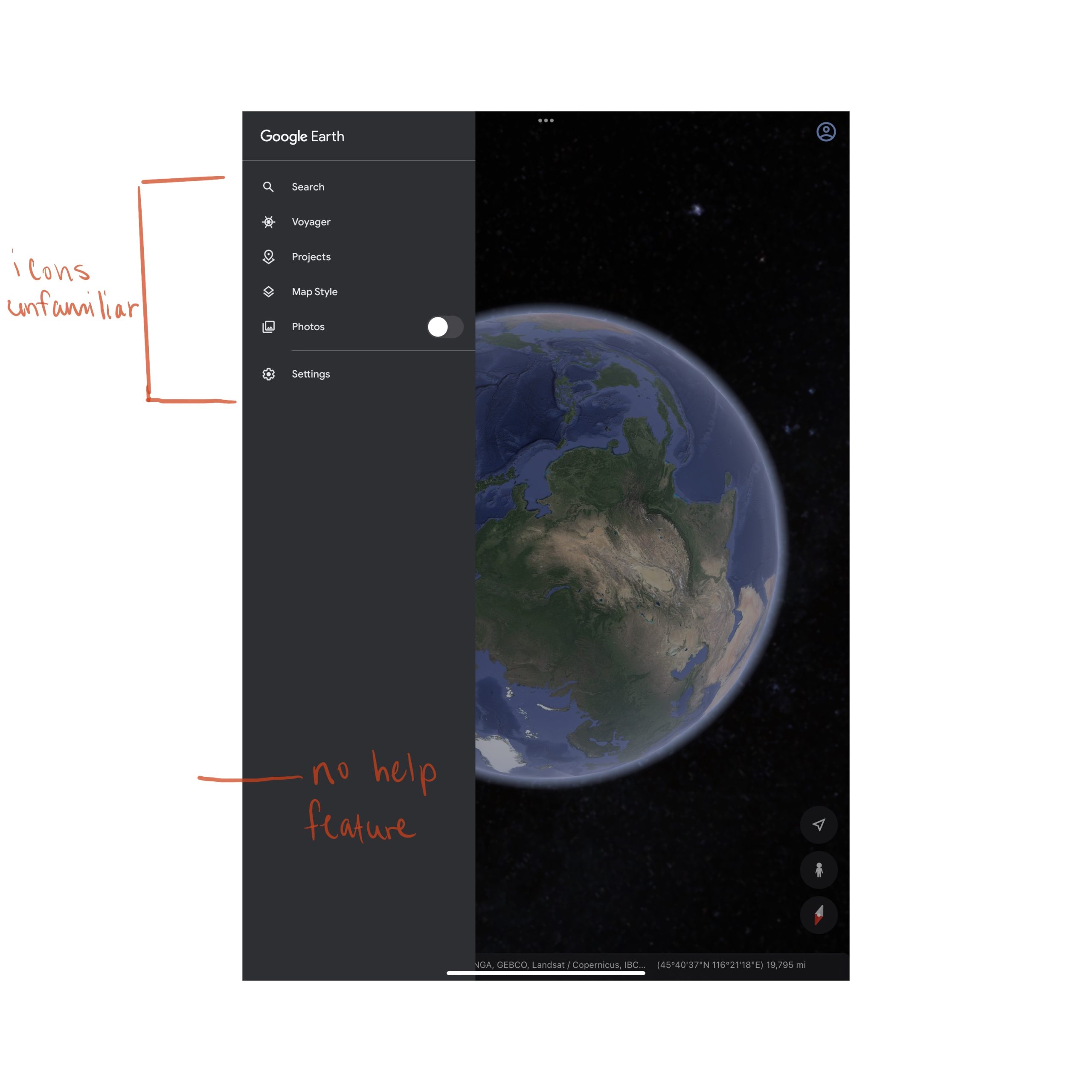
It’s important to consider the effects when engaging with this tool. Before analyzing Google Earth I have heard of the assistance it could afford you if you need help discovering an area. With excitement I began to utilize the application for the first time, however my engagement was left with many questions on the implications of developers , wondering how other people may engage with the app as well. The first base of the application is always affordability. What action should take place? Immediately upon entering the app; it is unclear how I should proceed with the service. I have a basic knowledge of the application, and its features; however there is no help service available. The icon that indicates search is for searching locations, and doesn’t get you categories to specify your search. And it doesn’t give clear distinction of location of certain functions.
Visual Questions
The second is Signifiers. While engaging in the application for the first time, I was unsure what action to perform first. The icons listed are not the universal indicators of the action that is performed. Example, a photo icon is marked with an unfamiliar icon, and I was unable to complete the task desired to zoom in prior to taking a photo of the location. I feel there is a universal design with mapping here. There are a mix of commonly known and unfamiliar icons in the application . This to me led to much cognitive overload. Leading to a Gulf of evaluation and execution. When viewing the home screen I look for icons and interactions that I could engage with hopefully leading to my desired end goal. However with many attempts with the icons I kept performing the wrong tasks, and this eventually led to me failing executing the desired task. Once the action is performed, there is no proper feedback to indicate the action performed successfully.
Conclusion
The icon selected above is for snapshots, and not navigation however the user can commonly become confused because of the design rule proximity it would help if this feature was displayed somewhere else, or if there is a separate section, with other close related function. This function and layout of icon placement also falls under system image. There is again a common misconception about how things are to perform within the application. I think the application could improve if it has some tutorial and/or hoover assistance integrated within the application.
