Zara is a major clothing chain that’s perhaps most well-known for their inventive and somewhat concerning clothing imagery, as evidenced by the Instagram account Awkward Zara. However, when users are brave enough to sift through these mind-boggling images, they tend to have a clear goal in mind: purchase a new, trendy piece of clothing for their wardrobe or a snazzy item for their home. This means the ability to filter products adequately, choose a product from their images, and select the specifications to add the item to the cart. For this analysis, the user experience of Zara’s website will be addressed.
Viewing Product Options
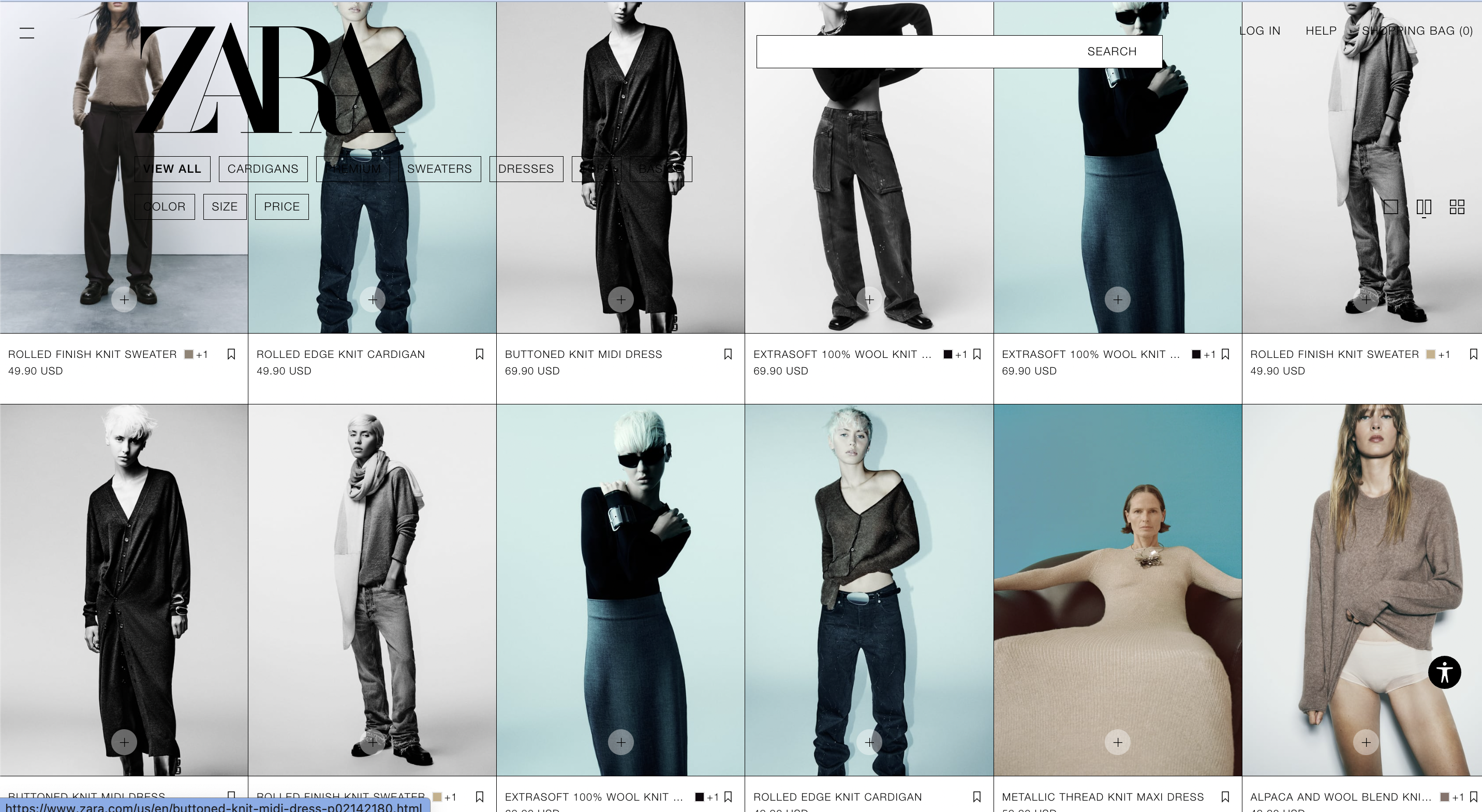
Don Norman explains that “standardization provides a major breakthrough in usability,” referencing an example of being able to drive any brand of car if you know how to drive one brand (Norman 248). You do not have to relearn the steps each time. This same concept applies to the expected usability of digital products in other industries, such as online retail. The standardized online shopping format is that products are displayed individually in rows, with options for different colors and sizes placed within a single listing. While a trend has begun in showing the same clothing item in different colors as separate listings, the standardized format remains that they are (at least, in part) different products.
Zara does not follow the standardized model, confusing the user on whether the product they are viewing is different from a similar listing. As seen above, there are 3 of the same “extra soft 100% wool knit cardigans.” One listing shows the identical product in a different model pose, while the other two are exact photographic copies, with all 3 being the same color.
Norman explains the concept of feedforward when it comes to user actions: “Information that helps answer questions of execution is feedforward” (72). For a user browsing Zara, the goal is to find a product that interests them within the many rows of photos. The feedforward from Zara’s current format does not help answer questions on how to proceed with an item you may like: there are identical options that make the user question whether these are, in fact, the same product, and then ponder how to move forward. A user might feel frustrated at having to check if each product is indeed the same one and determine that the cardigan might not be worth it in the first place. The better user experience is to reduce the product listings to a single listing, as is expected for online retail. The feedforward the users receive would be to click the item that interests them, not triple-check different listings and second-guess themselves.
Selecting a Listing View
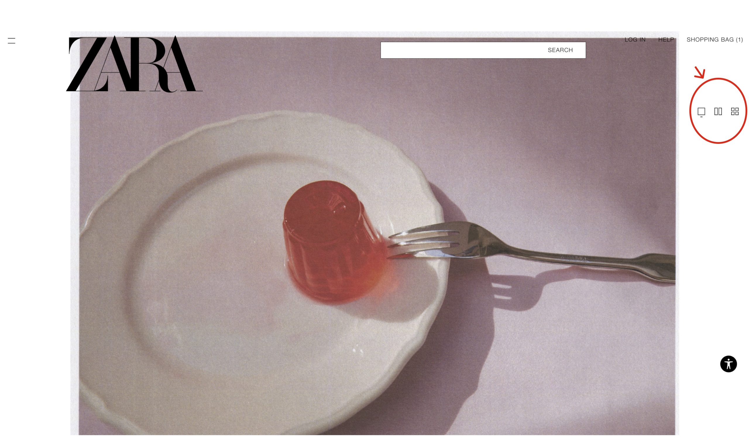
A second usability issue does not, surprisingly, come from the fact that there is a lone glob of Jell-O on the edge of fancy dinnerware: the issue lies in the product listing view preferences. Norman defines signifiers as “words, a graphical illustration, or just a device whose perceived affordances are unambiguous” (19). The issue comes about when signifiers are not prominent enough to counter the conceptual model users have of a product.
As a default, users expect the listing view of products to be within a grid system of orderly rows and columns. This is customary in nearly all online retail sites. Instead, they are presented with large-scale, asymmetric imagery. This presentation is so jarring (and is also the default view) that the first impulse is to scroll to find more regularly displayed products. However, as soon as the user scrolls, the signifier of layout icons on the top right of the screen disappears. They lose the option to rearrange the products in a more familiar format and are subjected to the frustration of the opening view, increasing their potential to abandon the page.
To better this user experience, the signifiers should do one (or ideally all 3) of the following: the icons must use bolder lines or a fill to be more noticeable, the icons should have a written label above them describing what they are for (users might not be familiar with layout icons in general), and they should remain in place as the user scrolls down the page.
Choosing an Item to Check Out
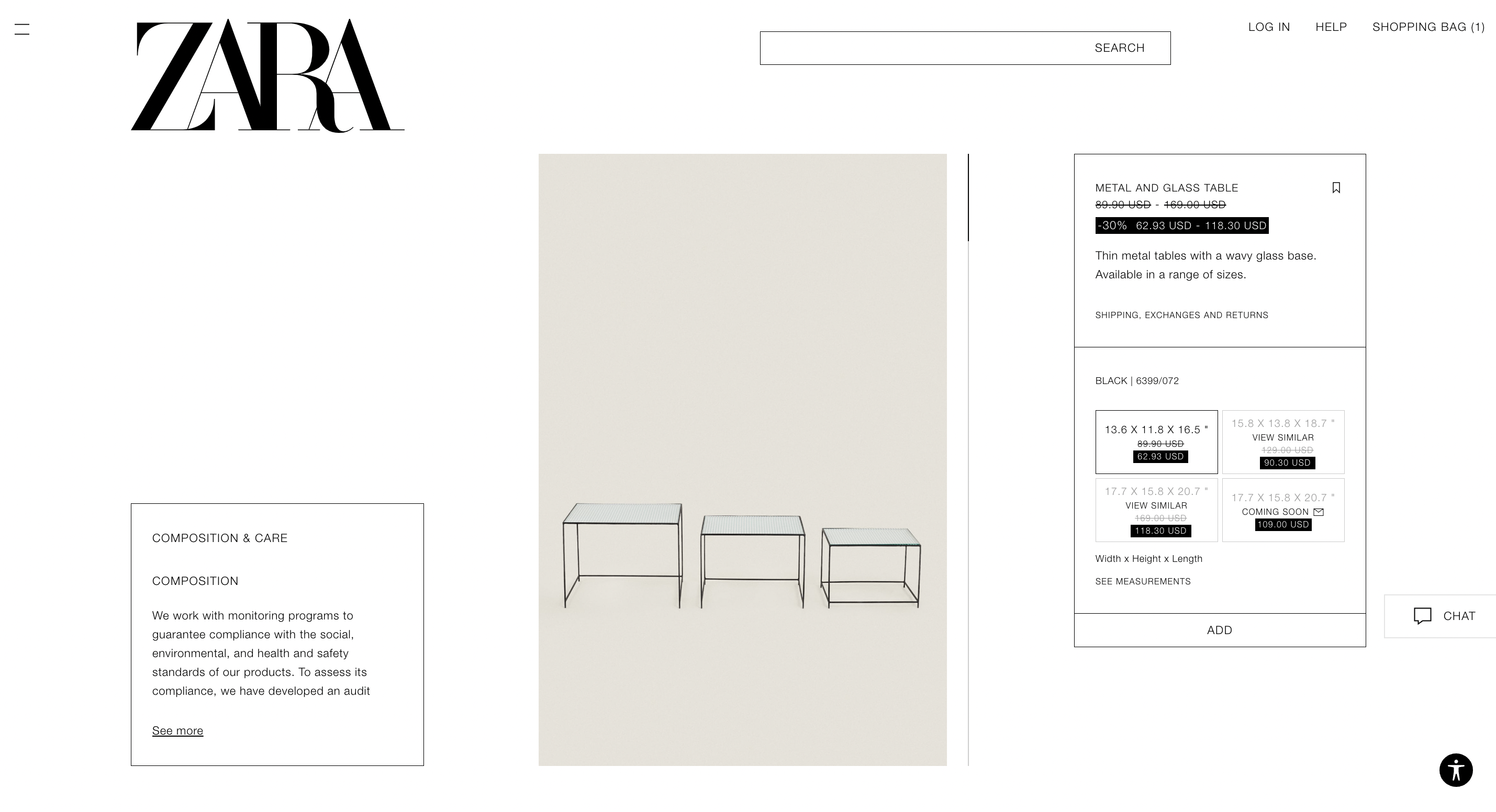
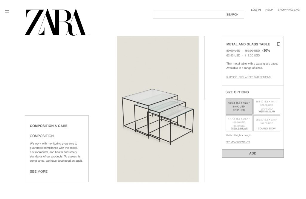
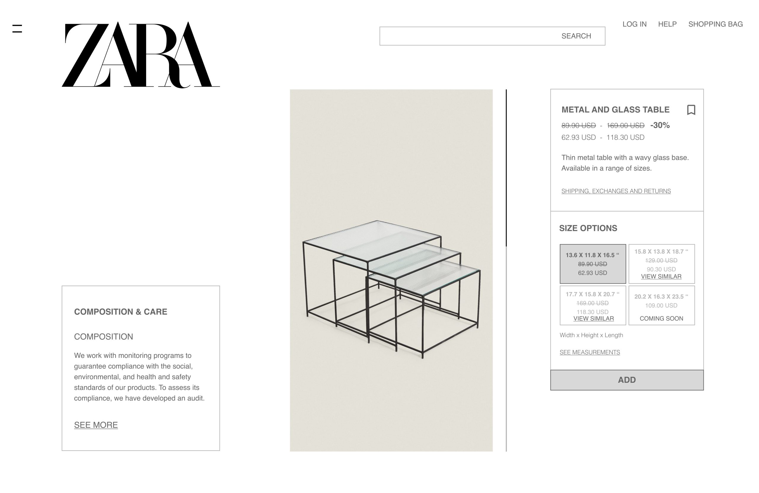
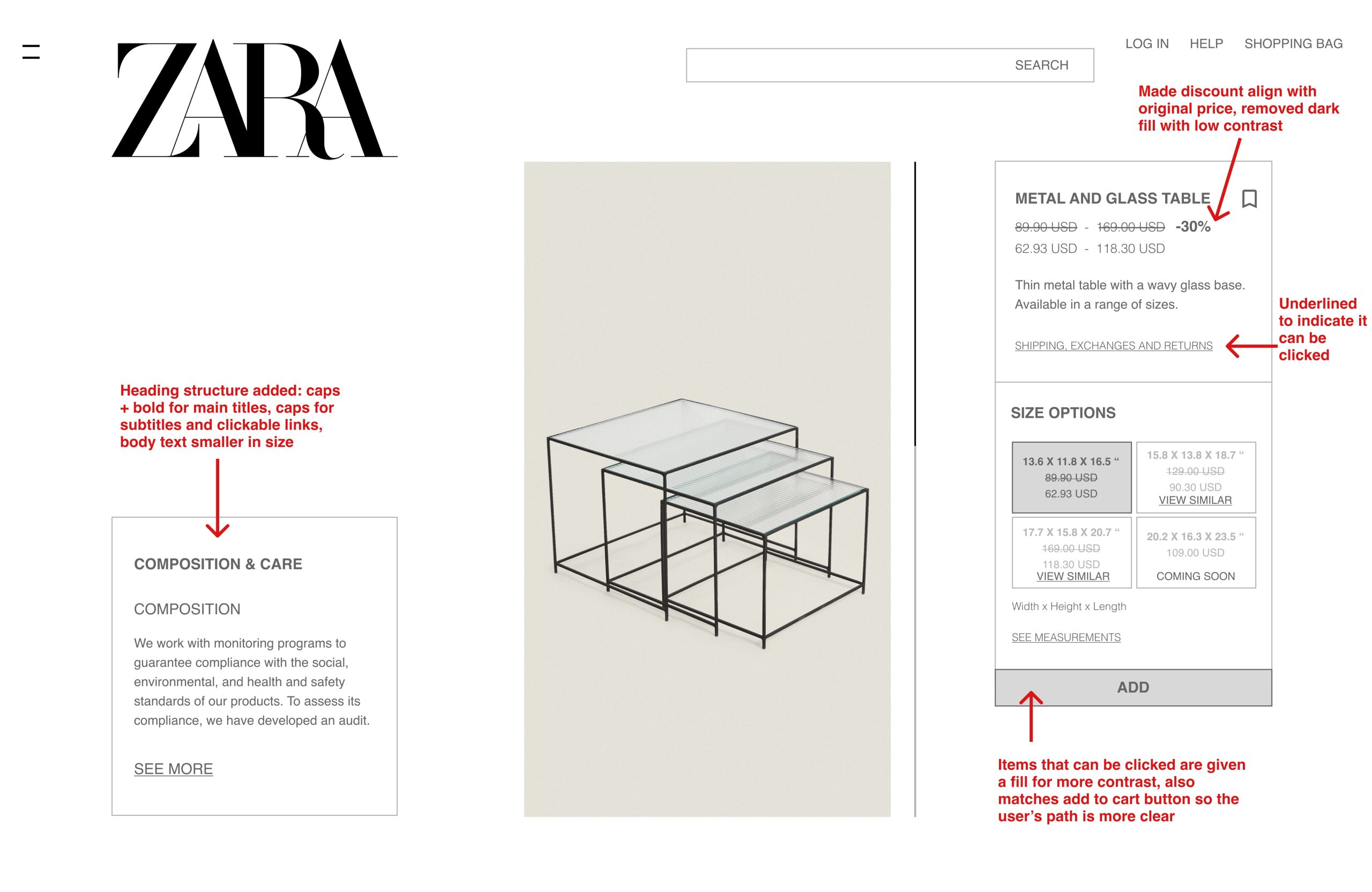
Let’s say the user feels a draw to the utter uniqueness of these borderline invisible tables. The issue with this page’s design is that discoverability is hindered, discoverability meaning “what actions are possible and the current state of the device” (72). The design does offer a decent amount of feedback for actions, such as items turning black when selected. Where it falls short is in the visual presentation of the information so the user knows what to click on.
All the elements of what they need to know about the product are there, but there is almost no visual hierarchy. Norman states that “we learn to discriminate among things by looking for distinguishing features” (81). The design is hindered by the thin black lines that are all unified in thickness, offering no visual depth. Capitalization is both the heading style and the button text (which unfortunately also lacks the signifier of a button shape or underline to show it’s clickable). The font sizing is the same throughout the page. Items that are no longer available are a slightly lighter shade of grey, making it hard for the user to notice. Overall, there are minimal visual features for the user to see how to select and check out an item. A user may find themselves overwhelmed by all the information without clear headings or become annoyed at why the site is not letting them select an out-of-stock item, as out-of-stock items are only slightly lighter in their box contour.
The time it takes the user to figure out what can be done means that the gulf of evaluation is that much longer. To rectify this, more distinguishing features must be added: a clear heading structure, contrast in the thickness of fonts, contrast in selectable items vs. not with fill color, and clickable indicators. I have created a mockup example below.
Final Thoughts
Zara’s perplexing site certainly offers visual uniqueness and interest. However, when it comes to usability, going out of the box comes at a cost. While it strives for minimalist detailing in its fonts and icons, this style backfires in allowing users to complete their goals of choosing an item quickly and comfortably, likely only at a cost to Zara itself.
Source: Norman, D. (2013). The Design of Everyday Things: Revised & Expanded Edition. Basic Books.