
Introduction
Rijksmuseum, located in Amsterdam, Netherlands, is home to many well-known pieces of Dutch art and history, like, The Night Watch painting by Rembrandt van Rijn (1642), The Milkmaid by Johannes Vermeer (1654–58) and the Vincent van Gogh self-portrait (1889). The collection of art dates back almost 800 years and represents the beauty of Dutch art and history, from the Middle Age to Mondrian period.
Landing Page
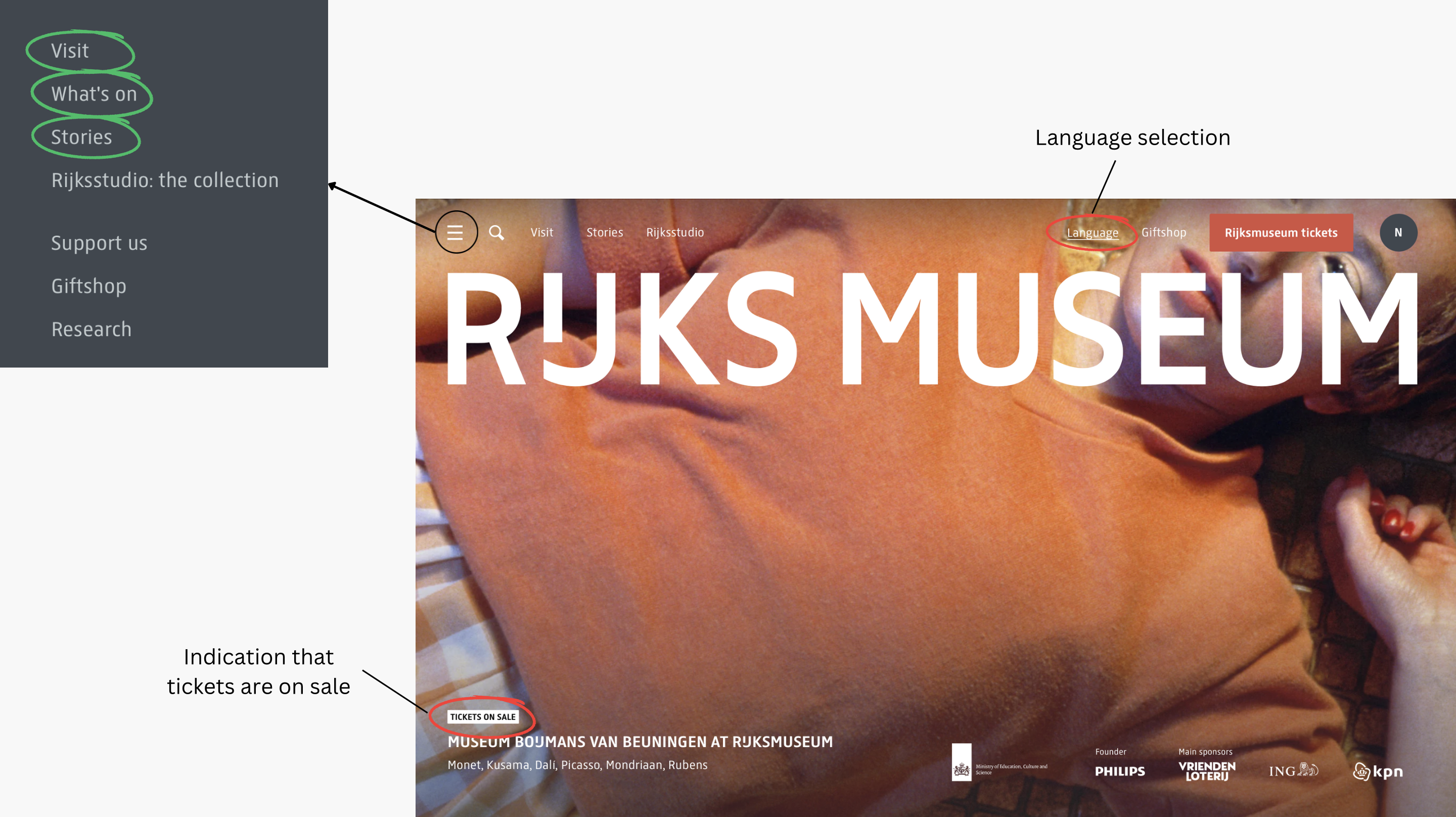
The Landing page has the option of buying tickets, to see the museum, displayed evidently. It eliminates the initial search of the option to buy tickets so it does a good job in the discoverability aspect of good design. Additionally, the “What’s on” section on the homepage allows users to explore the artwork currently on display in the museum. The “Stories” section is another way for users to discover and read more about famous artwork at Rijksmuseum. The above mentioned two features give the users the affordance of deciding if it is worth visiting.
However, on further evaluation, quite a few elements of the landing page portray bad design. Firstly, the option to change to a user’s preferred language does not remain consistent throughout the website. It switches to English (default) after navigating to one page. This would result in the user being frustrated for having to click “translate” multiple times. Secondly, “tickets on sale” is written so small when it should be something that will grab the attention of the user. It is not a good signifier for informing the users of a sale in tickets.
Booking Tickets
The ticket booking section has four steps to purchase a ticket-
1. Tickets- To select the number of tickets
2. Extra Options- To choose the starting point of the tour, date of visit and time of visit
3. Details- Person details
4. Summary & Pay- Gives a summary of payment
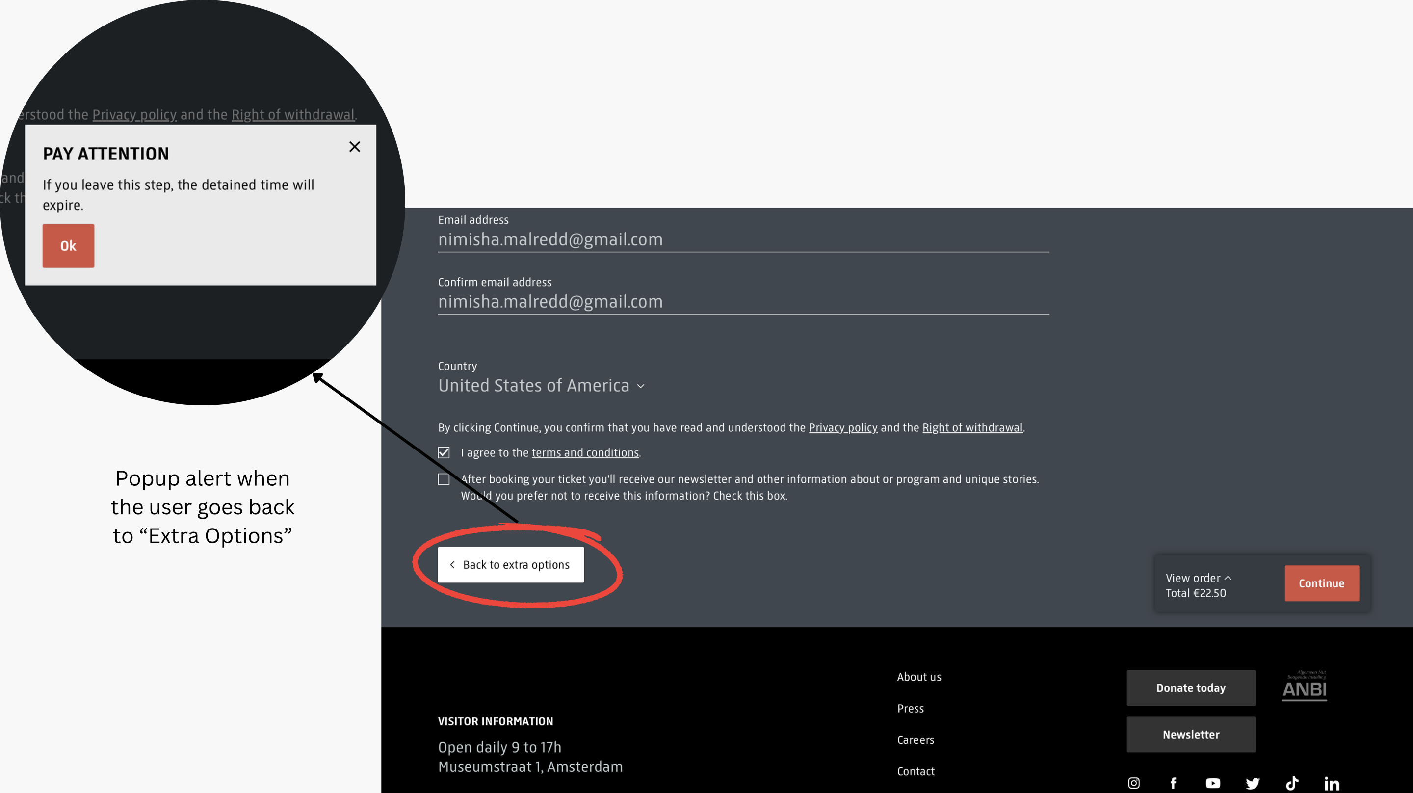
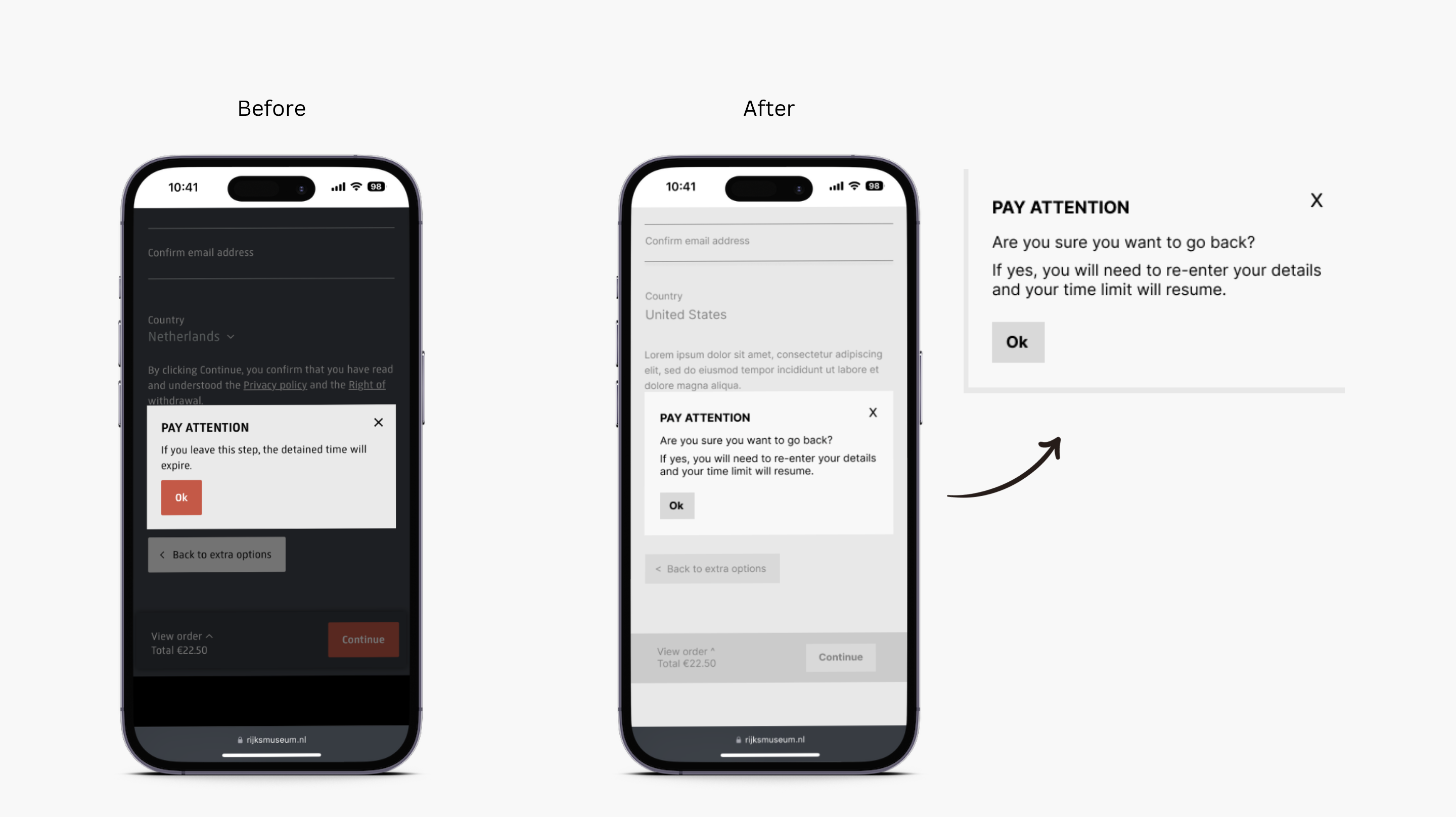
There is a timer which starts a countdown from 15:00 minutes from the time a user selects the number of tickets. In case a user wants to modify the information in “Extra Options” after filling out “Details”, there is a pop-up alert on the screen when they try going back. The pop-up does not convey what it needs to because a user may believe that it is only referring to the time expiring but in reality, the information entered in “Extra Options” is lost and needs to be re-entered by a user. In this case, the behavioral level of processing in the human brain may expect to see their details saved when they navigate through the sections. The ambiguous and unclear information in the pop-up alert results in the lack of a good conceptual model. The timer adds to the frustration of a user having to rush through the process of re-entering their details. The pop-up gives poor feedback. Moreover, It is an example of the wrong use of constraints as it is negatively limiting the possible actions of a user.
Navigating Through the Museum
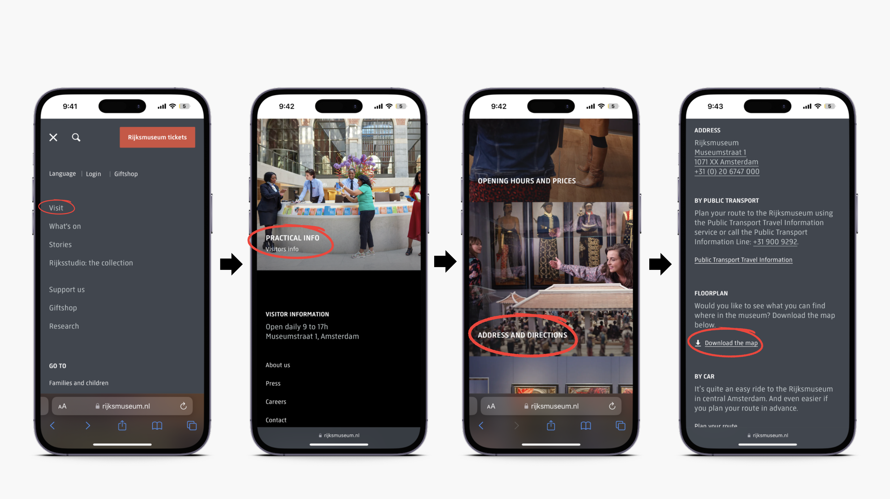
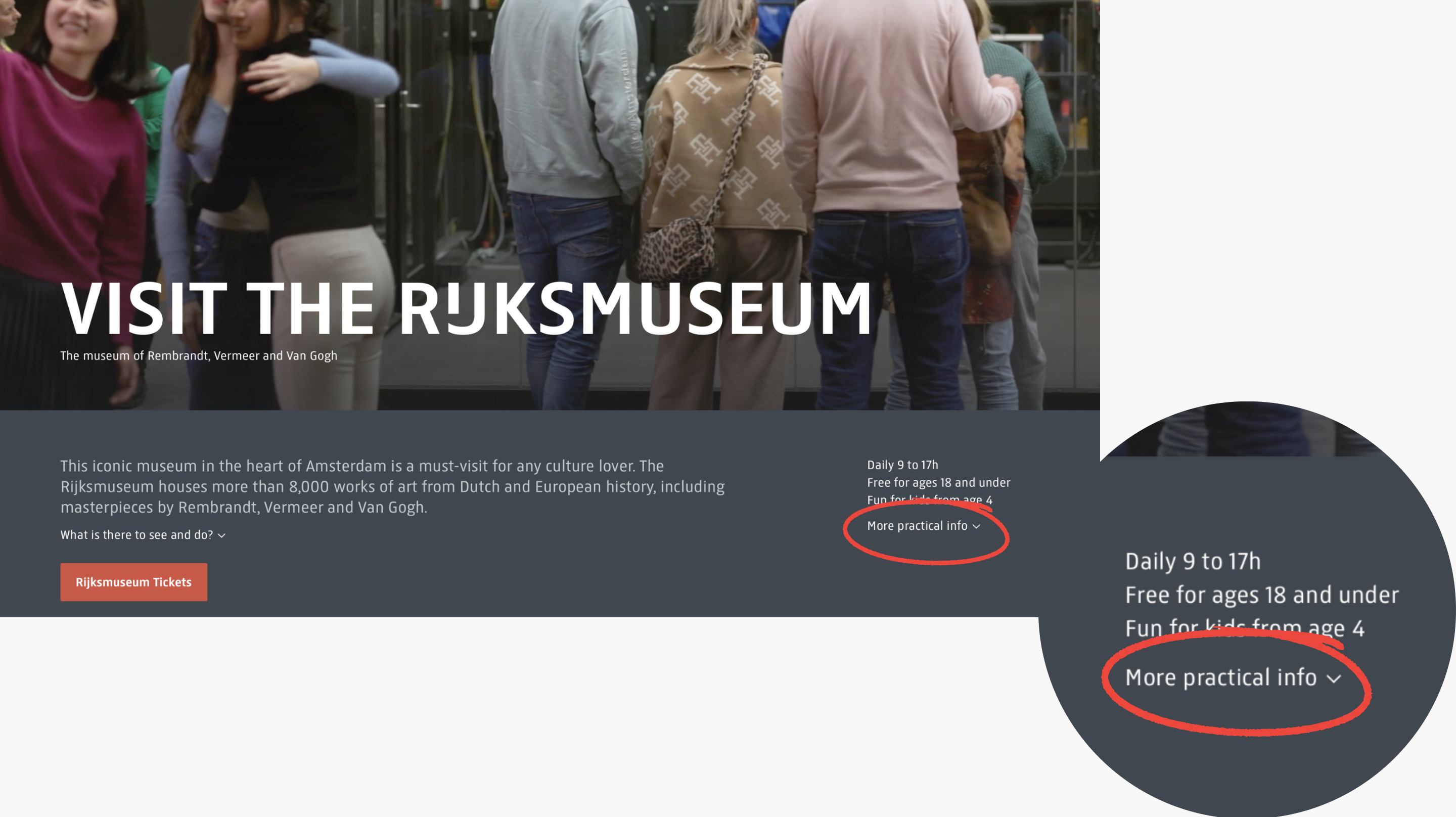
Assuming an average user would want to be prepared to explore the museum and not get lost in it, they would want to check out the map of the museum either before visiting or when they arrive. The way for users to access the map is through this chain of clicks: Visit→ Practical Info→ Address and Directions→ Floorplan→ Download the Map. Although it comprises five steps, a user may stall after clicking ‘Visit’ because the overload of other information doesn’t drive their visceral response into thinking that ‘Practical Info’ has the map that they are looking for. Moreover, the lack of discoverability is maximizing the gulf of execution for users looking for a floorplan of the museum. There is also an option to access the map under the “More practical info” dropdown which is in the right section of the webpage. This section is hidden and not highlighted unless a user hovers over the text. There is also other information about accessibility in the museum but again it’s all hidden and a user can only find this information if they choose to explore all parts of the website.
This issue can be solved by providing access to the map in two places- At the top section when a user clicks the “Visit” section, and when a user completes the action of buying their ticket(s). Putting it at the top of the “Visit” section can help the user minimize their gulf of execution by spending time looking for it. Additionally, it seems logical to also put it after they purchase tickets because they will be prepared with the map of the museum even before they enter. Moreover, by making the “More practical info” dropdown bolder and more accessible will increase discoverability of that section.
Conclusion
Although the website looks aesthetically pleasing, many of its important information and features are hidden and not easily accessible unless the user deep dives. As said by Norman, “Good design requires good communication” (Norman, D. A. (2013). The design of everyday things. The MIT Press.) and at various points during the design critique it can be noticed that the root cause starts from a vague understanding of the feature. Even at its core functionality of allowing users to book tickets, it gives users reasons to be frustrated by the interface. Overall, the website displays more characteristics of bad design than good design.