Overview:
The New Jersey Transit app is designed to help commuters purchase tickets, plan transit schedules and find commuter information all in one place. While it groups together important information for commuters, it assumes a familiarity with public transit and the area, which could be limiting for many users.
Design features:
This critique looks at the discoverability, mapping, feedback, and addition of skeuomorphism of the app.
Discoverability:
The home screen of the app shows a stacked list of where to buy tickets, see departure times in real-time for the train, real time departure times for the bus, the light rail schedule, all schedules grouped together and a link that takes you off the page for rewards.
From this main screen, the design uses both icons suggesting what each option is and text describing the tool. From here, it is both simple and clean to navigate to the next step. The clunkiest part of the layout is an ad banner bar at the time that toggles every few seconds. While it’s understandable a publicly created utility may need to run ads to generate revenue, the placement and speed of the transitional ads is distracting and takes us a valuable amount of space.
At the bottom of the screen, there is a homebar style list of icons with five options: a star and the word “favorites”, a ticket icon with “my tickets”, a home icon with “home”, a two-point display with “rider tools”, and a circle with an ellipsis and the word “more.” While on the home page, the home icon is selected in blue while the rest of the icons are gray, clearly indicating which page the user is on.
At the top, above the ad bar, is an icon with no text of an icon of a person inside a circle, the NJ transit logo in the middle and a lighter-blue bell icon. Tapping the person icon brings you to a user account page with options for controlling your individual payment methods, log-in settings and other useful tools. Tapping the notifications icon gives an alert that there are no alerts currently for My Tickets and gives the user an option to select ‘OK’ and close the warning.
Overall navigating around on the app is straight-forward and there are clear indicators of where an individual is on the page. The icons are supported with text and color helps reinforce which options are available. The two biggest design flaws are the size and placement of the ad bar, and that the individual settings menu and alerts menu are hard to see compared with the layout of the rest of the app’s design.
To fix the issue, the NJ transit app could either include these options at the bottom alongside the other main options. Or, it could move the placement of the ads banner to below the main stacked menu and make a clean space indicating the menu bar at the top and bottom as individual grouped options.
Feedback
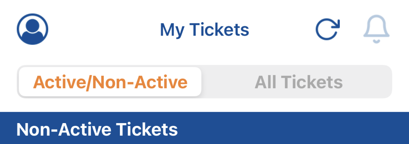

One of the things this app does well is give feedback wherever you are in the process. Color is used to indicate which tool you’re on from the bottom bar, regardless of the option you select from the home page vertical menu.
Pop-up notifications are included through the experience to alert when something about the selected menu option either should be known by the user, or is inaccessible to the user. For example, when selecting the notification (bell icon) on the top bar, the user is met with a pop-up indicating there are no alerts for their tickets at that time. To continue on with the journey there is a clear ‘OK’ button to press to acknowledge that you’ve seen the notification.

In sub-menus, the icon on the bottom of the bar remains blue to indicate that you’re on the active page and sub-menu options are highlighted and have orange text, to indicate which of the possible menus you are looking at.
Mapping:
One of the clearest parts of this app is the use of icons with text to indicate where a user would need to go to accommodate their commute. Related options are grouped together and, aside from the top-bar which was addressed in the last section, read in a top-to-bottom and left-to-right format.
However the design falls short once a user moves beyond the home page and goes through the steps to look up the schedule or to purchase a ticker of the bus, train or light rail.
Take buying a ticket, for example. From the home page, selecting ‘Buy tickets’ is simple. Then, a user is prompted to select from Rail, Bus, Light rail, or Special Promotion. A user with knowledge of the NJ transit system can continue down this path, but new users may lack the knowledge of which form of transit makes the most sense for them and it is still unclear what the cost of a ticket would be.
A reasonable step could be to then select the ‘Rider tools’ option from the menu bar at the bottom of the app, which could then offer the option of ‘Trip Planner’ to the user. That option allows the user to search by station, by address, or by location. Searching by location gives users a static list of stations, presumably those closest to them. Without a visual aid, it’s unclear how far these stations are, where they are in proximity to the user and how long it would take to get between them.
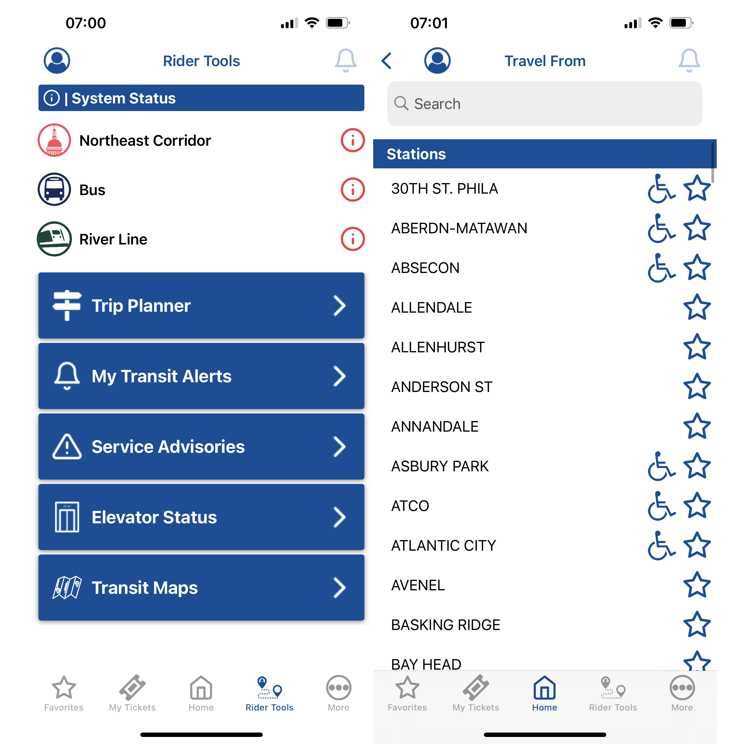
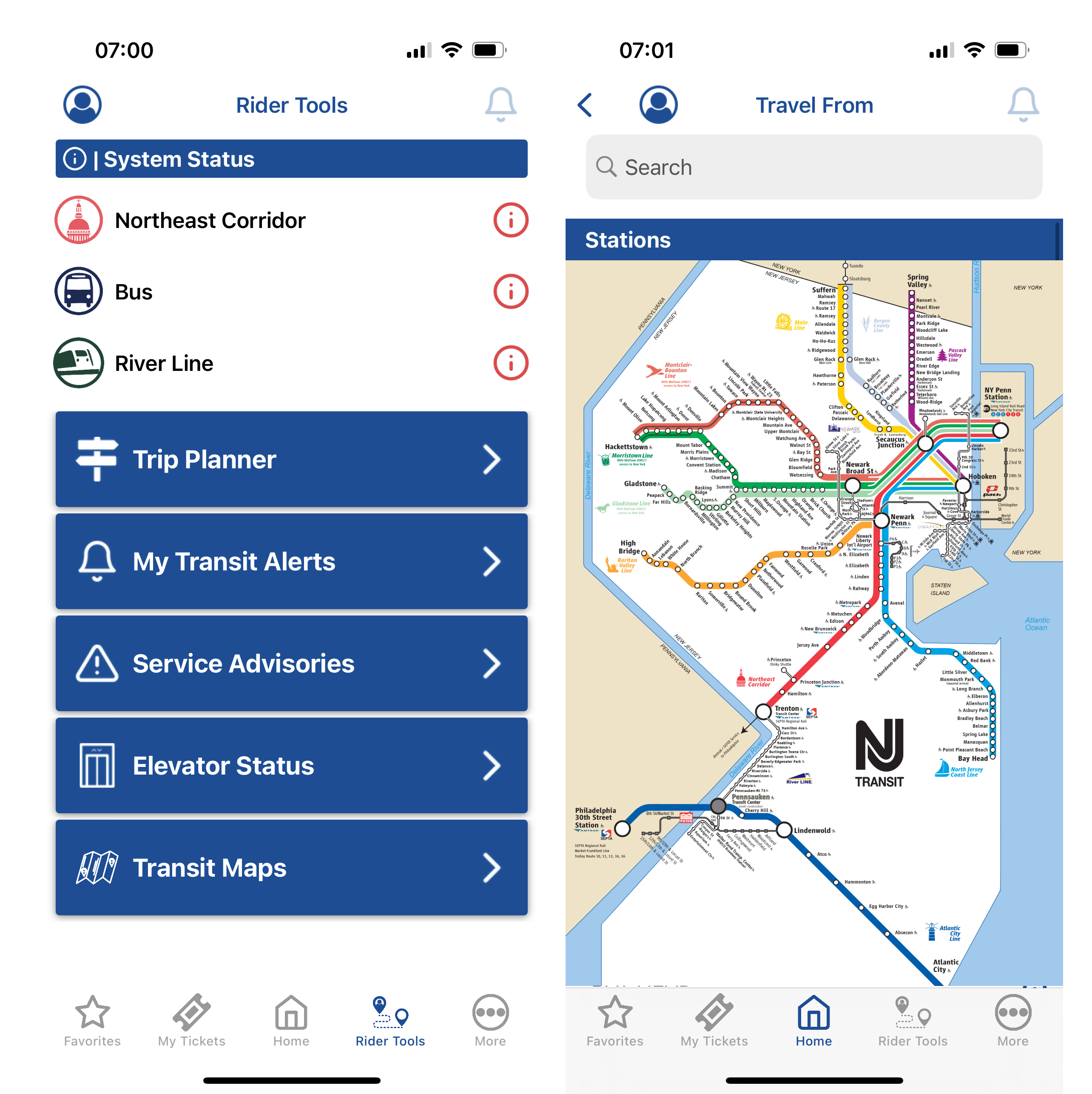
A possible solution would be to integrate an interactive map that showed users where stations were and allowed them to explore based on their current location or by station name. Maintaining the stations in a static list presumes the users may be more experienced than they are in reality and reduces the likelihood that someone, unless necessary, will continue to use the app to plan or figure out their commutes.
Skeuomorphism:
Another prominent design feature throughout the app is the use of icons that look like the thing they would be in real life. Every single menu icon could be readable without the text. The addition of text with menu options reinforces the useability of each page and allows users of different backgrounds to interact with the interface.
Overall experience:
Overall, the design is relatively clean, simple and straightforward. The user of banner ads and lack of interactive map adds clunkiness and requires a level of previous knowledge that may hinder a potential user.