
Introduction
X-plane store is an online marketplace and community forum for flight-simulation enthusiasts. Built specifically for the flight-simulation software X-plane, this store allows users to purchase and upload add-ons, modifications and other content to improve their flight simulation experience inside the X-plane software.
Who is this service for?
As per the organization’s ethos, their primary target audience consists of individuals passionate about aviation and gaming, particularly those interested in flight simulation and its personalization. After exploring the community forums, it became evident that the majority of users possessed some level of topical knowledge (aviation), suggesting that the platform may not cater to complete novices.
I, personally, lack any previous knowledge of aviation and flight simulation. Therefore, I will be approaching this design critique from the perspective of a newcomer to the field.
What tasks do they expect to complete?
Upon conducting initial research on the target audience, available services, and the product category (e-commerce), I focused on two primary user actions that I anticipate will be frequent and important when engaging with this interface:
Task 1: Exploring the catalog
Involves the user being able to navigate through the different items available, and obtain relevant information about the same
Task 2: Purchasing a particular item
Involves the user being able to obtain relevant information before making a purchase, as well as the actual purchasing flow
Task 1: Exploring the catalog

Step 1/2
As this service is exclusively web-based, there is no onboarding process for users. Upon accessing the website, users are immediately directed to the home page, which comprises a top menu and navigation bar, header advertisements, featured products, and new releases. However, certain usability issues arise:
- Top Menu and Navigation Bar: The top-level menu lacks discoverable signifiers, requiring users to hover directly over it to reveal dropdown options. There is inconsistency in the system in terms of design and functionality, with top-level menu bars not opening dropdown menus, while lower-level menu categories do.
- Featured Product List: The extensive list of featured products lacks categorization or price sorting, making it challenging for users to contextualize and comprehend the various product types offered. Moreover, the list’s uniform spacing disregards Gestalt principles of proximity, potentially leading to decision-making errors.
- Sorting Feature: Placing the sorting options (price and manufacturer) at the end of the screen demonstrates a clear lack of visibility and doesn’t convey the affordance of sorting through the extensive list of items.
Overall, I feel that there is a gulf of execution – Lack of constraints and hierarchy, along with uninformative terminology makes users confused on what they can do and what they should do on this interface. The saving grace is that the structure of the website and price listings for products indicates that it is an e-commerce platform which most users are used to (knowledge in the head) and hence are able to navigate through the website.

Step 2/2
After selecting a specific category from the dropdown menu, users are directed to a dedicated category page. However, the feedback confirming that users are on the correct category page is extremely subtle and therefore inadequate. Similar in appearance to the home page, this page lacks fresh information about the products, leaving users disoriented about their progress—a deficiency in feedback.
When it comes to the product page, it successfully presents the relevant product information. However, there’s an issue with the design: More specifications about the product like reviews, software requirements etc are grayed out, and therefore do not convey their clickability. This design choice contradicts users’ learned behavior across different interfaces, where grayed-out elements are typically considered inaccessible. This inconsistency with user expectations exemplifies a gap between the system’s behavior and users’ conceptual models, underlining the importance of providing intuitive signifiers.
Proposed Solution:
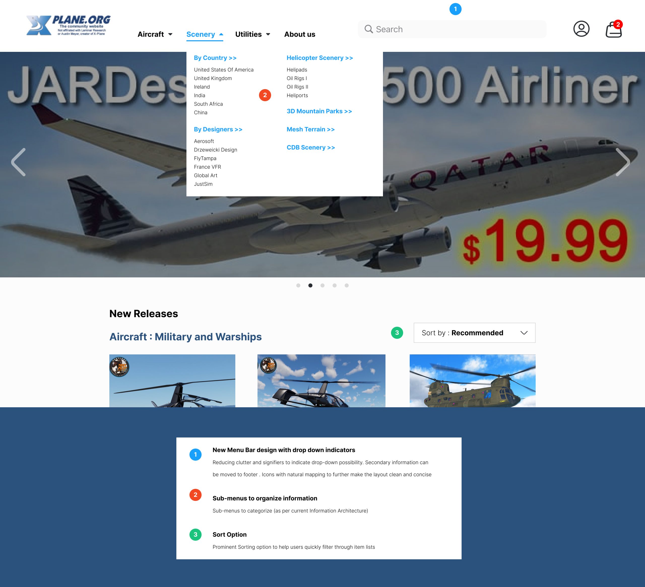
My proposed solution revolves around aiding discoverability and reducing the gulf of execution by a more streamlined design for the menu/navigation bar. Additionally the sorting feature in a prominent location affords the opportunity to sort through the extensive lists of items quickly and easily.
Task 2: Purchasing a particular item
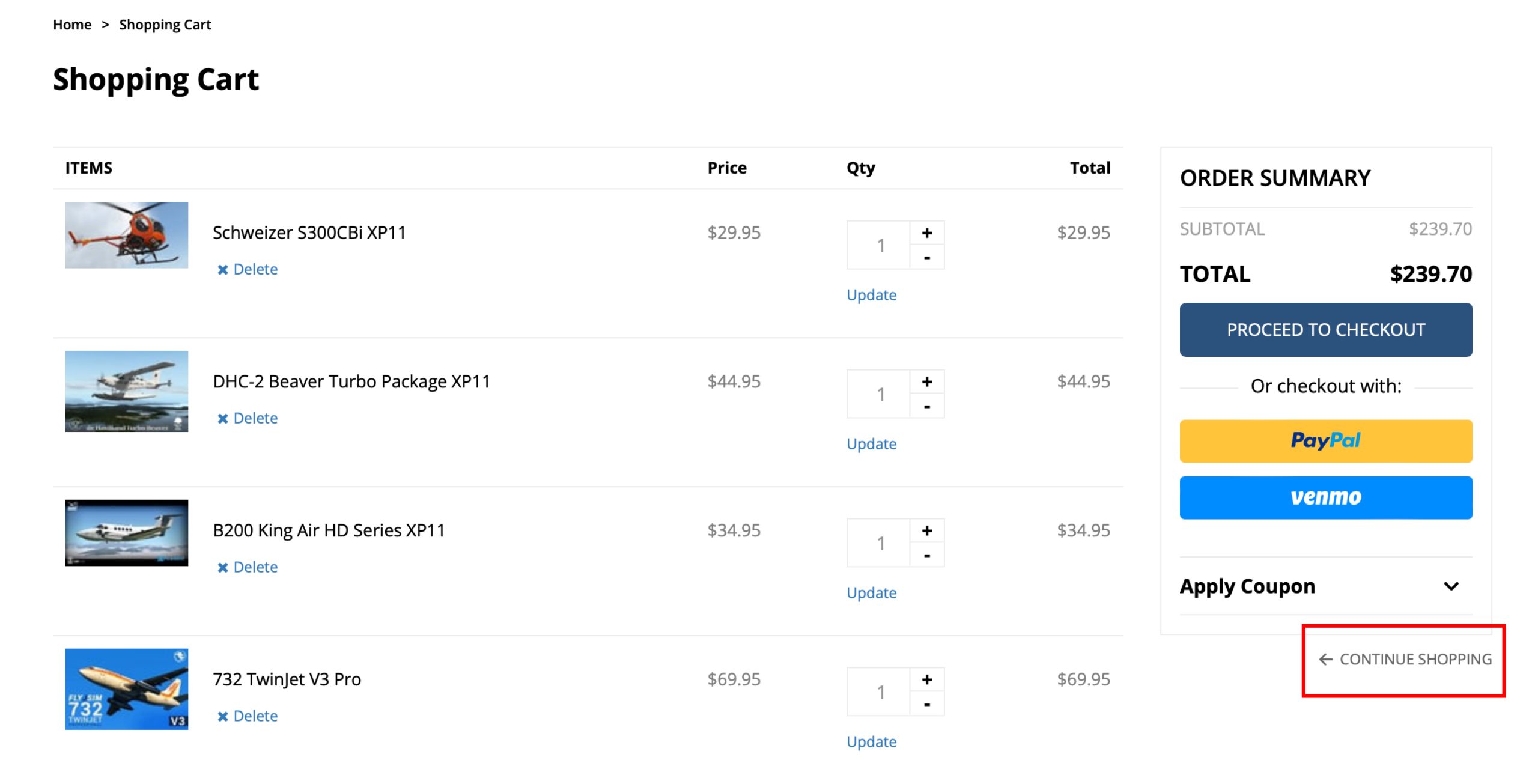
Option 01: Directly from Home/Category Page
On the home/category pages, all product items prominently feature an “add to cart” button. However, upon clicking this button, users are immediately redirected to the cart page, which can be unintuitive and counter productive when intending to purchase multiple items. Furthermore, the inconspicuous “continue shopping” option, positioned below the “proceed to checkout” button, may give users a sense of losing control over the process. The option to undo/recover, a fundamental requirement in an interface according to Don Norman, is not satisfied in this particular flow.
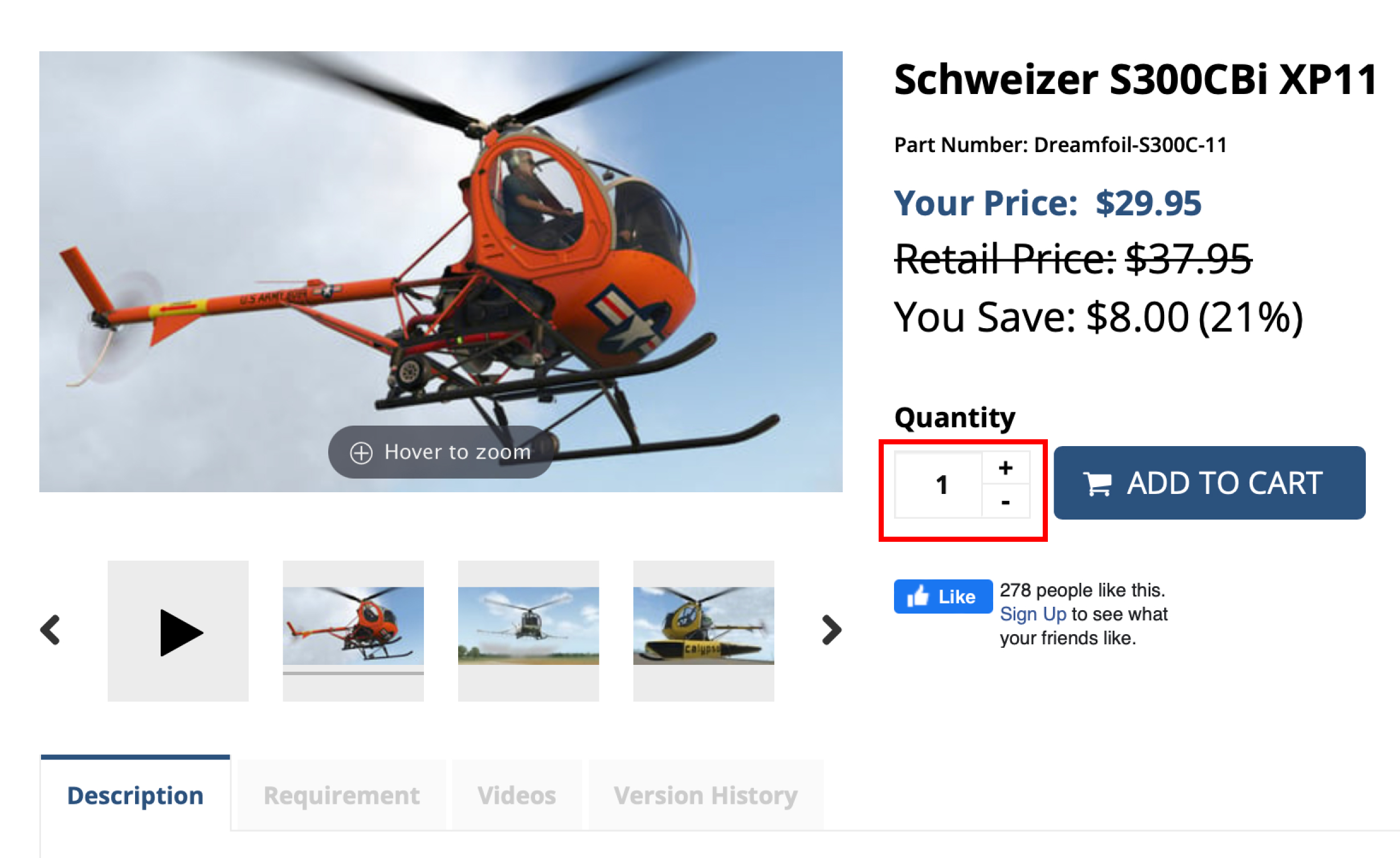
Option 02: From Item Page
Purchasing from an item page offers a more intuitive and commonly used approach in e-commerce. Here, users can make informed decisions after evaluating product features and prices. The addition/subtraction of items is intuitively mapped—addition is represented above, and subtraction below. However, the button design, characterized by close proximity and small size, may increase the risk of accidental slips by users.
Proposed Solution:
In the following mockup, I redesigned the item card that is present on the home pages and individual category pages. By providing more information about the product in the card, users can make better and quicker decisions (fundamental in e-commerce!). Additionally, I worked on a suitable feedback for the “add to cart” option to let users quickly understand that their actions have been recorded.

Conclusion:
After a thorough assessment of this interface, it becomes evident that numerous usability concerns demand addressing to transform it into an intuitive and efficient e-commerce platform, especially for novice users. Aligning with the design principles advocated by Don Norman in “Design of Everyday Things,” addressing these usability issues will significantly enhance the user experience. From a design standpoint, adopting a uniform and consistent visual style can further elevate the platform’s appeal and aid discoverability.
References:
Norman, Donald A. The Design of Everyday Things. Revised and expanded edition., Basic Books, 2013