SSENSE is a Montreal-based clothing retailer offering high-end streetwear and designer fashion for both men and women. Their website showcases more than 70,000 items from over 500 labels, incorporating new and emerging designers as well as household names like Gucci and Prada. Emphasizing product and editorial, the website is a clean, minimalist design with few navigation options and a straightforward checkout process.
Bridging the Gulf of Execution: Minimal Navigation Labels
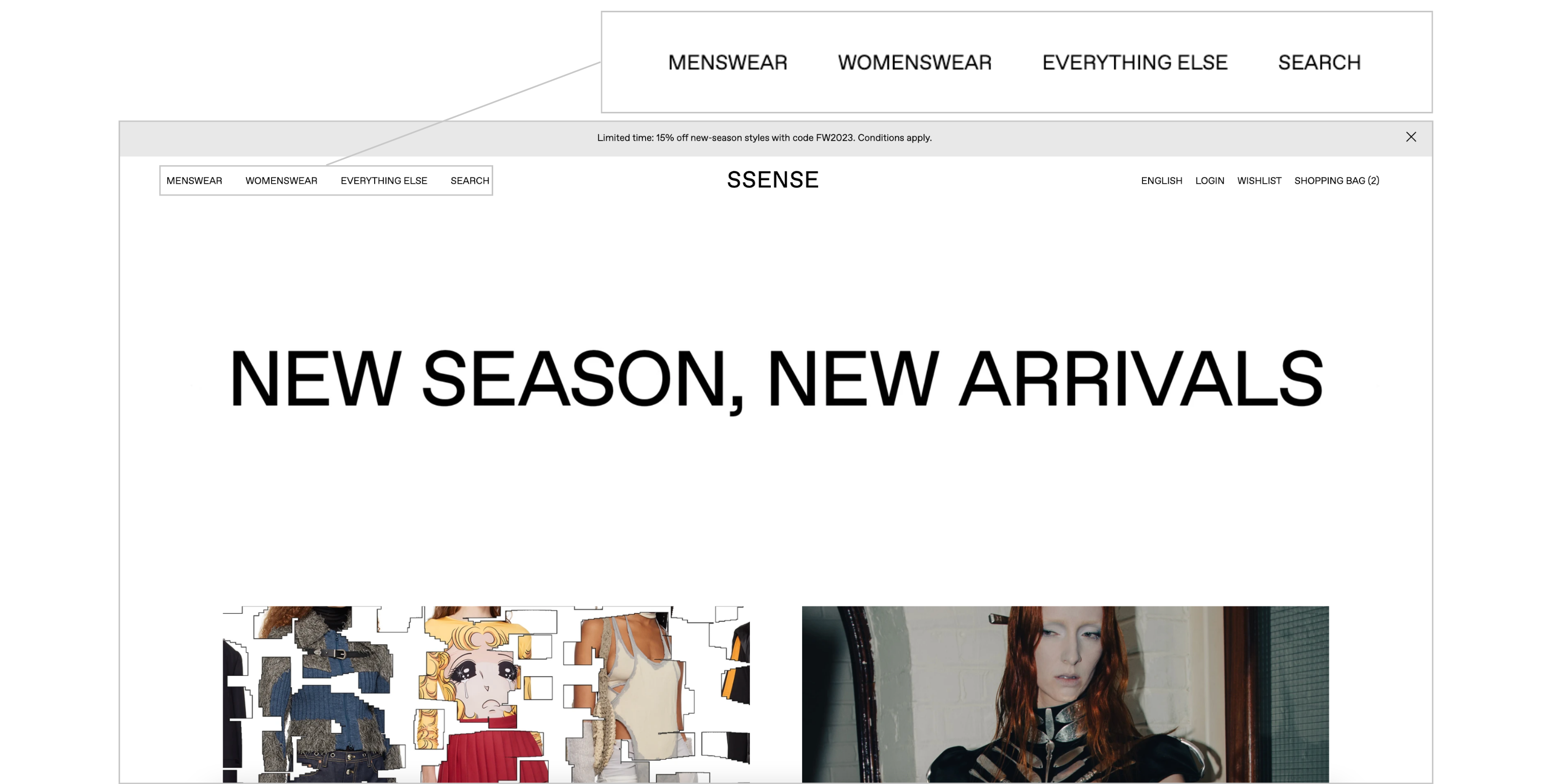
SSENSE’s homepage showcases editorial content, not products, and uses minimal labels for navigation.
The simple homepage and a pared-down global navigation immediately aid with the gulf of execution by fostering discoverability and understanding for the user, who most likely is visiting SSENSE’s website to shop and get style inspiration. With just a few shopping categories from which to choose — menswear, womenswear, and a catchall category called “everything else” — at the top left of the page, the user can quickly get a sense of where and how they can navigate within the site and how the site is meant to be used.

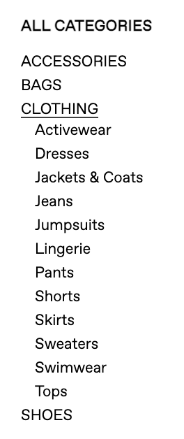
The local navigation on the products page remains simple even when expanded to offer clear but limited pathways for the user.
Once the user selects an initial category from which to shop, the user can make use of the local navigation on the left sidebar to further hone their shopping experience. The two menus there are entitled “All Categories” and “All Designers,” which serve as signifiers as to what options are available for the user and how the user can shop this page.
The “All Categories” menu only expands when clicked to reveal more specific product types but still keeps the number of labels to a minimum. The underline of the hover state provides feedforward to the user, indicating that the text can be clicked. The underline of the selected state also provides feedback that confirms to the user where they are currently located and that they took the correct action.
As users navigate SSENSE’s site, they will find their existing mental model of fashion ecommerce sites supports their understanding of this one. The organization of the site in increasingly specific product categories is consistent with other fashion ecommerce sites the user may have visited, while the decision to include only a few choices in the top-level navigation supports SSENSE’s minimalist design.
Interrupting the Action Cycle: Limited Filtering Options
With tens of thousands of products available on SSENSE’s website, users can easily become overwhelmed with the amount of content. That’s why filters and sorting options are so important.

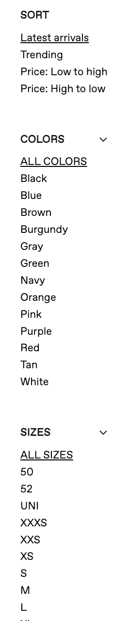
A user can only refine their search for a specific product by selecting a specific designer or filtering by color and size.
However, once a product category is selected, users have very few ways to refine their search. They can either click on a designer’s name to see only products by that designer, or filter all products by color or size. The option to filter by only one stylistic attribute — color — won’t go very far in helping a user with the goal of finding a product with a specific feature, such as a particular neckline, sleeve length, or pant inseam. Since other fashion ecommerce sites do offer more detailed filtering of products, some users’ mental models may not hold true with SSENSE’s site. When the user finds they cannot refine their search any further, the action cycle is interrupted, creating frustration and confusion for the user as to how to proceed. As they perceive the state of the world — that the filters they may have expected are not there — they realize their goal of refining their search has been thwarted.
One solution would be to offer expandable filters on the right-hand side of the products page. The user would see their options for refining their search, aiding them in their goal of finding a particular type or style of product. The collapsible nature of the filters would avoid creating visual clutter and maintain the overall minimalist design.
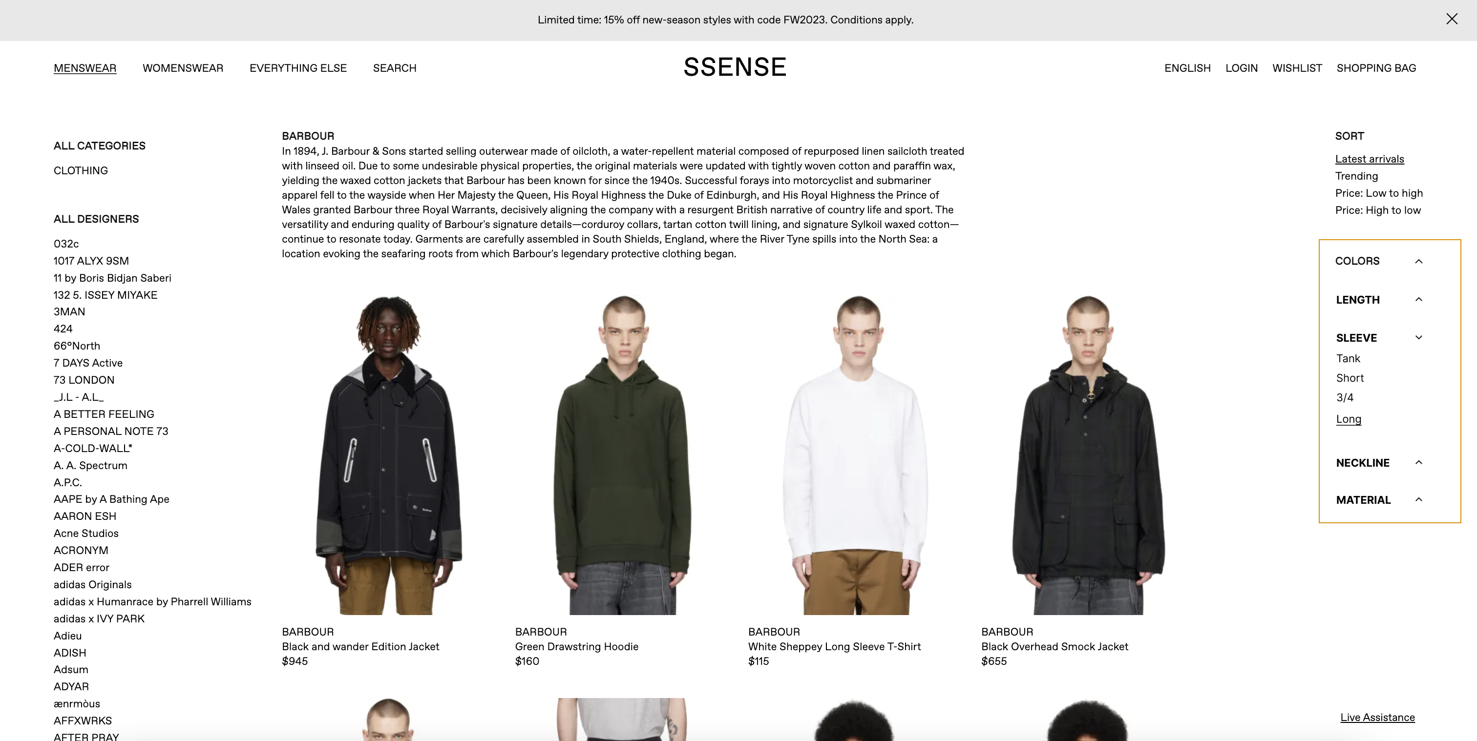
My Solution: The addition of collapsible filters like these on the right-hand side of the products page would give users additional ways to refine their product search.
Guiding the Checkout Process: Strong Signifiers and Constraints
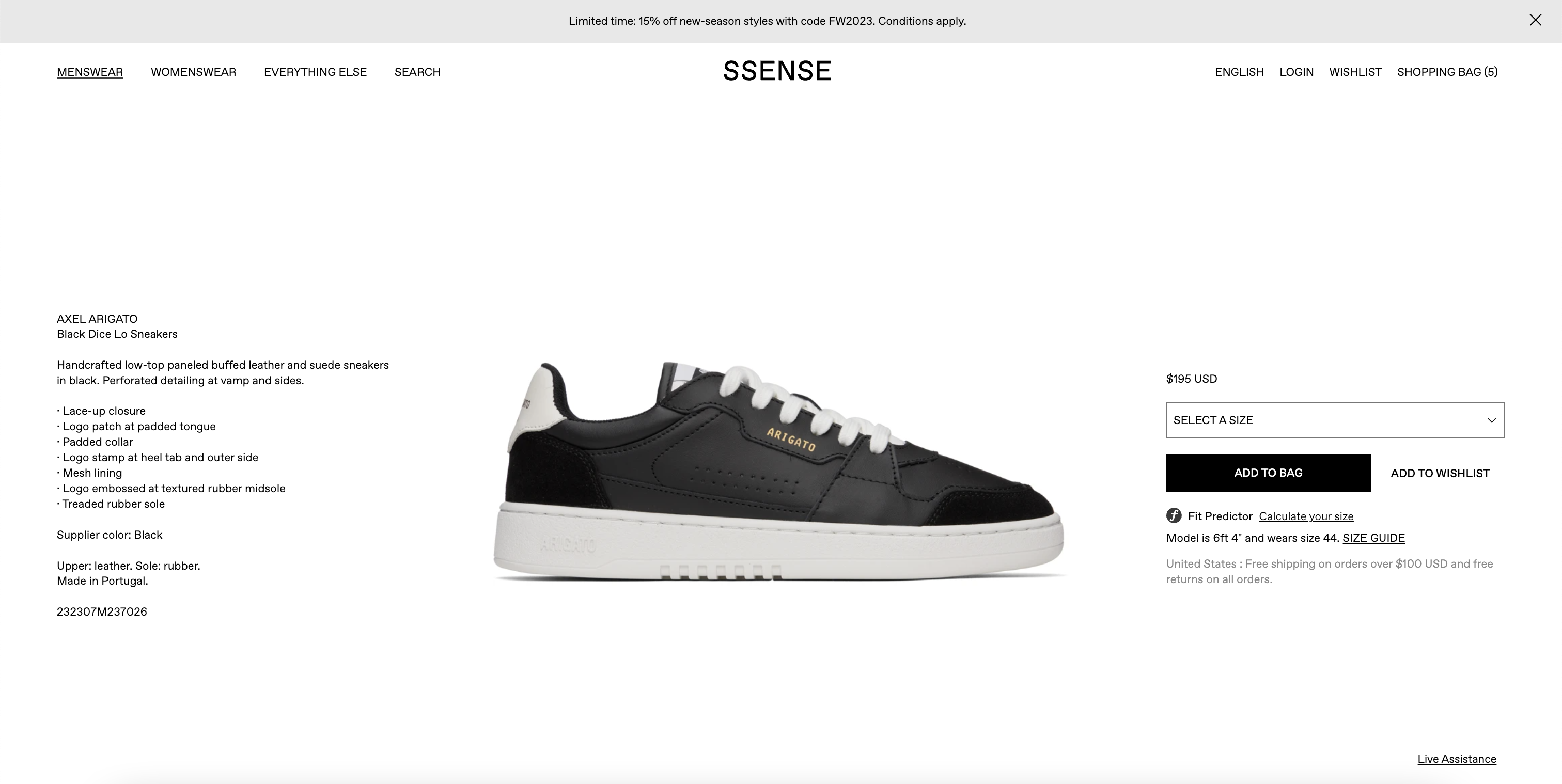
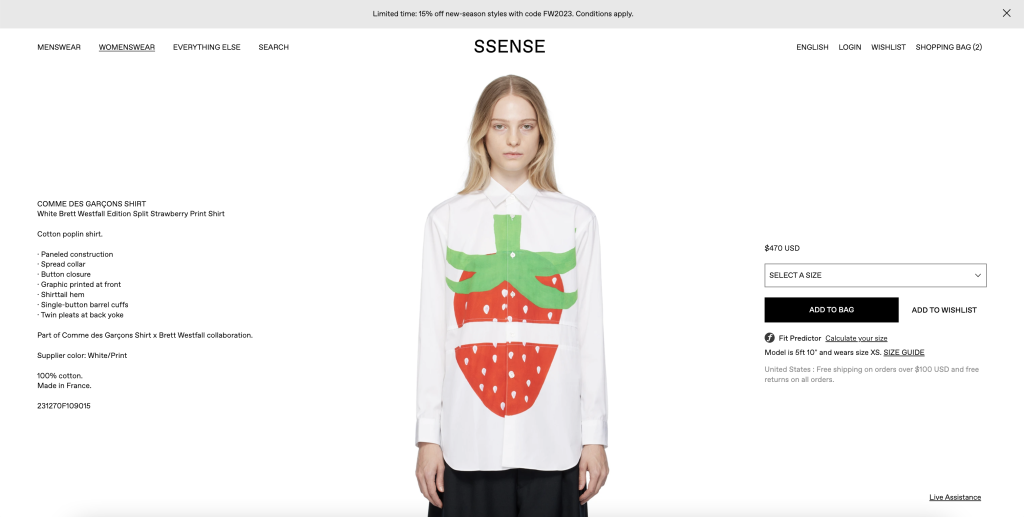
An example product detail page displays all the product details above the fold with simple formatting. The user can only see more images upon scrolling down.
Product detail pages are extremely simple, highlighting the product with all of the product information above the fold and a large photo as the centerpiece. Additional product images are only revealed upon scrolling down. However, the lack of any signifier that scrolling accomplishes this action is a barrier to understanding for the user. A simple vertical scroll bar (pictured below) would solve this problem by providing a clear signifier that the action of scrolling is possible.

My Solution: A scroll bar such as this one or another scroll indicator would serve as a signifier that scrolling is possible.
SSENSE’s online checkout process is especially seamless, guiding the user from one step to the next in just three screens. The checkout process follows a conceptual model that integrates most users’ mental models of typical online checkout processes, along with clear signifiers in the case of large black buttons that stand out starkly against the white background: “Add to Bag,” “Proceed to Checkout,” and “Place Order.”
After the user clicks “Add to Bag,” a line of text in a small font size confirms that the item has been added to the cart. The “Add to Bag” button also changes to “Proceed to Checkout.” This feedback may not be obvious enough to the user.
One possible roadblock to an otherwise smooth checkout process is how subtle the feedback is after the user clicks “Add to Bag.” Only a very small line of text reading “Added to Bag” appears underneath the “Add to Bag” button, which also changes to “Proceed to Cart.” The gulf of evaluation is not resolved here, as the user might not be immediately sure what happened and if it was the desired action. The new text is not prominent enough to catch the eye, and the change in the button is not very noticeable without a second glance because the colors and placement remain the same. With a more obvious change in state for the button, such as from a black button with white text to a white button with black text, would provide clearer feedback to the user and help bridge the gulf of evaluation.
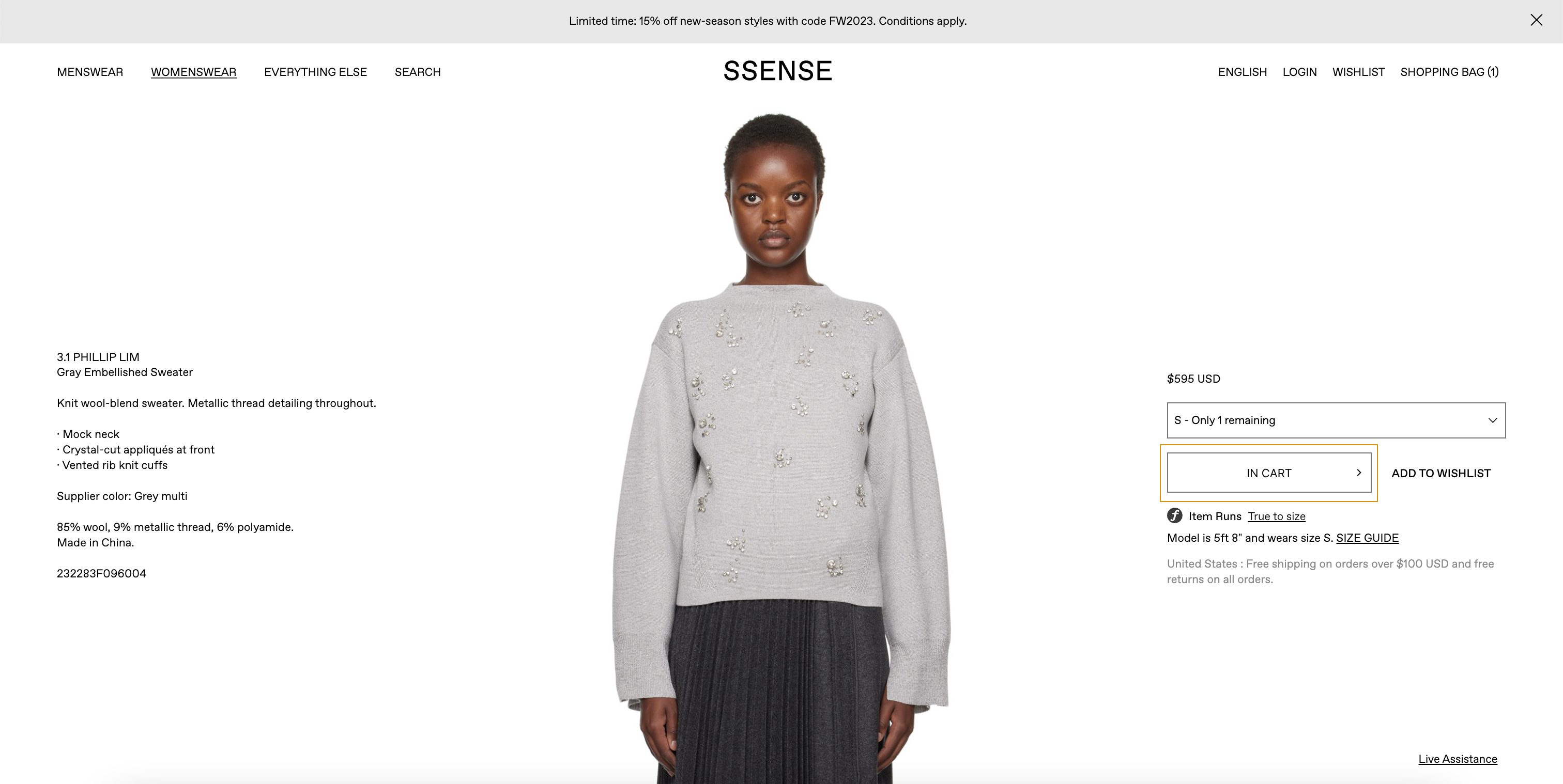
My Solution: A more dramatic change of state to the “Add to Cart” button between before and after adding an item to cart would provide clearer feedback to the user.
Once on the payment page, before the user places the order, the user faces an interlock constraint whereby their only options are to continue the checkout process (i.e. typing in their billing and shipping information) and click the “Place Order” button. The global navigation menu is gone, there is no additional content or products below the fold, and even the SSENSE’s logo is not clickable to return to the homepage. Eliminating other affordances on the page reduces the likelihood of error, specifically slips in the perform, perceive, or interpret stages of the action cycle. The user is clearly being guided to move through the checkout process and perform the desired behavior: making a purchase.
Conclusion
Overall, SSENSE’s website succeeds in emphasizing product and editorial content with a modern and minimalist design, but falls short in a few key areas in ensuring a smooth user experience. With some simple but effective additions to the interface, the user would have an even smoother experience selecting products and completing the checkout process.