
Overview
Slide Deck
My Role: User Researcher; User Experience
Team Members: Jimin Hong; Gatha Bakta; Rong Cheng; Hugo He
Tools: Figma, Google Drive,
Duration: Late October to Early December
The Client: KnowUnity
Who are they?
Knowunity is Europe’s fastest growing educational tech app with now 9 million users across Europe and is now being implemented in the United States. The KnowUnity platform allows students to share their notes, summaries, flashcards and quizzes with one another to provide a true peer to peer perspective on school related content.
What do they already know?
Identified age selection and school search as points where users were dropping off from the onboarding process.
What do they want to know?
How to better understand user expectations before and after onboarding to provide actionable insights to enhance the onboarding experience.
Goals
- Give usability insights which support research goal of project.
- New user onboarding and understanding to what extent new users understand the value proposition of KnowUnity.
- Bridging the gap between user expectations and the app experience.
Initial Client Meeting
We initially met with KnowUnity’s project manager, David Villa, to gain insights on the current standing of KnowUnity’s onboarding and on the related research conducted so far. We also asked him a series of questions to gain insights into KnowUnity’s goals and objectives.
We learned that:
- Week 1 retention is around 30% right now in the US
- Their main competitors right now are: Quizlet, Chegg, and Brainly
- Their business goals are to gain insights on how to improve the experience for first-time users
Their Goal: Test with US high school & middle school students the onboarding flow of first time users of the app
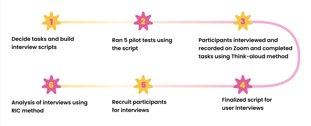
Moderated User Testing Process
User Group
Based off information we got from our client meeting, we decided that our user group would be high school & middle school students enrolled in schools in the United States. From there, we began figuring out ways to recruit students to be interviewed.
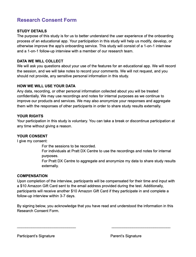
Consent Form: because most of the students were under the age of 18, we were required to get consent from their legal guardians before recording any interviews
Script and Questionnaire
We divided our interview into 4 steps. At each step, we asked interviewees repetitive questions about their expectations and feelings for each stage to identify any gaps between them. We went for a more open-ended approach, allowing users to explore the website. We also asked them about their initial impressions, expectations, and thoughts on what they were doing to gain insights into user behavior and needs.
Steps
Step 1: TikTok Ad
Step 2: App Store / Google Play Preview Screenshot
Step 3: Sign-up (Age, Grade, Subject Selection, Sign Up)
Step 4: Explore the overall Knowunity app
Tasks
Task 1: Watch a TikTok Ad with your smartphone. After watching it, please say your thoughts and feelings out loud.
Task 2: Go to the App Store / Google Play Preview Screenshot and swipe through the provided screenshots. Say your thoughts and feelings out loud while swiping.
Task 3: Download KnowUnity and do the Sign-up (Age, Grade, Subject Selection, Sign Up) process. Through out the process please say your thoughts and feelings out loud .
Task 4: Now take 5 minutes to explore the overall features and content of the Knowunity app
Main Questions We Asked
- What do you think this app is for?
- Can you describe what you expect the app to look like?
- Can you describe what features it might have?
- Through this app, what do you think you can get out of it?
Recruiting Participants
To recruit participants, we reached out to families and friends who had children enrolled in either middle or high school. To encourage participation, participants received a $10 Amazon Gift Card reward at the end of the interviews for participating.
We recruited a total of 14 participants.
Methodology
Conducted 14 in-depth, 45-minute qualitative user interviews with middle and high school students enrolled in schools in the US. After a week, conducted quick follow-up interview.
Analyzed user interviews to discern prevalent themes and recurring patterns within the data.
Strategic focus on bridging the gap between user expectations and the reality of their experiences.
Pilot Tests
Before we finalized the script for the interviews, we conducted pilot tests for the script to see if any aspects needed improvement and to see how long the whole interview would take.
Our pilot tests revealed that the whole interview could take between 30-40 minutes in total.
Second-Client Meeting
We met with David once more after our Kick-Off meeting to briefly describe what we have discovered so far. We also used this meeting as an opportunity to ask him questions we had come up with while working on the project.
User Research
Slide Deck
Analysis of User Interview
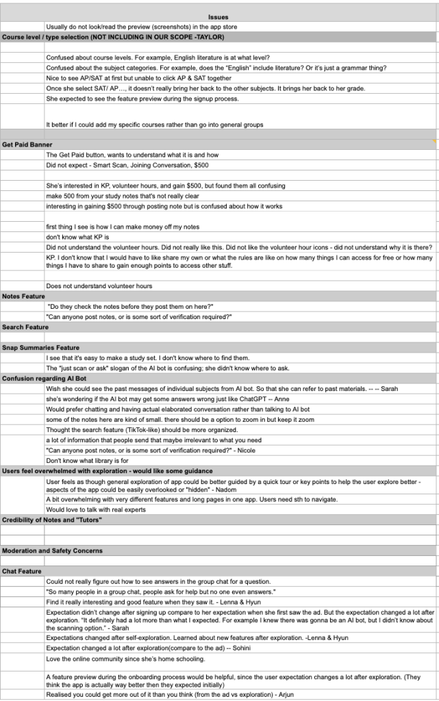
After conducting all the interviews, we analyzed the recordings and quoted important details said by participants. We organized the data based on context and grouped the related ones into several main issues.
What we learned from the analysis:
1) Low expectations before exploration led to dropouts during the sign-up process (10/14 users)
User expectations before exploring KnowUnity were low resulting in high dropout rates. Their initial perceptions of the app influenced how willing they were to continue engaging when met with obstacles or hurdles.
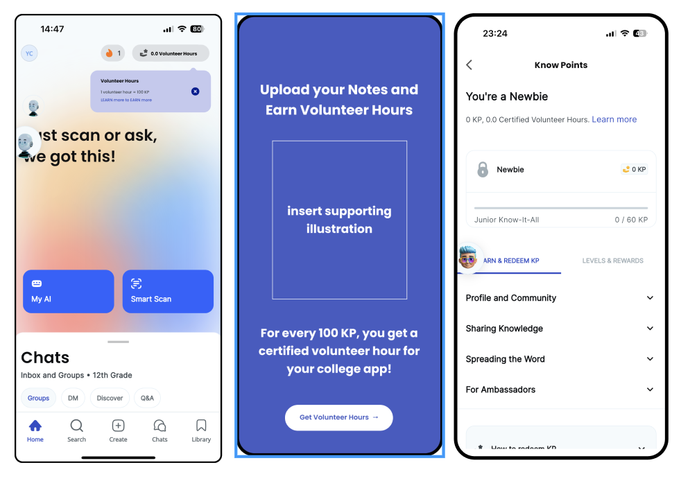
2) KP and Volunteer Hours are not explained enough (9/14 users)
Users did not fully understand the concepts of KP and Volunteer Hours. After the onboarding process, they were still confused about what they entail and how they relate to each other.
3) Hesitant to rely on the context provided by the platform due to lack of assurance (4/14 users)
Users were unsure if they could trust the credibility of the app and were hesitant to rely on the content provided.
4) Hard to navigate through overwhelming features (4/14 users)
Users felt overwhelmed when first exploring the app and did not know where to begin.
RIC Scores
We used RIC Scoring to decide which issues are of the highest priority.
Our results:

Reach: How many people will this feature affect within a given time period?
Impact: How much will this impact individual users?
Confidence: How confident are the researchers about the impact and reach scores?
Findings
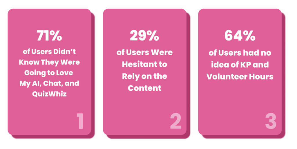
1) User expectations of KnowUnity’s features didn’t match the tangible reality of their experiences when using the app. 71% of the participants didn’t know that features such as My AI, QuizWhiz, and Chat would end up being their favorite features on the app.
2) Students were hesitant to rely on the content of the app. Around 29% of participants expressed their concerns over this aspect of Knowunity.
3) By the end of KnowUnity’s exploration, 64% of users were still confused with the concept of KP and volunteer hours.
Recommendations
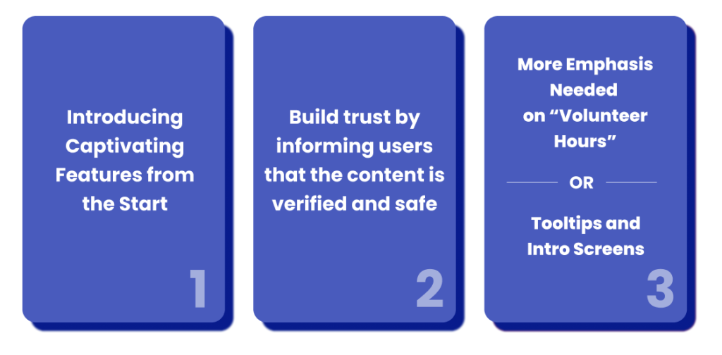
1) Introducing Captivating Features from the Start
We suggested incorporating brief yet impactful videos, similar to TikTok, before the sign-up phase. These dynamic visuals are more effective in grabbing attention compared to static content. Also, this does not force any interaction from their end.
Cool Video Explanation before sign-up
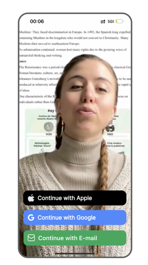
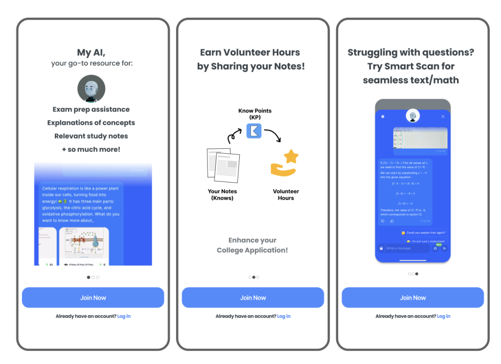
Best features showcased before sign-up
We also suggested considering introducing users to their favorite features before the age selection step.
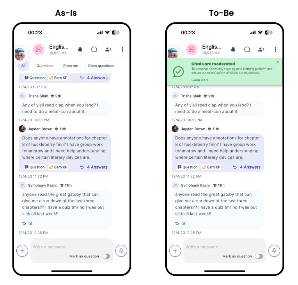
2) Build Trust by Informing Users that the Content is Verified and Safe
We suggested Knowunity add a layer of assurance to boost confidence and trust among its users.
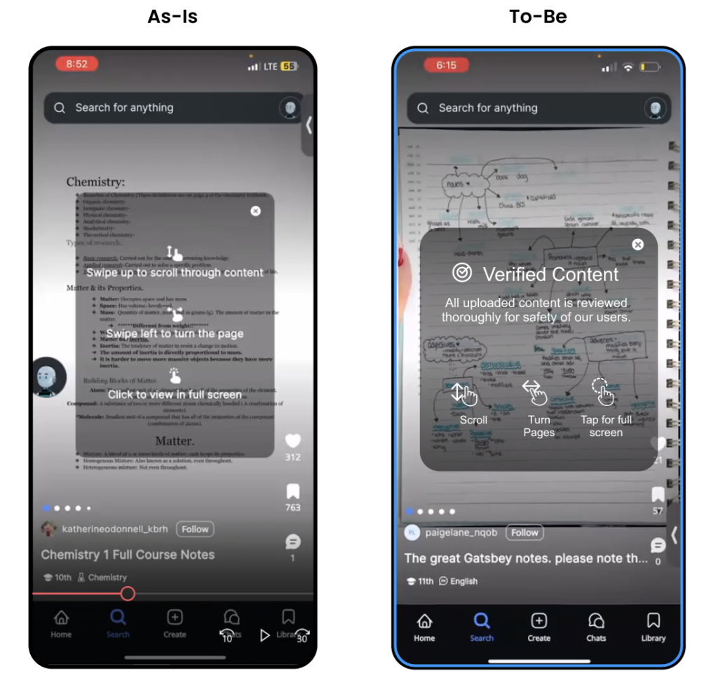
We also suggested reminding users during their chat sessions that chats are moderated and that they need to adhere to rules and guidelines if they interact with each other.
3) More Emphasis Needed on Volunteer Hours OR Use Tooltip Screens
Conclusion
We presented our findings and recommendations to David and several other members of the KnowUnity team. We created a slide deck using Figma to illustrate all the research we conducted. Overall, our presentation went great and the clients were very satisfied with our work!
If we had next steps, our next steps would be to implement our recommendations and conduct analyses to see if they will improve the user’s onboarding experience or not.