Amazon Prime Video, a versatile streaming platform providing a wide array of content in multiple languages, including movies, TV shows, documentaries, and original series, offers a rich digital experience. Nonetheless, during personal use and group viewings, some usability challenges have been noticed. Drawing from usability principles highlighted in Don Norman’s “The Design of Everyday Things,” potential solutions can be explored to address these issues. Three primary concerns are outlined below, along with suggested solutions.
- Find Information on content on the Home Page
1.1A PROBLEM (LACK OF ACTIONABLE SIGNIFIERS AND VISIBILITY OF VIEWING STATUS)
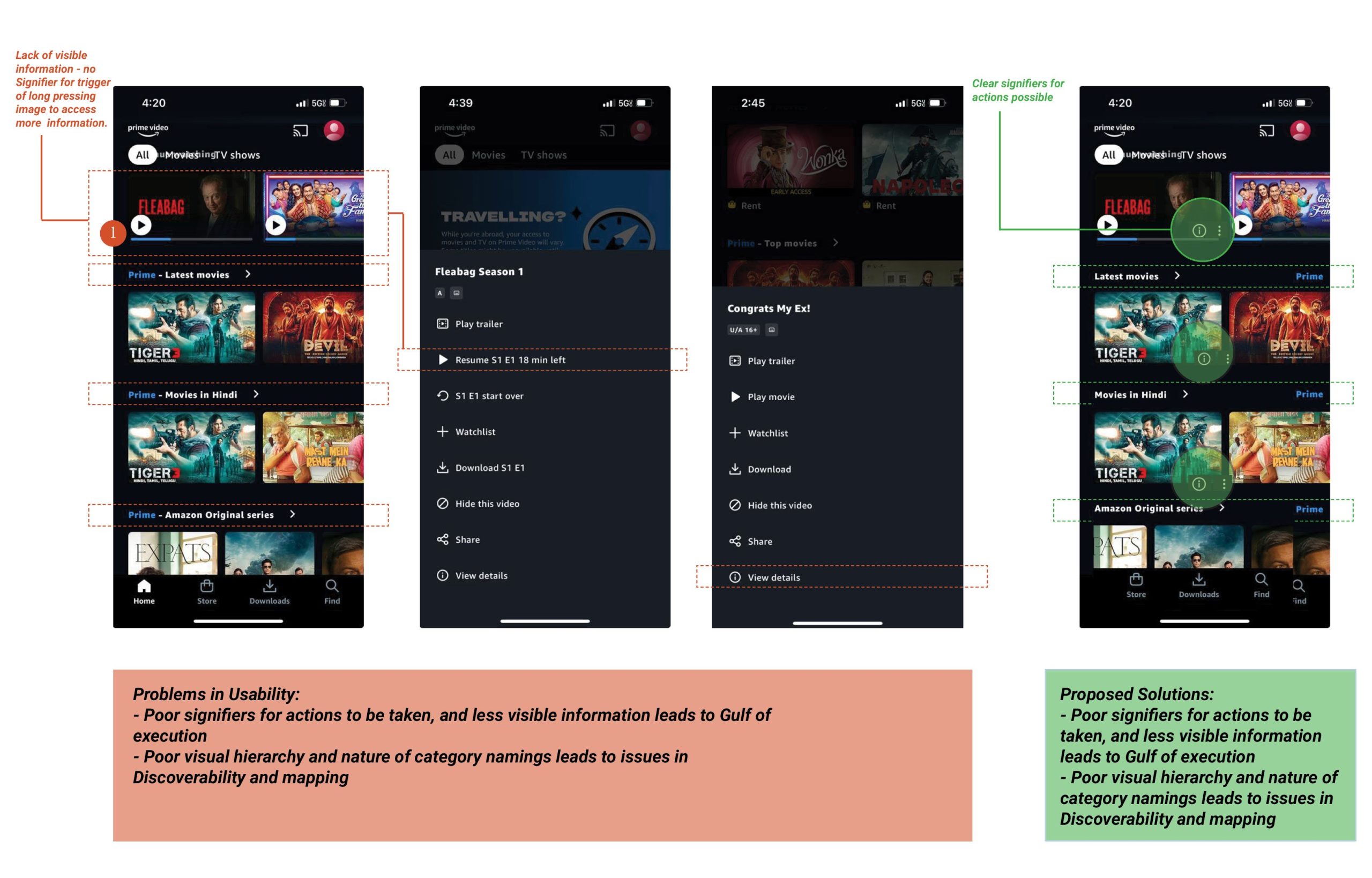
As the app opens, the home page presents rows of movie titles in a horizontal scroll, lacking clear actionable signifiers for crucial functions like accessing information, or managing preferences. The individual movie images lack direct cues, necessitating a long press for details without a clear signifier prompting users to perform that action. In the context of Norman’s concepts, this creates a significant Gulf of Execution, as users may struggle to bridge the gap between their intentions and the actual interactions required because of absence of signifiers.
The ‘Continue Watching’ section lacks visibility on current status of episode details and watched minutes, contributing to slips and errors in resuming play accurately. This leads to a bad user experience. Providing clear feedback and signifiers here aligns with Norman’s emphasis on feedback and constraints to prevent accidental actions. (Refer to Image below)
1.1B SOLUTION (INCORPORATE DROP-DOWN ICON, ADD CURRENT VIEWING STATUS INFORMATION ON HOME SCREEN)
To enhance discoverability and align with Norman’s principles, incorporating visible signifiers such as a drop-down menu or a three-dotted information icon could guide users. This would serve as a visible affordance, providing a clear cue for interaction. (Refer to Image below). Current status of minutes watched should be added for ‘Currently Watching’ movies/ TV shows to reduce accidental errors when a user forgets where they had paused playing.
1.2A PROBLEM AREA (ISSUES IN QUICKLY BROWSING CATEGORY NAMES)
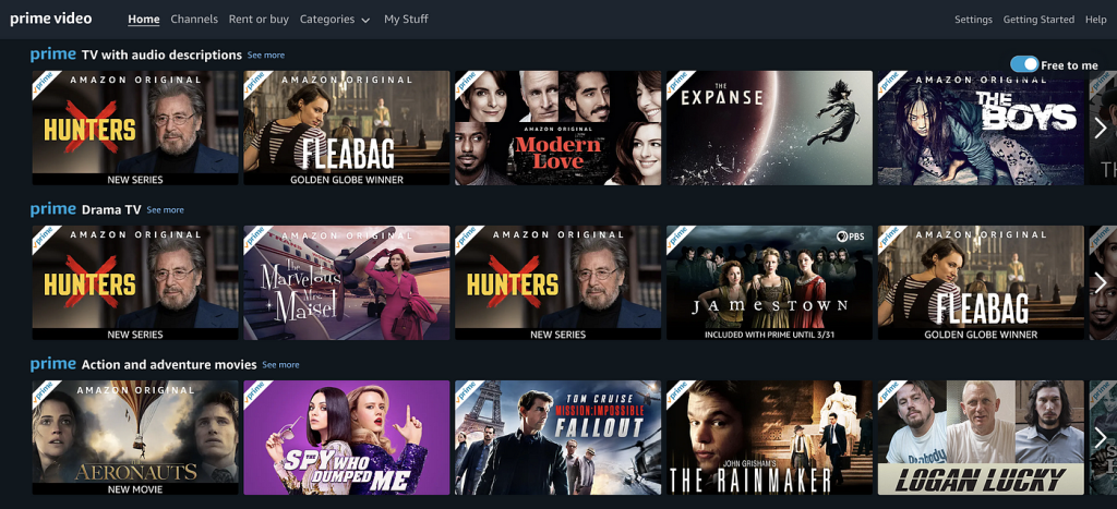
All category names across the Home Page start with ‘Prime’ in the blue Brand color, and then state the Category name. This may cause issues to the user in quickly perusing Category names while quickly scrolling up or down.
1.2B SOLUTION (REPOSITIONING BRAND NAME FOR VISIBILITY)
Considerations for “Knowledge in the World” involve repositioning the ‘Prime’ brand name to the right, reducing interference with category names. This aligns with Norman’s notion that effective design should leverage users’ external knowledge and expectations. This also enhances Visibility of the Category names. (View Solution image below)
1.2 Repositioning ‘Prime’ brand name for better visual hierarchy for Discoverability
(Click to enlarge Image)
2. Filter and Search:
2.1A PROBLEM AREA (GULF OF EXECUTION FOR ‘SEARCH’)
The content structure, particularly for TV shows, leads to confusion as search results display multiple seasons for a single show in the same search result. (Image below). Norman’s Gulf of Execution concept is evident here, as users may find it challenging to understand and execute the search process effectively.
2.1B SOLUTION (SIMPLIFY MAPPING AND NAVIGATION BY STREAMLINING SEARCH RESULTS)
Simplifying this process aligns with Norman’s principle of mapping, making the relationship between user intentions and actions more intuitive. Presenting a single result for TV shows when the name is searched in the Search Bar, and enabling users to change Season settings, and explore individual episodes within the product detail page can reduce the Gulf of Execution and simplify Mapping. This also aligns with Knowledge of the World concept.

2.2A PROBLEM AREA (GULF OF EXECUTION FOR FILTER)
While searching for a specific Genre, there is a separate Filter pop-up. However it is blank when opened. Users need to open the drop-down menu to make them visible, and in most cases, it just has only one filter option, and this adds an unnecessary step in the execution process. (Refer to images below for Task flow)
2.2B SOLUTION (POTENTAL FILTER CATEGORIES VISIBLE RIGHT ON THE MAIN SCREEN)
Possible filter options can directly be added on the Main screen, letting users filter with one direct click, and make all filter options visible on the main page. This leverages constraints, by providing quick signifiers directly on the detail page, thus reducing the cognitive load and improving user understanding.

3. Content Name Readability and Recognition
3.1A PROBLEM AREA (ABSENCE OF FILTER FOR CATEGORY LABELS)
Decision fatigue arises due to the absence of a filter option for the numerous Categories on the home screen, compelling users to search for items by scrolling.
3.1B SOLUTION (FILTER OPTION FOR ‘CATEGORIES’ FOR DISCOVERABILITY)
Since the app is well-known for a lot of regional content, the Filter option can increase Discoverability of movies filtered by languages, regions, etc. without having to scroll excessively. Leveraging the app’s recognition for regional content aligns with Norman’s idea of designing with “Knowledge in the World.” Implementing a visible filter option on the home screen, acting as an external memory aid, can significantly enhance user experience.
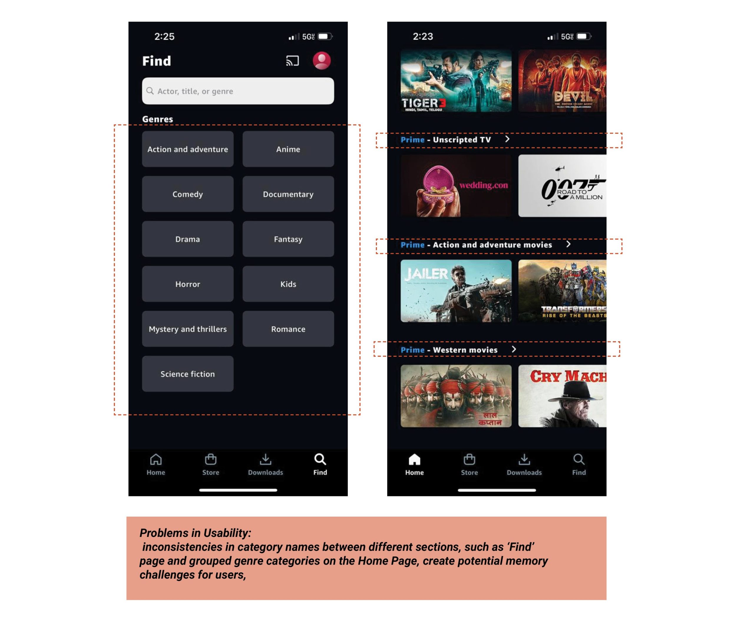
3.2A PROBLEM AREA (INCONSISTENCIES IN CATEGORY NAMING)
Inconsistencies in category names between different sections, such as ‘Find’ page that has fixed Genres, and ‘Categories’ on the Home Page, create potential memory challenges for users, making it difficult to recall and locate specific genres. This can be considered in relation to Short-term memory (STM) caused errors. Notice how the Genre names, and the Home Screen Category name differ drastically in the image below.
3.2B SOLUTION (CONSISTENCY IS KEY!)
This issue can be addressed by applying Norman’s principle of consistency in design, ensuring that the category names are uniform across different sections (on the Home Page and the Find page). This consistency serves as a knowledge aid, reducing cognitive load and potential errors.
In conclusion, the usability challenges identified in the Amazon Prime Video app, marked by poor mappings and weak signifiers, contribute to significant Gulfs of Execution. By enhancing signifiers, improving mappings, and fostering consistency, the app can bridge the gaps, reducing the cognitive load on users and ultimately providing a more seamless and user-friendly streaming experience.