Introduction
“Weee!” is an online Asian and Hispanic supermarket, offering from daily necessities such as milk, eggs, and bread, to cuisine-specific items such as dumpling wraps, kimchi, and udon. Customers can purchase products from the company’s website, and the app is available for both Apple and Android users. Deliveries are typically made within the next 2 days, guaranteeing the freshness of the products. The app stands out among Asian Americans, along with a lot of international students as it offers a convenient way to shop for specific products, that aren’t always available in traditional grocery stores. This blog post will provide design critique of the homepage, the explore page, and bookmark functionality using concepts from Don Norman’s book – The Design of Everyday Things.
1. Homepage
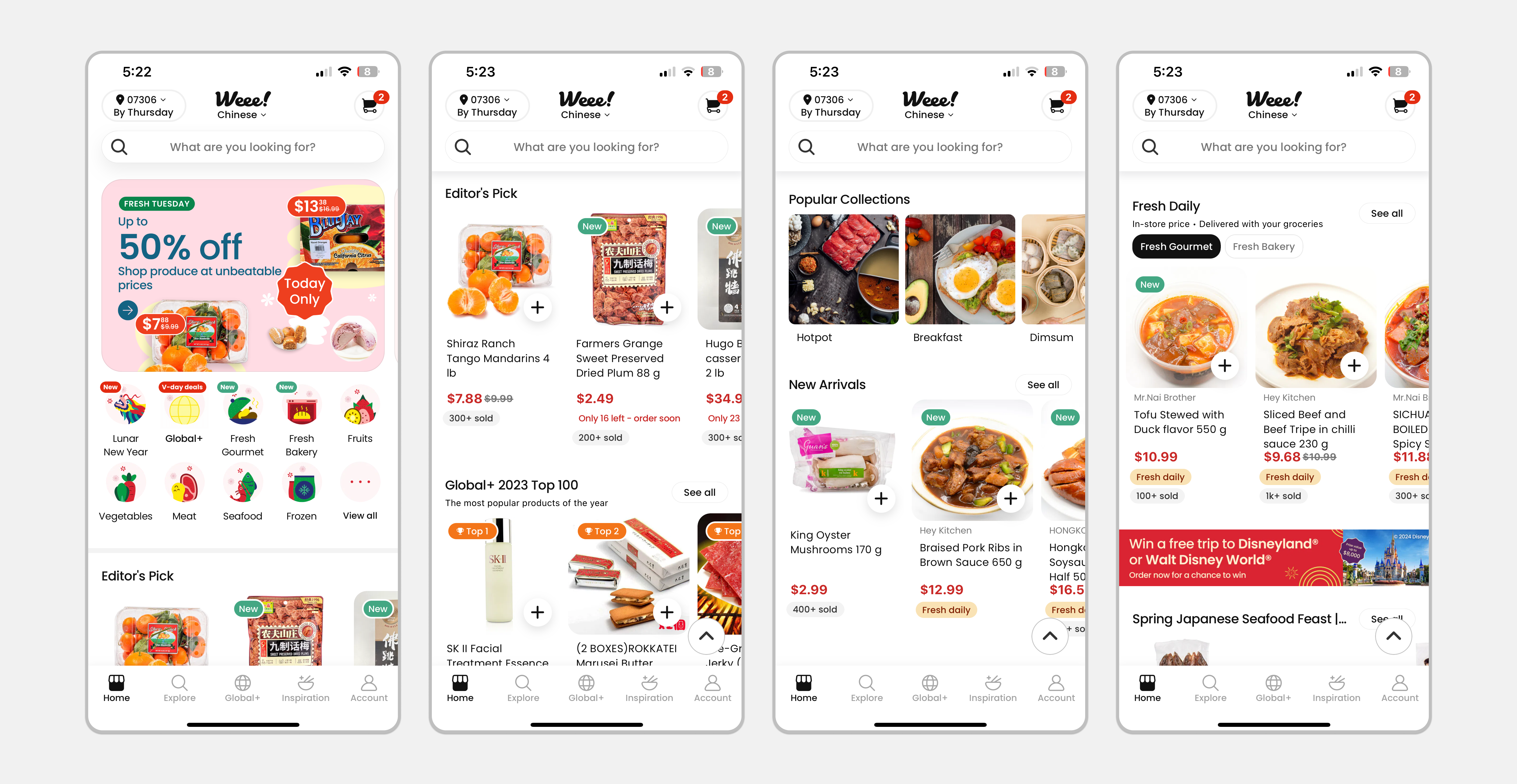
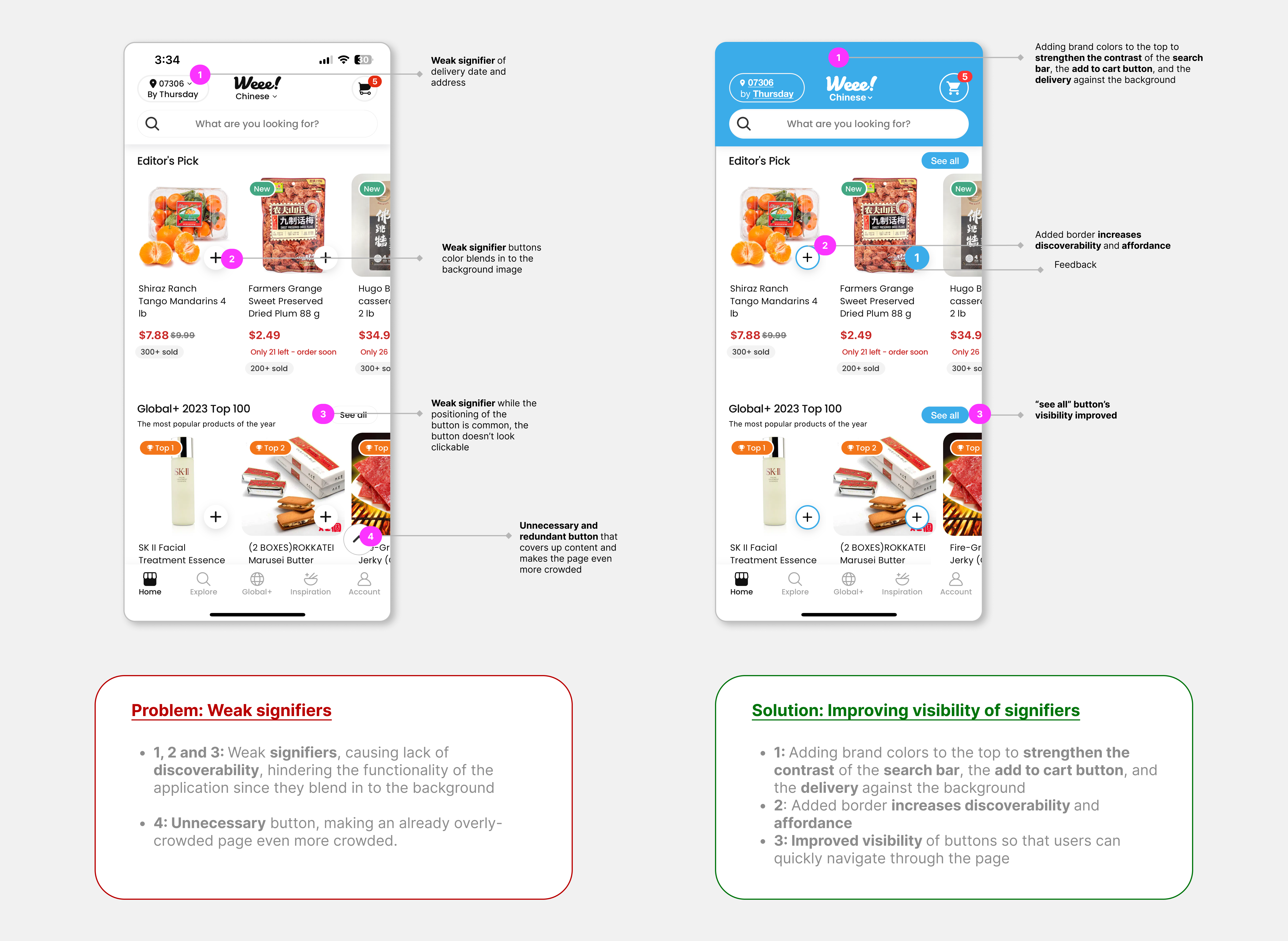
Upon entering the app, I was instantly overwhelmed by the amount of information presented. My visceral response was confusion, there is no clear branding of “Weee!”, There is no visual division between categories, it is just an endless scroll of images and black text on a white background. Many of the elements on the page lack discoverability, as the signifiers blend into the white background.
1a Problems:
Currently the home page and explore page function similarly. Users could either search for their products in the search bar located at the top or browse through pre-defined categories. The only difference is that there are some ads located at the top of the homepage. The home page has many weak signifiers. While it is densely populated with colorful, detailed product images, the buttons sink into the background. There is also a lack of divisions between categories, creating a problem of discoverability since users might give up on scrolling endlessly.
1b Solutions:
By adding spots of the company’s primary color (blue), the signifiers become significantly more visible against the white background. By enhancing the signifiers, and improving the visual hierarchy of elements, the users can seamlessly move through the page and add items to the cart without feeling overwhelmed by the amount of products available.
2. Explore Page
As mentioned earlier, the current explore page and the home page function similarly. Through my observation, I assume the designer intended the homepage to showcase more curated lists of products, and the explore page to cater to the user’s individual needs.

2a Problems:
On the first row with the icons, the feedback is weak, once the user has selected a category. The icons are detailed, bright, and colorful. Highlighting a single category with a thin, black circular outline doesn’t create strong feedback. The second row of filters (in capsules) seems redundant against the icons. The endless horizontal scrolling of the tabs creates an issue in discoverability, as many options are hidden further in the scroll. The filter adds complication to the process, adding difficulty to personalize the filter experience.
2b Solutions:
Since the application only provides a few more options, I recommend bringing the content out to the main flow. With this design, looking at the entire block (the filter), the design signifies the affordance of customizing personal preference. There are clear goals to achieve: picking a theme, sorting, choosing the delivery type, setting the price range, and filtering the desired products. The Gulf of Execution and Gulf of Evaluation are bridged because as the user completes their shopping preferences, the recommended products are updated in real-time.
3. Bookmarks
3a Problems:
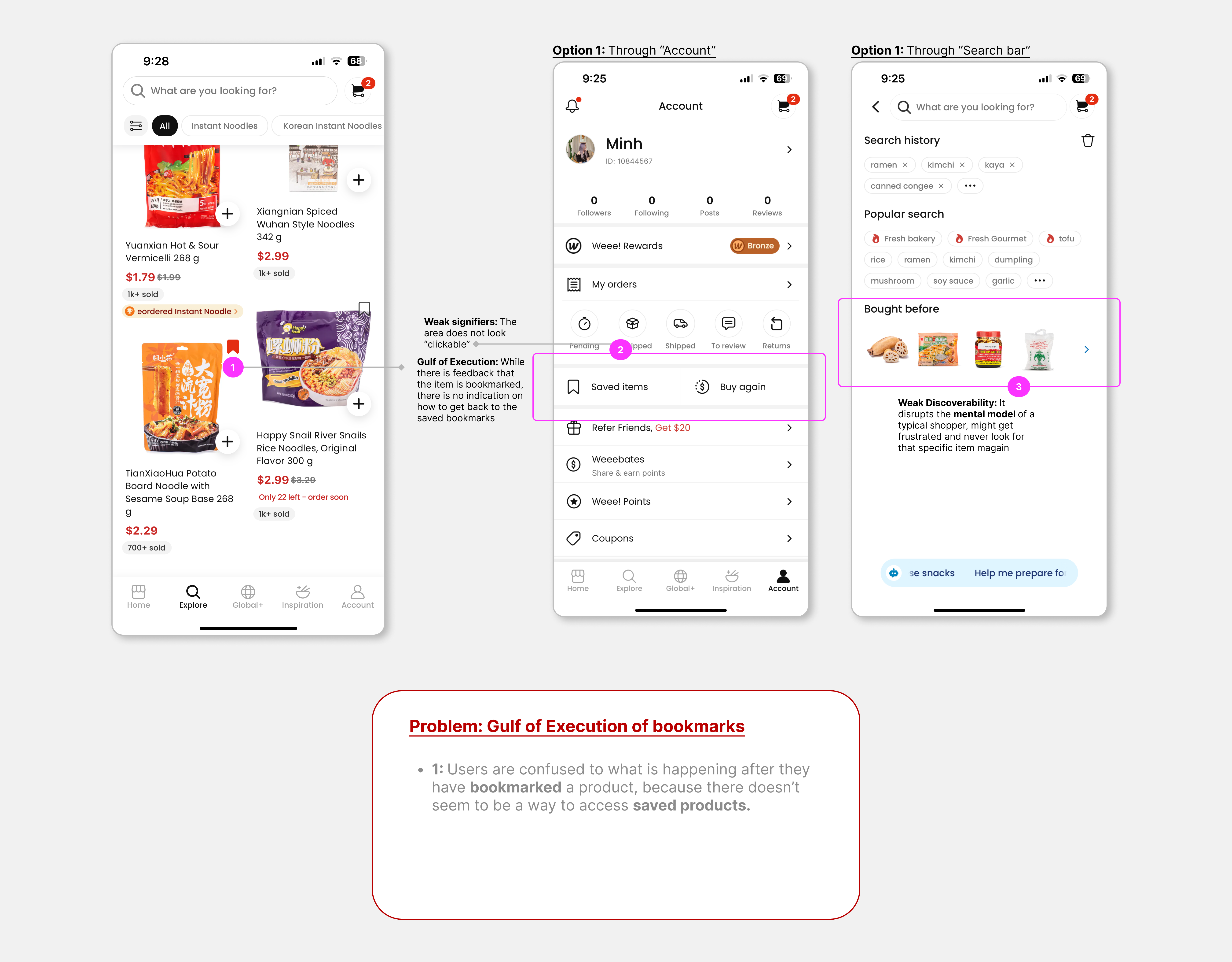
The bookmark icon is placed on the top right corner of every product that can be accessed through the explore page and the search bar. It is important to mention that this function is missing from the homepage, the reasoning behind this is unclear. The outlined icon is a signifier to tap on interesting products in order to view them later. The bookmark turns red, showing moderately strong feedback.
The issue arise when there doesn’t seem to be an option to view bookmarked items. The app runs into a discoverability and mapping problem. The user falls into the Gulf of Execution as they try to navigate the bookmarked list. The mental model of the user is challenged, as they would expect the bookmarked tab to be available on the interface.
- The first way to find the bookmarked list is through “Account”. The weak signifiers of “Saved items” and “Buy Again” are easily dismissed by a user. Besides, those two buttons lead to the same destination.
- The second way to navigate to the bookmarked list is to go through the search bar. This goes against the mental model of the user, as they wouldn’t expect to find the bookmarked list within the search bar.
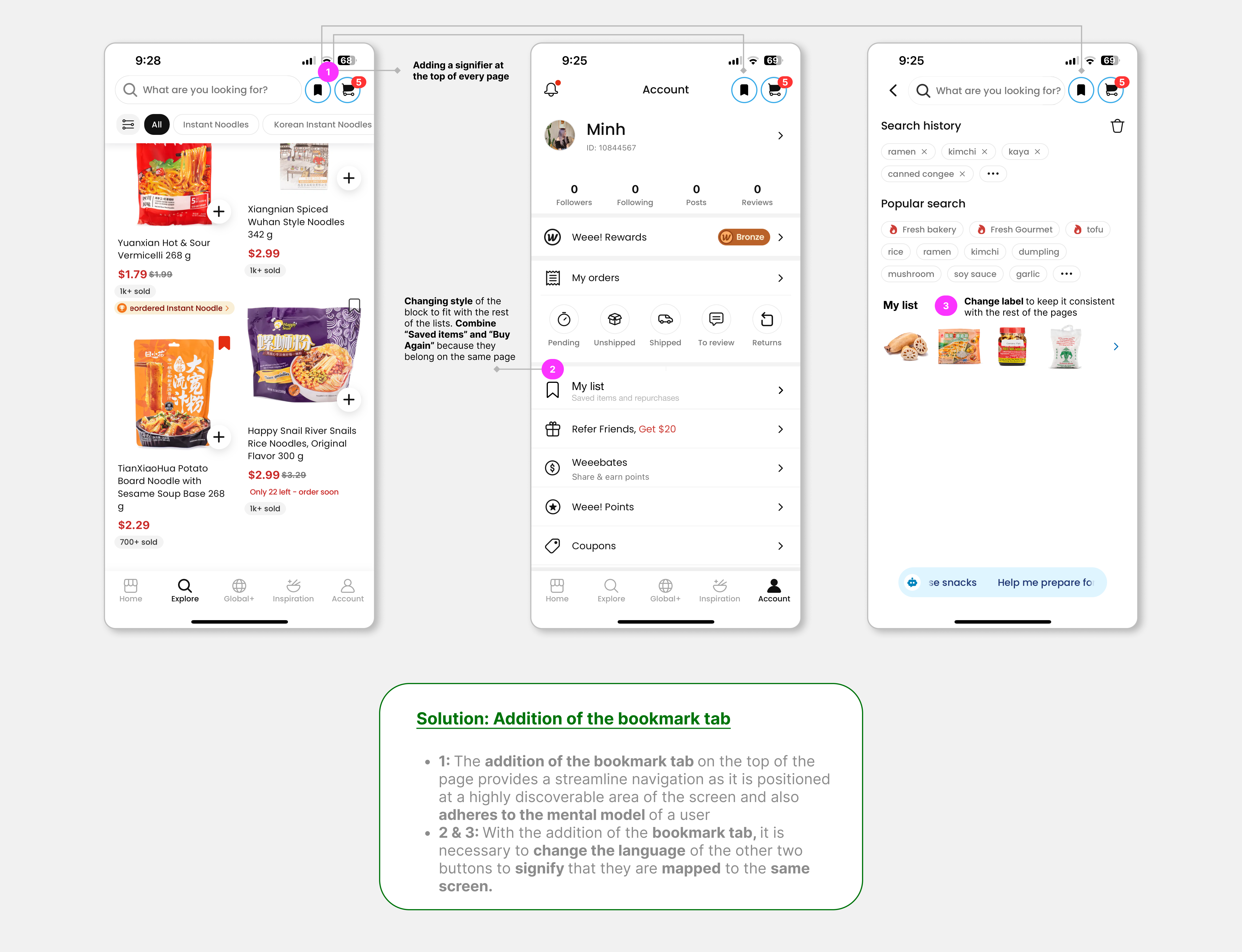
3b Solutions:
I recommend adding a bookmark tab on the top right of every page to align better with the user’s mental model. The position is highly discoverable and it would streamline user navigation. With the addition of the bookmark tab, the previous signifiers should be relabeled as “My list” as it holds both bookmarks and previously bought items.
Conclusion
“Weee!” offers a wide range of specialty products delivered to customers doorsteps. With some minor tweaks to the app, the company will be able to change the problem of weak signifiers, poor discoverability, and mapping. By increasing the visibility of current signifiers and adding additional signifiers, users will be able to achieve a more straightforward navigation through the application.