
Introduction:
Amtrak is an application that mainly serves for customers looking to purchase tickets, check train statuses, and manage users’ travel plans with America’s national railroad service. This critique focuses on the application’s user experience based on Don Norman’s design principles as outlined in his book “The Design of Everyday Things”.
As a frequent user of the Amtrak app, typically engaging with it 3-5 times weekly, my extended interaction has allowed me to pinpoint three specific areas for potential enhancements. This design critique is an endeavor to explore these aspects to elevate the overall user experience.
Problem & Potential Solution:
Check the Detail Information of a Trip
Accessing specific train information such as service details, route, timing, and duration is critical for travelers. Although Amtrak provides this data at the point of ticket booking, revisiting these details post-booking presents a usability challenge in the app. Enhancing the accessibility and visibility of this information in post-booking scenarios is essential for a seamless user experience.
Problem 1: Inconsistent Signifiers
During the ticket booking process, clicking the “Detail” button reveals comprehensive information including the route, travel time, and other services, effectively meeting user expectations. However, post-booking, the same “Detail” button leads to a different page showing only the ticket code and basic time information, omitting other previously accessible details. This inconsistent application of the “Detail” button creates confusion, as the same signifier (the button) leads to different results at different stages of the user interaction, disrupting the consistency and predictability of the user experience.
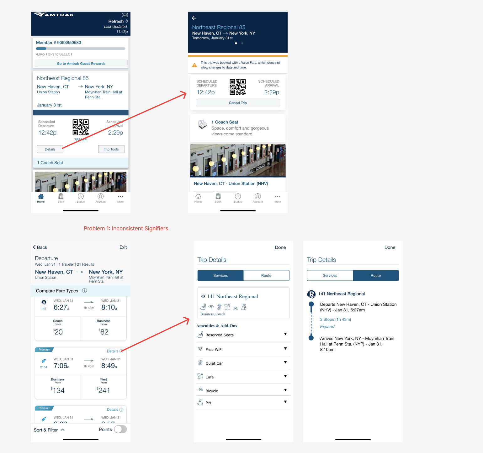
Solution to Problem 1
My recommendation for addressing the inconsistency with the “Detail” button in the Amtrak app is to standardize its functionality across the app. This involves ensuring that the button provides the same type of detailed information both before and after booking a ticket. Specifically, after a ticket is booked, clicking the “Detail” button should not only display essential information like departure/arrival times and the QR code but also include the same comprehensive details as seen during the ticket selection phase, such as the route and train services.This approach maintains the signifier’s consistency, as the “Detail” button would consistently lead to a comprehensive information page throughout the app.
Problem 2: Lack of Error Prevention
A user on a train journey is unable to access real-time route information and consequently disembarks at the wrong stop is indicative of a violation of Don Norman’s concept of error prevention . The absence of real-time train location and stop information in the app represents a missed opportunity in design for preventing user errors.
Solution to Problem 2
Integrating a real-time train progress tracking feature into the Amtrak app would improve the user experience for customers. This feature should be comprehensive, offering several key functionalities. Firstly, it should include station arrival alerts, which would inform passengers when their destination is nearing, ensuring they are prepared to disembark. Secondly, a stop countdown is essential, providing clear information on the number of remaining stops before the train reaches the desired station. This feature would greatly assist customers in tracking their journey’s progress and a good example of error prevention. Lastly, displaying an estimated time of arrival (ETA) for each station, including the final destination, would be highly beneficial. This would aid users in planning their activities post-journey, such as arranging pick-ups or making connecting travel plans.
Problem 3: Inappropriate feedback
An Amtrak app user clicks the “Detail” button to enlarge a QR code for scanning, but experiences discomfort due to the automatic adjustment of their phone’s brightness, illustrating an issue with feedback balance. While enlarging the QR code is a positive feedback mechanism, facilitating easier scanning, the automatic adjustment of screen brightness exceeds the necessary feedback and impacts the user negatively, especially for those wearing glasses. This over-extension of feedback functionality is contrary to Don Norman’s principles of appropriate and considerate feedback design. Optimal feedback should enhance the user experience without introducing new problems or discomforts. A parallel example in his book could be a dishwasher that, upon completing its cycle, emits a loud signal late at night.
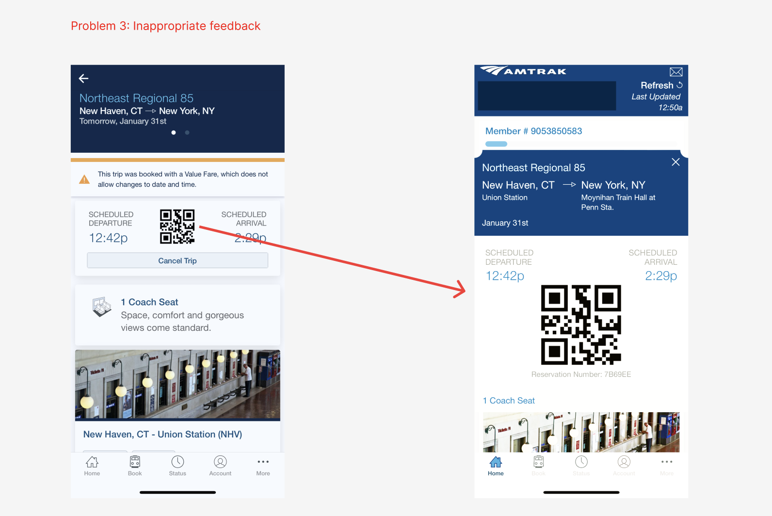
Solution to Problem 3
In revising the QR code functionality in the Amtrak app, it would be advantageous to maintain the feature that allows users to zoom in on the QR code for easier scanning while eliminating the automatic adjustment of the phone’s brightness. This change would respect the principle of user-centered design by giving users the autonomy to control their phone’s brightness according to their personal preference or need. This approach aligns with Don Norman’s concept of providing appropriate feedback. The feedback, in this case, being the enlarged QR code, is sufficient for the task without being overbearing or causing discomfort, such as the unintended consequence of the automatic brightness adjustment. By doing so, the app would better cater to diverse user needs and preferences, enhancing the overall user experience while respecting user control and comfort.
Change a Trip at Trip Summary Page
Problem 4: Mismatched conceptual models and inappropriate constraints
The Amtrak app’s handling of booking modifications can be seen as a deviation from standard user conceptual models for train booking applications. Users typically expect the ability to confirm departure and arrival times, select preferable trains, and easily modify travel details on the confirmation page. However, the app’s design, which necessitates the use of the back button for multiple steps or starting the booking process anew to make changes, imposes unreasonable constraints. This design choice not only disrupts the user’s mental model of a fluid and flexible booking process but also forces them to either adhere strictly to their initial choices or abandon and restart the booking process. Such a rigid system design overlooks the dynamic nature of travel planning, where changes are often necessary. It leads to a cumbersome user experience, significantly detracting from the efficiency and usability of the app.
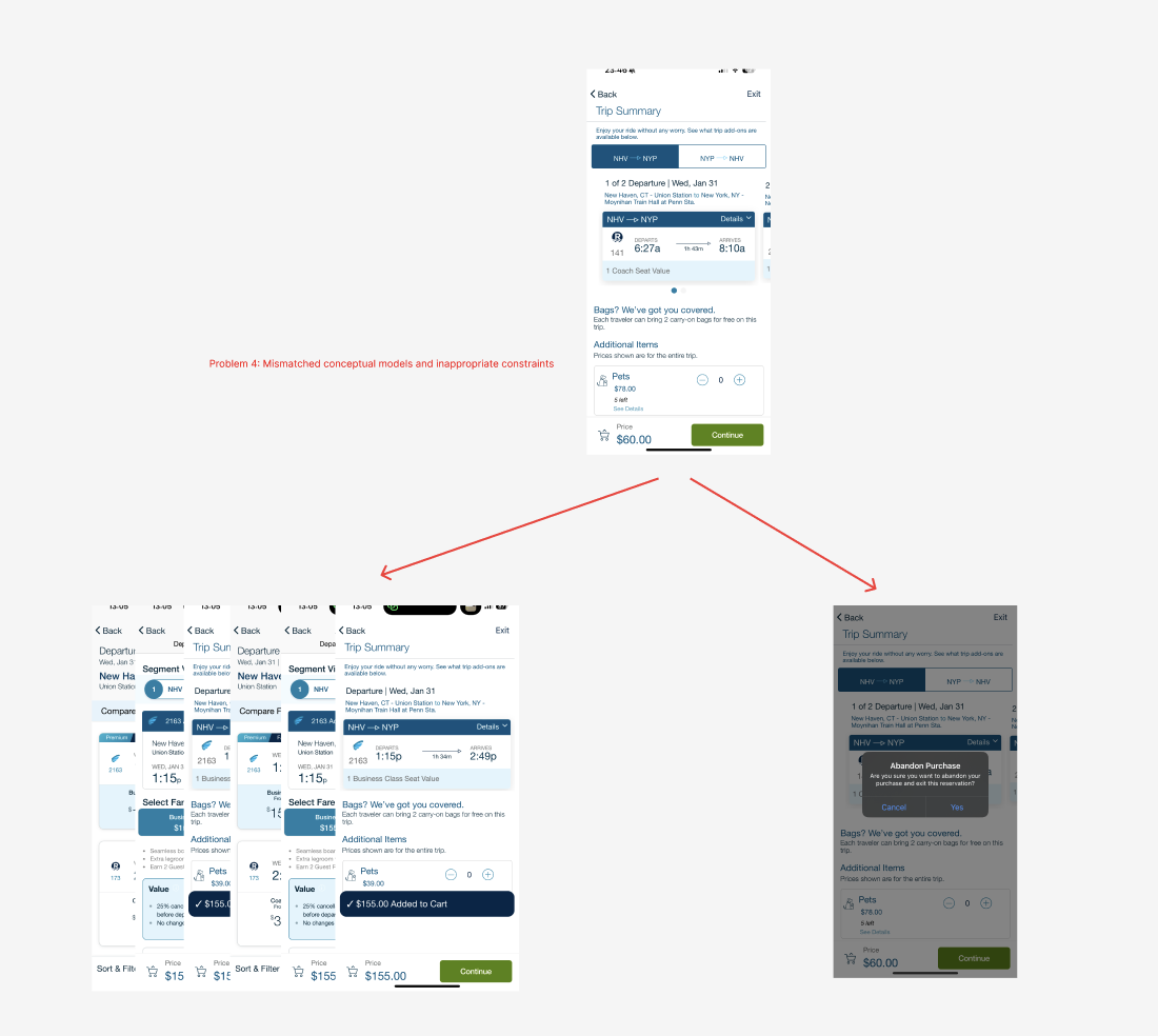
Solution to Problem 4
Improving the Amtrak app’s ticket modification process involves removing the current cumbersome constraints and introducing a straightforward, user-centered modification option. This improvement should be implemented by adding a clearly marked ‘Modify Ticket’ option on the confirmation page, allowing users to easily navigate back to the ticket selection page. This direct access would maintain user inputs and preferences, reducing the need for re-entering information and aligning the process with the user’s mental model of a train booking app.
The Use of Filter Feature
Problem 5: Mapping of Filter Feature
The placement of the filter button in the Amtrak app during the ticket booking process illustrates a divergence from typical mapping conventions. The filter button is positioned at the bottom of the screen, a location that might initially seem intuitive. However, the issue arises when users, habitually swiping down to browse through ticket options, trigger the filter function. The filter interface then emerges from the bottom, extending upwards, which disrupts the expected mapping of the app’s interface. This design choice contrasts with the natural flow and directionality that users might anticipate based on their common experiences with other applications, where such actions typically align with the direction of the swipe or scroll.
Solution to Problem 5
In addressing the mapping issue in the Amtrak app’s user interface, a key change would be the repositioning of the filter button. Moving the filter button to the top of the page would align better with the typical user behavior of swiping downwards on the screen. Additionally, altering the filter menu to expand downwards rather than upwards upon selection would create a more intuitive and seamless user experience. This change not only addresses the mapping inconsistency but also enhances the overall navigational flow, making the app more user-friendly and in tune with common user interactions in mobile applications.
Conclusion:
In summarizing our critique of the Amtrak app, it’s clear that while the app serves its fundamental purpose, there are notable areas for improvement based on Don Norman’s design principles. By addressing issues like the inconsistent use of the “Detail” button, enhancing real-time tracking features, balancing feedback mechanisms, and refining the ticket modification process, the app can significantly improve its user experience. These recommendations aim not just to optimize functionality but to ensure the app aligns more closely with user expectations and needs.