Introduction
Zomato is an Indian multinational restaurant aggregator and food delivery company. It was founded in 2008. Zomato provides food delivery options from partner restaurants in more than 1,000 Indian cities and towns, as well as menus and user-reviews of restaurants, dining and sponsored events suggestions.
“From swanky upscale restaurants to the coziest hidden gems serving the most incredible food, Zomato covers it all. Explore menus, and millions of restaurant photos and reviews from users just like you, to find your next great meal.” – Zomato
As of 2023, Zomato has over 80 million monthly users, this case study is an attempt to identify the usability in the most prominently used ‘Delivery’ section of the app using concepts from Don Norman’s ‘The Design of Everyday Things’.
1. No discoverability of ‘Favorites’
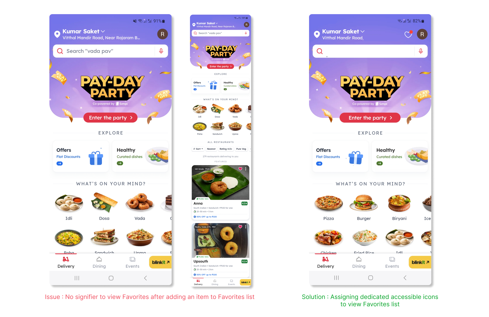
Issue
The homepage has several categories in the hierarchal format of Search, Offers, Explore, Suggestions and All Options. As the user navigates on the homepage, they have a choice to ‘Favorite’ a restaurant by tapping on the heart icon. During explorations, users will obviously ‘Favorite’ the restaurants they like or want to save a a reference for future and later expect it to be discoverable. However, when the user wants to revisit the ‘Favorites’ the perplexing notion arises – “Where are my favorites?” Here, the issue is discoverability, where the users cannot easily perceive the state of the system and understand how to interact with it.
Solution
The solution is derived from Norman’s ‘How Technology Can Accommodate Human Behavior’. It is crucial to communicate to the users how and where their actions and its system reactions are represented. Hence, to make the consequence of their actions discoverable, an icon depicting ‘Favorites’ should be implemented to improve the discoverability of the provided function. This solution also address the ‘red dot theory’ to notify user of a feedback to their action.
2. Incomplete Feedback
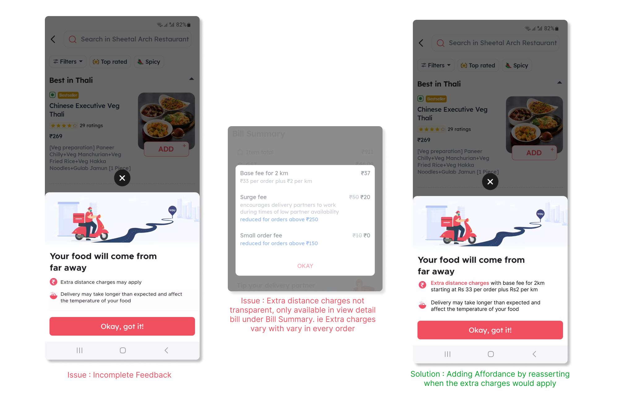
Issue
When the user adds a certain order to cart, a Feedback pops up which communicates to the user that extra charges will be applicable. However, this is Incomplete Feedback as it does not inform the user the details of the constraint i.e. the baseline of how the extra charges will be applied as the extra charge is not nominal. The complete feedback is provided to the user at the billing page, hidden under several billing sections. This lack of transparency tends to disrupt the mental model of the user when they decide to re-order after seeing the final charge in order to refrain from the extra-distance charge.
Solution
This issue highlights ‘People’s Response to Changes In Convention’. It is imperative to provide user with complete feedback and add affordance to enhance/influence their decision making capacity i.e. user behavior. This issue, I believe is a upfront conflict between business model and user experience.
3. Analyzing User behavior prior to ‘Checkout’
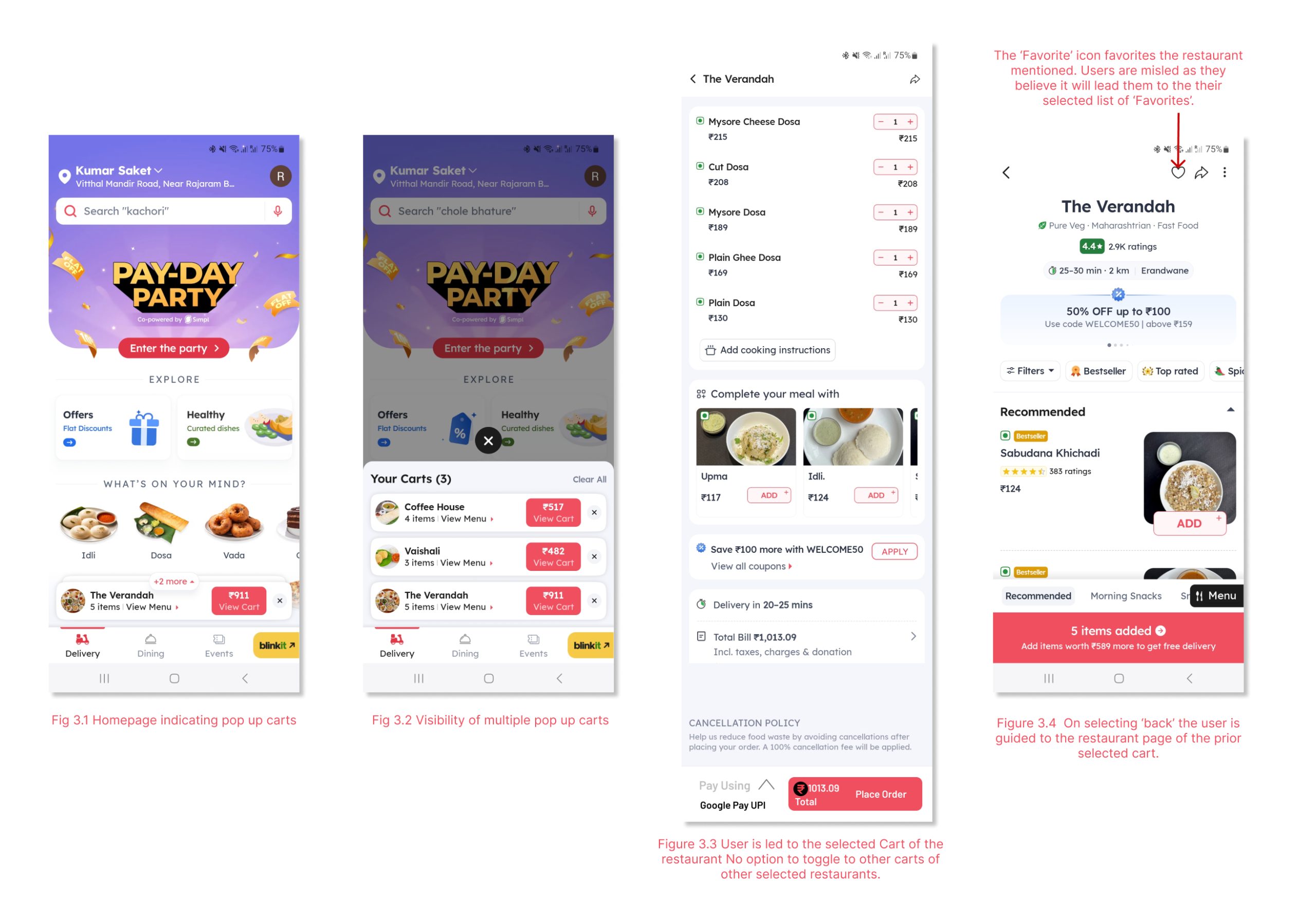
Issue
The process of Adding items to cart is fairly simple. Yet, navigating out of cart to check items in other carts is tedious. Zomato creates multiple carts for multiple restaurants and their items selected. On Zomato, a user has unlimited choices to explore from, users add several items from multiples places creating multiple carts before finalizing an order. During this process, the user reflects on his decisions by shifting between multiple carts to check items, comparative pricing and extra charges based on varying distances. This visibility process is particularly long as user navigates through four steps as shown from Fig 3.1 to Figure 3.4 and back to Figure 3.1 to enter another cart and disrupts the user’s mental model.
Fig 3.1 The carts near the bottom navigation do not have great visibility and merge with the rest of the contents the page.
Fig 3.4 Going against the mental model of the user, the ‘Favorites’ icon favorites the particular restaurant and instead of leading the user their list of ‘Favorites’ hihglighting the issues in mapping.
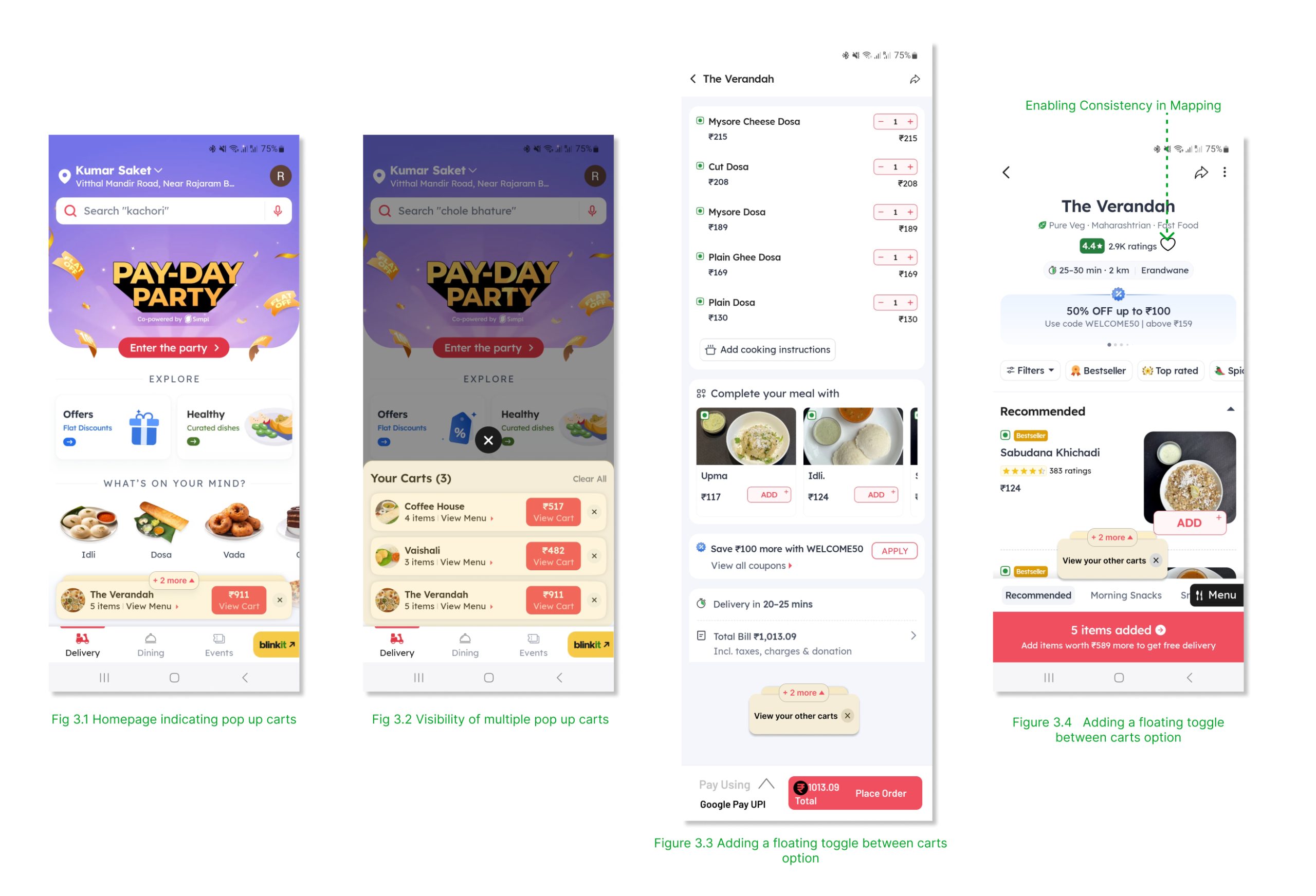
Solution
Taking into consideration the users’ mental model and to ease the process of comparative cart-ing, the design can implement a ‘Toggle between carts’ option when multiple carts are created. This will enhance discoverability and effective affordance.
Fig 3.1 The Visibility of the cart can be highlighted by implementing a visual segregation through color palette.
Fig 3.4 The location of the ‘Favorite’ icon should be re imagined based on the concept of Mapping and Consistency. The relationship between controls and their effects should be intuitive and correctly guide the users.
Conclusion
Zomato is one the most used delivery apps in India. However, issues such as poor discoverability, mapping, feedback need to be addressed. This can be addressed by understanding the users’ mental models and implementing appropriate signifiers, adding affordances and in turn improving the visibility of the systems. The synthesis of these design concepts should not only foster efficiency but also cultivate user satisfaction, ultimately contributing to the success of the application in the competitive digital landscape.