Introduction
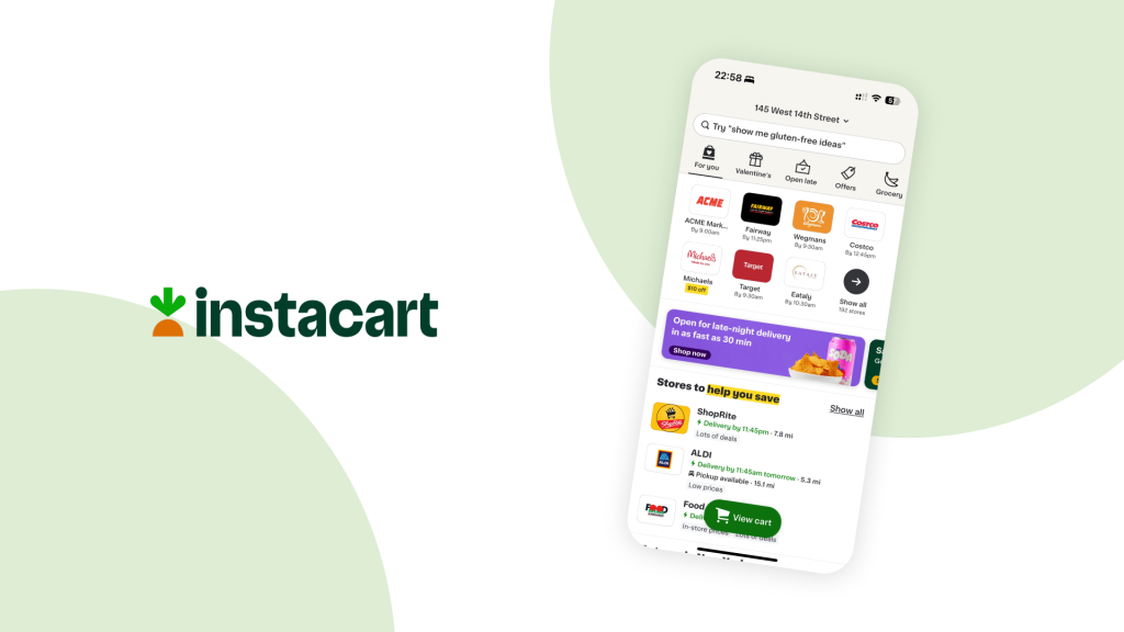
Instacart is an online platform for convenient delivery or pickup from local retailers, offering a diverse range of fresh groceries and household items. The platform provides a time-saving solution for online ordering.
In this case study, I focus on the experience within the Instacart iOS App by analyzing the experience of browsing and selecting grocery items for fast and low-cost delivery through the lens of Don Norman’s design concepts.
1. Exploring grocery store options

Problem 1: Lack of constraints in the list to help users efficiently discover stores with specific ordering options.
When using online ordering services, users typically have the mental model to find stores based on their delivery preferences, such as opting for the fastest delivery or lower delivery fees. However, the current page design presents all available stores without providing constraints, making it challenging for users to easily identify and select their preferred options.
Solution 1: Add filter tags of properties frequently considered by users to help prioritize options.
I suggest incorporating filters related to delivery time, cost, pickup options, and store discounts. This addition would provide users with more refined and personalized options, aligning with their specific needs and improving search efficiency.
Problem 2: Delay in the discoverability of delivery fee.
Typically, users decide on a store early in the process based on the delivery fee. However, in the current design, users can only access this information in the checkout page, creating difficulty in making informed decisions when selecting a store.
Solution 2: Add delivery fee in each store card.
This would streamline the user experience by providing transparent and easily accessible delivery fee details right on the store card. Users would be able to make informed decisions at this step, eliminating the need to navigate to the checkout page for such important information.
2. Browse the store home page
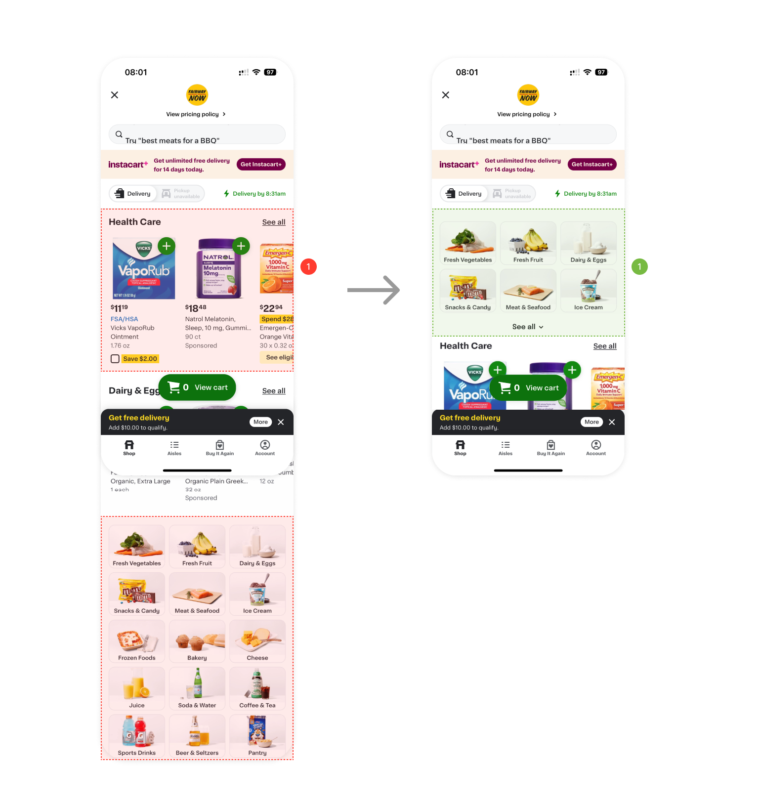
Problem 1: Gulf of execution between users’ intention to find groceries to the prioritized “Health Care” section.
After entering a store’s home page, users usually anticipate accessing information about grocery choices. However, the existing layout places put more emphasis on the “Health Care” section, lacking clear signifiers for users to easily discover groceries. Users are required to scroll down to find the product category, causing potential confusion and distraction.
Solution 1: Increase the discoverability of product categories.
Considering the potential business need of promoting Health Care products, I recommend improving the visual hierarchy by moving product categories up to the top. However, to maintain the visibility of the “Health Care” section, I propose displaying only the top portion of the categories, with a dropdown button for users to unfold the complete menu.
3. Save an item in detail page

Problem 1: Poor signifier as icon button, lack of feedback after saving an item.
After tapping the “Save” icon button on the top right, the system lacks textual feedback to convey the outcome of this action. This absence of feedback may lead to user confusion, particularly when distinguishing between the functionalities of this icon and the “Add to list” option in the middle of the screen. While users may assume that the “Save” button is intended for preserving or collecting items, they can find it difficult to discern the location to retrieve the saved items within the app.
Solution 1: Add feedback as a 3s animation showing the bottom bar to indicate the result of the action and where to find the saved item later.
I suggest a quick feedback can be added after clicking “Save” icon to communicate the result that the item was saved. Users could access their saved items through the right “View” button, with the bottom feedback displayed for 3 seconds before it disappears. To ensure visibility, I recommend the bottom bar adopting a dark gray color, creating a noticeable contrast with the current white primary color scheme.
Conclusion
While Instacart’s iOS app offers overall convenience in its browsing process, it can be improved in certain aspects. To align with users’ mental models, incorporating constraints and upfront display of delivery fees in the store list would enhance searching efficiency. Addressing the gulf of execution on the store home page involves improving the discoverability of product categories. The item-saving process currently lacks clarity, so I suggest the implementation of a quick animation for feedback to guide users. These enhancements would contribute to a more intuitive and user-friendly experience.