Introduction
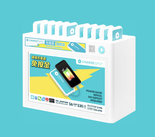
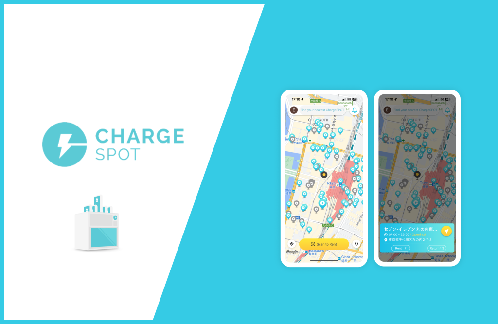
ChargeSpot is a portable charger rental provider that offers cross-countries services currently with over 35,000 rental spot worldwide. Its easy rent/return process and reasonable rental prices attract individuals with high demands for charging their phones while on the go.
The rental services process can be easily divided into 3 steps:
1. Use the app to find a nearby rental spot
2. Scan the QR code on the physical rental spot
3. Obtain the portable charger and return it at any rental spot after use
In this design critique, I will focus on the process from the perspective of a phone user exploring the ideal rental spot on this application based on Norman’s design concepts. I will create visual mock-ups using Figma to illustrate how I recommend addressing the following issues I found.
Design Critique
The initial entry page(homepage): Map view
Issue A
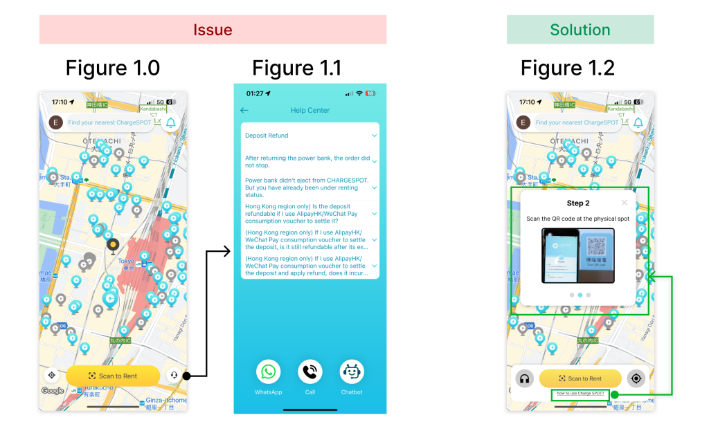
The homepage of ChargeSPOT, also serving as the map view page (Fig 1.0), acts as the initial entry point for users when they open the application. New users or those who haven’t used the service in a while may find it confusing to understand how the rental process works and what steps to take next. The issue lies in the weak conceptual models presented on the initial entry page (Fig 1.0), lacking guidance or hints for users and potentially leading to a ‘Gulf of Execution.’ For instance, while the “Scan to Rent” button at the bottom (Fig 1.0) is noticeable, its actual function—scanning the QR code on the physical rental spot after finding it—may not be immediately clear to users. This could result in questions like “What should I scan?” or “When should I scan?” upon first seeing the button. Additionally, despite the presence of an assistance icon at the bottom right, the information provided is unrelated to how to use this service(Fig 1.1).
Recommended Solution
The recommendation for this issue is to include a short instruction on the homepage to improve the overall conceptual model of this service(Fig 1.2). The bottom part could be optimized by adding a small text-link button labeled ‘How to use ChargeSPOT.’ Users who are not familiar with this application could check the popup introducing how this rental service works. At the same time, this guide would strengthen the understandability and decrease the ‘Gulf of Execution’ for users.
Browsing and clicking rental spots in map view
Issue B
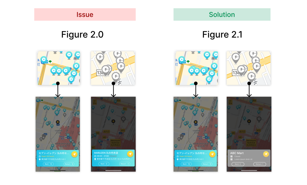
As you can see, the rental spots icon mainly have two colors, light-blue and gray on the map(Fig 2.0). The icon turns gray either when the place that the rental spot at is closed or there is no availability at the spot to rent or turn back any charger during the time. Upon clicking any colored spot icon on the map, users are presented with a light-blue popup at the bottom(Fig 2.0). Although it displays a nice feedback after clicking any spot icon, the mapping between the spot icon in different color and the corresponded popup remains weak.
Recommended Solution
I recommend changing the background color of gray spot icons’ popup to a gray-toned color. This visual solution provides a stronger mapping between the popup and spot icons in 2 color. This optimized popup presents a more obvious discoverability because the users barely could see which what color of the icon they are selecting is because of the dark mask, and it additionally gives users clearer signifiers and hint that the gray and light-blue icon represent different meaning for the rental spot and users should be noticed it when they are exploring the rental spots.
Popup / List View
Issue C
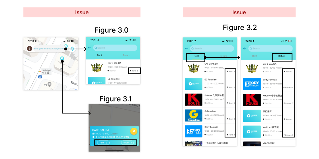
Users could view rental spots’ information on the popup by clicking the spot icon or clicking search bar on the map view to enter the list view that shows all the nearby rental spots(Fig 3.0&3.1). As far as I concerned, the wording “Rent” and “Return” on either popup or list view(Fig 3.0&3.1) serves an ambiguous signifiers. When I just started using this application, I misunderstood the meaning of the word “Rent” and “Rental”. For instance, I thought the number after the wording ”Rent” means how many people rent the charger at this rental spot today instead of how many charger is available at this spot, which is the correct meaning. I believe others would interpret the wording “Rent” and “Return” in different ways or feel not 100% sure about what the exact meaning of the wording and number means.
Issue D
The section gives the number of “Rent” and “Return” should be the most important information to users while they are browsing the rental spot. However, the current information that shows not only on popup and list view page displays low discoverability(Fig 3.0&3.1). In addition, the list page(Fig 3.2) that shows near rental spots went against the ‘Knowledge in the World’. Since the current design clearly shows two tabs “Rent” and “Return” on the top of the screen, users would understand what is each list showing about. I consider it is redundant and not required to show “Rent” and ”Return” at button-right on every card(Fig 3.2).
Recommended Solution
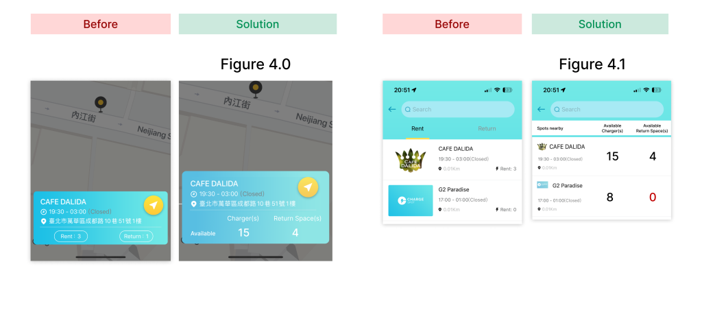
To add signifiers for the original “Rent” and “Return”section on the popup, I recommend fixing the wording and layout of the popup and the card on the list view. To be more specifically, I change the wording from “Rent” to “Chargers”, “Return” to “Return Spaces”, add the wording “Available”, and rearrange the layout of these section. As you can see in Fig 4.0 and 4.1, the wordings are more accurate compared to the previous design.
To make the number section of “Rent” and “Return” pop out, I rearrange the layout as I mentioned above and adjust the number information to a bigger size, hoping users could learn the information easily(Fig 4.0). For the list view, Fig 4.1, I removed the redundant wording “Rent” and ”Return” at button-right on each card(Fig 3.2) and also removed the original tab on the top of the page(Fig 3.2) because the information on each card overlapped a lot while switching between Rent and Return tabs. It is unnecessary presenting tabs but showing almost similar information on every card under each tab. My suggested solution not only conveys a better visual hierarchy, but also enhance the discoverability on the most important number information to users who are browsing rental spots on this application.
Conclusion
In summary, ChargeSpot provides a convenient service for users in need. As a user, I find the application helpful, but there is room for improvement in its signifiers and conceptual models to prevent user confusion. Additionally, I recommend that ChargeSPOT assess whether the current design and information align with discoverability through optimization or testing. This approach can help ensure that the overall user experience aligns with users’ mental models and becomes more intuitive.
