Target Introduction
Target is not only a well-known American retail corporation that operates a chain of department stores; it also has an online shopping platform, a website, and a mobile app, providing customers with a convenient and user-friendly way to browse, shop, and manage their purchases. They have the new features of Wishlist and Shopping Lists, Order Tracking, and In-App Barcode Scanner.
This article intends to discuss the user experience of the Target mobile app (iOS version) by critically reviewing three primary functions: Homepage, Cart Delivery Option, and Picking Up Schedule.
Process
There was a Target Market near my apartment; sometimes, I could not find the things I needed in the current Target place, or the shopping items were too big for me to carry back home. Thus, I wonder if there is an online shopping platform for Target. I downloaded a Target app and decided to shop online for their items. However, there are some difficulties when I use the app.
Homepage
Shopping Category Listing & Advertising
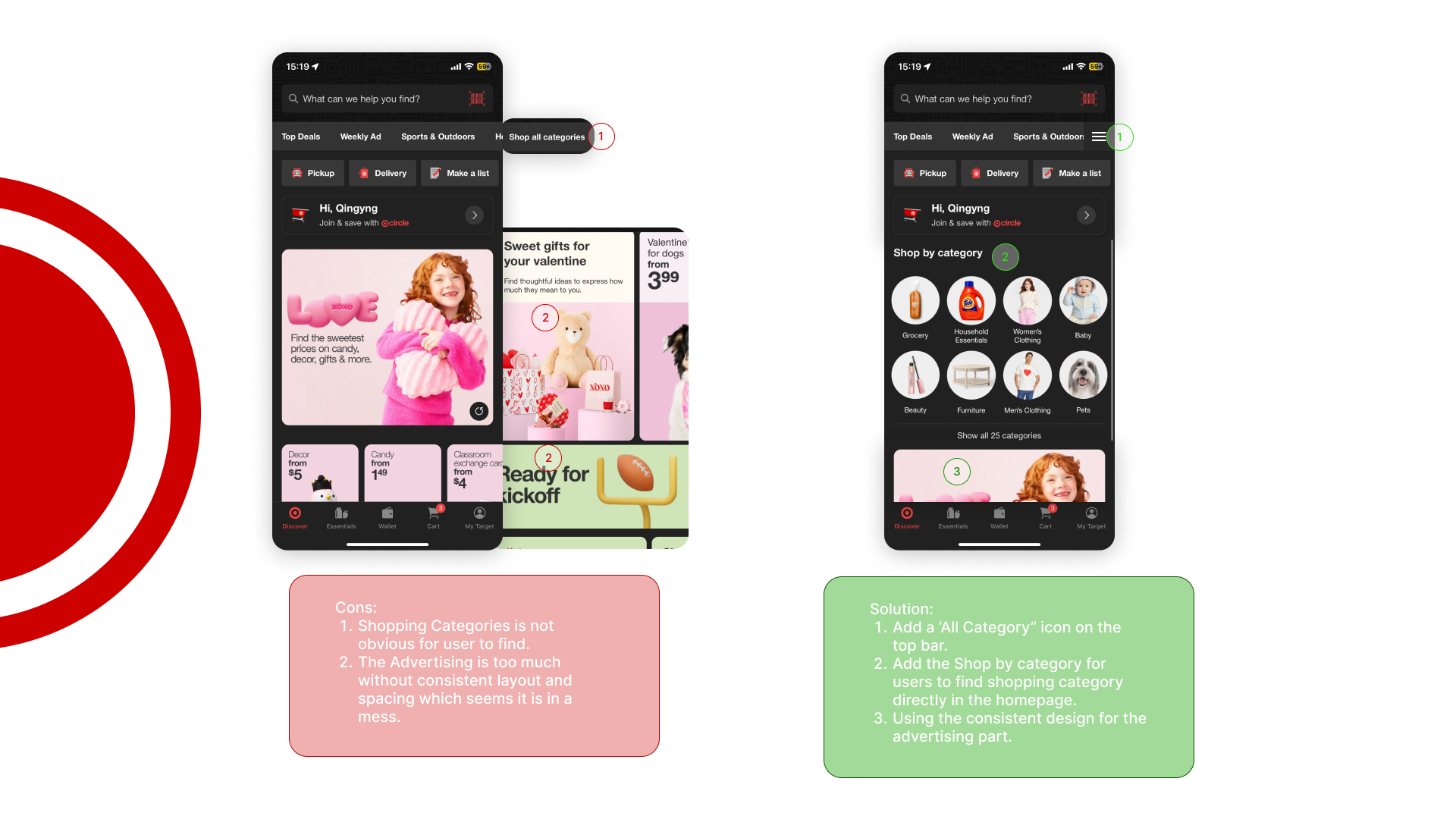
Problems:
The ‘Shopping Categories’ is one of the most important items for people shopping online. However, customers have difficulty discovering the “Shopping Categories” on the homepage of the Target app. Customers have to swipe to the bottom of the narrating bar on the top of the app to find “All Categories.” Additionally, advertising is included mostly on the homepage, but with inconsistent layout and sizes, which makes it seem like the information is a mess.
Solution:
I decided to add an “All Category” icon on the side of the top bar. When people swipe on the top navigation bar, they can also go to the All category directly by clicking the icon instead of swiping the bar to the bottom. Additionally, I added all ‘Shop by category’ on the top of the page before the advertising part for users to easily find the Shopping Categories. Furthermore, I decided to organize the advertising parts in a consistent design.
Cart
Categorizing Cart by shipping ways
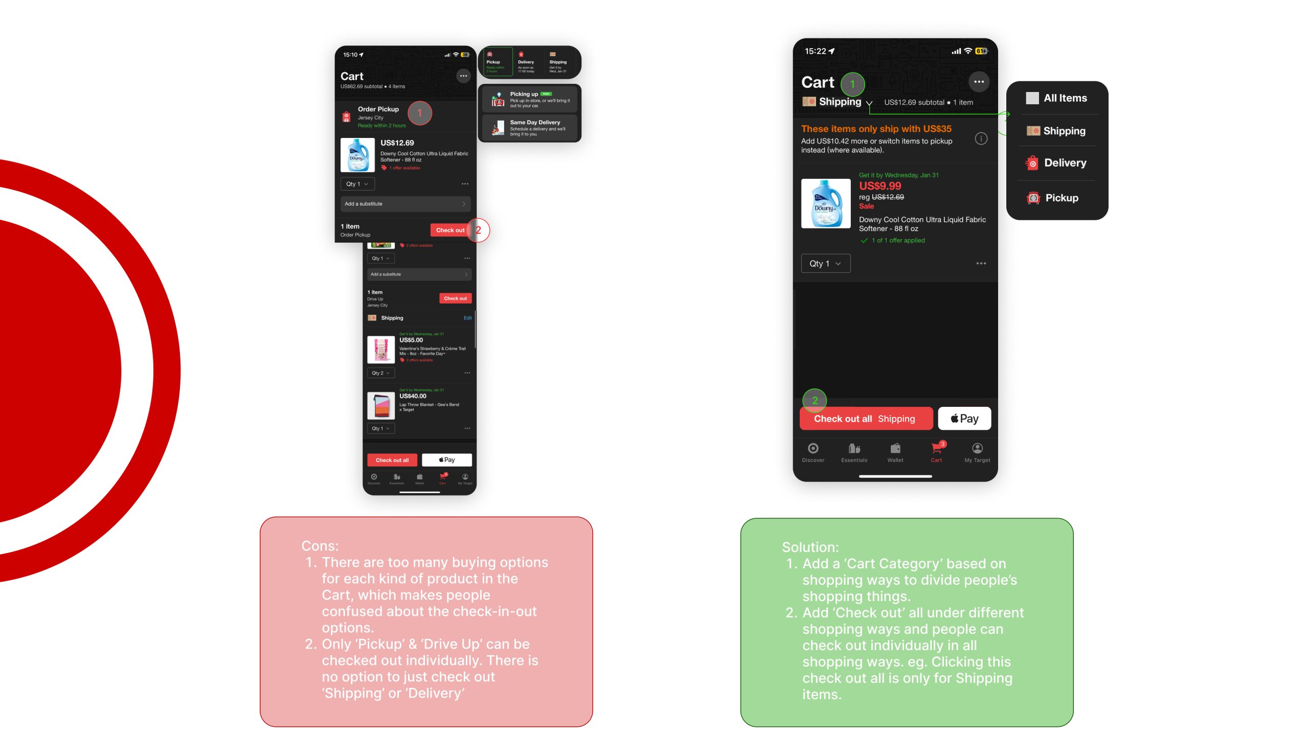
Problems:
The laying out of different shopping options in the Cart is a lack of organization. There are three main shopping options on Target, ‘Pick up,’ ‘Same Day Delivery,’ and ‘Shipping.’ Also, customers can choose to pick up items ‘Indoor’ or ‘Drive up.’ There is no clear information to let customers differentiate their cart items. Also, customers find it hard to check out different shopping ways individually. Only ‘Pickup’ & ‘Drive Up’ can be checked out individually. There is no option to just check out ‘Shipping’ or ‘Delivery’, which will make customers confused about their shopping experience.
Solution:
I chose to categorize the different shipping ways in Cart so that people can see their items in different shipping ways individually. Also, people can check out the items from different categories individually.
Check out
Schedule for pick up times
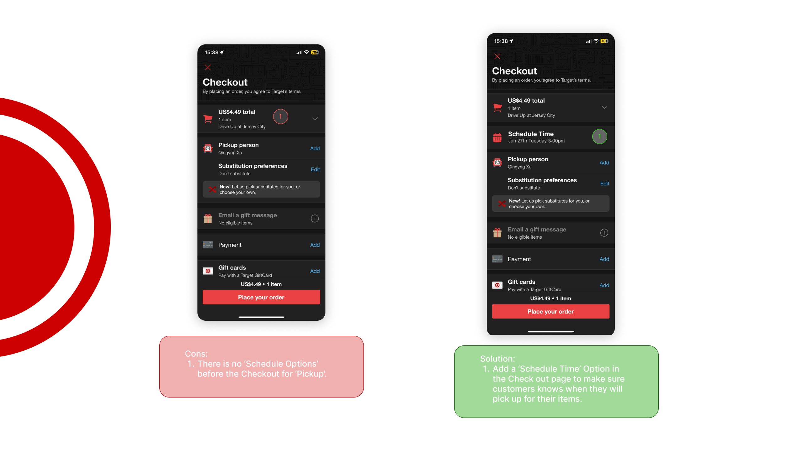
Problems:
Customers are hard to find the ‘Schedule Option’ before the Checkout for ‘Pickup’. Thus, customers do not have a piece of clear information to know what time they can pick up their items.
Solution:
I chose to add a ‘Schedule Time’ option on the checkout page. Customers can schedule pick-up times for their orders before they check out. Also, people can see the direct information about picking up their items on the Checkout page.
Conclusion
The most important information should be visible and highlighted on the home page of the app. When multiple different pieces of information are hard to present to users on an app, it is better to information categorize those that are related. Consistency is important for laying out for customers easy to read about. Analysis of each step of the user purchase process makes sure to let them manage their customized items and provide precise information to the users.