Introduction
The Starbucks mobile application serves as a convenient platform for users to easily order beverages and foods, and it is also a crucial component of the Starbucks loyalty program.
Based on my user experience, this article would critique Starbucks iOS App using some usability factors mentioned by Don Norman’s book- The Design of Everyday Things.
1. Use the filter to choose a Starbucks with Wi-Fi — Poor Feedback
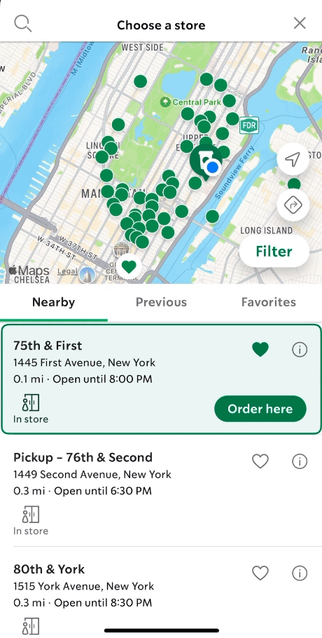
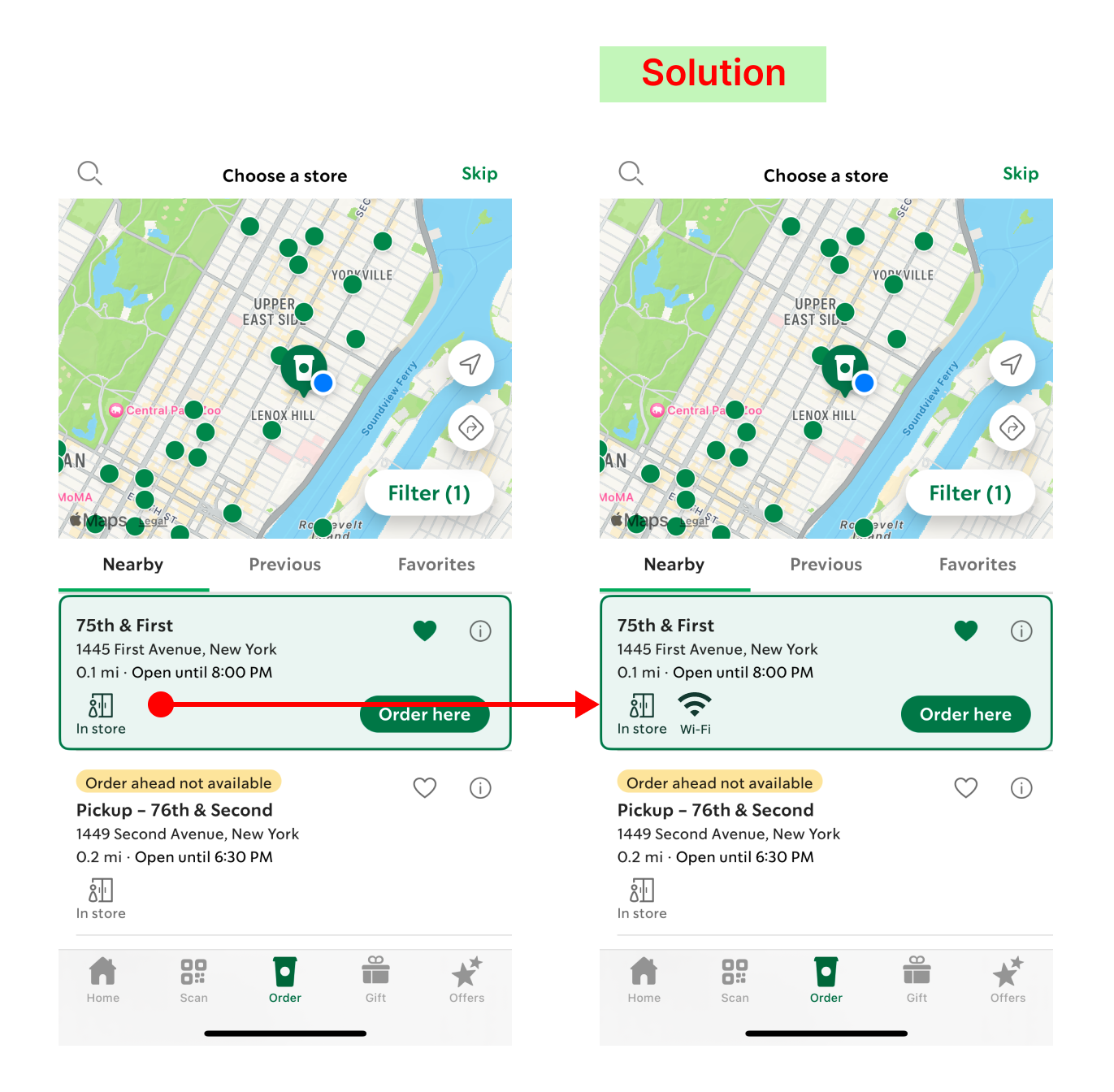
Issue: Starbucks’ filter offers numerous attributes for users to find one that suits their needs. However, when users select the attribute to find a Starbucks with Wi-Fi, the feedback after using the filter is not clear. The app does not present distinct results after the filter is applied, causing uncertainty and confusion among users.
Solution: Designers could include an icon or indication of Wi-Fi on the form to make the signifier clearer for users.
2. Order more than one food or beverage — Gulf of Execution

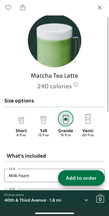

Issue: Users typically navigate the ordering system based on their established mental model, which allows them to conveniently add multiple items simultaneously at the bottom of the page, a feature commonly found in applications like Uber Eats. However, in the Starbucks app, the emphasis is placed on customizing food and beverages, sometimes overlooking scenarios where customers may wish to order multiple identical items at once. For instance, if customers intend to purchase five of the same drinks, they must individually tap the “add to order” button five times. This discrepancy could result in a gulf of execution for users, potentially leading to hesitation before completing their order.
Solution: Designers should include “add” or “subtract” buttons for items to help users order more conveniently.
3. Select a Starbucks which is open now — Poor Signifiers and Mappings
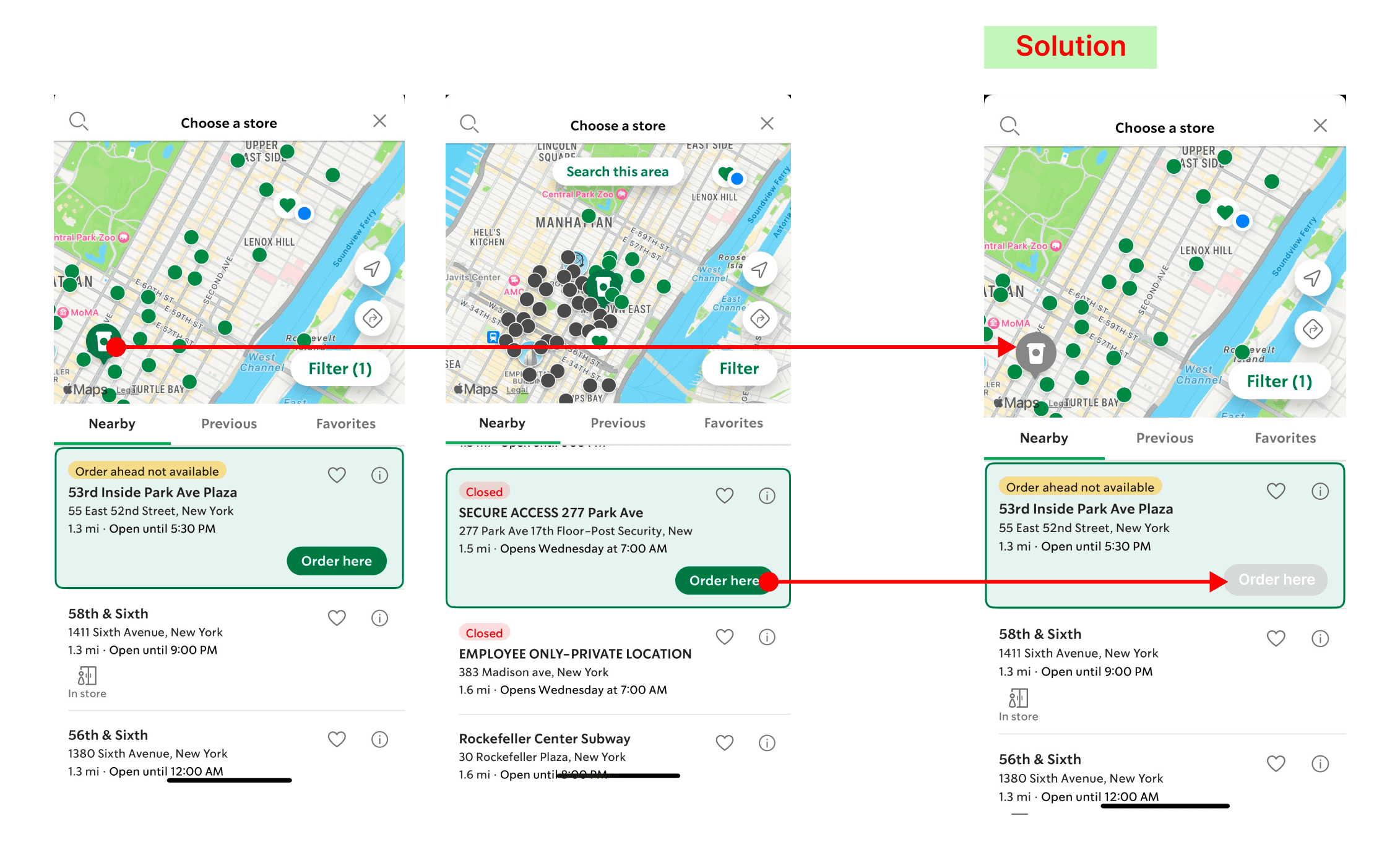
Issue: Users are trying to find a Starbucks that is currently open and accepts orders ahead. However, while browsing through all the Starbucks options, even if a specific Starbucks is closed or does not allow ordering ahead, the “order here” button still prominently appears on the app. This indicates a signifier issue. In addition, the icon of the closed Starbucks on the map remains green, indicating a mapping issue that may mislead users into clicking it and causing confusion. Adjustments should be made to the signifiers to ensure clarity.
solution: Designers should adjust the “order here” button to appear grey and semi-transparent. Additionally, the icon displayed on the map should also be changed to grey.
Conclusion: Starbucks customers can conveniently pre-order and pay for drinks and food for pickup using the mobile application, and they can also earn rewards and freebies through the Starbucks Rewards program. This makes Starbucks coffee lovers addicted. However, there are still several issues in the app, such as weak feedback when operating the filter, slight inconvenience in ordering, and unclear signifiers. In the future, hopes Starbucks could improve and provide customers with a better UX experience.