Todoist claims to be “the world’s #1 task manager and to-do list app”. To explore that strong statement, let’s examine basic task creation and task ordering through the lens of Don Norman’s principles and concepts as laid out in his book The Design of Everyday Things. Todoist is available on Desktop (browser), Android, iOS, and Wearables. For this critique we’ll focus on the native app experience in iOS.
App Icon / iPhone Home Screen
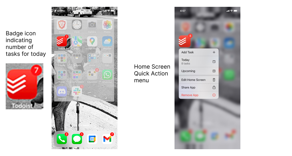
Todoist offers a unique, memorable icon to users’ home screens. When applicable, the icon displays the number of tasks scheduled for the day via a Badge notification. Although a touch on the icon will open the app, a long press presents the user with a Home Screen Quick Action menu, providing Add Task, Today, and Upcoming actions. Add Task adds high user value by presenting a one touch option to immediately add a task, and Upcoming provides user value by displaying this view immediately in the app – saving the user an additional touch after opening the app via the standard app icon. The Today option is redundant; the app defaults to the Today view on opening via a single press of the app icon to get to this view, whereas the Quick Action path for this action requires two presses – so I’d remove it.
Both of these views offer multiple Affordances to users with the appropriate Signifiers ( via Badge and Quick Action labels) with the Quick Action menu providing immediate Mappings (displaying actions) and Feedback (after the action is selected, the result is immediately displayed.)
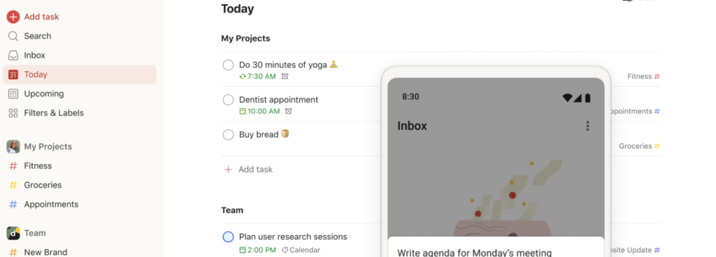
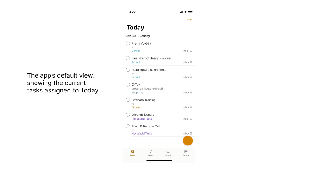
Landing – Today
Opening the app immediately presents the user with the tasks prioritized for Today beneath a header in the largest font on the screen, followed by today’s date – thus promoting Learnability and Efficiency. Tasks are presented in a user ordered list prioritized from top to bottom. Labels allow a user to add personalized categories for fast-access depth and context, enhancing Mappings. A toolbar at the bottom of the screen shows additional actions available to the user – Inbox, Search, and Browse – providing both Affordances and their relative Signifiers aligned with Discoverability. Completing a task is achieved by touching the circle to the immediate left of the task. I suggest that this circle indicates a Mapping to the user; I feel that it’s an intuitive design choice for controls representing an on/off switch, while also encouraging Knowledge Of The World – “hey, it’s a checkbox. I know how this works.”
This is a straightforward, efficient, intuitive display. From an Emotional Design perspective, I propose that it minimizes Norman’s Gulf of Execution – where the design reduces the effort between a user’s intent to act, planning of a sequence of actions, and execution of that action sequence based on overarching goals.
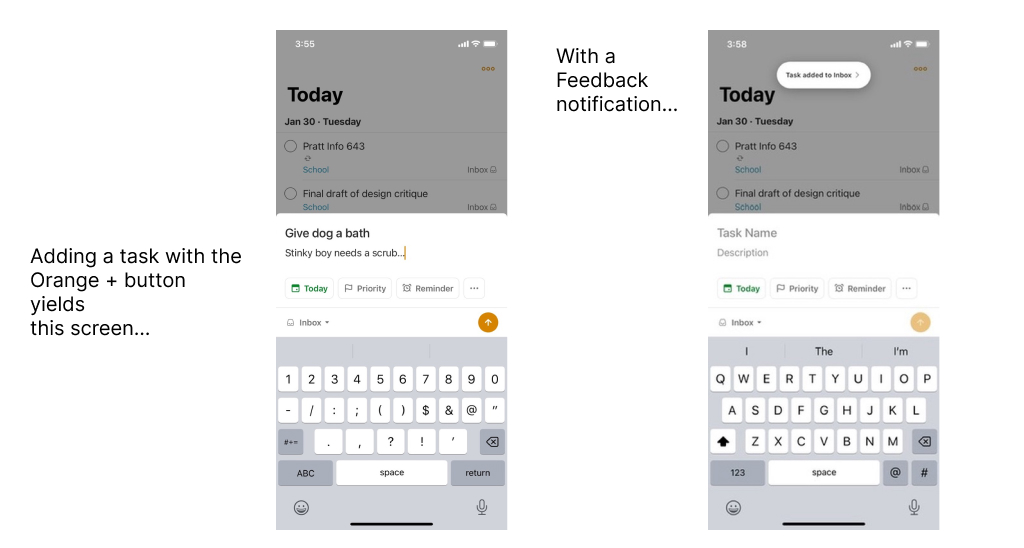
Adding A Task
The most obvious element on the Today screen is a large orange circle with a plus – providing maximum Visibility to a high value user action. Touching this button provides a very subtle haptic bump (a wonderful Feedback mechanism) and introduces the Add Task screen. Several Affordances are indicated by their relative Signifiers here – Task Name, Description, Date, and Priority are all clearly labeled in the empty text fields, prompting the user effectively and enforcing Discoverability. Following completion of task generation, the user clicks the Orange Arrow button (which follows the concept of Conceptual Design; the styling of the Orange Plus button at the beginning of the Add Task path mirrors the same design as this Arrow button), a subtle haptic bump is felt (Feedback), and the user is shown a small notification at top of screen (more Feedback)…
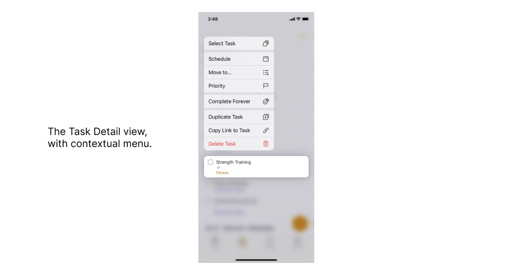
Task Detail View
Long pressing a task allows a user to view a contextual menu related to the specific task. The interface responds with a light haptic bump and a color variation, presenting immediate and excellent Feedback to the user and exposing a submenu providing Discoverability, with multiple Affordances of possible actions coupled with clearly labeled Signifiers indicating what those actions are. Actions are subtly grouped (a lovely minimalist design choice), with the Delete Task option pushed to the bottom and in red to alert the user to an action with permanent consequence. These actions are evident Constraints for the user, presenting only the options available within this view.
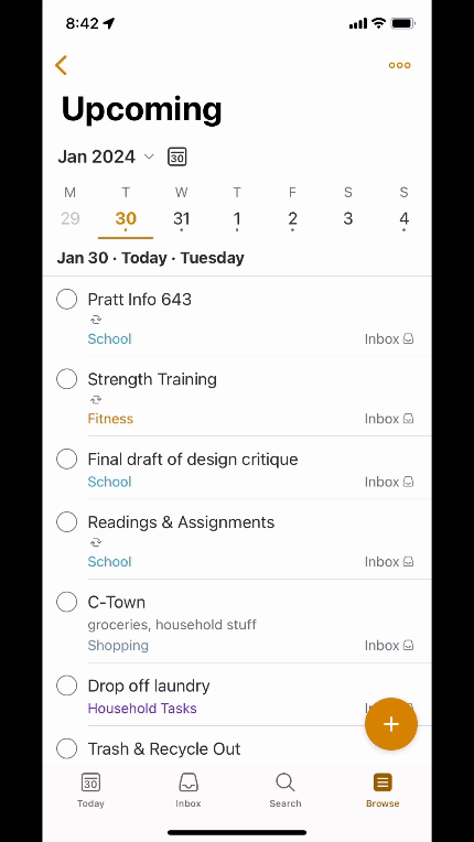
Reordering A Task
A user has the option to re-order a task in the list via a long press on the individual task (similar to engaging Task Detail View), but if the user continues to hold the press on the task after the Task Detail submenu is exposed, we can pull or push the task into a new slot. I find this to be finicky; at times when I was on the street or in a store attempting to move tasks around with one hand, I found myself accidentally pressing one of the Detail View options as I was trying to “unfreeze” the task and push it to a new location. In some cases, I dismissed the contextual menu entirely and incorrectly marked the task as complete. This presented an opportunity for a Slip – the action I’m performing is not the intended action – or even a Mistake – my plan failed – with potential negative and permanent results.
Continual attempts had me considering the concept of Recall (Long Term Memory / slow access) – i.e., “how does this thing work again?” This widened my own personal Gulf Of Evaluation…am I invoking a submenu or reordering a task here?
One possibility may be to introduce a touch target to the far right of the task that is only for dragging. This may be indicated by a small touch target invoking an Affordance and related Signifier – with potential confusion to Discoverability (too much going on here!) – and we also encounter the risk of cluttering the interface / insert sad emoji. This is a design tradeoff that must be considered. I don’t have a specific design suggestion, and it may be that pro users eventually learn how this functionality works to use this feature effectively.
Conclusion
Overall, Todoist presents a well designed experience for people who have the need for a fast, intuitive organization tool focused on lists. This review only scratched the surface of what the app is capable of. I think it’s an absolutely fantastic app and I use it daily…but one wonders how many more features can be added before Usability and Understandability are reduced?