Zocdoc is a healthcare appointment scheduling platform, that plays a role in connecting users with healthcare providers seamlessly. It helps users identify and schedule in-person or telemedicine appointments for health or dental services. Additionally, the portal serves as a rating and comparison database for doctors and dentists. Let’s explore Zocdoc’s interface through the lens of Don Norman’s book, The Design of Everyday Things.
Find care flow
On the homepage, every step in the process of finding a care activity has precise action sequences, ensuring users a clear interaction within the appointment system and enhancing usability by providing users with clear discoverability and affordances, allowing them to comprehend how the system operates easily. Users can navigate through the steps seamlessly, having a more intuitive and accessible experience. Each step is separate, ensuring that only the controls that are relevant to the current operation are displayed, thereby improving the overall efficiency of the booking process.
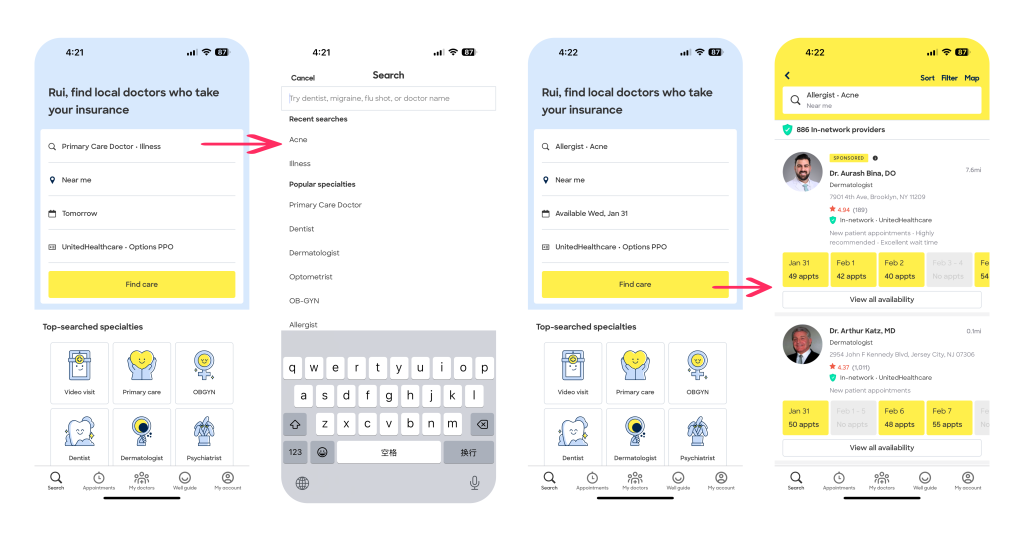
The app speeds up the appointment process with a step-by-step selection process. Users can choose a doctor’s specialty, location, and preferred time slot. Figure 1.2 shows Zocdoc’s deliberate use of constraints. When the user needs to choose a symptom specialty, the user can easily search for keywords to find the option that is closest to their symptoms, instead of self-entering what the user thinks the symptoms are, limiting the options that each input will bridge the user’s gulf of execution. The system provides input options to prevent errors or slips, such guidance can reduce the possibility of user input errors, resulting in failure of later tasks, such as not finding the right doctor. This reduction in cognitive load contributes to a smoother and more efficient user experience and ensures a seamless booking experience. Extensive physician specialty options further give users plenty of choice.
Choose a doctor who is an in-network provider
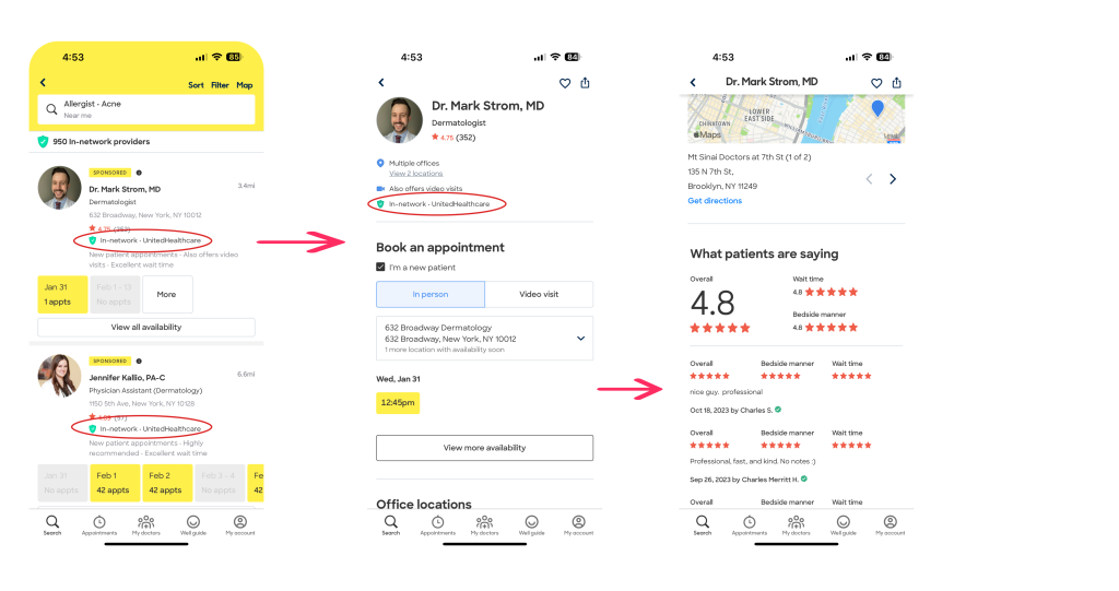
The platform’s streamlined provider search, utilizing clear categorization and efficient information display, embodies the concept of affordance by making the process inherently understandable. The presentation of insurance plan compatibility at a glance provides users with a signifier that tells them whether or not they’re in your insurance plan, providing users with a clear connection between their goal (finding an in-network provider) and the available actions (Whether to choose the current doctor). Below the search box in Figure 2.1, there is an indicator that provides the doctor’s signal within the network. In the list of available doctors, this signal is displayed under the doctor’s score, which also ensures the consistency of the system.
Once a doctor is selected, the detailed information—covering availability, office location, and patient reviews—follows the principle of feedback, ensuring users receive pertinent information in response to their actions. This thoughtful integration underscores Zocdoc’s dedication to creating a user-friendly healthcare navigation experience.
Modify on “View more availability” Feature
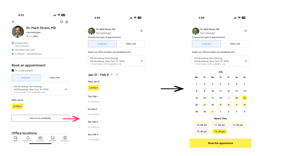
After confirming with one doctor, the user will be directed to view more availability of this doctor. I propose an enhanced design for user convenience in navigating the scheduling process shown in figure 3.3. Instead of providing a pre-defined time range, I’ve transformed the time selector into an intuitive calendar. This redesign ensures clear mapping for users, aligning with cultural conventions and facilitating a precise selection of the desired day. The calendar format minimizes the risk of action errors and slips, such as memory lapses, which in the context of a time selector refers to the potential for users to forget specific details or options when presented with a pre-defined time range. When users are required to recall or anticipate available time slots without a visual aid, there is a risk of errors due to the limitations of human memory. So I made this mapping of calendar UI to provide a more user-centric and error-resistant approach to scheduling, also minimizing the user’s memory load. This thoughtful adjustment aims to enhance the user experience by offering a familiar and straightforward method for choosing appointment dates.
The date highlighted in blue indicates the present day, while the date within the yellow box signifies the availability of the doctor. A yellow-filled date designates the user’s selected time slot. And I chose the main color of the system to do the re-design to ensure the design’s consistent aesthetics.
Top-searched specialties
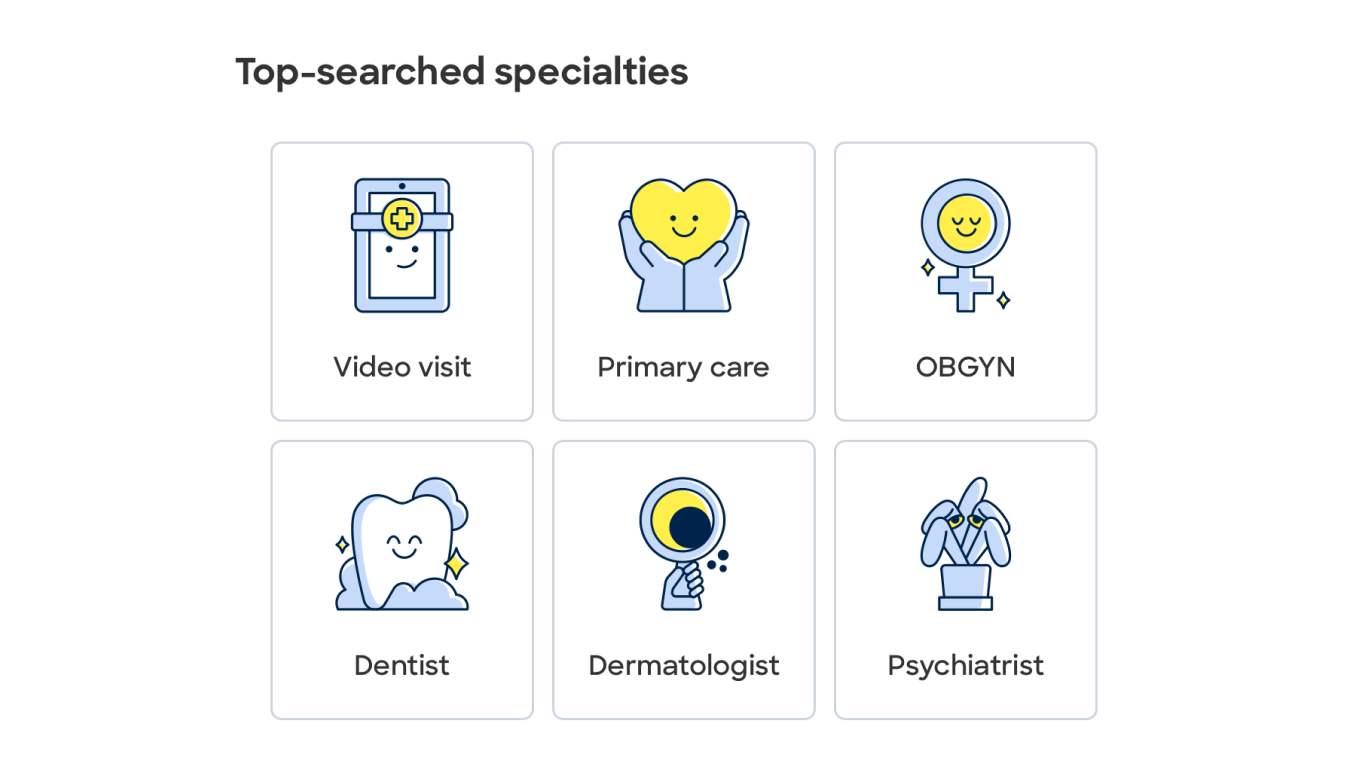
On the homepage, here is a shortcut function for users to select a specialty from a given categorization. The icons above each specialties box maintain readability on the mobile app with consistent and appropriately sized typography, such aesthetical conceptual models also give an explanation of how each box means. The icon styles align with the brand, ensuring a visually cohesive experience.
Well guide
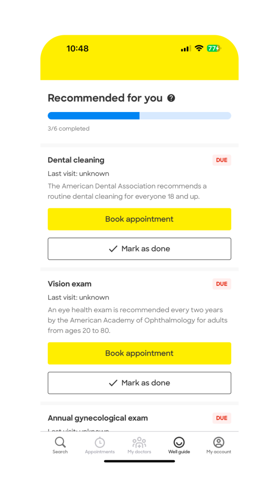
On the well guide page, users will have a list of wellness recommendations, though these are just some of the recommendations that may apply, users still can get a self-awareness on which physical screening they can take. Above the wellness guides, there is a progress bar showing the meter tracks progress as wellness recommendations are completed. This immediate feedback communicates the results of users’ action, user can figured out what happened, which reflects the amount of effort that users must make to interpret the current state and to determine how well the expectation and intentions have been met. This design element bridges the gulf of evaluation, users can perceive what happened, and compare what happened with what was wanted. Also, the progress bar will affect user’s emotional state. Such visibility of system status keep users informed through feedback within a reasonable time, which follows the usability heuristics.
Overall visual system and experience
The main dashboard displays clear and concise information about available appointments, doctor reviews, and specialty filters. The visibility of relevant details contributes to a user-friendly experience, allowing users to quickly comprehend the available options. The platform utilizes constraints appropriately to guide users in a step-by-step manner. The appointment booking process is structured logically, with constraints in place to prevent errors. For instance, users are guided through selecting a specific reason for their visit, helping to narrow down relevant healthcare providers. Zocdoc provides effective feedback mechanisms, ensuring users are informed about the consequences of their actions. For instance, when selecting an appointment slot, users receive immediate feedback regarding the availability of the chosen time. Zocdoc employs effective affordances by using familiar icons and clear buttons. The design elements indicate their purpose, allowing users to understand how to interact with the platform intuitively.
In conclusion, Zocdoc’s UI shows strong adherence to Donald Norman’s design principles. The platform prioritizes visibility, feedback, and affordance, creating a user-friendly experience. Consistency, effective mapping, and error prevention further contribute to a positive overall experience for users seeking healthcare services.
