Duration : September – December 2023 (4 months)
Team Members : Shivani Kolte, Anne Kuo, Jiayi Jiang, Kiyo Yang
Overview
A volunteer-run, zero-profit urban farm in Rockaway, NY with a mission to provide produce, open space, and education to the historically low-income community.
Project Goals
After our Kickoff meeting with the client who is the head volunteer at Edgemere Farm, we identified our main goals for the project :
- Tell Edgemere Farm’s Story
Edgemere Farm seeks to showcase their mission, history, team, and achievements.
- Educate Food Justice & Farming
Edgemere Farm seeks to educate individuals basic farming skills and a sustainable compost cycle.
- Encourage Participation
EF prioritizes community participation and hope to get people involved.
- Facilitate Support
As a zero-profit org, EF relies on the assistance of volunteers, donations, and collaborative partnerships.
The Big Question to be answered :
How might we redesign the website to present EF’ story & mission, and motivate engagement?
Exploratory Research
So we dove right into research. Understanding the goals we were working towards we set out to conduct some research via mixed methods to triangulate and solidify our findings.
Technical Analysis
How does the current website perform?
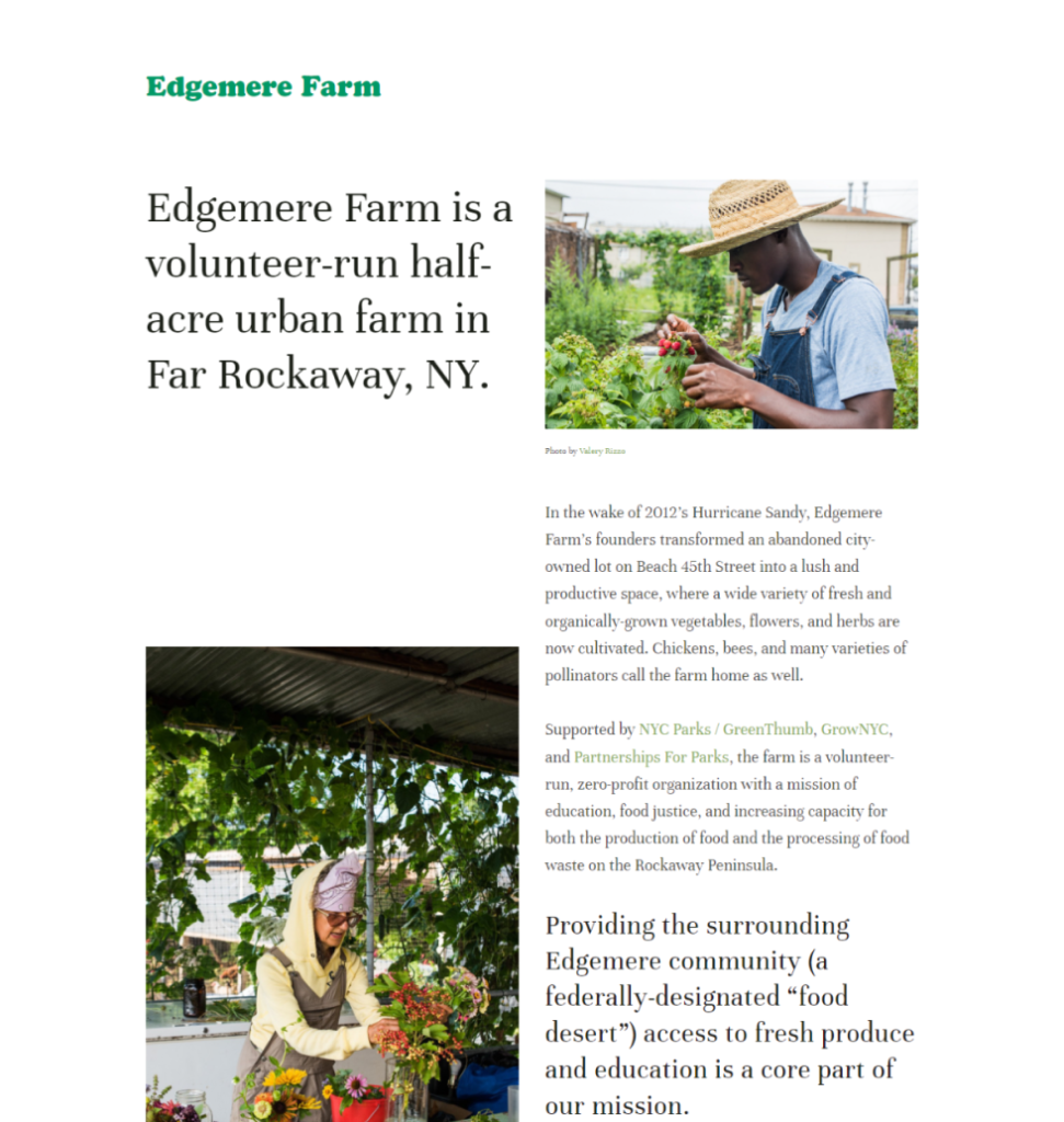
The technical analysis revealed that the current website has appealing imagery and a simple and on-brand colour palette adding to the feel of the Volunteer-run Farm
It also revealed some areas of improvement :
- Information Architecture and UI
Absent navigation bar and unstructured information on the website. A weak hierarchy causing low scannability.
- Outsourced Volunteering Flow
User motivation lost due to increased amount of clicks to get to the flow along with information overloaded and concentrated in a low-significance page overwhelming users.
Ecosystem Map
Who is involved and how do stakeholders work together?
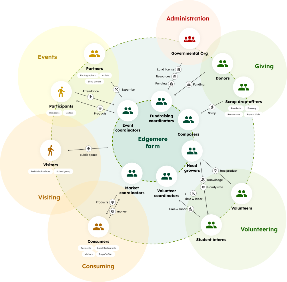
We identified that the main stakeholders involved in the working of Edgemere, that hold relevance to the scope of our project were :
Volunteers : Individual volunteer, Student intern
Consumers : Residents, Local restaurants
Visitors : Individual visitor, Group visitors
Donors : Scrap drop-off-er, Monetary donor
Event Attendee : Local residents, Visitors
We understood that website would cater to two main groups :
The local community residents and People who learn about EF online to create an authentic narrative and highlighting he ongoing efforts for education. In addition to thiswe would also have to adapt the website according to the Seasonality and timeliness the content.
Social Media Audit
What content does EF create and how do they connect with users?

We reviewed EF’s Instagram account and analyzed the various interactions to understand contents they created naturally and users’ engagement and we found that :
- Users value the emotional bonding with EF
People’s stories, image with people and EF’s achievement tend to get more “likes”: usually more than 150, sometimes even more than 400 - Information timeliness is crucial
Users are eager to stay informed about the up-to-date information in EF, including products on-sale, opening hours, upcoming events and more. - Volunteers prioritize clear information
Volunteers look for clear expectations, including time commitments and benefits.
Competitive Audit
How are similar websites designed?
We reviewed the storytelling, volunteering page, donation page, and events page of similar websites and concluded some key pointers.
- Storytelling :
– Convey organization’s mission with concise taglines
– Enhancing the human aspect behind the project through authentic pictures. - Showing Impact :
– By highlighting stories and contributions of real people, and making them measurable for better connection - Inciting motivation :
Through incentivizing the experience of volunteering and clarifying what exactly they would get out of it. - Presenting information :
Making information more digestible by making the forms shorter and increasing transparency on processes involved through application processes, FAQs and policy statements. - Offering flexibility :
Familiarising people with multiple ways to engage other than donating/volunteering and showcasing the various activities and programs they can participate in.

Literature Review
What are other experts’ opinions?
Through our literature review, we researched the existing articles to form a good strategy for our key user flows and add to our previous findings and strategise the content accordingly.
Some findings that were reiterated through this were the importance of clear and concise information, easy access to donation and volunteering forms as they require high motivation to engage with and humanised storytelling on the website through a well balanced text to visual content weight.
Interviews
What are users saying?
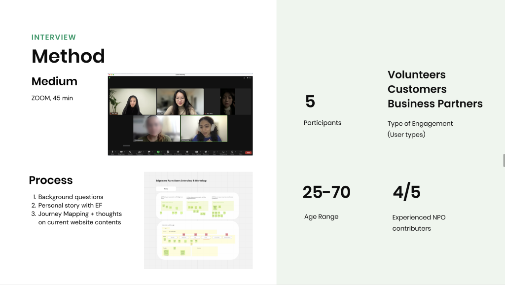
Finally, to understand what the existing community members of this organisation had to say, we conducted interviews with them and zoomed in on two main motivations that drove people to engage :
1. Empathizing with and appreciate EF’s mission and story, as detailed by one of the members, Matt (a local restaurant owner and long time supporter)
2. And secondly, the desire to Connect with a diverse and inclusive community as marked by Jeff, a long term volunteer
Ideation
Creating a User-Centric Information Architecture
After outlining the user motivations as such, we moved on to create the information architecture that suits our users’ needs, transitioning from Research to Design.
We split our pages into two categories: Information and Ways to engage.

We then identified three types of users: Newcomers, Participants, and Supporters.
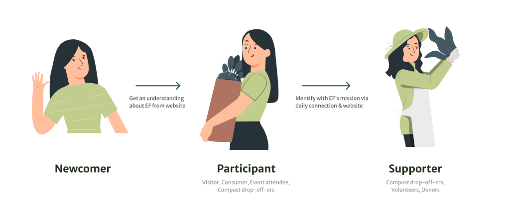
As newcomers have little knowledge about Edgemere Farm, their purpose would be to explore what Edgemere Farm does.

After learning more about Edgemere Farm, newcomers might transform into participants who wants to engage in lighter activities such as visiting the farm, attending events, buying produce, or dropping off her food waste.
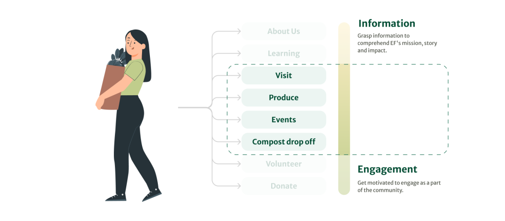
After satisfactory experience on interacting with the farm, participants might transform into supporters who spend more time and effort engaging with the farm. They would volunteer in the farm, donate, or continue to drop off her compost.

Design Principles for Presenting Edgemere’s Story
With the clear information structure in mind, we further highlighted guiding principles to inform our story-telling and content strategy:
- Building Trust
- Curate Authentic narratives and images
- Provide sufficient information to ensure transparency
- Ensure the information is up-to-date
- Keeping Diversity and Inclusiveness in Mind
- Show how Edgemere Farm connects people from diverse backgrounds
- Highlight unique stories of individuals
- Design the site to be accessible for seniors and visually appealing to the younger audience
- Presenting Specific Examples of Broad Ideas
- Show instances of how Edgemere Farm’s missions and actions are impacting people’s daily life
Evaluative Research
We conducted 2 interviews with community members to ensure our ideas align with their work. We also interviewed 4 students that are interested in farming/volunteering to see if the website is clear and engaging from an newcomer’s perspective.
Participant reactions
I like how it highlights personal stories along with the organization’s story.
– Community Member
Is there a possibility that I’ll be rejected for volunteering? Is it a long-term commitment?
– Newcomer
Main Changes
Soften the text tones
The Farm’s co-founder, David, told us that their work is more about supporting each other rather than fighting for a cause. We since edited the taglines to make it more neutral and supportive.
Clarify the opening hours of different activities
In the current layout, participants thought they could do all the activities in the farm as long as the farm is open to public. However, the farm stand does not open on a date that the farm is open. Therefore, we decided to highlight the farm stand, volunteer, and compost drop-off hours and separate them from the farm opening hours.
Present more quantitative impacts
As Edgemere Farm is looking to apply for grants, quantitative impacts would be a straightforward way for people to know the scale of their impact. We decided to include more numbers in the Our Mission and the Donate page, followed with stories to make the narrative more cohesive.
Making the volunteering page more welcoming
Our initial copy did not specify the duration and selection process, causing some confusion to participants that this is a selective and a long-term commitment. In contrary, this is a friendly one-time activity that welcomes people of all ages. We adjust the copy so that it is more welcoming and inclusive.
Final Design

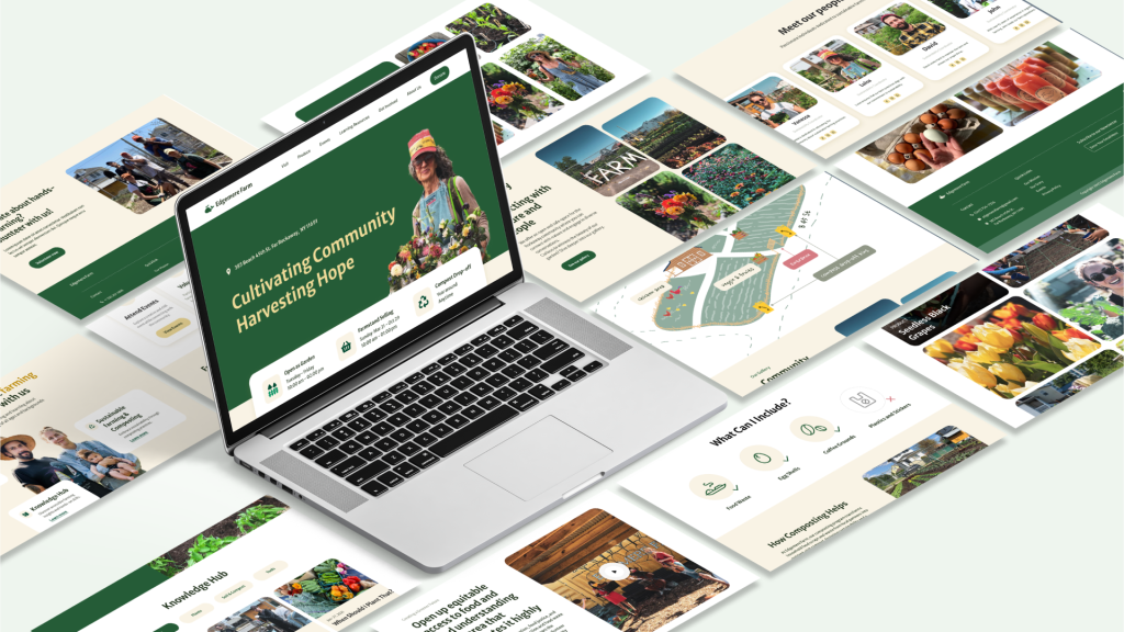
Explore our Prototype →
Client Feedback
“Thank you for giving us this perspective of our farm, I think you understood it uniquely and brought out our farm’s work beautifully.“
– Vanessa, Chief Operator of Edgemere Farm
Next Steps
- Implement the Design to Squarespace
- Converting it into a Squarespace website
- Keeping up with the Updates on the website
- Fill-in Text Copy
- Testimonials to be collected (consider IG as a source)
- Information targeted at applying for grants.
- Explore More Humanized Visual Designs
- Test out the serif fonts to make the visuals look less corporate
- Integrate the Donation Feature
