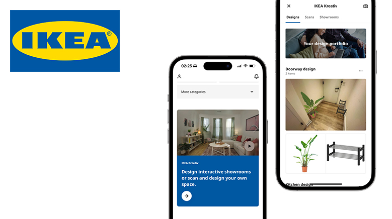
IKEA is one of the world’s largest furniture retailers for affordable and ready-to-assemble home goods. The IKEA Kreativ, a virtual design tool inside the IKEA app, allows users to design interactive showrooms or in their living place virtually and bring the iconic showroom experience that exists in IKEA’s offline store locations to a digital platform. This article focuses on an iPhone 14 Pro user exploring the IKEA app’s virtual design feature and critiques the IKEA Kreativ based on some usability factors mentioned by Don Norman’s book- The Design of Everyday Things.
View in room
Scan the environment
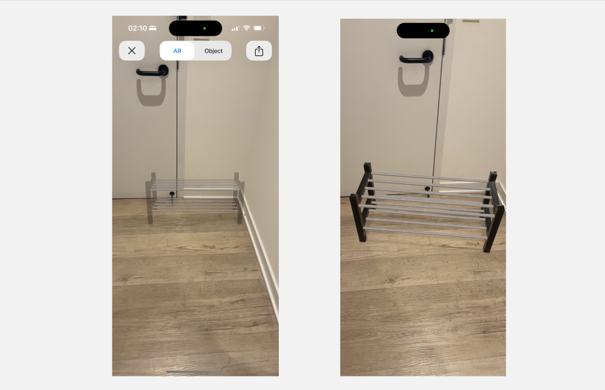
When users initiate the AR feature by tapping “View in the room” on the product detailed page, they are directed to a new interface with the object fixed in the center of the screen. The gray out effect of the object are good signifiers that indicate the object is still in preparation and it’s unclickable. Once it’s ready, it will turn to vivid color to signify that the object is ready to move.
Position the object
Once the object is ready, it will become solid, and users can see it blend in with their living space. However, users might stand too close to the model and pass through it due to the lack of constraints. For first-time users this situation can be confusing and there is no signifier to indicate what actions are possible to fix it.
Solution

To provide proper constrains, I’ll suggest a pop-up message displays “Please step back to see full model” that served as feedback of users getting too closed to the model, so the users know how to recover from the incorrect actions.
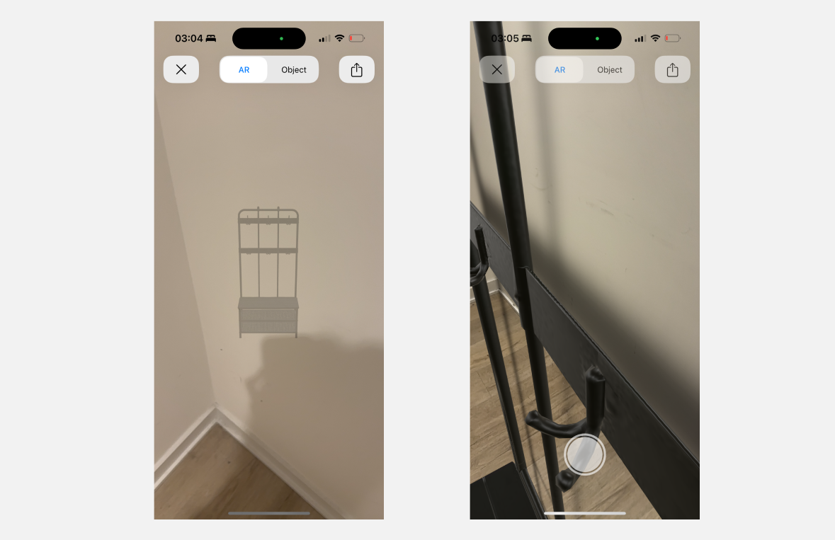
Move and rotate the object
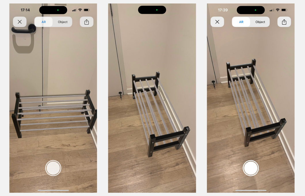
Even after the object is placed appropriately in the center of the screen, there is no further guidance on how to move or rotate the object. The interface lacks discoverability due to the lack of signifiers and mapping and falls short in bridging the gulfs of execution. Users might have learned how to move and adjust the object from their previous experience with AR app, which is tilt and move the cell phone to align the object. So users might assume that they can move the object by moving the phone, but it can not. The white button at the bottom of the screen can also mislead users from the right track since it is a signifier that affords to interact.
Solution
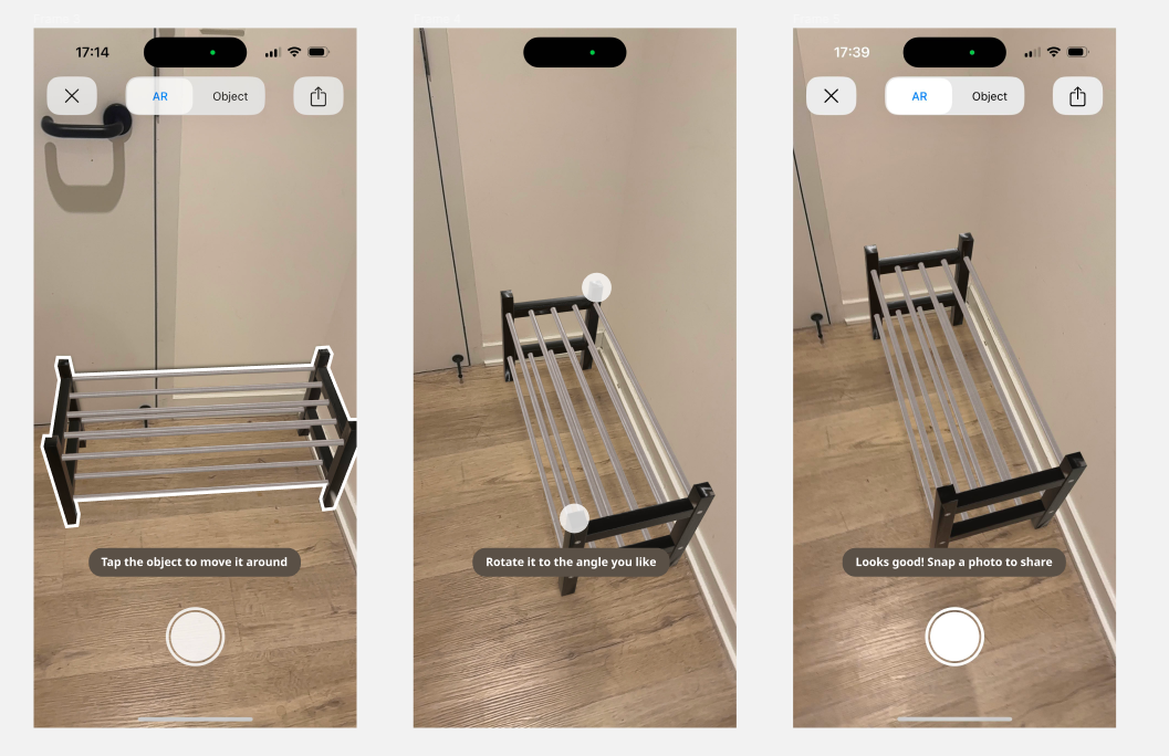
To create an intuitive AR onboarding experience, it’s crucial to provide a mental model that is easy to understand and recognize. I’ll suggest pop-ups displaying “Tap the object to move it around” with a white outlined effect around the object to signify that the object is selected. After users finish this step, another pop-up displays “Rotate it to the angle you like” to clearly inform users of the correct action, so the users don’t suffer from imprecise knowledge and are guided by precise knowledge. Two white dots suggest the means to rotate will serve as a signifier that affords the correct operation.
Showroom
Cart

In the showroom customization page, users can browse the catalog of furniture inside the showroom and buy them with one click. The blue buttons are good signifies that affords to add items to cart. After users click “Add room to cart”, a snack bar pops up to inform users of items that have been added to the cart. However, there is no indication on this page itself to help users recognize this action that has been done. Once when users come back to this page after adding more furniture to the showroom, they will suffer from being unable to recall what items have already been added to the cart due to the lack of feedback and signifiers.
Solution
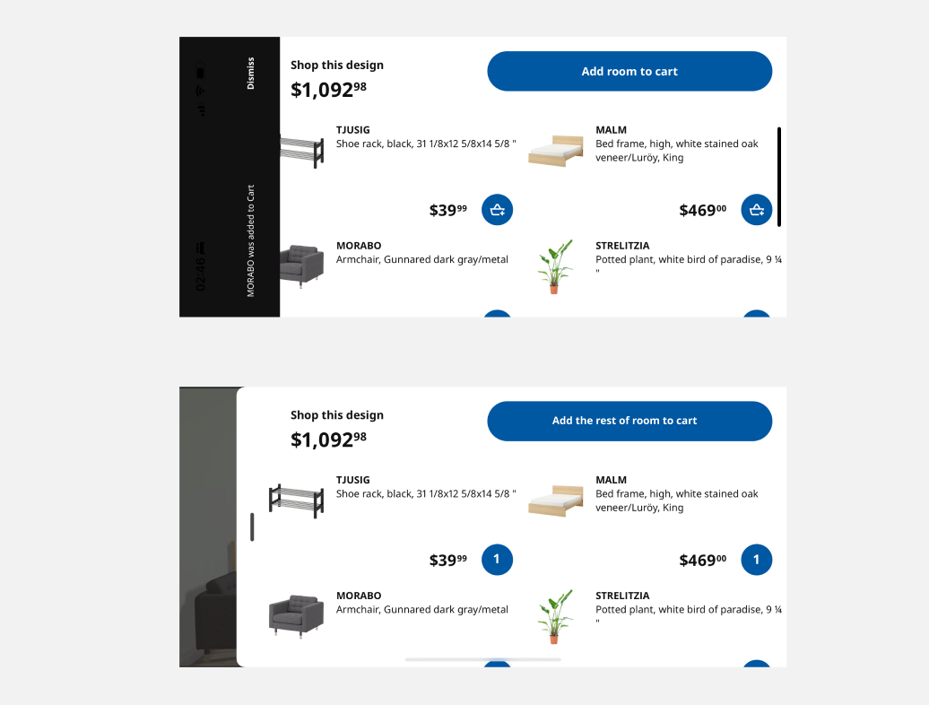
To ease user’s memory load, I will recommend providing instant and proper feedback after user click “Add room to cart” such as the bag icon turning into a number to indicate the number of this type of object in the cart, and “Add room to the cart” turning into “Add the rest of the room to cart” to reassure user of knowing that the same items will not be added twice. The change of different states of one component serves as clear feedback.
My own space
Scans

The “Scans” page offers users a way to explore existing scans by categories, allowing them to edit previous designs multiple times. However, when users have more than one scan belonging to a category, finding a specific scan, such as the scan of the kitchen corner, can be challenging. Users are currently limited to scrolling through categories, which is inefficient and hampers discoverability when searching for specific scenes they’ve scanned.
Solution

To streamline the process of locating desired scans, I recommend adding a series of labels served as direct access to each category. This addition enhances overall user experience of this page by allowing users find target scenes effortless.
Erase

After users enter the interface where they can edit their design, they will notice the erase feature in the left tab bar. Once when users tap the icon “Erase”, they will be directed to a page that allows users to virtually remove unwanted furniture and other items with just a click. In “Erase” page, Labels beneath icons are good signifier and improve user’s understanding of what possible actions are. Colored outlines around different objects, as well as the color differentiation between deleted objects and kept objects, served as good signifiers, indicating users can delete unwanted objects or add objects back with a click. However, after users tap “Hide All” or “Show All”, they are not provided with any options other than saving the changes. Users are unable to recover from this action, and they are forced to save the unwanted changes.
Solution
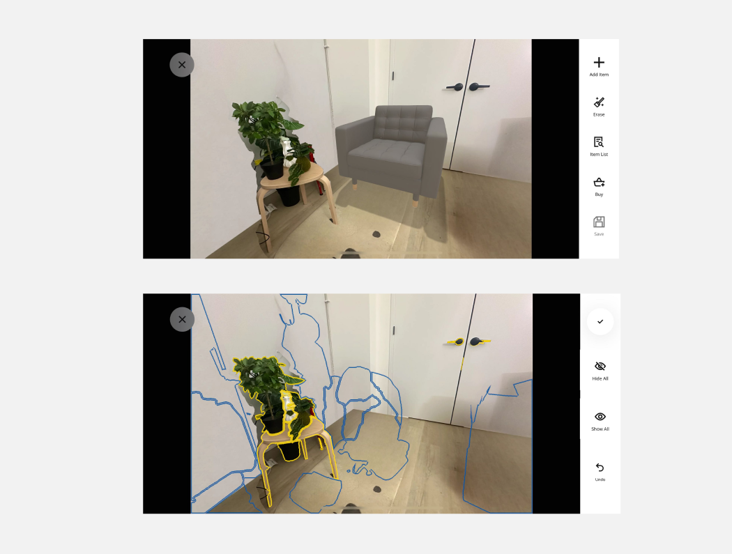
In order to provide users with an effective mean to recover from error, I’ll suggest add “Undo” to left tab bar to allow users to reverse actions so they can recover from the error immediately.