
Medium is an influential online blog platform, that seamlessly brings together professionals, publishers, and knowledge enthusiasts. It offers a rich mix of original and curated content, fostering a vibrant space for sharing ideas and insights. Catering to both those seeking knowledge and content creators, it serves as a hub for quality articles, fostering meaningful discussions. It functions as a user subscription model.
Home Page
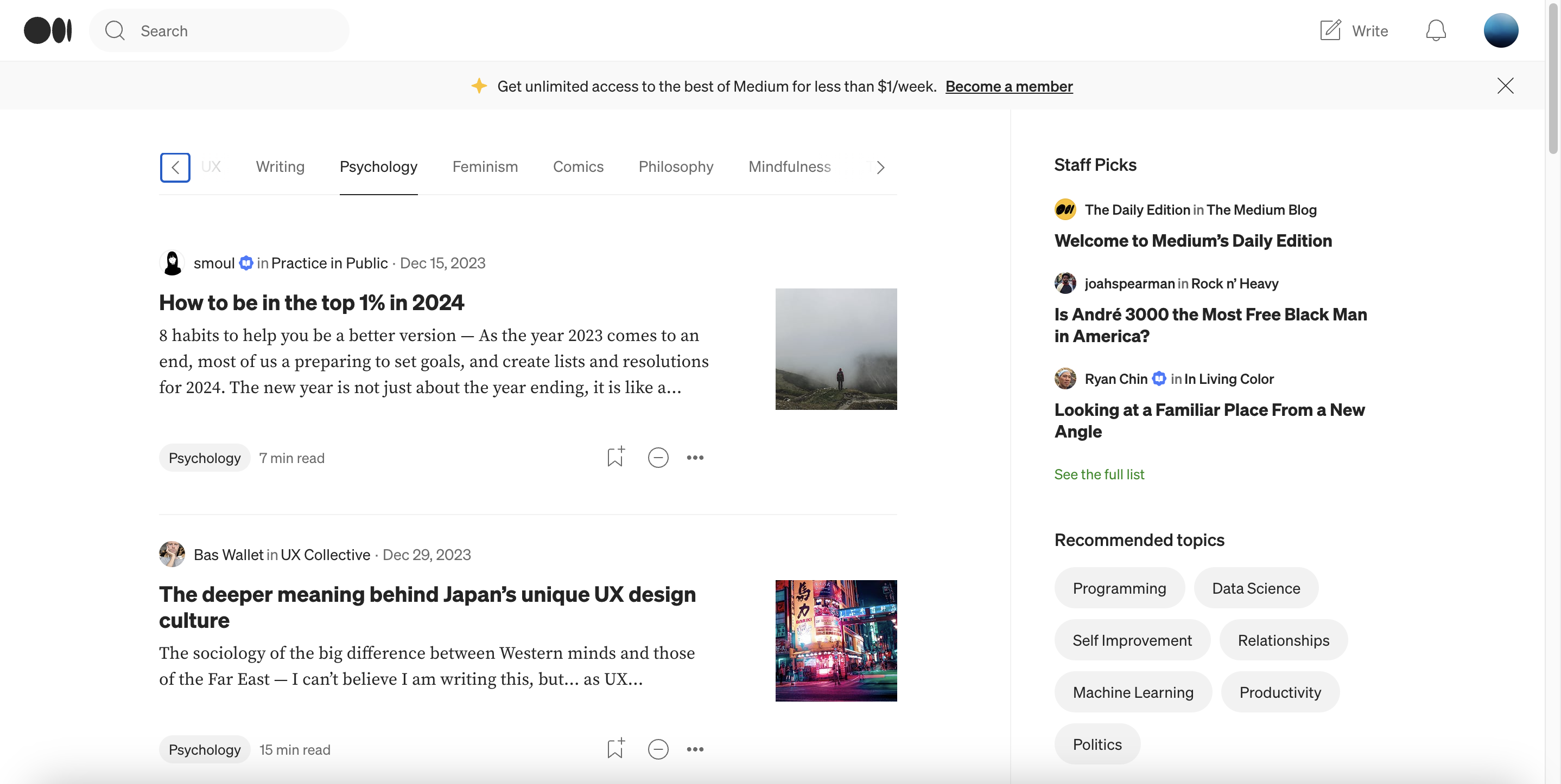
The Home Page of the Medium application on the desktop features a fairly simple and easy-on-the-eye UI.
This prevents information overload as Norman advocates for a clear and concise presentation of information to prevent cognitive overload and enhance the usability of a design
The main navigation bar features the logo, which serves as a clear signifier for the platform, and the search bar, accompanied by an icon and text, provides affordances for users to search for content easily.
The “Write” button serves as a clear affordance, again the placement of the user profile icon at the top corner adheres to the concept of natural knowledge, as users commonly expect to find profile-related features in this location across applications, enhancing user familiarity and usability.
The presence of the horizontal scroll element offers an affordance for users to explore additional content horizontally. While also serving as a visible signifier, indicating additional content beyond the initial view. This aligns with Norman’s principle of providing clear cues for users about the interactive elements. And importantly contributes to a sense of mapping as users can associate the scroll functionality with the content below, promoting a logical and intuitive interaction.
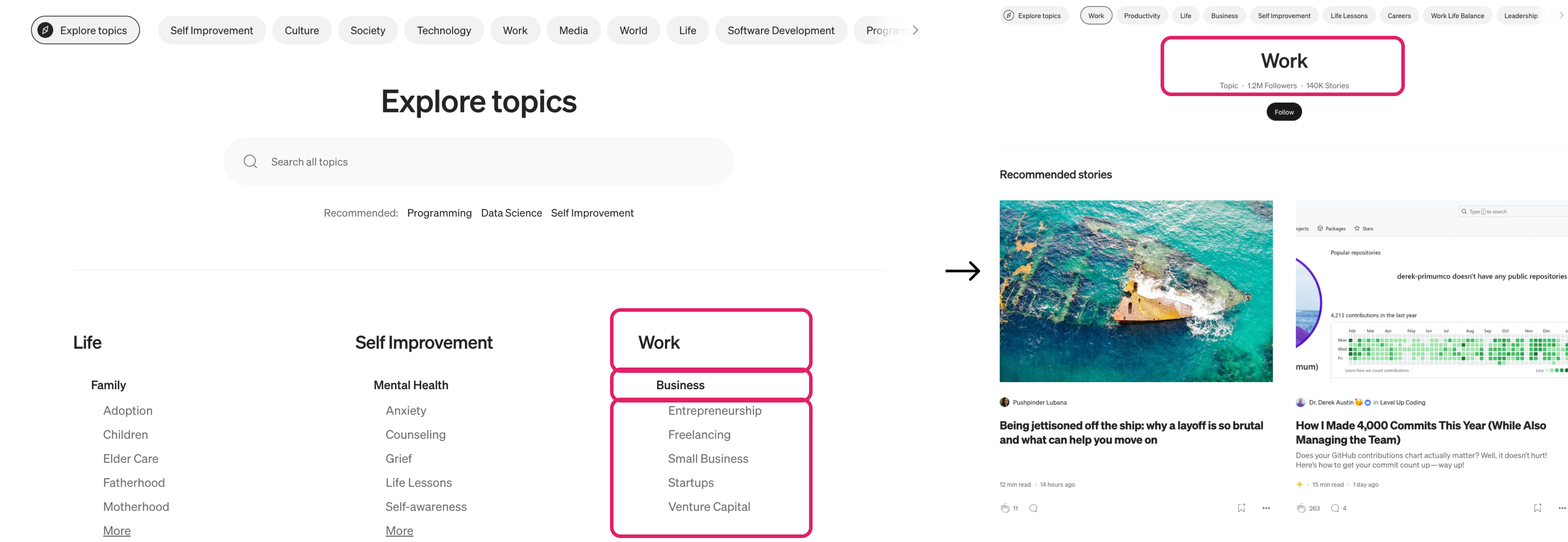
Article Section
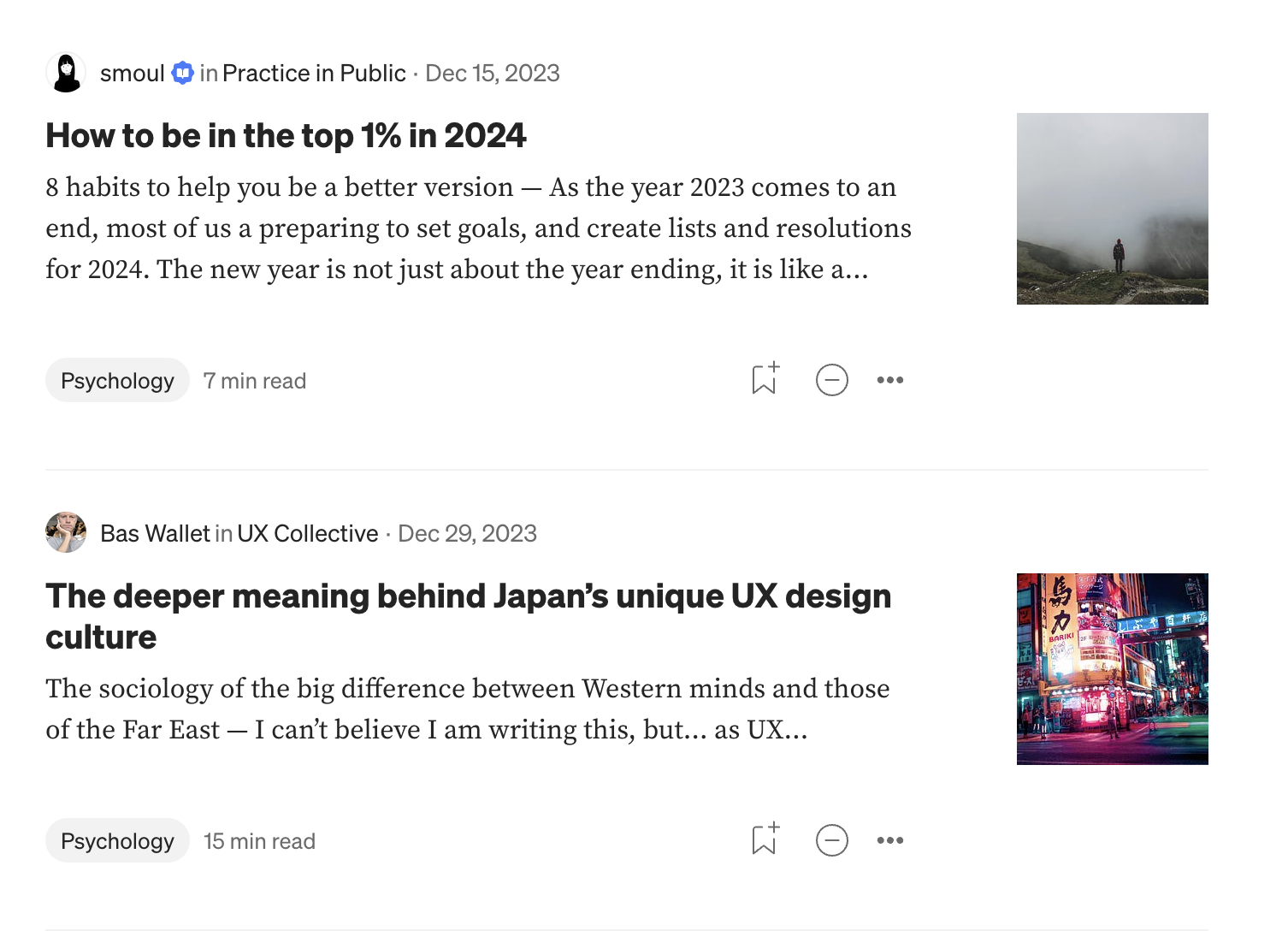
The consistent layout and structure of the content contribute to a sense of mapping, allowing users to predict where to find specific information. It is visually clear and provides feedback as users hover over the icons stating it functions.
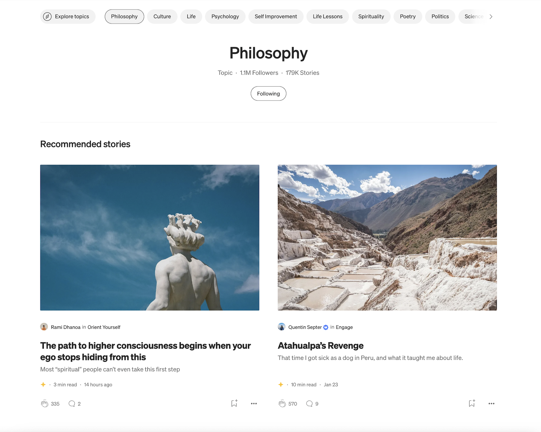
With the category of the article tagged below, it helps the user with the discoverability aspect, as when clicked on it the instant feedback takes the user to an all-new screen showcasing articles tagged under that specific title.(shown below)
Side Panel
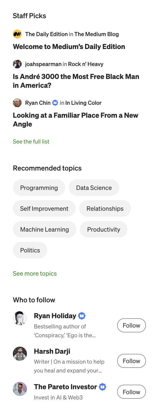
The effective segregation of content on the home page behaves well for easy discoverability as the layout provides a clear and intuitive path for users. The well-segregated content ensures that users can easily navigate and find relevant information, and also remember it.
Specifically the side panel, clearly labeled as “Staff Picks,” for example acts as a signifier for curated content. While also providing affordances for users to explore high-quality content. The dynamic nature of the section also offers feedback, indicating updates and freshness.
Problem Areas
Problem
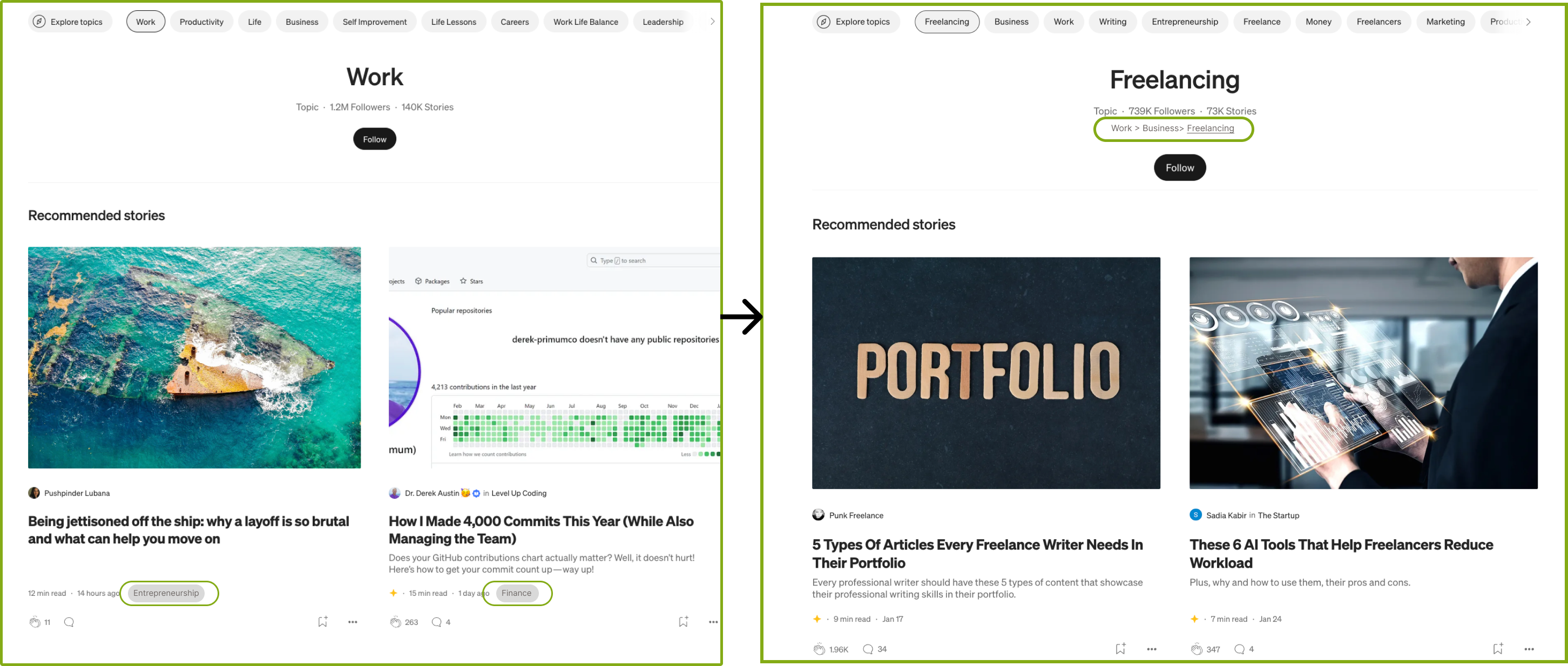
Problem #1: The website’s categorization lacks a clear structure, leading to confusion. Inconsistencies in terminology across sections contribute to this issue. For example, when users explore options in the search bar, they encounter a super screen with various topic headers, sub-headers, and listings. While these headers are clickable, the nested categories within a specific topic lack visibility, creating a disconnect and violating Norman’s mapping principle.
solution
– Introducing tags to individual articles within a super topic ensures a consistent hierarchy. This not only maintains clarity but also empowers users to delve into more articles within a specific category, enhancing their discoverability experience.
– By implementing a progress bar, users gain a visual guide through nested topics. This not only signifies their location within the hierarchy but also serves as a helpful affordance, informing them about additional options to explore within the broader topic.
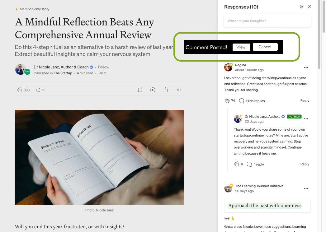
Problem #2: I noticed a gap in feedback within the comments section, particularly after a user submits a comment. The absence of an immediate visual cue to confirm the successful posting or to provide feedback on potential errors creates a disconnect between the user’s action and the system’s response. This issue is worsened by the fact that submitted comments appear at the bottom of the page, necessitating users to scroll extensively to see the outcome of their action.
solution
To address this, implementing a pop-up box that communicates the status of the comment submission, accompanied by options to view the comment or dismiss the message, would offer users the necessary feedback without requiring them to scroll extensively. This enhancement not only bridges the Gulf of Evaluation by offering immediate and visible feedback but also ensures that users are kept informed and engaged during their interactions, contributing to a more satisfying and user-friendly experience on the platform.
Problem #3: The absence of a word limit for articles presents a challenge, and introducing constraints, both in terms of a minimum and maximum word limit, would address this issue. This ensures that writers do not submit overly brief and incomprehensive articles, while also preventing the submission of lengthy 5000-word essays without editorial refinement pressure.
In conclusion, the Medium blog website effectively adheres to usability principles without any major shortcomings. The application provides a clean and user-friendly interface for both navigation and content uploading. It successfully caters to its audience by ensuring discoverability and visibility of important actions without overwhelming the user.