Domino’s is the largest pizza chain in the US and the world over. They are industry leaders in terms of innovation, marketing, supply chain management and coming up with innovative campaigns such as the recent ‘Domino’s Pinpoint Delivery’ service that delivers pizza to you anywhere you like, without requiring your address.This along with their market position and popularity should ideally mean they have an extremely efficient, user friendly and responsive website and app interface.
And through this design critique, I shed light on some key usability issues I noticed in the Domino‘s app interface. Having used the Domino’s app in the past, I sat down and observed the pizza ordering flow for the purpose of this exercise.
One thing I really like is their focus on timely deliveries, and how they make the user know of that right before they start building their order. Also of note is their absence from all food delivery apps except their own Domino’s app. They tend to do this to ensure greater margins and greater control over the delivery process. This means their app and website are the only places users can order from. Seeing as their app and website are the only places customers can order/pick up pizza’s, the interface of these touch points should ideally be extremely intuitive and user friendly.
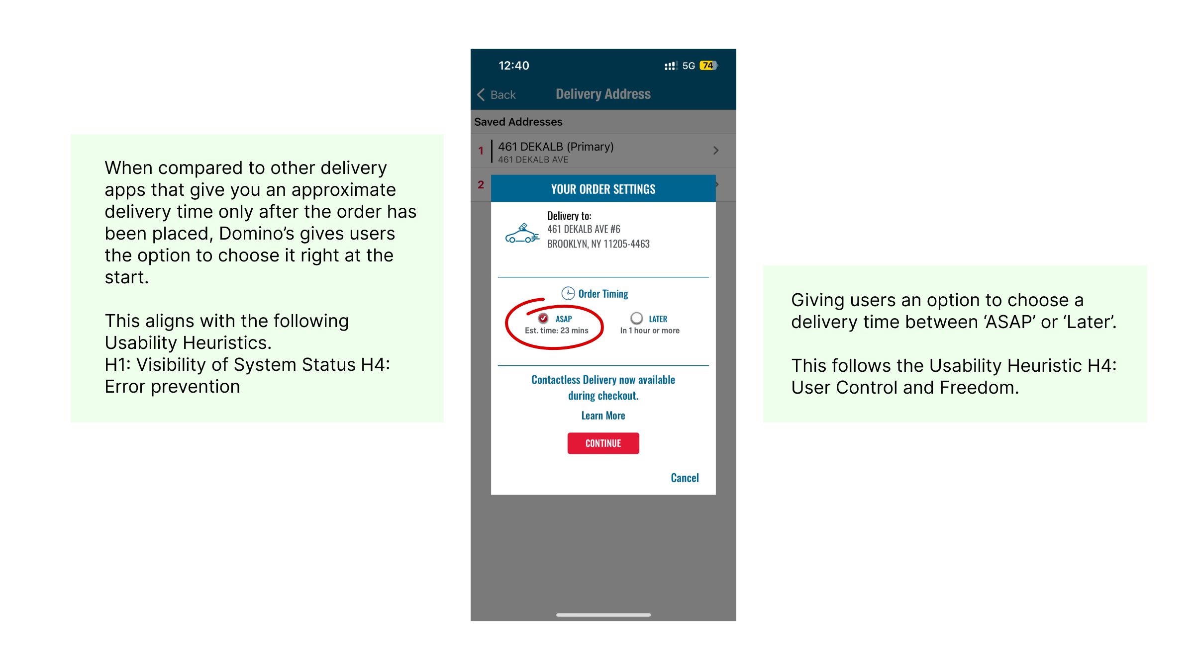
Page 1: Delivery Address & Order Settings
On entering/ choosing the desired address, you see a modal widow open up. On this screen, I appreciate their focus on timely deliveries. This is an idea they have owned for quite some time and it is good to see that reinforced right before you place your order. Especially when compared to other delivery apps that give you an approximate delivery time only after the order has been placed.
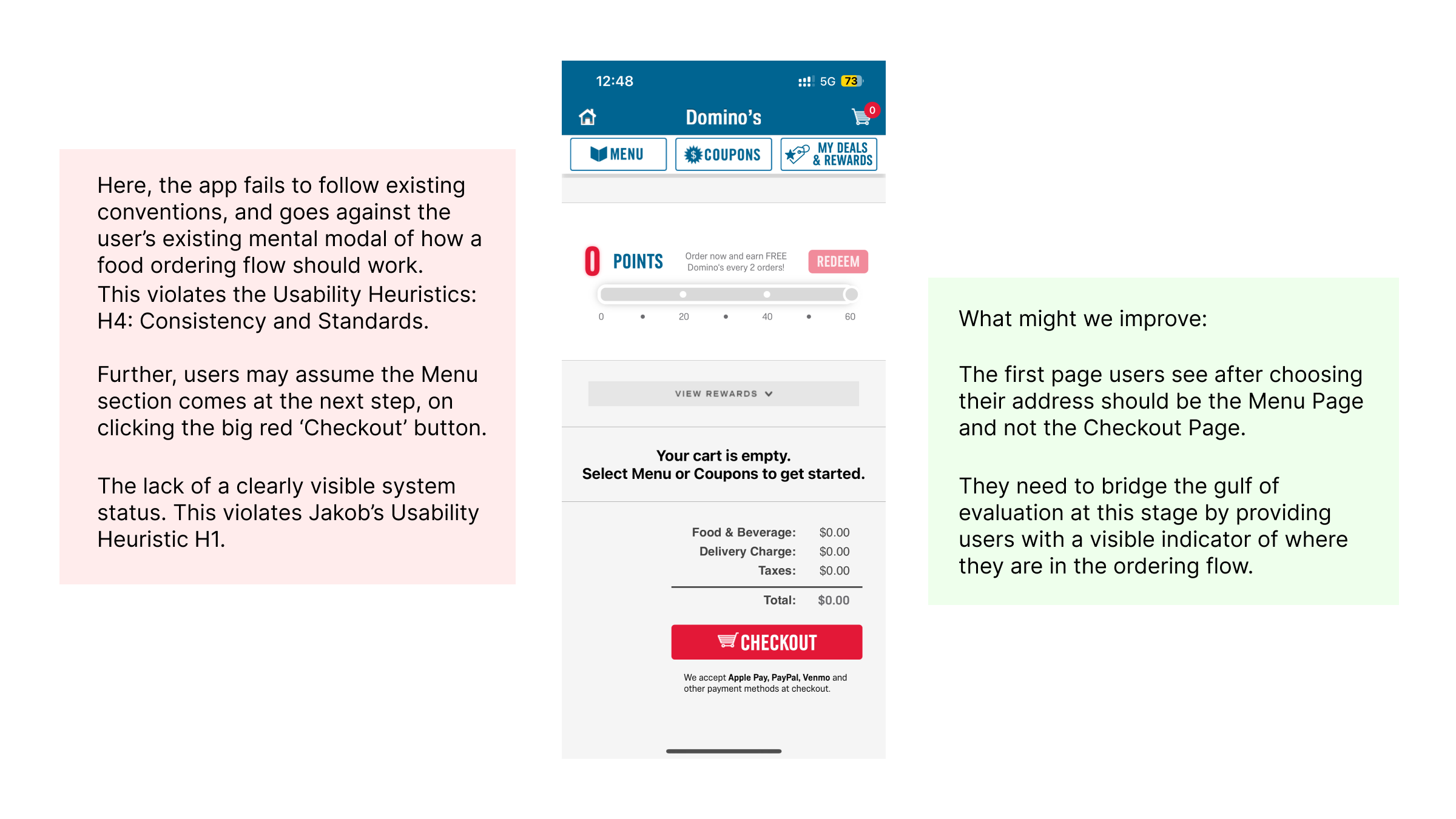
Moving on to the next step, on clicking Continue in the above step, you go straight to the Cart, and not the Domino’s menu page. This can be disorienting, since users expect to see the Domino’s Menu at this point in the flow.
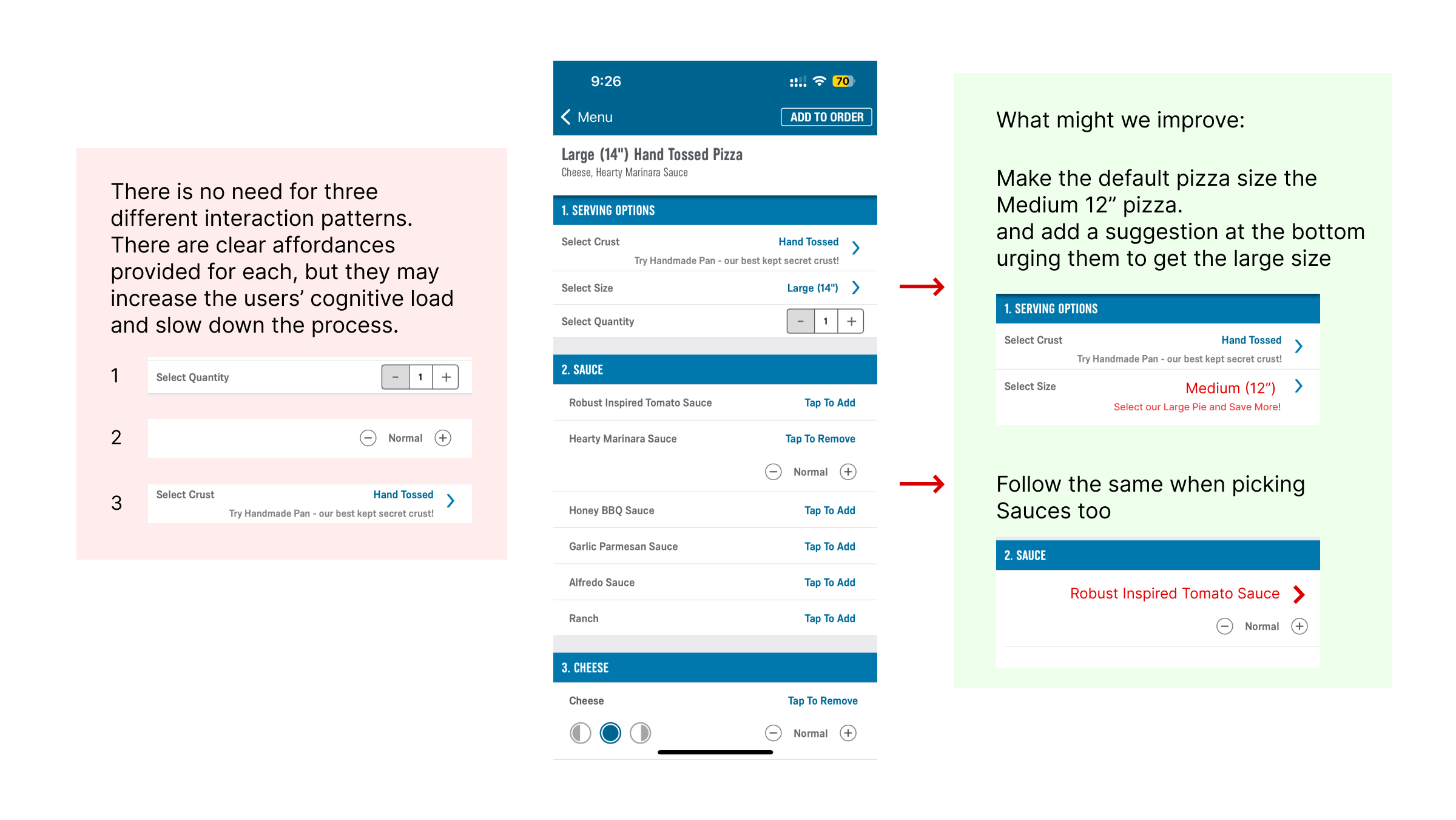
Pizza Modifications Page
1. Serving options and Sauce selection
Here, the page is structured fairly well. There are also visual affordances in places where different kinds of interactions have been used. A usability issue here is when user’s are choosing their Serving Options and Sauces. The Default Crust is their classic ‘Hand Tossed’ crust, and you can choose to change it if you like. This is good, and expected. Whereas, the Default Size is their Large 14” pizza. This goes against Jakob’s Heuristic H4: Consistency and Standards, since users are used to seeing the ‘regular’ portion size as the default choice on delivery apps. And they may then choose to size up or down based on their needs.
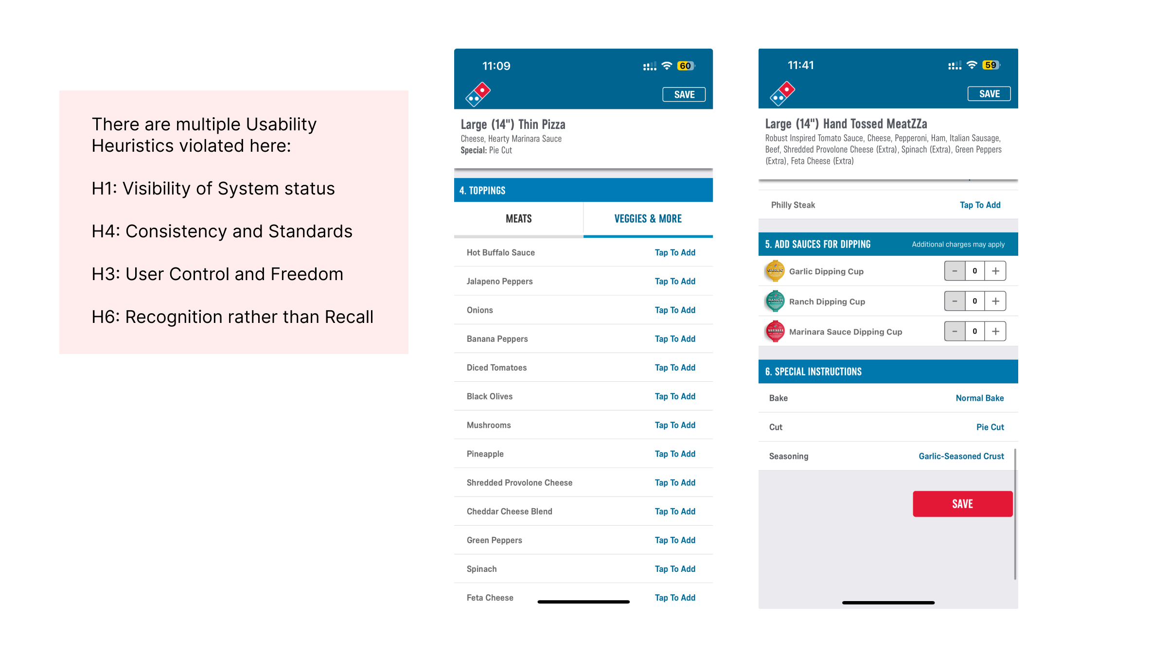
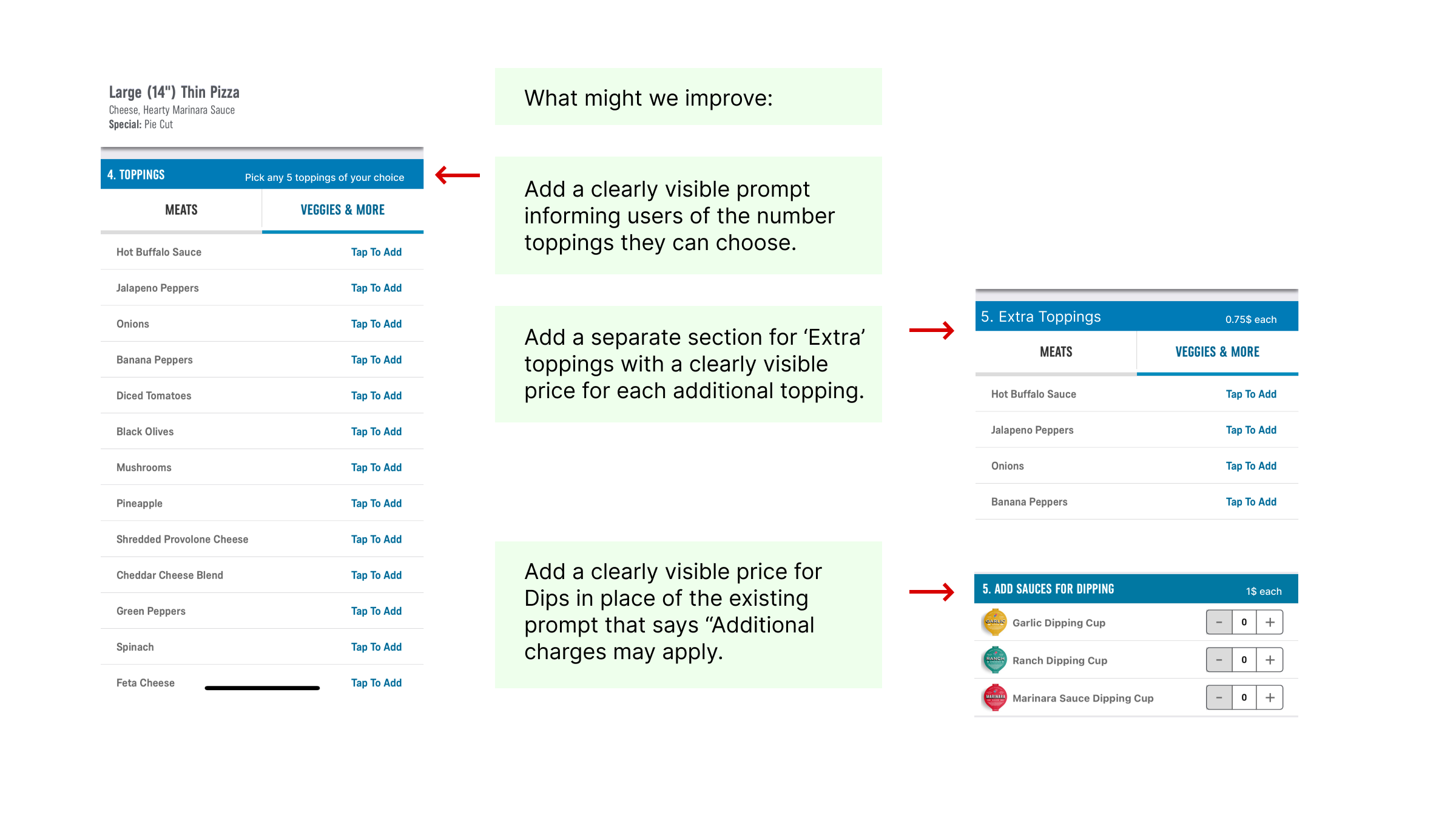
2. Toppings and Sauces
This section of the page lets users select the toppings they want on their pizza. It is fairly easy to use, now that users know how the ‘Tap to Add’ interaction works from the previous step.
But there are a few major usability issues here:
– Users don’t know how many toppings are already included with their pizza.
– Users don’t know the maximum number of ‘extra’ toppings they can add to their pizza.
– Users can’t see the total number of toppings they have added or the individual cost of each of the extra toppings
– Users can’t see the amount of calories of each of these ingredients anywhere. Just a calorie count by slice on the checkout page.
– The user doesn’t see the total cost of the pizza at the end of this page
Overall, The Domino’s Pizza application gets the job done, but there are a lot of major and minor improvements needed. The app follows Norman’s principles of good design in some parts, but there are consistency issues throughout the app, both visually and from a usability point of view.
The poor visual language surely makes the app look cluttered and aged, and this takes away from the joy of ordering a pizza. Fixing just the usability issues would result in a pleasing and seamless pizza ordering journey, one where the user won’t need to jump back and forth between these screens to confirm the details of their order.