Screen Slate guides moving image culture in New York City and the San Francisco Bay Area. Users rely on it to access daily listings of arthouse/repertory cinema and gallery shows, read original cultural criticism, interviews, zines, and podcasts, and connect with the film community through screenings and events organized by the website. In this article, I will critique the design of the website, focusing primarily on the homepage and the listings (movie screening search) page.
Homepage

On the homepage (see Figure. 1), you can see Screen Slate’s logo in the top left corner, accompanied by a brief description underneath. In the center is the article section, where the latest movie reviews feature prominent movie stills. On the right, other links lead to events organized by Screen Slate or their online store. Two notable features: a scrolling marquee at the top continuously invites users to click through to their hosted podcast programs. At the bottom left, there’s a thick black line with graffiti-style font saying “scroll down,” prompting users to involuntarily scroll down to discover listings of various theater or gallery events, catering to audiences interested in attending specific shows.
From a design perspective, they successfully leverage human instinct to direct the user’s attention to where they want it. Users are naturally drawn to the largest proportion of content in the center, which includes prominent articles and movie stills. Moreover, the continuously moving podcast links at the top and the images of the store effectively capture users’ attention. Ultimately, users will likely choose to scroll down because they noticed the distinctive font and signifier in the bottom left corner, leading them to the Listings.
For users already familiar with Screen Slate, the website offers both Discoverability and Understandability. They can quickly navigate to desired pages through signifiers. For instance, to read movie reviews, they can easily find the central article column and click on it; to search for recent releases, they can follow the arrow to the Listing page, and to listen to podcasts, they can click the link at the top.
However, for users who have never heard of Screen Slate and are visiting the website for the first time, it may not be as user-friendly. Firstly, the layout of the various links appears somewhat cluttered without a navigation bar, and all links are presented in black font, making it easy to confuse them with content (see Figure. 2). Secondly, the homepage presents too much content at once, resembling an overload of feedback, which can be distracting and even lead to anxiety about not knowing what content to focus on. Finally, accessing the website’s background requires clicking on the small text below the Screen Slate logo (see Figure. 3), leading to the “About” page. Initial users may struggle to find this, and without understanding the website’s background, it’s challenging to form a conceptual model to understand how to navigate the site effectively.

Figure.2
Listings Page

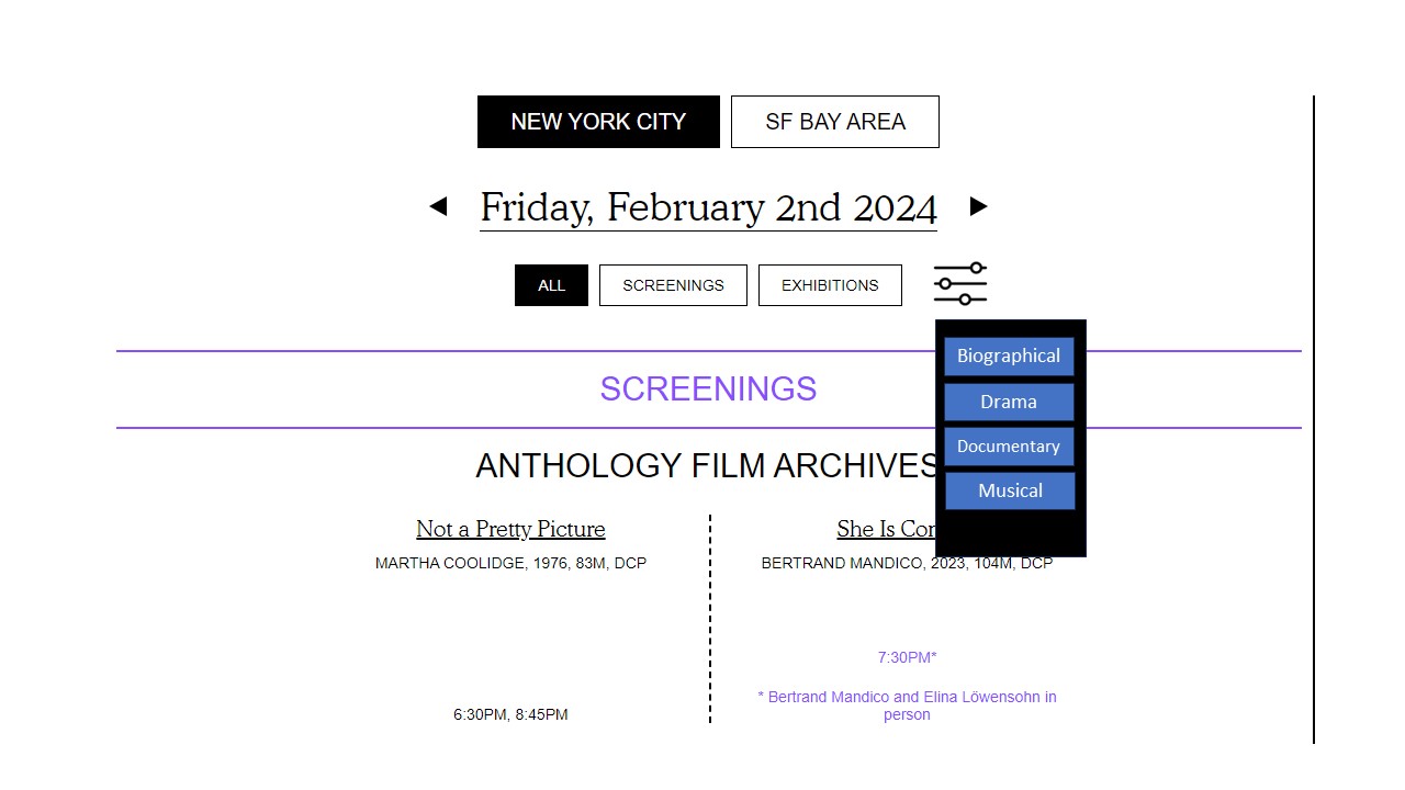
The Listings Page curated by Screen Slate serves as a search platform where users can explore daily theater showings or art exhibitions by location, providing search functionality (see Figure. 4). At the beginning of this page, the squares for selecting regions, choosing desired screenings or exhibitions, and picking dates all exhibit good discoverability. When clicked, the squares turn black, providing clear feedback. Additionally, the triangles next to the dates instantly convey whether it’s for the next day or the previous day.
The content below adjusts based on the date and location you’ve selected. For instance, the screenings section lists the movies being shown at each theater alphabetically by theater name, along with the showtimes for each movie on the selected date. Each theater and movie title is hyperlinked to their respective pages, and when you hover over them, the text turns purple, indicating they are clickable links, providing immediate clarity for users.
Unfortunately, it lacks a search function. From this page, users cannot immediately find out which theater is showing a particular movie they have in mind. Moreover, with numerous theaters in New York, locating a specific one may require users to scroll down continuously until they reach the letter corresponding to the theater’s name. Lastly, for users looking for specific types of movies, it lacks a mechanism to categorize the shows, potentially leading users to click on each movie title to understand its genre, which can be time-consuming.
To address this issue, I believe adding a search function would be beneficial (see Figure. 5). Users could search by movie title or theater name to immediately display corresponding results. Additionally, introducing filtering options for movie genres, such as biographical, drama, documentary, musical, etc., would make it easier for users without specific preferences to find movies they may enjoy (see Figure. 6).

Conclusion
Although I have raised some issues regarding the website design, the website has still achieved significant success in guiding users to explore and understand visual culture. Looking forward, potential updates to the website could potentially enhance the user experience, providing users with an even better browsing experience.