Too Good To Go is a mobile app that aims to reduce food waste by connecting restaurants, grocery stores, and cafes to users looking for a deal on leftover food. Orders are packaged in surprise bags of whatever the business has left over and listed for sale at a significant discount.
The mobile app is similar to many other food ordering apps like GrubHub or DoorDash and consists of four tabs — three for browsing available food and one for the user’s profile and order history:
- Discover: includes only some listings using personal recommendations and curated categories
- Browse: includes all listings in either a map or list view
- Favorites: saves pickup locations you like and displays a signifier — a little red dot — when one of your favorite places has food available


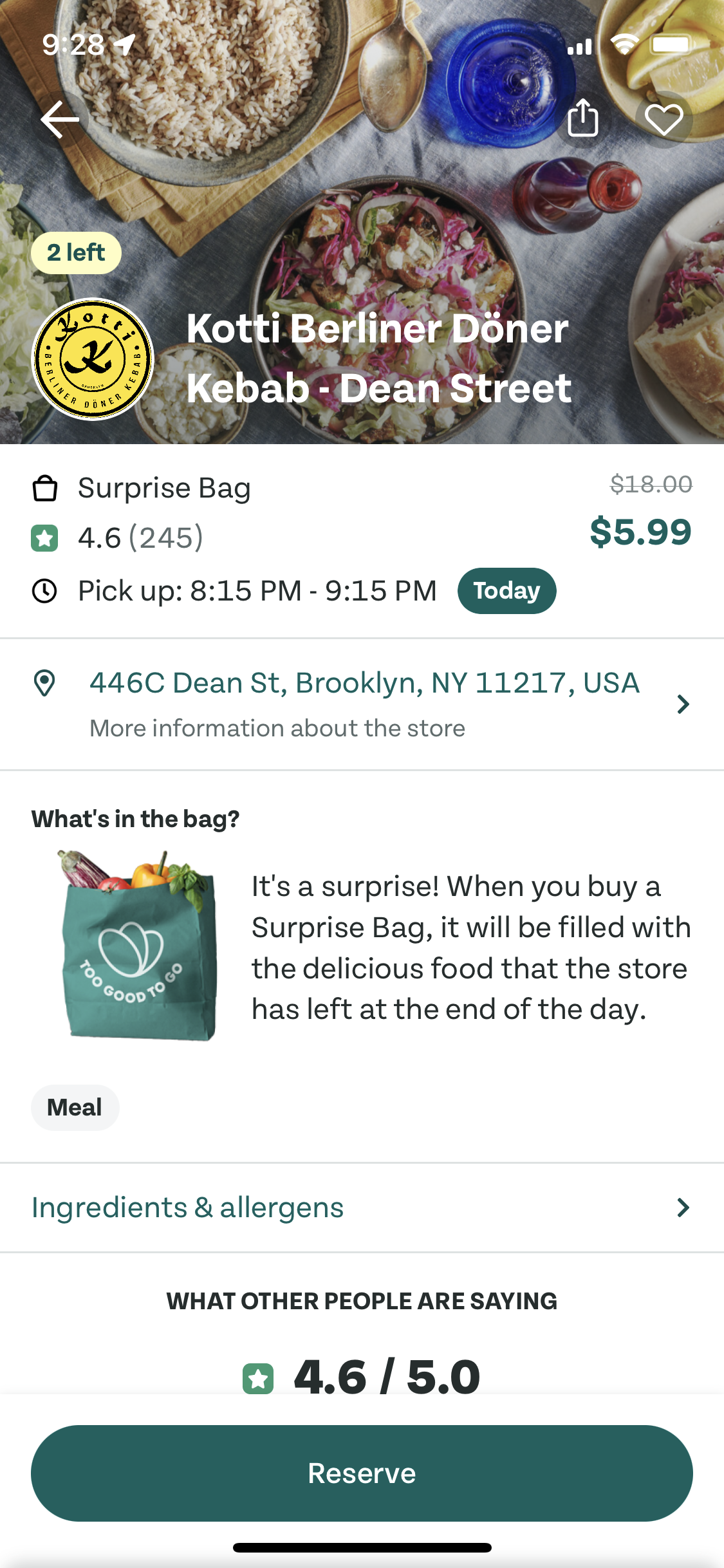
At least in my neighborhood, there aren’t so many options available on the app that I feel like I need three ways to browse them and I don’t think they’re all useful. The Discover tab, for example, uses a categorical organization structure similar to many food delivery apps. It’s conventional for the industry, but unlike UberEats, there aren’t enough options to be able to sort listings into helpful categories. Plus, all restaurants offer basically the same thing — a surprise bag. Too Good To Go provides only limited information — if any — on the type of food the business serves. The surprise bag is truly a surprise. In the screenshots below, the descriptions aren’t very specific. The bagel shop, for example advertises bread and pastries, but sometimes includes soup.

Since there’s not much specificity in these descriptions, the categories they’re sorted into can’t bee too specific either. Unable to give more information about the food itself, they aren’t actually that helpful. Here are some of the categories I’ve seen on the Discover tab:
- “Surprise bags in your area” (Aren’t they all surprise bags in my area?)
- “Pick up for dinner” vs. “Meals” (What’s the difference? Most pickup times are in the late afternoon or early evening.)
- “These were popular today” (This was a list of sold out businesses. Why show a whole section dedicated to unavailable options?)
Besides just not being very helpful, these categories create a confusing conceptual model for users who might place an order based on its categorization. They could order what they think will be a healthy dinner and end up with all desserts.
The surprise bag format is central to Too Good To Go’s business model. It keeps inventory management and creating listings easy for businesses, which is important since the low cost of a surprise bag won’t bring in much profit. But the degree to which the food is a surprise is a huge constraint for users with dietary restrictions. As a nearly lifelong vegetarian, it’s difficult for me to find listings that I feel confident about being able to eat. For me, this limits the types of businesses I’m likely to consider and prevents me from using Too Good To Go regularly. Dietary restrictions are common and many are far more complicated than vegetarianism. For example, bakeries feel like pretty safe options for myself because I think I’d probably be able to tell if my surprise bag includes a ham and cheese croissant or bacon-topped donut, but what about users with allergies? How could they know if their surprise bag contains gluten or tree nuts?
“There is no such thing as the average person. This poses a particular problem for the designer, who usually must come up with a single design for everyone; the task is difficult when all sorts of people are expected to use the item.” — Don Norman on Designing for Special People
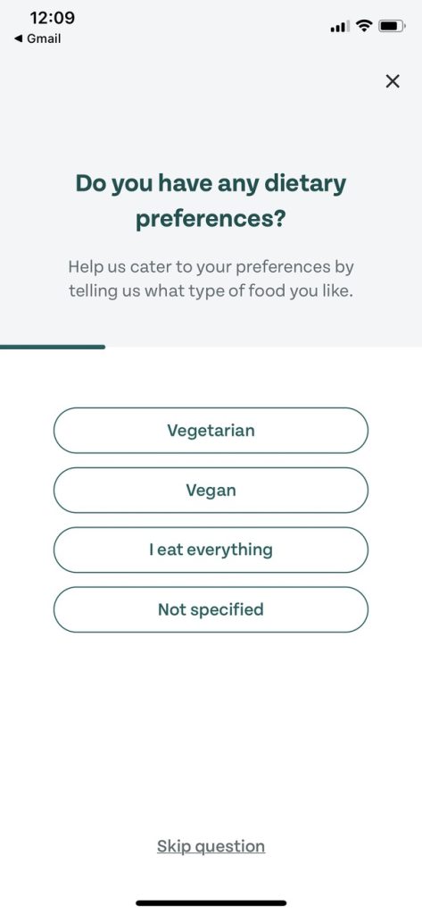
The app kind of tries to address this problem during account setup when users are asked about a limited number of common dietary restrictions. However, this information doesn’t seem to change anything about the listings shown. There’s another opportunity to filter for vegetarian options on the Explore tab, but so few (only one in my neighborhood) are confirmed as being vegetarian that the filter isn’t really helpful. In most cases, users still have to rely on their best guess and weigh their risk tolerance.
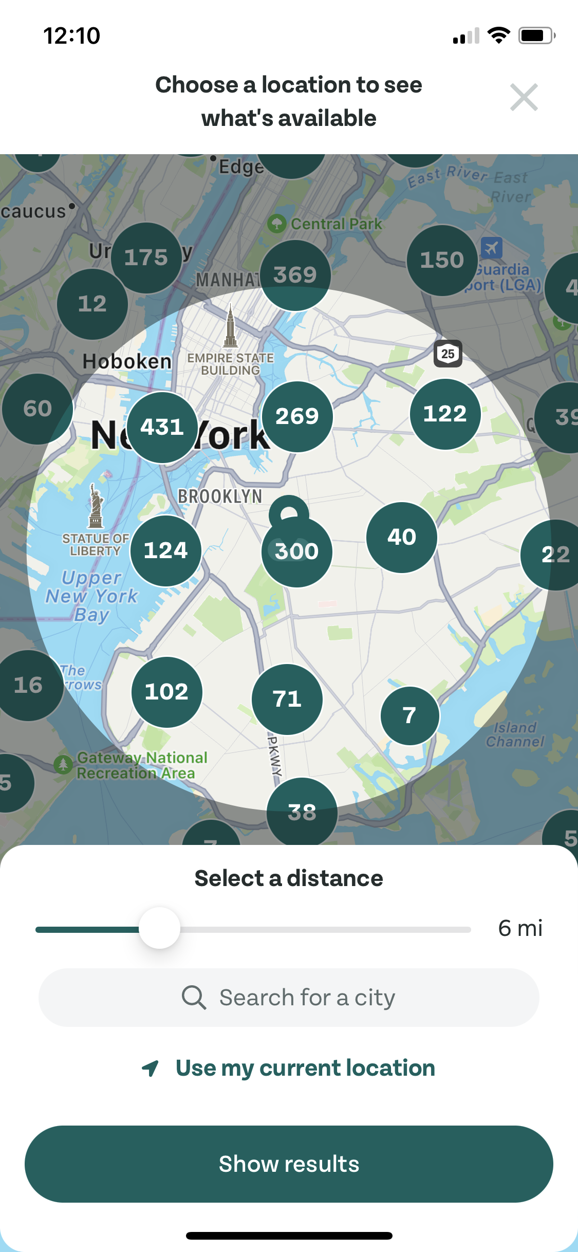
Many of the other filters are more helpful and some are even pleasant to use. The sliders to set the pickup radius and timeframe, for example, are mapped from left to right — smallest to largest, or earliest to latest. The length of the active selection corresponds to the size of the pickup radius or the closeness of pickup start and end times. This is intuitive and sort of satisfying since adjusting the pickup slider updates the map in real time — instant feedback.

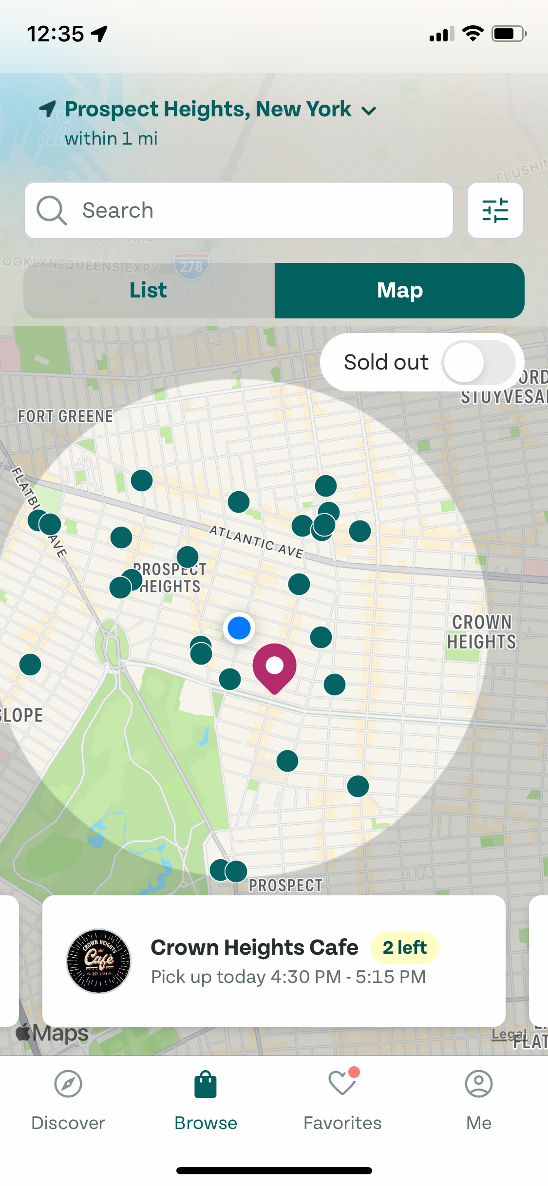
Beyond the browsing limitations, my only real critique of the user interface is that it’s hard to see the location of individual businesses on the map view. When an option is selected, its dot grows slightly larger on the map. But since it’s otherwise identical to all of the other dots, it doesn’t stand out. The more restaurants there are on the map, the harder it is to see which one you’re looking at. This could easily be fixed by using a different color and shape for the active selection.

I’ve used Too Good To Go three times now and, overall, I like it. But I probably won’t use it much in the future as I would if there was more information about the food or if the filters worked better. I’m keeping the app on my phone and might use it again, but if the goal is to rescue food from the trash, people need to know for sure that they’ll be able to eat it.