Introduction
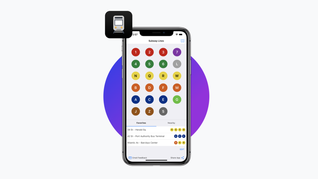
Subway Time is a New York City transit application, created “by New Yorkers for New Yorkers.” It provides fast and accurate status updates on every NYC subway line and station, with data from the official MTA feed. Subway Time allows users to plan and track their subway transfers and commutes easily, efficiently, and accurately.
As a New Yorker, I use Subway Time daily to accurately track my trains and while commuting. Since this application is such a staple in my life, I wanted to examine its features closely from a design perspective. This design critique evaluates three features of Subway Time (iOS App) using usability principles derived from Don Norman’s The Design of Everyday Things.
Visual Design
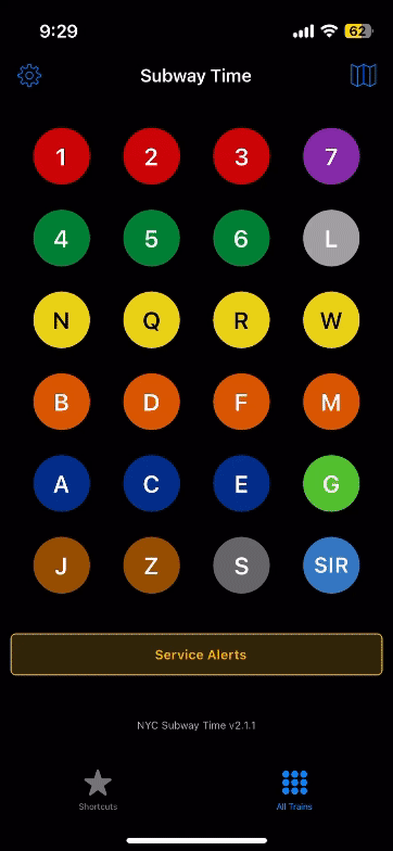
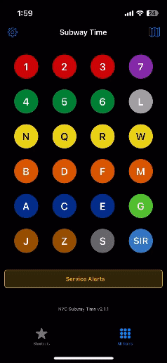
The visual design for Subway Time is beautiful, minimalist, and streamlined. The moment you open the app, you are able to recognize the NYC transit system’s features. This is due to the large amount of similarities between the signifiers in the NYC subway system and the visual features of the application. Subway Time employs natural mapping of signifiers to the app’s system image to create a conceptual model in the user that reflects the knowledge in the world. This allows users to easily use and navigate the virtual app’s features as they are parallel to the physical features experienced in the NYC subway system.
However, it is important to note that while the minimalist design allows ease of use, it can also impair it for certain users. Familiarity with the NYC subway system comes from the knowledge of cultural constraints and conventions that are learned behaviors and exist in the head. Subway Time’s target audience is a regular NYC commuter. Therefore, if used by a visitor or tourist who does not have this previous knowledge, Subway Time’s visual design can come across as confusing rather than accessible, hiding usability significantly.

Accessing Specific Subway Trains and Stations
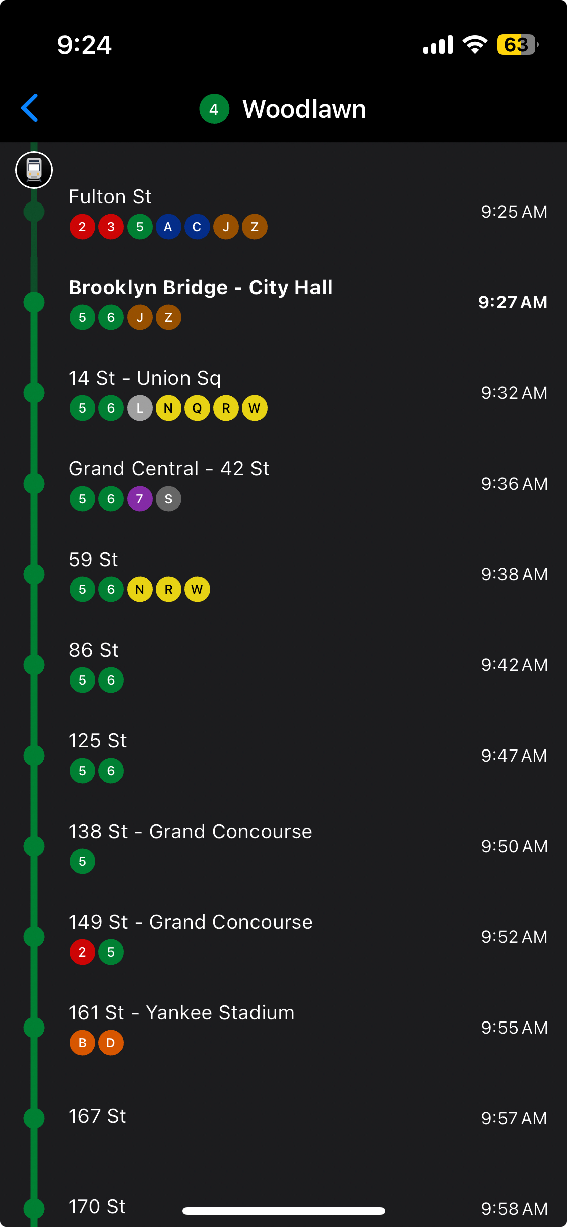
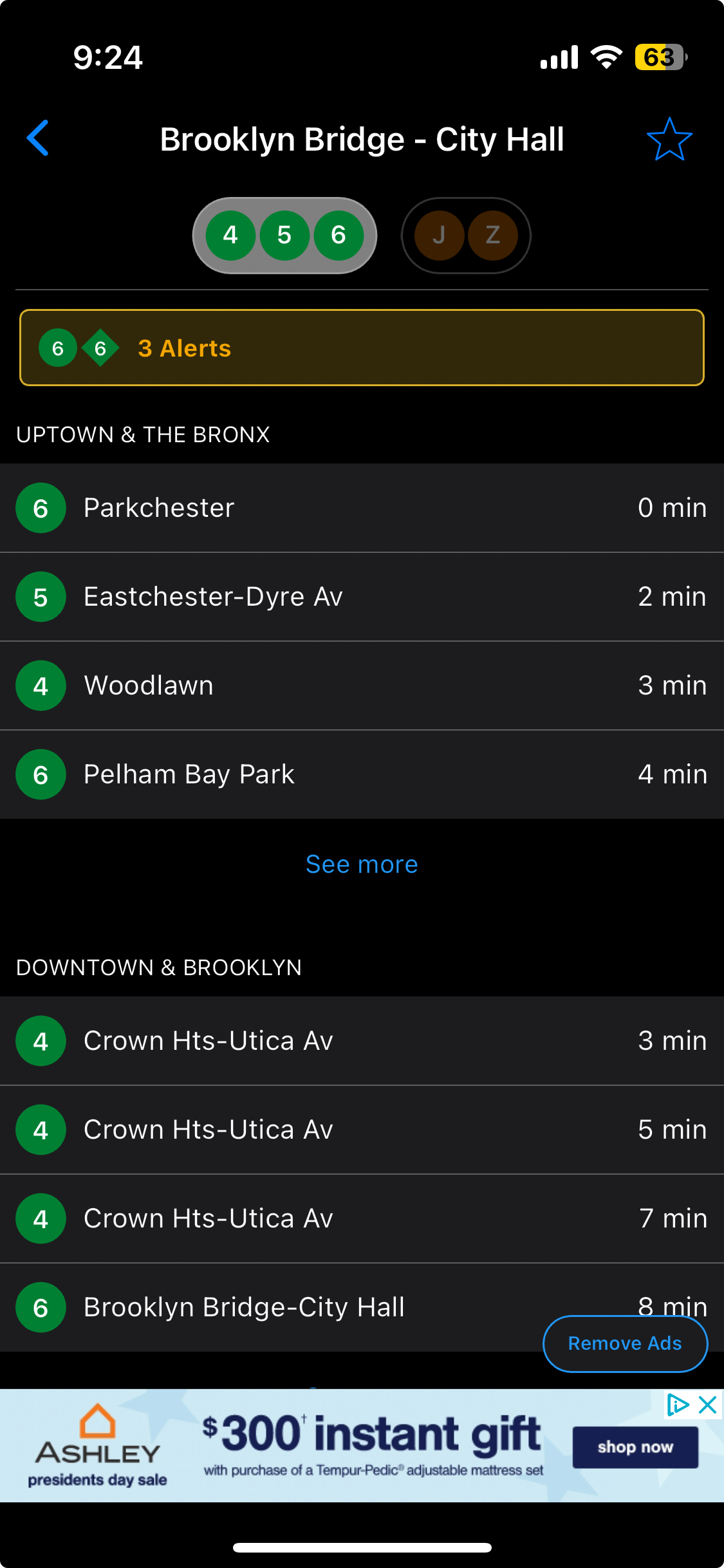
One of Subway Time’s features is being able to toggle between information on a subway station (all upcoming trains) and information on a subway line (all stops on a specific line), with accurate times shown for each train. While this is helpful during a commute, they have an added feature that allows users to click on the different trains incoming into a station and click on the different stations on a subway line, for further information about each. However, there is no end to this action sequence, and users can get stuck in a loop of endless clicking while trying to exit. This is because there are no appropriate signifiers to indicate an exit, resulting in a series of slips which means users are unable to exit their task.
When a user wants to exit from this action, they have to either restart the application to click on the back button and go through all their past pages to reach the home page. Solutions include adding a clear signifier in the form of a home button as an “emergency” exit out of the task for flexibility and efficiency of use, as well as changing the task sequence to have a hard stop at an appropriate point.
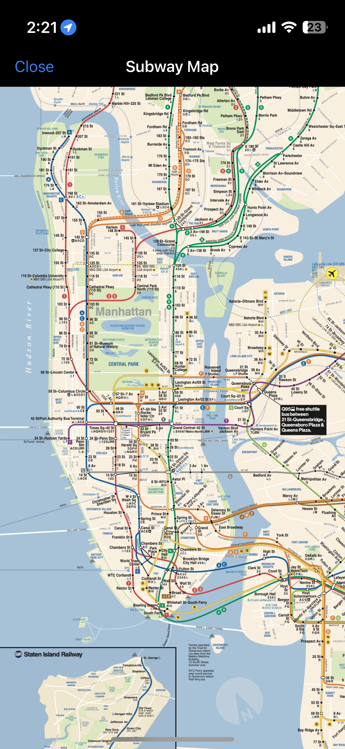
Built-in Subway Map
Subway Time has a built-in, MTA designed map of the subway system embedded into the user interface, accessible with a button on the home landing page. The map is added as a scrollable image. This contributes to the system image of Subway Time, and allows users to access additional visual documentation and information about the subway system, informing decisions about users’ commutes and train transfers.
However, while this feature affords navigation, it is important to note it causes confusion when used in insolation and therefore creates usability issues. Every time that I have used Subway Time, it has been in tandem with another navigation app. The other app creates my route, and Subway Time provides accurate timing for my journey. The embedding on the MTA subway system map is not accessible and efficient to perform this function alone. It might be useful to apply wayfinding features of standardized navigational tools to overcome these limitations, and create a more holistic system image and conceptual model of the app.
Conclusion
Subway Time is an intuitive and powerful tool for the commuters using the subway system in NYC using effective signifiers and natural mapping to increase usability. However, its features are more impactful for regular commuters than visitors, who lack the knowledge of cultural constraints of the NYC subway transit. Implementing more signifiers to curb slips and mistakes as well as standardizing the system image of the application with other navigational aids could improve usability in the future.