Introduction
Uber is a ride-hailing service that provides users with the option to travel where they want and access to different types of rides across more than 10,000 cities. The Uber app allows users to request rides from nearby drivers, track their journey in real-time, and pay seamlessly through digital transactions.
I recently ordered an Uber for my friend and found Uber’s assistive technology intuitive and user-friendly. However, I noticed some functions could be easily missed, leaving the user confused. This critique focuses on the user experience and proposes solutions based on the usability principles from Don Norman’s ‘The Design of Everyday Things‘.
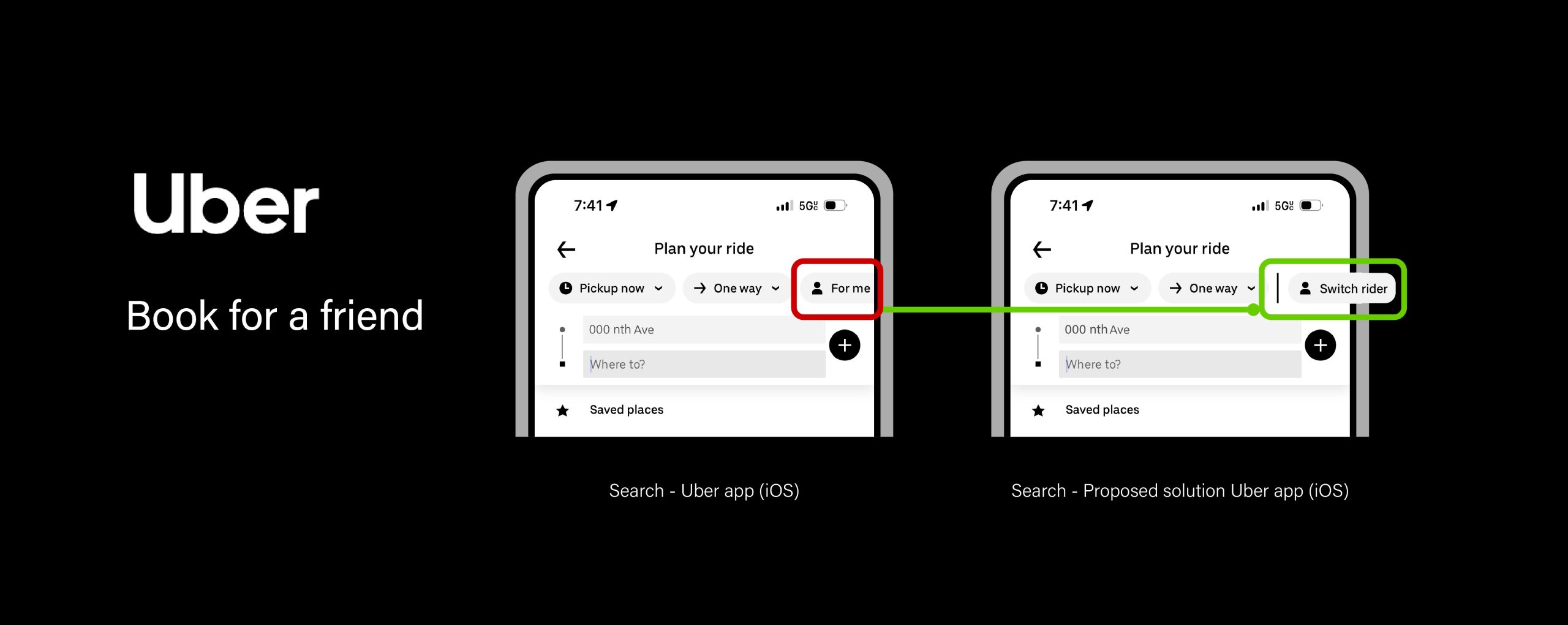
Book an Uber for a friend
I remember being in a hurry to book an Uber for my friend, who had just landed at JFK Airport, New York. And Uber kept on asking, ‘Is this ride for you?’ This was being prompted based on my location that the ride isn’t for me and Uber needed me to add my friend as a contact on the app. It definitely caused a minor inconvenience since I was already a step away from payment. A few days later, I realized that there was an option available to book for someone else, and I had clearly overlooked it.
Design solution for booking Uber for a friend
Problem
Booking an Uber for a friend is easy, most people would just book an Uber for themselves and share the ride details. But not everyone knows that Uber provides the option of booking a ride for someone else. There are multiple options under ‘Plan your ride’ that are actually the default settings for booking a ride, but that doesn’t imply they can be modified. This constraint was built up because knowledge in the head perceives them as additional settings even though they are true to the knowledge of the world (booking a flight as an example).
Solution
This confusion arises because of low discoverability, as the settings aren’t highlighted but shown as an option. Therefore, the option should be renamed to clearly signify the action. The first step would be changing the ‘for me’ button to ‘Switch rider’. And then, the ‘Switch rider’ button should be mapped separately from the default options since it doesn’t apply on every trip. This would reduce the cognitive load and clearly signify the possible choice an Uber user could make while booking.
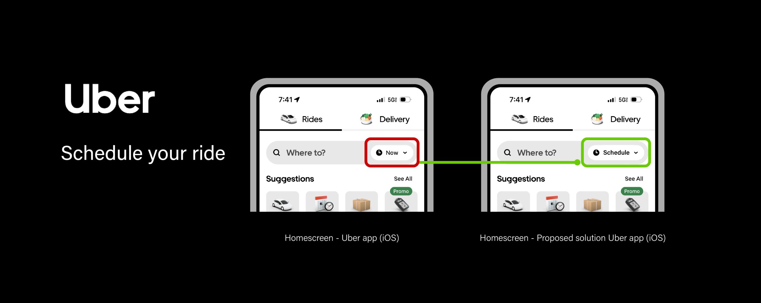
Schedule a ride
Uber provides scheduling a ride for a different day or time! By scheduling a ride, users can avoid the stress of last-minute arrangements or the uncertainty of finding transportation during peak hours or busy periods. But it would defeat the purpose if the signifier didn’t assist in the user journey.
Design solution for scheduling your ride
Problem
Even with the intention of scheduling a ride, the user highly likely misses the first step, which is clicking on the ‘Now’ button to reserve a ride. And instead, the user right away searches the location to check rides. Knowledge of the world shapes users’ mental models to think of search functions as an aid to finding things. Leading them to ignore the ‘Now’ button since users wouldn’t expect a default setting inside a search bar. This can be avoided if the signifier is clear of possible settings an user could explore.
Solution
Users are accustomed to being presented with alternate choices rather than current settings on search bars. Although the ‘Now’ button with the clock icon and a down arrow is a straightforward affordance, it would be much more clear with the appropriate verbiage, ‘Schedule’.
User Experience
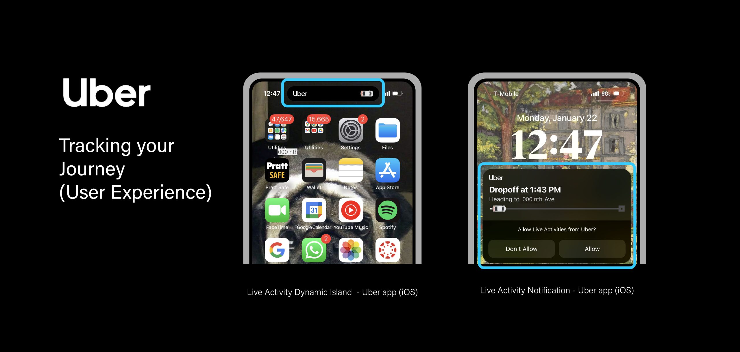
Screenshots of Live Activity Updates to track your journey
After booking the Uber for my friend, I was still part of my friend’s journey. The ‘Dynamic Island’, which is available on the iPhone 14 Pro and later models, provided feedback with the visual signifier (the car) that the journey was in progress. The Uber notification on the notification bar highlighted my friend’s journey as a timeline, displaying the progress as well as the estimated time of arrival. Tracking the journey was easy since I was able to view all the essential information without opening the Uber app. This is a good example of affordability, since the notification gave direct access to the app.
Conclusion
In terms of usability, Uber is intuitive, user-friendly, and consistent. Simple adaptations of appropriate signifiers, and understandable mappings can increase discoverability and enhance user satisfaction and the overall experience.