Duration
16 weeks
Studio
Projects in IXD
Team
Yeatasmin Shiropa
Madhumitha Pradeep Kumar
Sandy Leegumjorn
Tools
Figma, Figjam, Google Suite, Slack, Zoom
Overview
Travel Unity is a non-profit travel organization that aims to make the world of travel more accessible and inclusive. They are focused on educating members of the travel industry, creating a travel community within youth and students, and establishing themselves as the “thought leaders” in the industry.
Challenges
Our biggest challenge was creating a digestible way for users to consume information and showing the impact of Travel Unity for their youth and alliance members.
- The current website’s information architecture is very overwhelming for users to parse through
- There was an overload of information presented to users
Goals
Our team was approached by Travel Unity to redesign their website with the following principles in mind:
- Convey the impact of Travel Unity
- Improve the Information Architecture and Information Display
- Highlight the unique services offered by Travel Unity
- Create a bridge between two different target audiences
After thorough research, user testing, and mockups, we presented the client with a prototype that reflects those principles in a dynamic and visual manner.
The Process
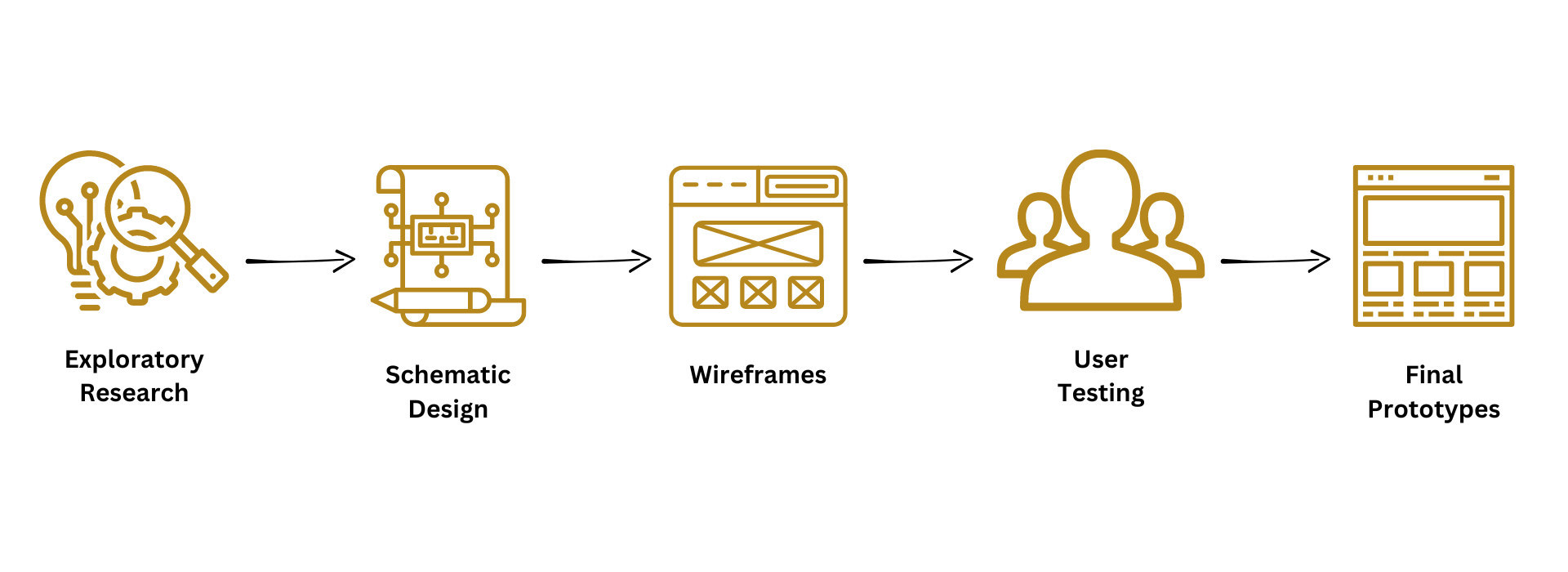
Exploratory Research: Understanding the users allowed us to understand what needed to be improved on the website.
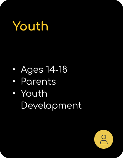
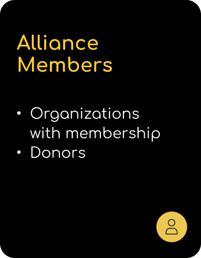
Our Target Users
Based on our initial client meeting and looking at the current website, the target users are as follows:
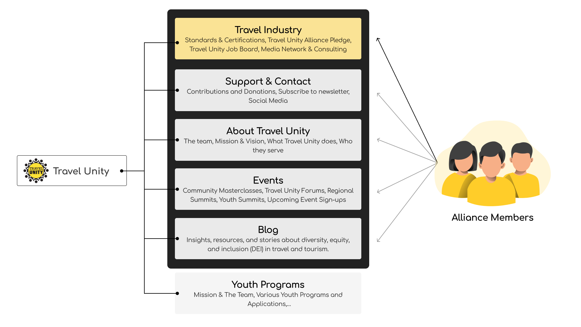
Ecosystem Map
We developed an ecosystem map to understand the relationship between the internal and external stakeholders of Travel Unity, as well as their target audience.
- The organization has a global reach which we can utilize when showing Travel Unity’s strengths
- Impact stories and student testimonials can be valuable when it comes to influencing both donors and youth who are part of the main target users

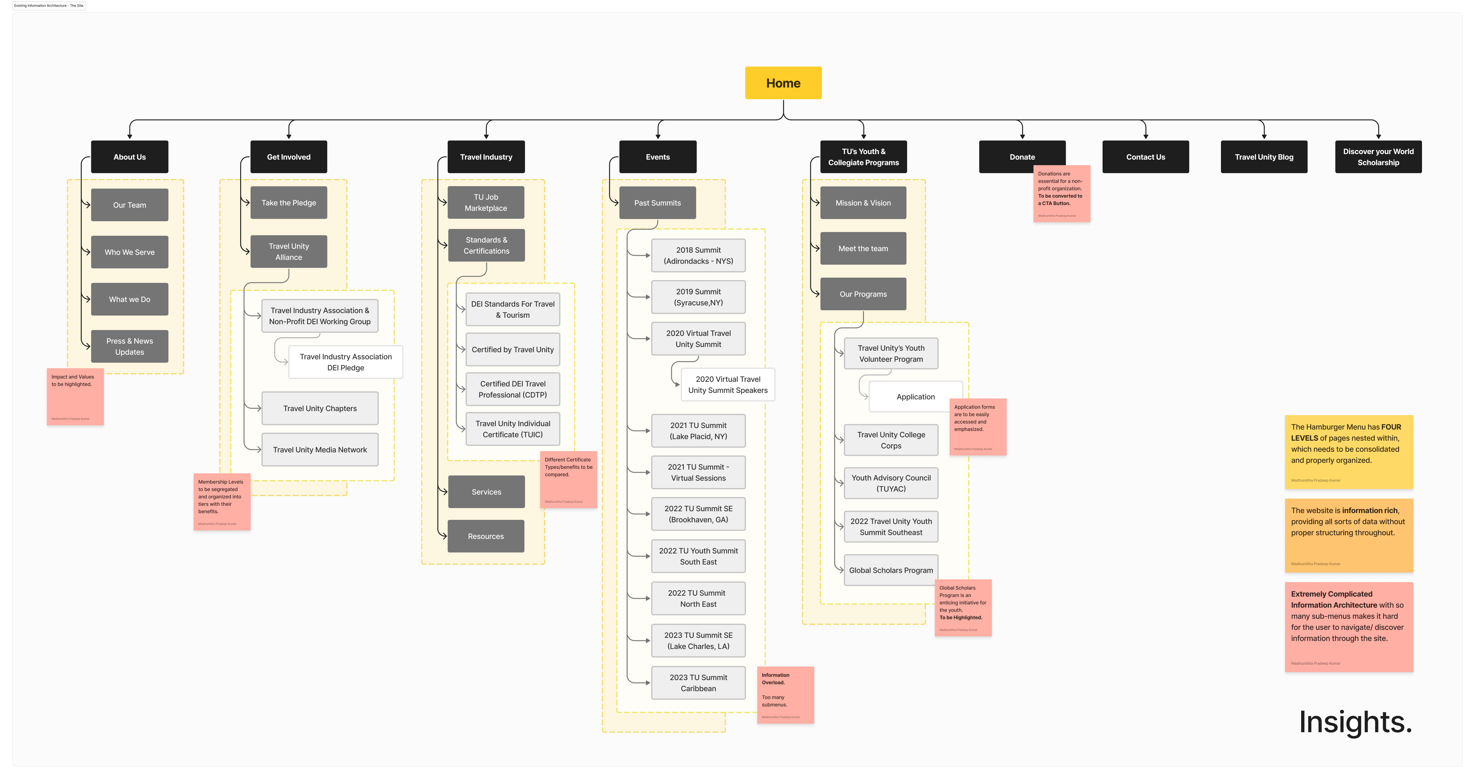
Technical Analysis
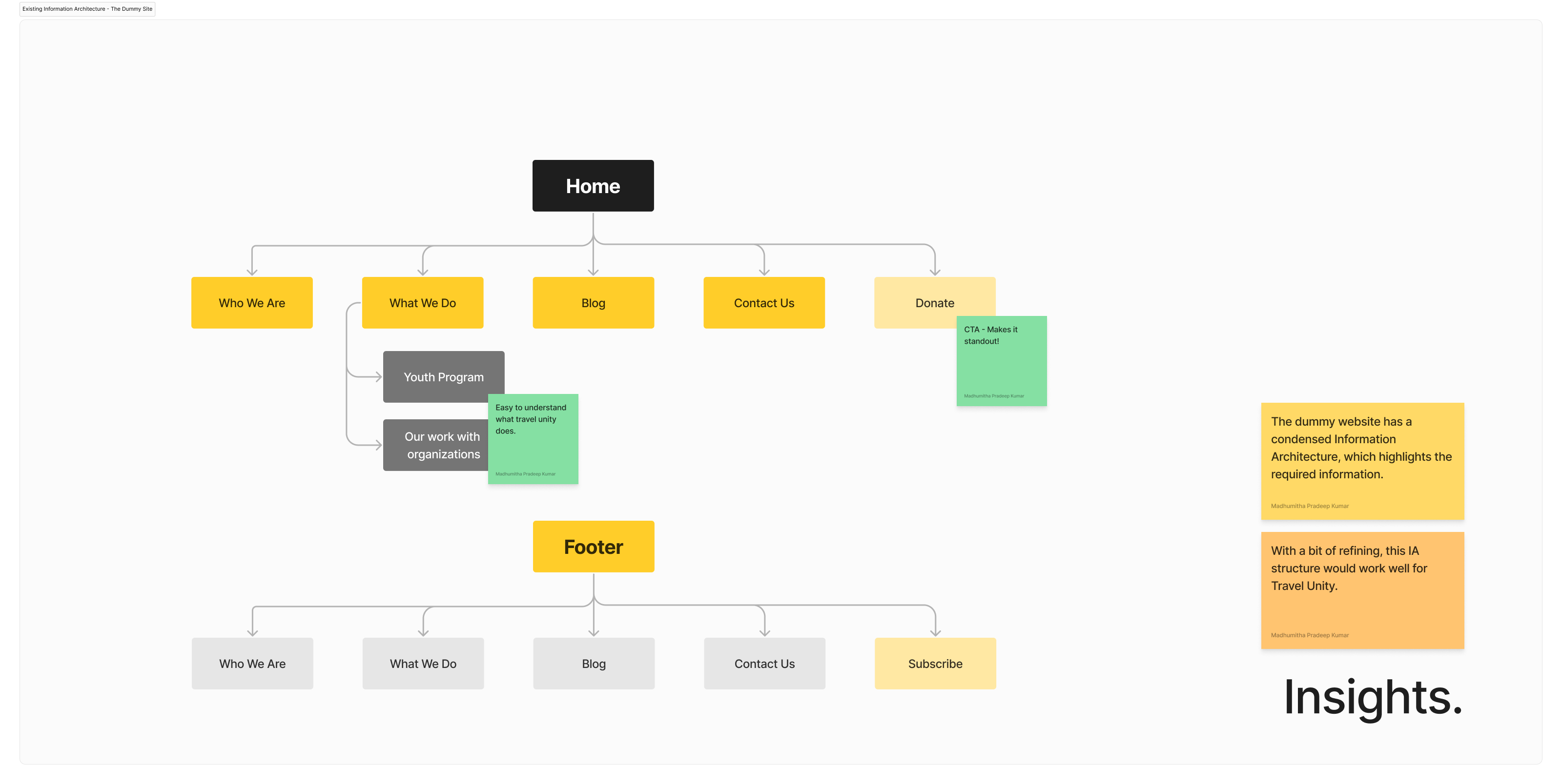
We analyzed the Information Architecture, key workflows, and content of the current website as well as the beta website that the organization was working on. Within both, we identified potential improvement areas.
- The current website has an extremely complicated Information Architecture with so many sub-menus makes; it’s hard for the user to navigate and discover information through the site.
- Though the current website is information-rich, it has loads of data piled up without proper structuring causing an information overload.
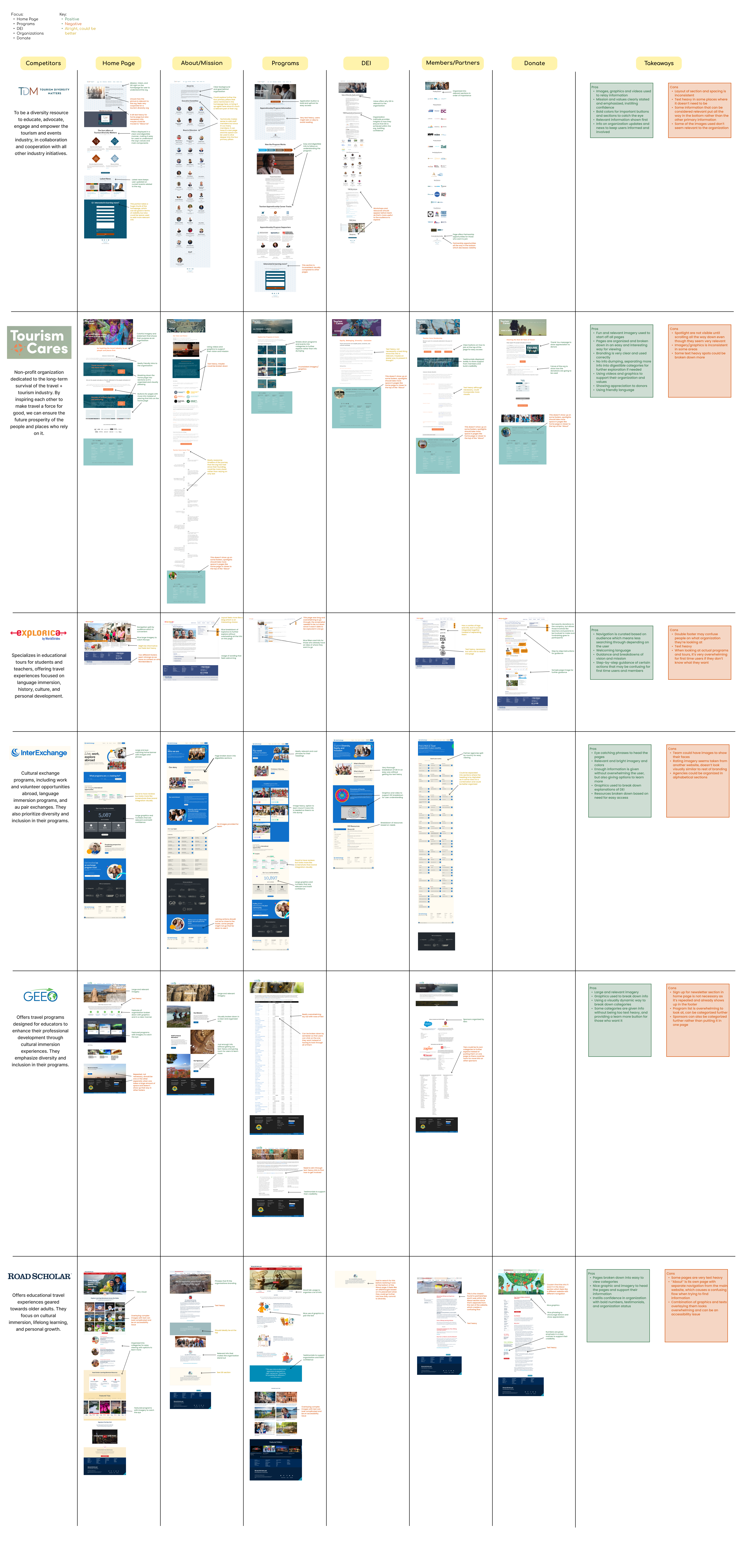
Competitive Audit
To understand what competitors are doing on their website and generate insights and inspiration for our design solutions, we evaluated 2 competitors provided by the client and 4 that we researched ourselves. We evaluated the following pages: Home Page, Programs, DEI Standards, Donations, Members/Partners, About/Mission. Our Key Takeaways that we wanted to bring into our final designs were
- Visual Storytelling: An alternative method of displaying information
- Organization: Breaking it down
- Confidence: Through language and unique features
- Branding: We know who they are
Literature Review
We researched through various sources on existing knowledge in using language that caters to all proficiency levels, designing for text-heavy web pages, and understanding youth travelers and their challenges.
- Using language that caters to all proficiency levels
- It’s important to use plain language and clarity so that web pages are accessible for all users and are prime for search engine optimization. This will also build trust and engagement with users.
- Designing for text-heavy web pages
- Designers should consider making text-heavy pages easier to consume by adding text hierarchy, breaking down content into digestible sections, utilizing white space and images, implementing responsive design principles, using contrast, and optimizing typography.
- Understanding youth travelers and their challenges
- Youth and their travel habits are dependent on economic factors and social policies that lead them to think about their future and current desires. They have a preference for longer and diverse trips with unconventional tourist destinations, and interests are influenced by learning and experiential desires.

Interviews + Usability Testing
During our interviews, we conducted user tests with 3 participants: 1 alliance member and 2 students. The interviews and user tests were catered based on the type of target user they were. We wanted to understand their perspective on the travel industry and their thoughts on the current website’s navigation.
- User Testing
- The content is very overwhelming to read through and is text-heavy – images and visuals are preferred to understand the context better
- The navigation and organization of the website could be more discoverable and with a clearer visual hierarchy.
- Each page looks different in style and could be more consistent in design
- Interview Quotes
- “I think one of the biggest benefits is just having knowledge and background and the diversity of backgrounds too. So they just offer us a different view on things.” – alliance member
- “Having other cultural learning opportunities is a good hook to get me interested in travel related programs.”
Overall Insights
After thorough research, our insights are as follows:
- Alliance Members like the opportunities for learning that open up when joining Travel Unity, as well as having access to different perspectives and diversity initiatives
- Youths are very interested in learning about and immersing themselves with other cultures and environments when traveling.
- Both target users want to see their wants met in a discoverable and approachable manner.
Establishing Principles: We kept these goals and principles in mind for our schematic designs.
Design Principles:
- Impactful
- Inspiring
- Empowering
- Inclusive
- Accessible
Design Goals for Schematic:
- Convey the impact of Travel Unity as an organization
- Bridging the two different user groups, youth and alliance
Schematic Design: Influenced by our diagrams, our wireframes were made and presented to the client
Product Diagram
We created a product architecture system diagram to understand how the website can connect the goals and design principles into user flows.

Key Workflows
We realized that despite the two user groups having different concentrations on the website, there are still overlaps where we can bridge them together.
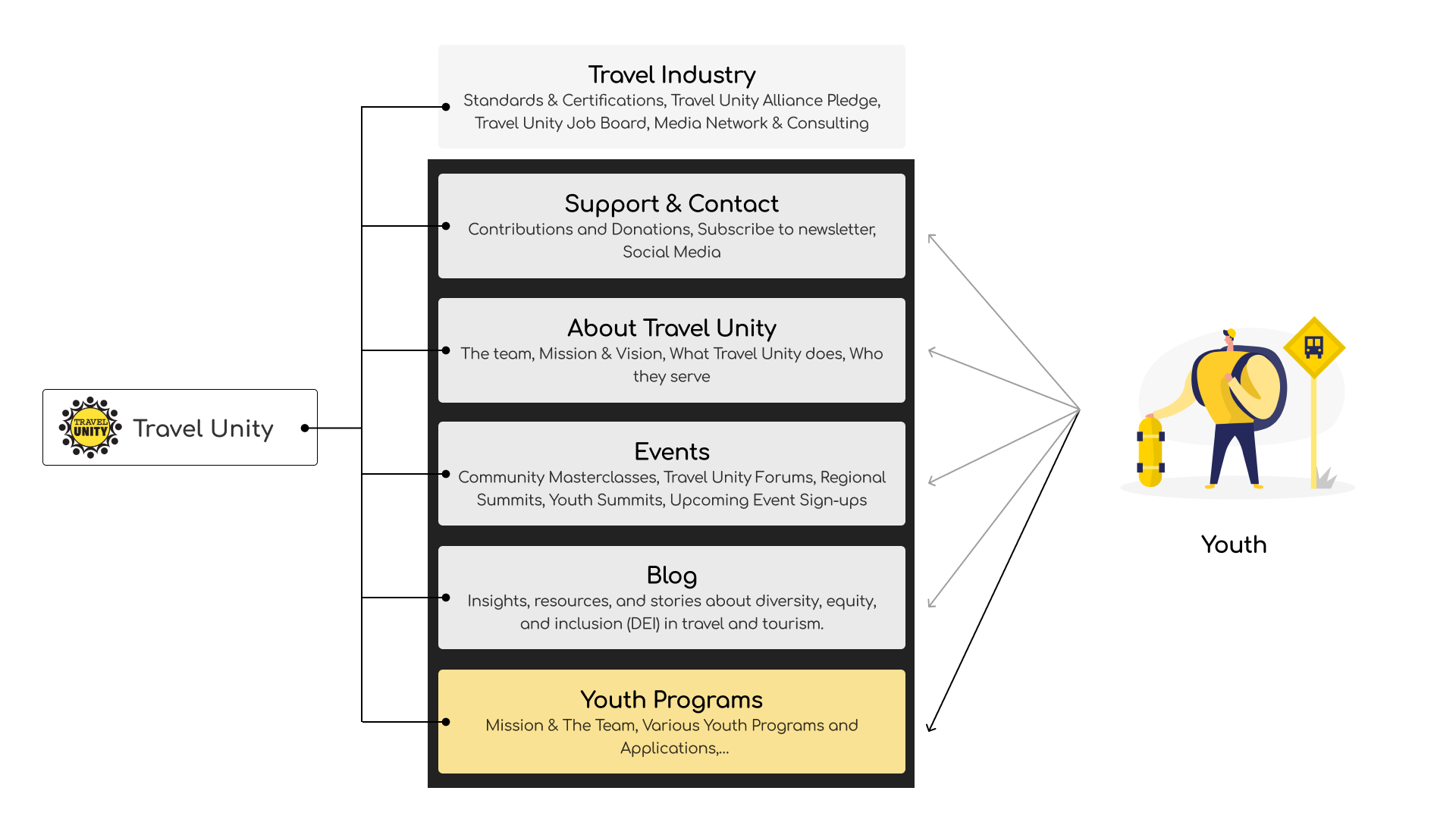
Information Architecture
These flows allowed us to create a concise and effective revised information architecture, which in our tree testing in later user testing confirmed was effective and one that users wanted to explore.

Wireframes
With all of this in mind, we created mid-fidelity wireframes of the three primary pages we deemed most important to test during our evaluative research and testing. The client was presented with these wireframes as well, who was very confident in our progress.
Evaluative Research: We tested and implemented all the feedback for our wireframes to our final prototype.
Usability Testing
We conducted user testing with 4 students and 1 alliance member with the wireframes we created.
- Things that worked
- “I like how it’s straight to the point, not too many layers. When hovering, there is not too much that pops up.”
- “I like how there are images throughout the page”
- “I like the design. I like how it’s clean and simple. I think that’s an improvement over where we were. I like the organization.”
- Suggestions
- The donate section was recommended to be removed from pages as there is already a donate button on the nav bar. Otherwise, it feels pushed onto the user.
- Users want signup button placements to be more intentional than including them in every section.
- Quotes from students on their career development experience might be helpful for future youth participants.
Design Development: We finalized our prototype by creating a design guide and elevating the UI and visual elements of all the pages.
Visual Design
Keeping in mind the design styles that the client wanted to maintain within the prototype, we created a cohesive design guide to follow when finalizing our prototype. We modified the usage of the brand’s yellow color to fit in components, and identified a grid and spacing guide to ensure that our usage of negative space and layout was uniform.

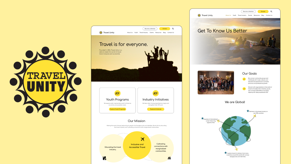
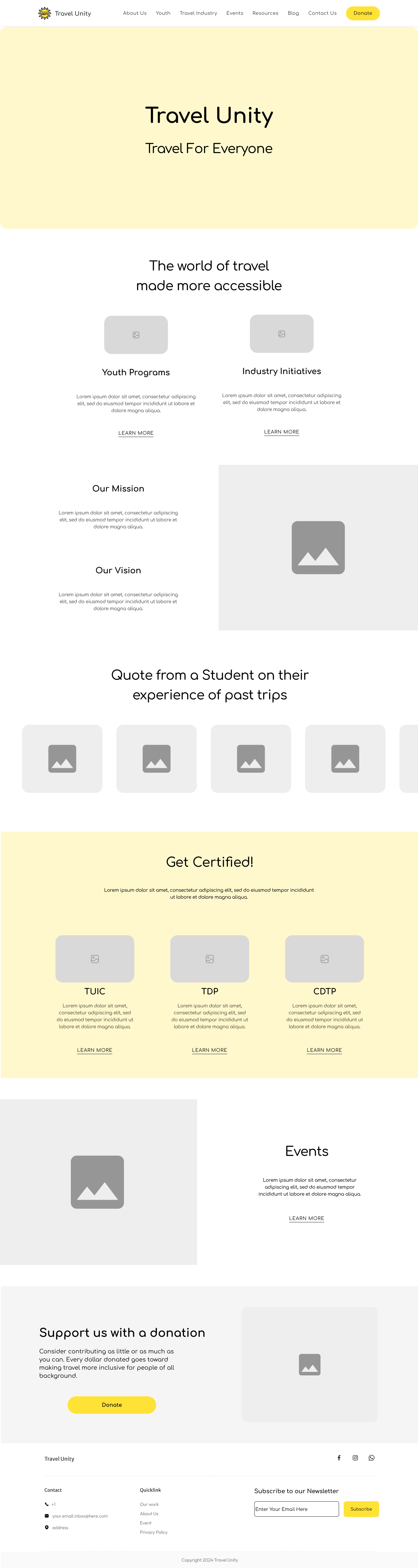
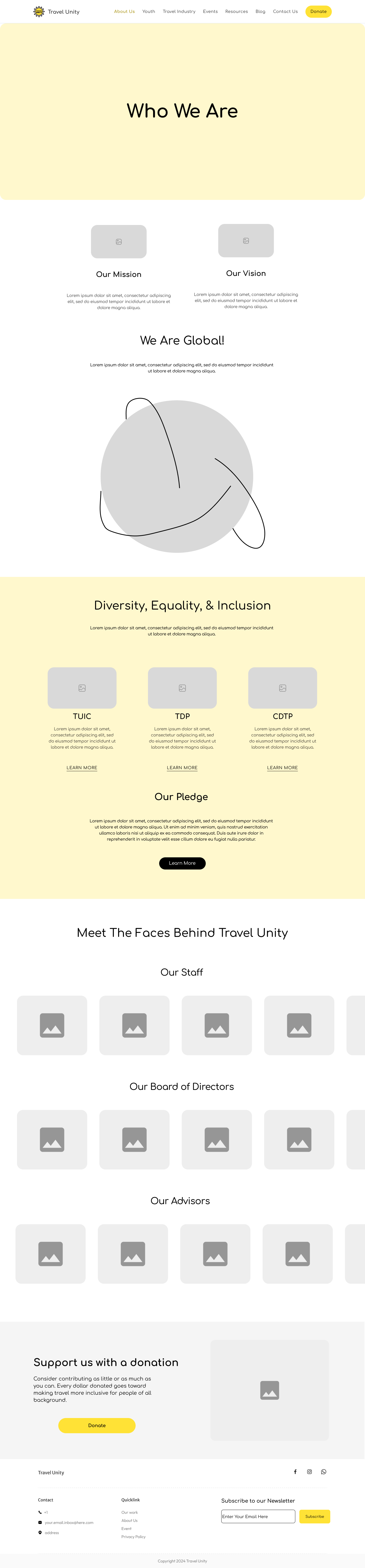
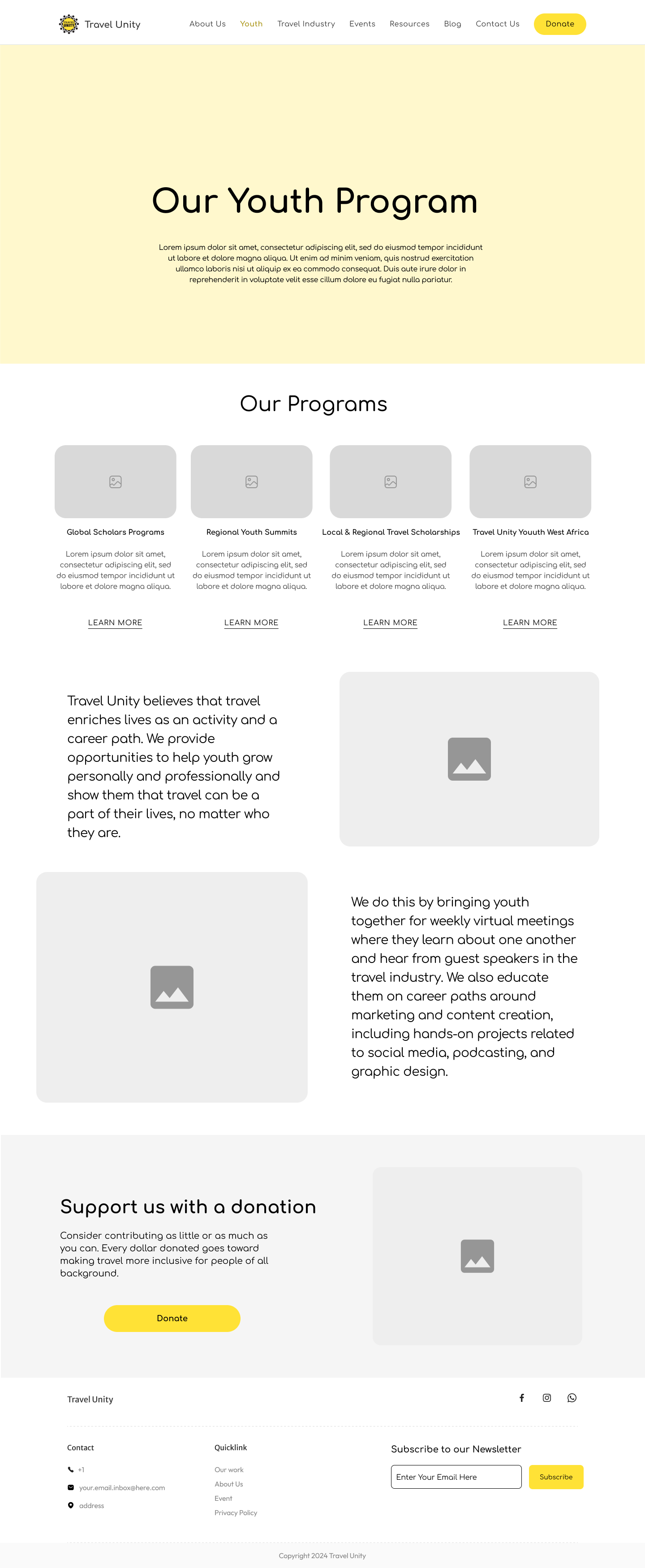
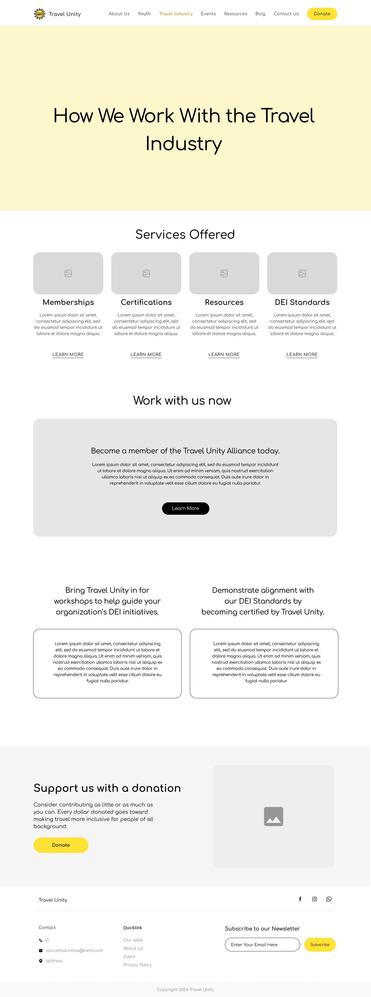
Final Prototype
Our final prototype was presented to the client with positive feedback and understanding of our design choices.
Client Feedback
The client was highly satisfied with the redesigned website prototype, especially appreciating the clear differentiation between youth and travel industry professionals. They like the seamless bridging of these two user groups and the prioritization of key actions, such as the “Become a Member” button for alliance members. Overall, the client commended the design for effectively catering to diverse user needs while maintaining a cohesive and user-friendly experience.
Reflections
Our team gained a lot of research skills that we didn’t previously have, which helped us in understanding our users and the organization we were working with.
We learned how to organize the work between our team from early research to final design stages, and implemented them together seamlessly.
This was an enjoyable experience for us as a team. Working with Travel Unity and Brianna brought us passion for the students and alliance members who are eager to explore the world of travel in a unique light.