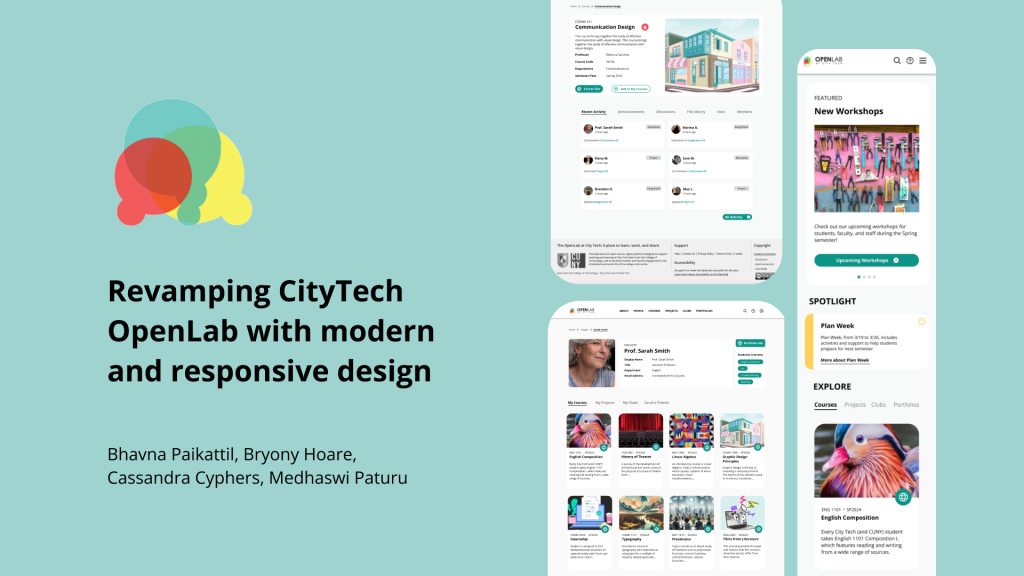
Overview
The Open Lab at CUNY’s CityTech college is at the intersection of online communities and open learning resources that presents as a hub for all students, faculty, alumni and the public to find courses, clubs, projects and portfolios. As their product design team, we successfully modernized their website with a mobile first responsive approach based on data analyzed from our research process.
Team: Bhavna Paikattil, Bryony Hoare, Cassandra Cyphers, Medhaswi Paturu
Project Goals
- Refresh the visual design with a contemporary look and feel.
2. Ensure accessibility for users of all levels of digital literacy and English language fluency.
3. Maintain continuity and functionality across desktop, tablet, and mobile.
Timeline
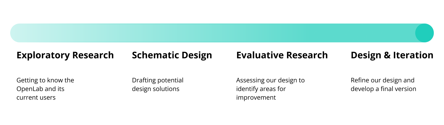
Exploratory Research
How do users interact with the OpenLab?
Based on our conversations with OpenLab’s team, we created an ecosystem map of the various stakeholders that use the platform within CUNY’s ecosystem
- Faculty
- Staff
- Students
- Alumni
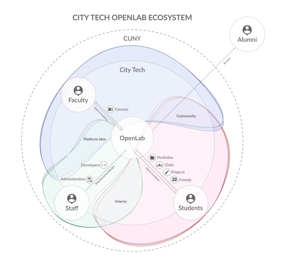
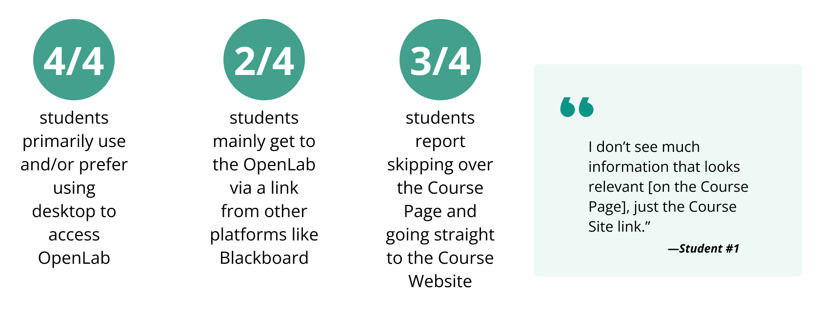
During our user interviews with stakeholders, we learnt that students primarily use OpenLab when required for a specific course, or as dictated by a professor. However, Interns who are more aware and involved with the platform tend to use it independently and quite extensively.
Notes from experts and similar platforms
We included Academic papers in our research process to identify key themes to create a successful Open Education Community
- Promote interaction and community
- Create a personal history for each user
- Accessibility as an integral part of the process
- Supporting equitable education
We also evaluated 7 similar platforms according to the following categories:
- Homepage
- Navigation
- People
- Courses
- Projects
- Online Communities
Key Findings:
- Few platforms provide an introduction with instructions and guidelines for users to navigate with ease.
- Most platforms have hierarchical positioning of the navigation menus, all at one glance
- Many platforms follow the same template / format for course structure
Analyzing OpenLab’s current state
OpenLab has an extensive information architecture with multiple pages, profiles, external sites and blog posts. We chose to not focus on transforming the architecture due to the large scale and development limitations within their team.
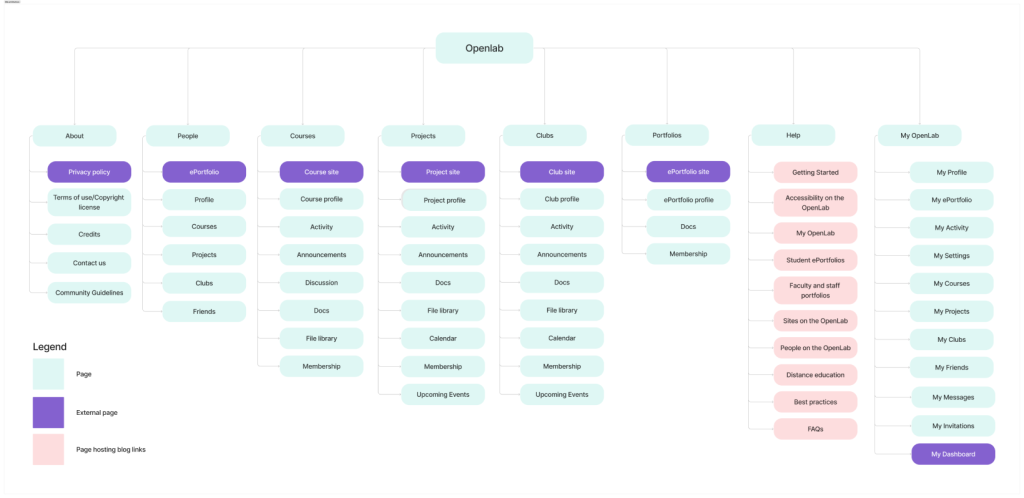
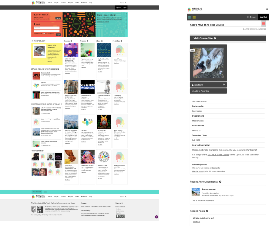
OpenLab currently uses a 1-4 column layout with rectangular UI blocks. Margins tend to vary and pages lead to an extended scroll due to the large amount of information
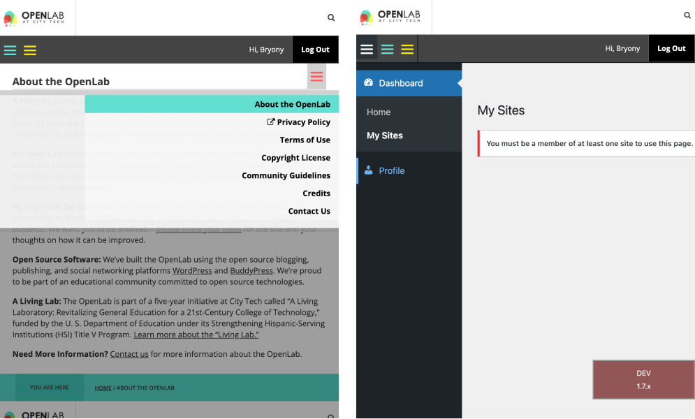
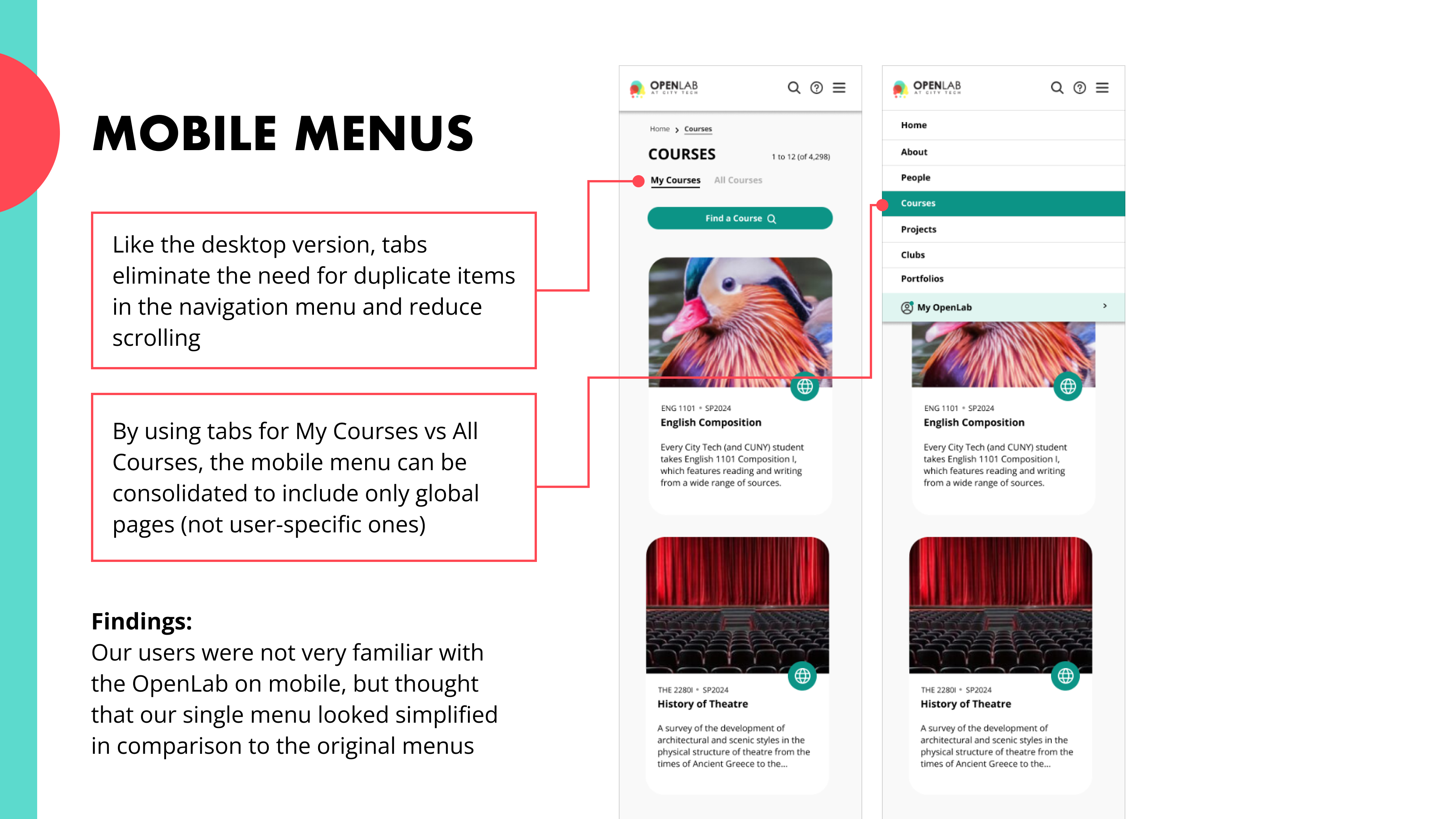
There are 3 hamburger menus located at different points which complicates navigation using the main menus.
Our re-design is focused on improving navigation and modernizing the look and feel of the platform, within the limitations of WordPress and BuddyPress
Schematic Design
Defining our Design Principles
Based on our interactions and research insights, we identified three key principles to guide our design process.
Openness
- Easy access to educational materials for all learners
- Indicating clearly which pages and features are open or closed
- Reduce barriers and clicks
Accessibility
- Simple language
- Easy-to-understand icons and visuals
- Guidance and onboarding for new users
- Ensure that every user feels included
Community
- Promote interaction and engagement
- Provide settings and features for personalization and identity
- Showcase work and create opportunities for connection
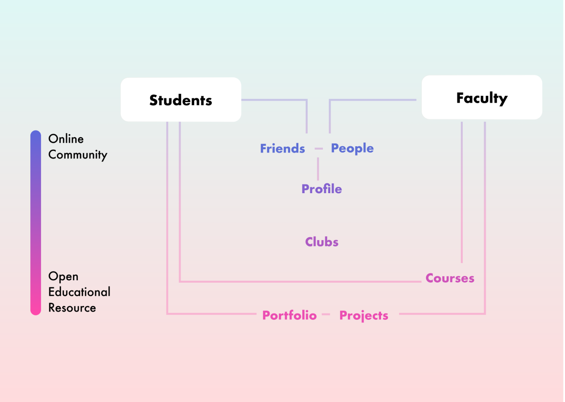
Crafting our Product Architecture
Based on the key workflows and ecosystem map, we created a product architecture that maps out main users and their needs and interactivity with OpenLab. We categorized students to include current students, alumni, and the public. The product architecture also shows which aspects of the OpenLab support open educational resource or online community aspects.
Design and Iteration
A quick walkthrough of our Design Process
Keeping in mind the limitations of OpenLab’s WordPress site and our insights from research,
we created basic sketches that transformed into multiple iterations lo-fi designs.

We shared our mid fidelity designs with the OpenLab team, but we quickly realized that the lack of colors, content and images confused our client
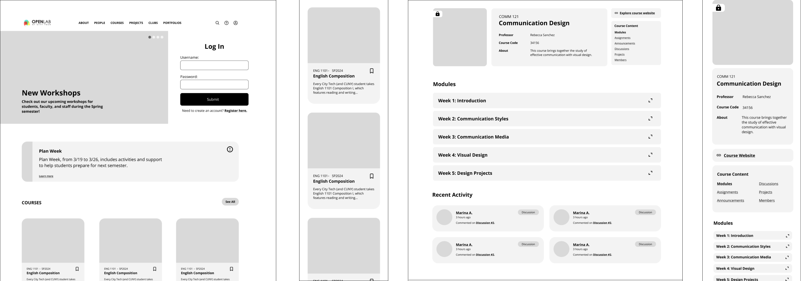
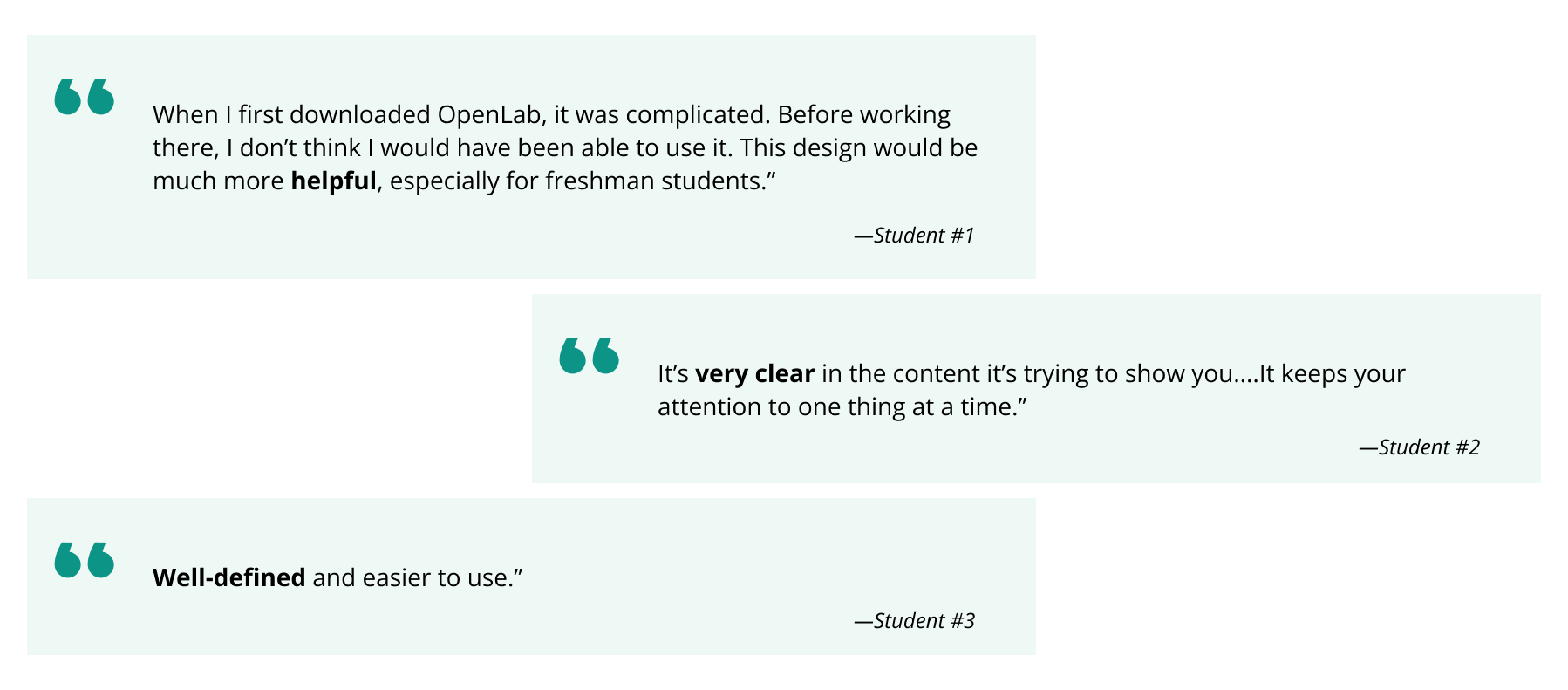
So, we got to fleshing out our high fidelity designs, and tested them with current students at CityTech and…
we received an overwhelmingly positive response!
Final Designs and Design Decisions
View our entire redesign process here
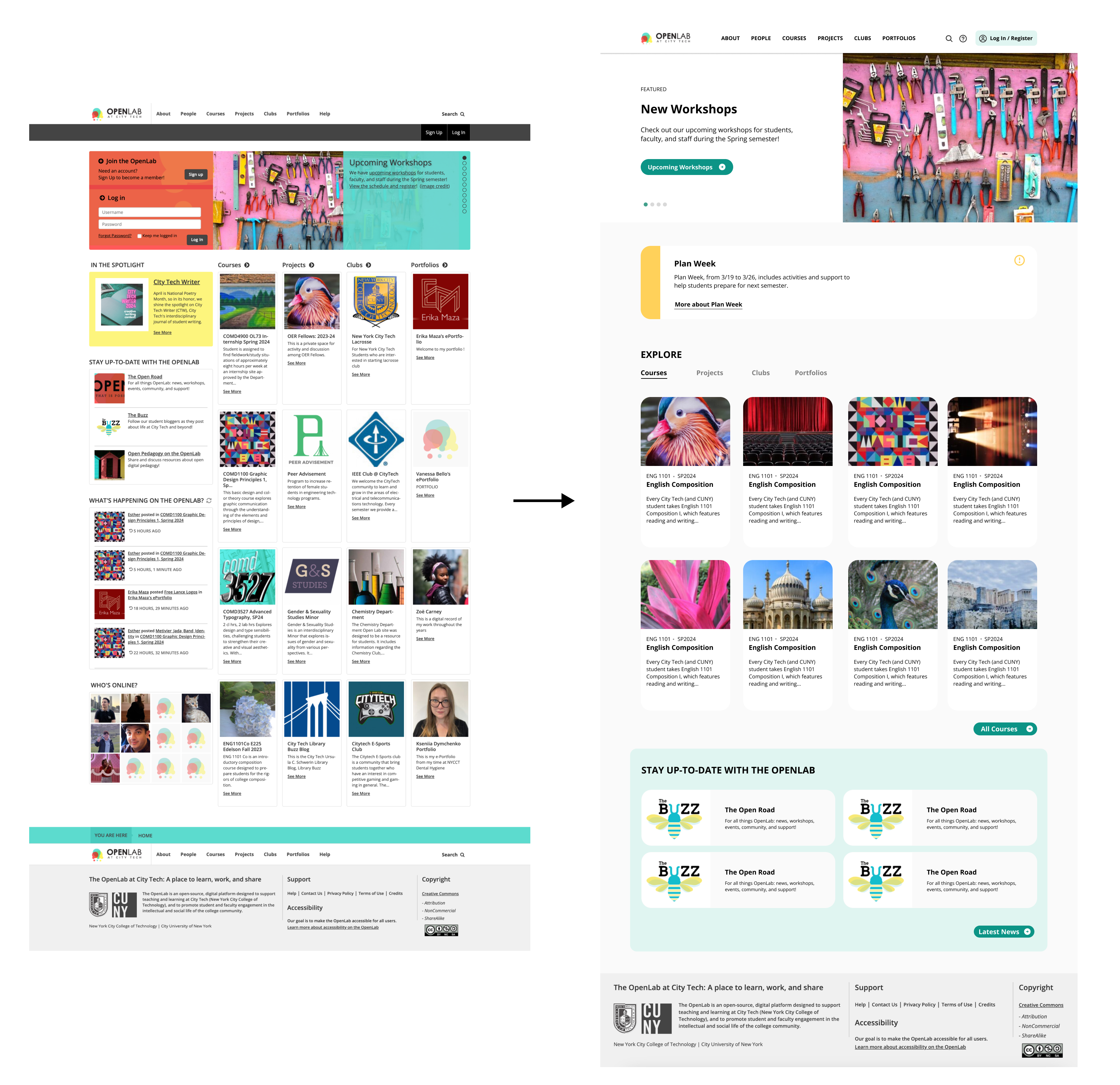
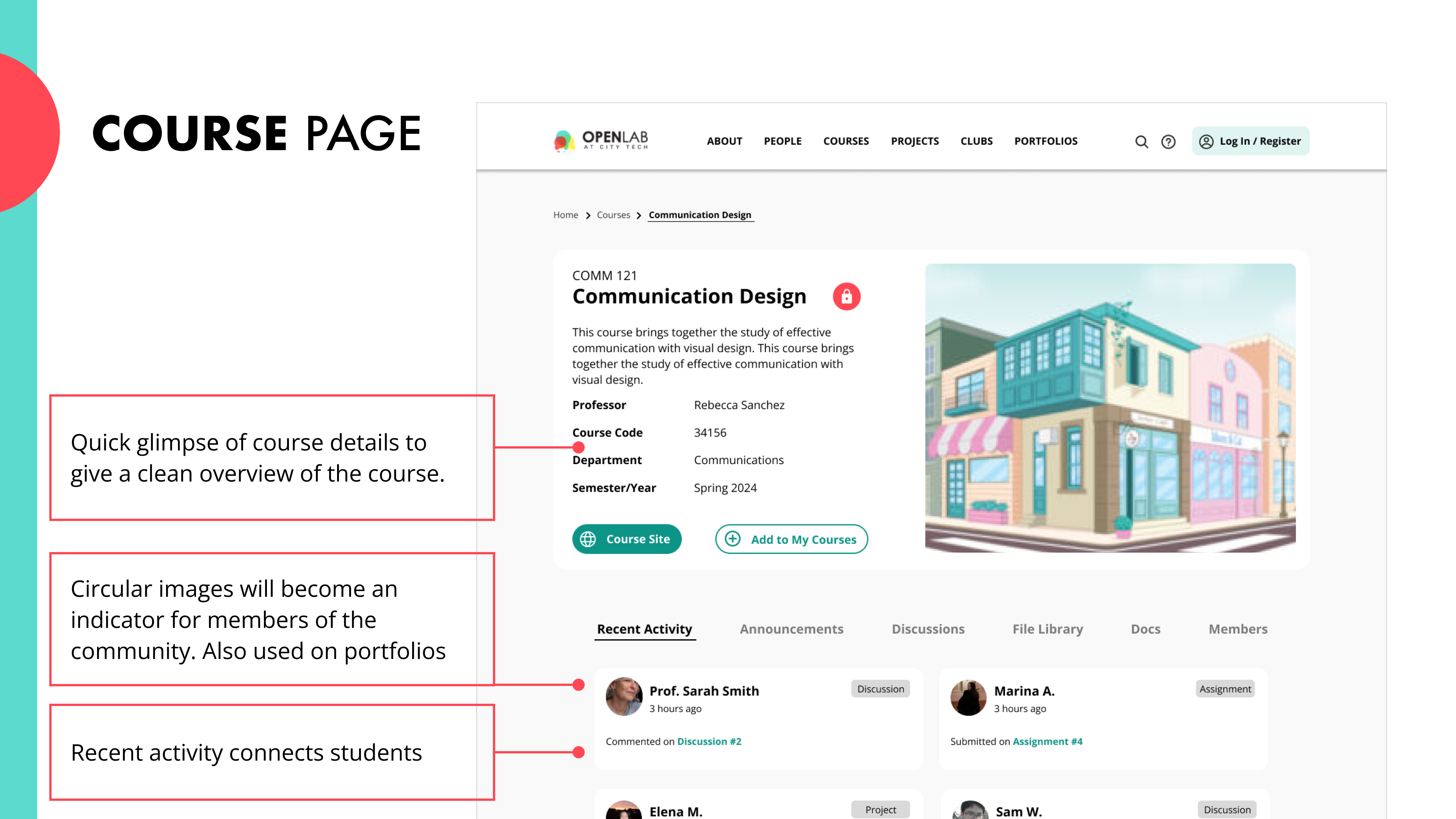
We created a modern + responsive layout
Bento-box inspired grid that stacks easily to provide a modern look to the website
Usage of tabs also reduces information overload on mobile by maintaining visual consistency
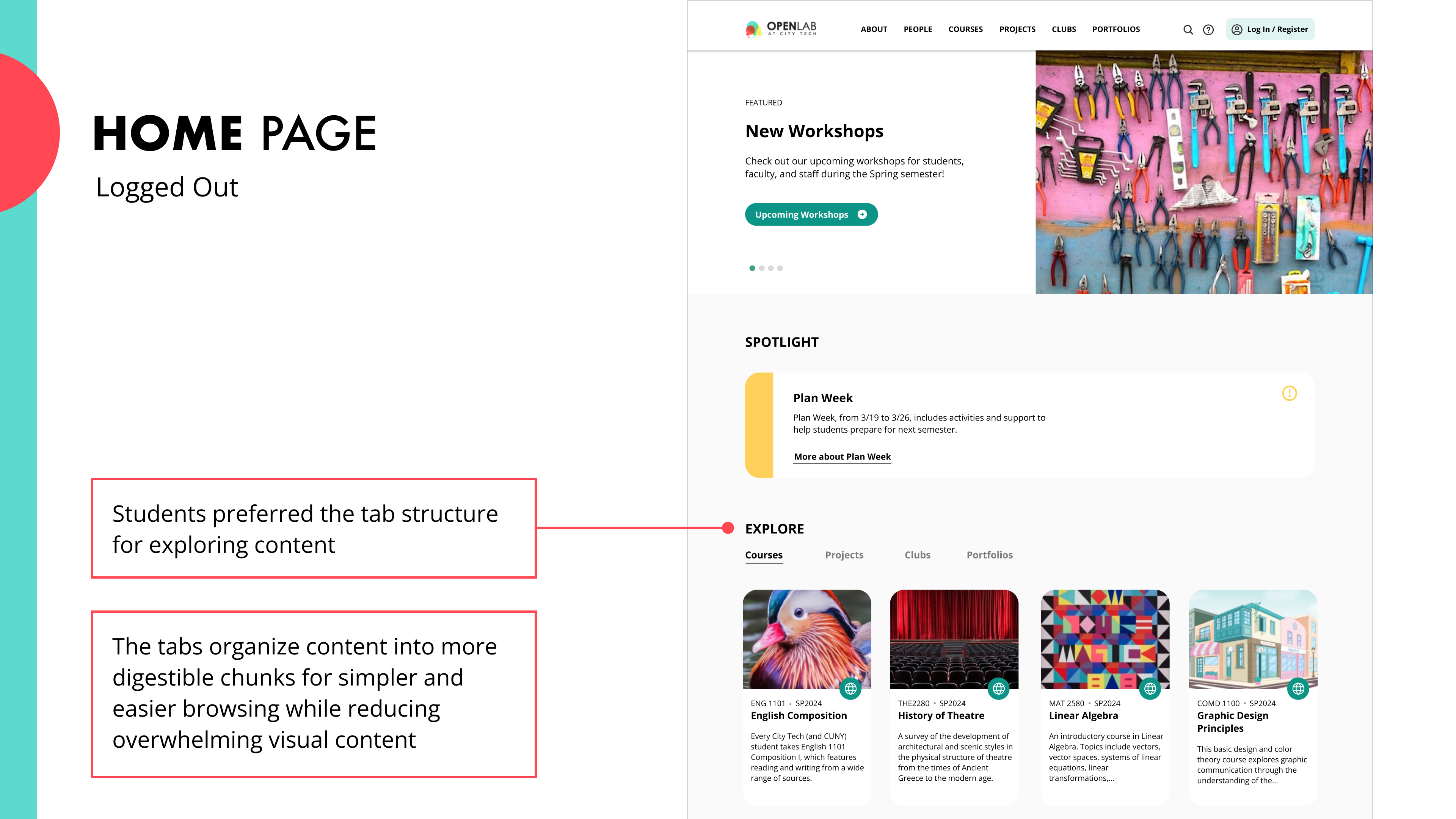
Courses promote both open education and online communities by highlighting user interactions on the platform
We solved the 3-hamburger menu problem
by decluttering the navigation menu, and providing in-page navigation such as tabs, lists and stackable blocks
Overall, our clients were impressed!
We successfully achieved all three project goals, and provided our clients with a new strategy. They were surprised by a lot of our findings, but they are going to consider our research + recommendations in their redesigns!
“Maybe the mobile first approach will push more students to use OpenLab”
Judy Rosen, Asst. Prof

Personal Reflections
This project made me understand the need to empathize with clients and speak their language if you want to communicate your vision and ideas.
Working within limitations is not a limitation at all! I liked having a fixed scope and it was a fun challenge to fit our ideas a box.